

Question: Flexbox exercise Required output: Mobile layout Tablet layout Header Header Menu 1 Menu 2 Menu 3 Menu 1 Menu 2 Menu 3 Sidebar Feature 1
Flexbox exercise
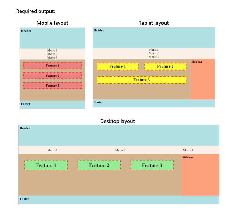
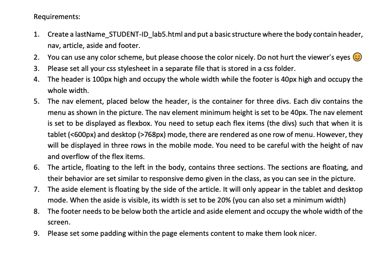
Required output: Mobile layout Tablet layout Header Header Menu 1 Menu 2 Menu 3 Menu 1 Menu 2 Menu 3 Sidebar Feature 1 Feature 1 Feature 2 Feature 2 Feature 3 Feature 3 Footer Footer Desktop layout Header Menu 1 Menu 2 Menu 3 Sidebar Feature 1 Feature 2 Feature 3 Footer Requirements: 1. Create a lastName_STUDENT-ID_lab5.html and put a basic structure where the body contain header, nav, article, aside and footer. 2. You can use any color scheme, but please choose the color nicely. Do not hurt the viewer's eyes 3. Please set all your css stylesheet in a separate file that is stored in a css folder. 4. The header is 100px high and occupy the whole width while the footer is 40px high and occupy the whole width. 5. The nav element, placed below the header, is the container for three divs. Each div contains the menu as shown in the picture. The nav element minimum height is set to be 40px. The nav element is set to be displayed as flexbox. You need to setup each flex items (the divs) such that when it is tablet (768px) mode, there are rendered as one row of menu. However, they will be displayed in three rows in the mobile mode. You need to be careful with the height of nav and overflow of the flex items. 6. The article, floating to the left in the body, contains three sections. The sections are floating, and their behavior are set similar to responsive demo given in the class, as you can see in the picture. 7. The aside element is floating by the side of the article. It will only appear in the tablet and desktop mode. When the aside is visible, its width is set to be 20% (you can also set a minimum width) 8. The footer needs to be below both the article and aside element and occupy the whole width of the screen. 9. Please set some padding within the page elements content to make them look nicer
Step by Step Solution
There are 3 Steps involved in it

Get step-by-step solutions from verified subject matter experts
 Study Help