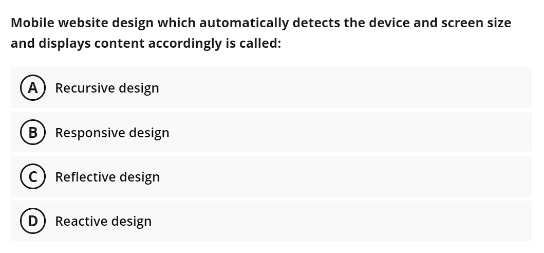
Question: Mobile website design which automatically detects the device and screen size and displays content accordingly is called: A Recursive design B Responsive design C) Reflective

Step by Step Solution
There are 3 Steps involved in it
1 Expert Approved Answer
Step: 1 Unlock


Question Has Been Solved by an Expert!
Get step-by-step solutions from verified subject matter experts
Step: 2 Unlock
Step: 3 Unlock


