

Question: STATISTICS PROBABILITY AND CODE IN PYTHON TO PLOT THE GRAPH. Consider the following Gross Domestic Product (GDP) data for the US in trillions of UD
STATISTICS PROBABILITY AND CODE IN PYTHON TO PLOT THE GRAPH.
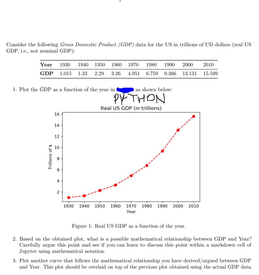
Consider the following Gross Domestic Product (GDP) data for the US in trillions of UD dollars (real US GDP. i.e., not nominal GDP) Year 1930 1940 1950 1960 1970 1980 1990 20002010 GDP 1.015 1.33 2.29 3.26 4.951 6.759 9.366 13.131 15.599 1. Plot the GDP as a function of the year in as shown below PYTHON Real US GDP (in trillions) 16 14 12 10 8 4 1930 1940 1950 1960 1970 1980 1990 2000 2010 Year Figure 1: Real US GDP as a function of the year 2. Based on the obtained plot, what is a possible mathematical relationship between GDP and Year? Carefully argue this point and see if you can learn to discuss this point within a markdown cell of Jupyter using mathematical notation 3. Plot another curve that follows the mathematical relationship you have derived/argued between GDP and Year. This plot should be overlaid on top of the previous plot obtained using the actual GDP data
Step by Step Solution
There are 3 Steps involved in it

Get step-by-step solutions from verified subject matter experts