

Question: Task 0 5 In the desktop media query, modify the first comment within the query to , Desktop Viewport: Show desktop class, hide mobile -
Task
In the desktop media query, modify the first comment within the query to Desktop Viewport: Show desktop class, hide mobiletablet class. Below the desktop style rule, create a new style rule for the mobiletablet class selector that sets the display to none
Task
In the desktop media query, add the following comment after the style rule for aside: Style rules for table
Below the comment, add the following style rules:
Create a style rule for the table selector that specifies a border with values of px solid #af collapses the border, and sets top and bottom margins to zero and left and right margins to auto.
Create a style rule for the caption selector that specifies a fontsize of em fontweight of bold, and sets the padding to
Create a style rule for th and td selectors that specifies a border with values of px solid #af and sets the padding to
Create a style rule for the th selector that sets the backgroundcolor to af the color to white fff and the fontsize to em
Create a style rule for the tr selector that sets the backgroundcolor to #deccba for odd rows.
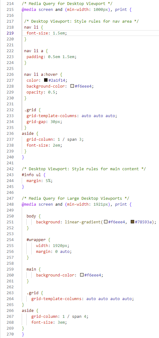
Media Query for Desktop Viewport
@media screen and minwidth: px print
Desktop Viewport: Style rules for nav area
nav li
fontsize: em;
nav li a
padding: em em;
nav li a:hover
color: #af;
backgroundcolor: square#feee;
opacity: ;
grid
gridtemplatecolumns: auto auto auto;
gridgap: px;
aside
gridcolumn: span ;
fontsize: em;
Desktop Viewport: Style rules for main content
#info ul
margin: ;
Media Query for Large Desktop Viewports
@media screen and minwidth: px print
body
background: lineargradientsquare#feeesquare#a;
#wrapper
width: px;
margin: auto;
main
backgroundcolor: square#feee;
grid
gridtemplatecolumns: auto auto auto auto;
aside
gridcolumn: span ;
fontsize: em;
Step by Step Solution
There are 3 Steps involved in it
1 Expert Approved Answer
Step: 1 Unlock

Question Has Been Solved by an Expert!
Get step-by-step solutions from verified subject matter experts
Step: 2 Unlock
Step: 3 Unlock
 Study Help