

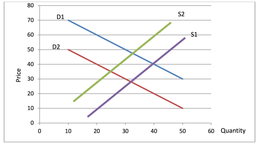
Question: The graph below shows a decrease in supply (from S1 to S2), followed by a decrease in demand (from D1 to D2). What kind of
The graph below shows a decrease in supply (from S1 to S2), followed by a decrease in demand (from D1 to D2). What kind of economic situation could I use to describe this graph and why? Taking into consideration the quantity and price on attached graph.
Step by Step Solution
There are 3 Steps involved in it
1 Expert Approved Answer
Step: 1 Unlock

Question Has Been Solved by an Expert!
Get step-by-step solutions from verified subject matter experts
Step: 2 Unlock
Step: 3 Unlock