

Question: Use python to import 12.32 frequency data from the data file data.csv listed below and graph a scatter plot of the amplitude on the yaxis
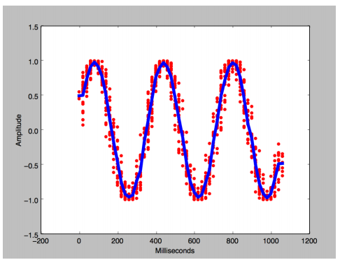
Use python to import 12.32 frequency data from the data file data.csv listed below and graph a scatter plot of the amplitude on the yaxis and milliseconds on the x axis. Then draw a line plotof the mean amplitude for each unit time on the top of the scatter plot.
| millisecond | amplitude | frequency |
| 0 | 0.4018 | 12.32 |
| 0 | -0.8463 | 9.25 |
| 100 | -0.0629 | 9.25 |
| 100 | 0.7801 | 12.32 |
| 300 | 0.980 | 9.25 |
| 300 | -0.9691 | 12.32 |
| 600 | -0.842 | 12.32 |
| 600 | -0.400 | 9.25 |
| 900 | -0.421 | 12.32 |
| 900 | -0.275 | 9.25 |
1.5 1.0 0.5 0.0 -0.5 1.0 1.5 200 200 400 600 800 1000 1200 Milliseconds
Step by Step Solution
There are 3 Steps involved in it
1 Expert Approved Answer
Step: 1 Unlock

Question Has Been Solved by an Expert!
Get step-by-step solutions from verified subject matter experts
Step: 2 Unlock
Step: 3 Unlock