

Question: Using Python: A bar chart or (bar graph) presents grouped data with rectangular bars with lengths proportional to the values that they represent. The bars
Using Python: A bar chart or (bar graph) presents grouped data with rectangular bars with lengths proportional to the values that they represent. The bars are plotted horizontally and shows comparisons among categories. One axis of the chart shows the specific categories being compared, and the other axis represents discrete values. You need to display a bar graph of the series logarithmic function: = and need to give the user control over the series of values in the graph including the starting value, number of values, the multiplier (A) and the step (or interval) for the series value x. Write a function named q6() that prompts the user for the following values: -A -Number of values for x -Starting value for x -Step (or interval) for x The program should then use a for loop and print() statements to display a header and bar chart (see examples) of the corresponding values for y based on the logarithmic function shown above.
Output should look exactly like below:
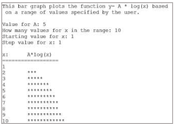
This bar graph plots the function y- A log (x) based on a range of values specified by the user. Value for A: 5 How many vlues for x in the range: 10 Starting value for x: 1 Step value for x: 1 X: Atlog (x) 7 8 10
Step by Step Solution
There are 3 Steps involved in it

Get step-by-step solutions from verified subject matter experts