

Question: Using the table below, construct a graph of main sequence luminosity (y-axis) versus mass (x-axis), drawing a best fit curve to your data. On
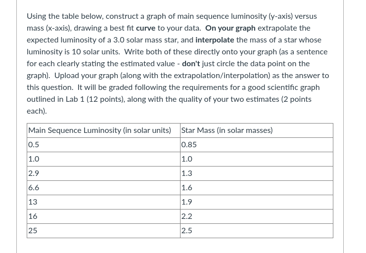
Using the table below, construct a graph of main sequence luminosity (y-axis) versus mass (x-axis), drawing a best fit curve to your data. On your graph extrapolate the expected luminosity of a 3.0 solar mass star, and interpolate the mass of a star whose luminosity is 10 solar units. Write both of these directly onto your graph (as a sentence for each clearly stating the estimated value - don't just circle the data point on the graph). Upload your graph (along with the extrapolation/interpolation) as the answer to this question. It will be graded following the requirements for a good scientific graph outlined in Lab 1 (12 points), along with the quality of your two estimates (2 points each). Main Sequence Luminosity (in solar units) Star Mass (in solar masses) 0.5 0.85 1.0 1.0 2.9 1.3 6.6 1.6 13 1.9 16 2.2 25 2.5
Step by Step Solution
There are 3 Steps involved in it

Get step-by-step solutions from verified subject matter experts