

The USStates dataset includes information on the 50 US states, including the percent of the population of
Question:
Figure 2.58
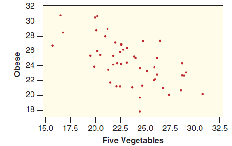
(a) Does the scatterplot show a positive or negative association? Explain why your answer makes sense for these two variables.
(b) Where would a very healthy state be located on the scatterplot: top left, top right, bottom left, bottom right, or middle? What about a very unhealthy state?
(c) Pick a point in a very healthy location in the scatterplot, and use the dataset USStates to find the state it represents. Pick a point in a very unhealthy location and find the state it represents.
(d) Is the data from a sample or a population? What is the correct notation for the correlation?
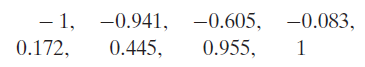
(e) Which of the following is most likely to be the correlation between these two variables?
(f) Would a positive correlation imply that eating more vegetables will cause you to gain weight?
(g) Would a negative correlation imply that eating more vegetables will cause you to lose weight?
(h) One state stands out for eating an average number of vegetables but having a particularly low obesity rate. What state is this?
Step by Step Answer:
a There appears to be a negative association which means in this context that states with a larger p...View the full answer


Statistics Unlocking The Power Of Data
ISBN: 9780470601877
1st Edition
Authors: Robin H. Lock, Patti Frazer Lock, Kari Lock Morgan, Eric F. Lock, Dennis F. Lock
