

The following graph shows the maximum age of all individuals whose deaths were recorded in a given
Question:
The following graph shows the maximum age of all individuals whose deaths were recorded in a given year, worldwide (Dong et al. 2016).
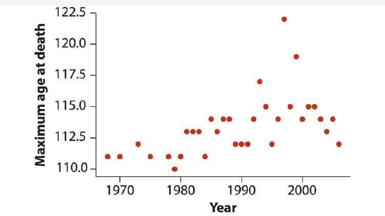
a. What kind of graph is this?
b. Since the data describe a temporal sequence, what other type of plot would be suitable to display them?
c. One individual in this graph is an outlier relative to the others. What is the age of death for the outlier?
Fantastic news! We've Found the answer you've been seeking!
Step by Step Answer:
a The graph you sent is a scatter plot It shows the relationship between two ...View the full answer

Answered By
Junaid ahmed
I am an English language professor with years of experience In Teaching English Language and Literature. I like to help people in the various difficult matter.
2+ Reviews
10+ Question Solved
Related Book For 

The Analysis Of Biological Data
ISBN: 9781319226237
3rd Edition
Authors: Michael C. Whitlock, Dolph Schluter
Question Posted:
