

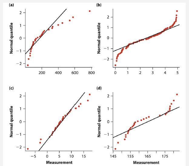
The four graphs shown below are normal quantile plots for four different data sets, each sampled randomly
Question:
The four graphs shown below are normal quantile plots for four different data sets, each sampled randomly from a different population. For each graph, say whether the distribution is close to a normal distribution.
Fantastic news! We've Found the answer you've been seeking!
Step by Step Answer:
a Not normal The points show strong c...View the full answer

Answered By
Leah Muchiri
I am graduate in Bachelor of Actuarial Science and a certified accountant. I am also a prolific writer with six years experience in academic writing. My working principle are being timely and delivering 100% plagiarized free work. I usually present a precised solution to every work am assigned to do. Most of my student earn A++ GRADE using my precised and correct solutions.
52+ Reviews
125+ Question Solved
Related Book For 
The Analysis Of Biological Data
ISBN: 9781319226237
3rd Edition
Authors: Michael C. Whitlock, Dolph Schluter
Question Posted:
