New Semester
Started
Get
50% OFF
Study Help!
--h --m --s
Claim Now
Question Answers
Textbooks
Find textbooks, questions and answers
Oops, something went wrong!
Change your search query and then try again
S
Books
FREE
Study Help
Expert Questions
Accounting
General Management
Mathematics
Finance
Organizational Behaviour
Law
Physics
Operating System
Management Leadership
Sociology
Programming
Marketing
Database
Computer Network
Economics
Textbooks Solutions
Accounting
Managerial Accounting
Management Leadership
Cost Accounting
Statistics
Business Law
Corporate Finance
Finance
Economics
Auditing
Tutors
Online Tutors
Find a Tutor
Hire a Tutor
Become a Tutor
AI Tutor
AI Study Planner
NEW
Sell Books
Search
Search
Sign In
Register
study help
business
intro stats
Stats Data And Models 4th Global Edition Richard D. De Veaux, Paul Velleman, David E. Bock - Solutions
Orange production The table below shows that as the number of oranges on a tree increases, the fruit tends to get smaller. Create a model for this relationship, and express any concerns you may have. Number of Average Oranges/Tree Weight/Fruit (lb) 50 0.61 100 0.59 150 0.57 200 0.55 250 0.53
Slower is cheaper? Researchers studying how a car’s Fuel Efficiency varies with its Speed drove a compact car 200 miles at various speeds on a test track. Their data are shown in the table.Create a linear model for this relationship and report any concerns you may have about the model. Speed
Lifting more weight In Exercise 28 you examined the record weight-lifting performances for the Olympics.You found a re-expression of Total Weight Lifted.a) Find a model for Total Weight Lifted by re-expressing Weight Class instead of Total Weight Lifted.b) Compare this model to the one you found in
Life expectancy history The data in the next column list the Life Expectancy for white males in the United States every decade during the past 110 years(1 = 1900 to 1910, 2 = 1911 to 1920, etc.). Create a model to predict future increases in life expectancy.(National Vital Statistics Report) Hint:
Weightlifting 2014 Listed below are the Olympic record men’s weight-lifting performances as of 2014.a) Create a linear model for the Weight Lifted in each Weight Class.b) Check the residuals plot. Is your linear model appropriate?c) Create a better model by re-expression Total Weight Lifted and
Logs (not logarithms) The value of a log is based on the number of board feet of lumber the log may contain.(A board foot is the equivalent of a piece of wood 1 inch thick, 12 inches wide, and 1 foot long. For example, a 2 * 4 piece that is 12 feet long contains 8 board feet.)To estimate the amount
Planets, models, and laws The model you found in Exercise 22 is a relationship noted in the 17th century by Kepler as his Third Law of Planetary Motion. It was subsequently explained as a consequence of Newton’s Law of Gravitation. The models for Exercises 23–25 relate to what is sometimes
Planets, and Eris In July 2005, astronomers Mike Brown, Chad Trujillo, and David Rabinowitz announced the discovery of a sun-orbiting object, since named Eris,2 that is 5% larger than Pluto. Eris orbits the sun once every 560 earth years at an average distance of about 6300 million miles from the
Planets, and asteroids The asteroid belt between Mars and Jupiter may be the remnants of a failed planet. If so, then Jupiter is really in position 6, Saturn is in 7, and so on. Repeat Exercise 23, using this revised method of numbering the positions. Which method seems to work better?
Planets, distances and order Let’s look again at the pattern in the locations of the planets in our solar system seen in the table in Exercise 22.a) Re-express the distances to create a model for the Distance from the sun based on the planet’s Position.b) Based on this model, would you agree
Planets, distances and years At a meeting of the International Astronomical Union (IAU) in Prague in 2006, Pluto was determined not to be a planet, but rather the largest member of the Kuiper belt of icy objects. Let’s examine some facts. Here is a table of the 9 sun-orbiting objects formerly
Baseball salaries 2013 Ballplayers have been signing ever larger contracts. The highest salaries (in millions of dollars per season) for each year since 1874 is in the file. (Data in Baseball salaries 2013). Here are recent entries:a) Examine a scatterplot of the data. Does it look straight?b) Part
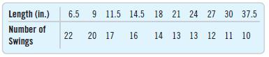
Pendulum A student experimenting with a pendulum counted the number of full swings the pendulum made in 20 seconds for various lengths of string. Her data are shown below.a) Explain why a linear model is not appropriate for using the Length of a pendulum to predict the Number of Swings in 20
Brakes The following table shows stopping distances in feet for a car tested 3 times at each of 5 speeds. We hope to create a model that predicts Stopping Distance from the Speed of the car.a) Explain why a linear model is not appropriate.b) Re-express the data to straighten the scatterplot.c)
Pressure Scientist Robert Boyle examined the relationship between the volume in which a gas is contained and the pressure in its container. He used a cylindrical container with a moveable top that could be raised or lowered to change the volume. He measured the Height in inches by counting equally
Better GDP model? Consider again the post-1950 trend in U.S. GDP we examined in Exercise 15. Here are a regression and residual plot when we use the log of GDP in the model. Is this a better model for GDP?Explain. Dependent variable is: LogGDP R-squared 99.1% s = 0.0554 Variable Coefficient
GDP 2013 The scatterplot shows the gross domestic product (GDP) of the United States in billions of (2013)dollars plotted against years since 1950.A linear model fit to the relationship looks like this:a) Does the value 98.3% suggest that this is a good model? Explain.b) Here’s a scatterplot of
Crowdedness again In Exercise 12 we looked at United Nations data about a country’s GDP and the average number of people per room (Crowdedness) in housing there. For a re-expression, a student tried the reciprocal-10000>GDP, representing the number of people per$10,000 of gross domestic
Gas mileage, revisited Let’s try the re-expressed variable Fuel Consumption (gal/100 mi) to examine the fuel efficiency of the 11 cars in Exercise 11. Here are the revised regression analysis and residuals plot:a) Explain why this model appears to be better than the linear model.b) Using the
Crowdedness In a Chance magazine article (Summer 2005), Danielle Vasilescu and Howard Wainer used data from the United Nations Center for Human Settlements to investigate aspects of living conditions for several countries. Among the variables they looked at were the country’s per capita gross
Gas mileage As the example in the chapter indicates, one of the important factors determining a car’s Fuel Efficiency is its Weight. Let’s examine this relationship again, for 11 cars.a) Describe the association between these variables shown in the scatterplot on the next page.b) Here is the
More models For each of the models listed below, predict y when x = 2.a) yn = 1.2 + 0.8 log xd) yn2 = 1.2 + 0.8xb) log yn = 1.2 + 0.8x e)1 2yn = 1.2 + 0.8xc) ln yn = 1.2 + 0.8 ln x
Hopkins winds, revisited In Chapter 4, we examined the wind speeds in the Hopkins forest over the course of a year. Here’s the scatterplot we saw then (Data in Hopkins Forest 2011):a) Describe the pattern you see here.b) Should we try re-expressing either variable to make this plot straighter?
Oakland passengers 2013 revisited In Chapter 8, Exercise 9, we created a linear model describing the trend in the number of passengers departing from the Oakland (CA) airport each month since the start of 1997.Here’s the residual plot, but with lines added to show the order of the values in
Life Expectancy and TV again Exercise 4 revisted the relationship between life expectancy and TVs per capita and saw that re-expression to the square root of TVs per capita made the plot more nearly straight. But was that the best choice of re-expression. Here is a scatterplot of lige expectancy vs
BK Protein again Exercise 3 looked at the distribution of protein in the Burger King menu items, comparing meat and non-mean items. That exercise offered the logarithm as a re-expression of Protein. Here are two other alternatives, the square root and the reciprocal. Would you still prefer the log?
Life Expectancy and TV Recall the example of life expectancy vs TVs per person in chapter 6. In that example, we use the square root of TVs per person. Here are the original data and the square root. Which of the goals of re-expression does this illustrate? Life Exp Life Exp 75.0 67.5 60.0 52.5 + +
BK Protein Recall the data about the Burger King menu items. Here are boxplots of protein content comparing items that contain meat with those that do not. The plot on the right graphs log(Protein). Which of the goals of re-expression does this illustrate? 60- Protein (g) 45 30 30 15 T 0 00 Meat
More Residuals Suppose you have fit a linear model to some data and now take a look at the residuals. For each of the following possible residuals plots, tell whether you would try a re-expression and, if so, why. a) b)
Residuals Suppose you have fit a linear model to some data and now take a look at the residuals. For each of the following possible residuals plots, tell whether you would try a re-expression and, if so, why. b) L
We’ve seen curvature in the relationship between emperor penguins’ diving heart rates and the duration of the dive. In addition, the histogram of heart rates was skewed and the boxplots of heart rates by individual birds showed skewness to the high end.Questions: What re-expression might
Second stage 2014 Look once more at the data from the Tour de France. In Exercise 46, we looked at the whole history of the race, but now let’s consider just the post-World War II era.a) Find the regression of Avg Speed by Year only for years from 1947 to the present. Are the conditions for
Inflation 2011 The Consumer Price Index (CPI) tracks the prices of consumer goods as shown in the following table. The CPI is reported monthly, but we can look at selected values. The table shows the January CPI at fiveyear intervals. It indicates, for example, that the average item costing $17.1
Tour de France 2014 We met the Tour de France data set in Chapter 1 (in Just Checking). One hundred years ago, the fastest rider finished the course at an average speed of about 25.3 kph (around 15.8 mph). By the 21st century, riders were averaging over 40 kph (nearly 25 mph).a) Make a scatterplot
Life expectancy 2013 Data for 26 Western Hemisphere countries can be used to examine the association between life expectancy and the birth rate (number of births per 1000 population).a) Create a scatterplot relating Life Expectancy to Birth Rate and describe the association. Are the regression
Bridges covered In Chapter 7, (Data in Tompkins County Bridges 2014) we found a relationship between the age of a bridge in Tompkins County, New York, and its condition as found by inspection. But we considered only bridges built or replaced since 1886. Tompkins County is the home of the oldest
Marriage age 2010 revisited Suppose you wanted to predict the trend in marriage age for American women into the early part of this century.a) How could you use the data graphed in Exercise 15 to get a good prediction? Marriage ages in selected years starting in 1900 are listed below. Use all or
Another swim 2013 In Exercise 40, we saw that Vicki Keith’s round-trip swim of Lake Ontario was an obvious outlier among the other one-way times. Here is the new regression after this unusual point is removed:a) In this new model, the value of se is smaller. Explain what that means in this
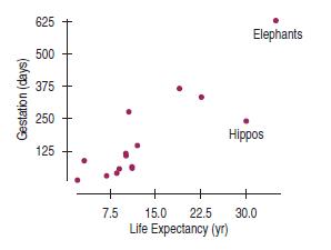
Elephants and hippos We removed humans from the scatterplot in Exercise 39 because our species was an outlier in life expectancy. The resulting scatterplot (below)shows two points that now may be of concern. The point in the upper right corner of this scatterplot is for elephants, and the other
Swim the lake 2013 People swam across Lake Ontario 52 times between 1974 and 2013 (www.soloswims.com).We might be interested in whether they are getting any faster or slower. Here are the regression of the crossing Times (minutes) against the Year since 1974 of the crossing and the residuals
Gestation For humans, pregnancy lasts about 280 days.In other species of animals, the length of time from conception to birth varies. Is there any evidence that the gestation period is related to the animal’s life span? The first scatterplot shows Gestation Period (in days) vs. Life Expectancy
Marriage age 2011 again Has the trend of decreasing difference in age at first marriage seen in Exercise 36 gotten stronger recently? The scatterplot and residual plot for the data from 1980 through 2011, along with a regression for just those years, are below.a) Is this linear model appropriate
Interest rates 2014 revisited In Exercise 35, you investigated the federal rate on 3-month Treasury bills between 1950 and 1980. The scatterplot below shows that the trend changed dramatically after 1980, so we computed a new regression model for the years 1981 to 2013.Here’s the model for the
Marriage age, 2011 The graph shows the ages of both men and women at first marriage (www.census.gov).Clearly, the patterns for men and women are similar.But are the two lines getting closer together?Here’s a timeplot showing the difference in average age (men’s age - women’s age) at first
Interest rates 2014 Here’s a plot showing the federal rate on 3-month Treasury bills from 1950 to 1980, and a regression model fit to the relationship between the Rate (in %) and Years Since 1950 (www.gpoaccess.gov/eop/).a) What is the correlation between Rate and Year?b) Interpret the slope and
Speed How does the speed at which you drive affect your fuel economy? To find out, researchers drove a compact car for 200 miles at speeds ranging from 35 to 75 miles per hour. From their data, they created the model Fuel Efficiency = 32 - 0.1 Speed and created this residual plot:a) Interpret the
Heating After keeping track of his heating expenses for several winters, a homeowner believes he can estimate the monthly cost from the average daily Fahrenheit temperature by using the model Cost = 133 - 2.13 Temp.Here is the residuals plot for his data:a) Interpret the slope of the line in this
Grades A college admissions officer, defending the college’s use of SAT scores in the admissions process, produced the following graph. It shows the mean GPAs for last year’s freshmen, grouped by SAT scores. How strong is the evidence that SAT Score is a good predictor of GPA? What concerns you
Reading To measure progress in reading ability, students at an elementary school take a reading comprehension test every year. Scores are measured in “grade-level” units;that is, a score of 4.2 means that a student is reading at slightly above the expected level for a fourth grader. The school
What’s the effect? A researcher studying violent behavior in elementary school children asks the children’s parents how much time each child spends playing computer games and has their teachers rate each child on the level of aggressiveness they display while playing with other children.
What’s the cause? Suppose a researcher studying health issues measures blood pressure and the percentage of body fat for several adult males and finds a strong positive association. Describe three different possible causeand-effect relationships that might be present.
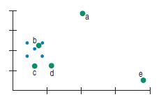
The extra point revisited The original five points in Exercise 27 produce a regression line with slope 0.Match each of the green points (a–e) with the slope of the line after that one point is added:1) -0.45 4) 0.05 2) -0.30 5) 0.85 3) 0.00
The extra point The scatterplot shows five blue data points at the left. Not surprisingly, the correlation for these points is r = 0. Suppose one additional data point is added at one of the five positions suggested below in green. Match each point (a–e) with the correct new correlation from the
More unusual points Each of the following scatterplots shows a cluster of points and one “stray” point. For each, answer these questions:1) In what way is the point unusual? Does it have high leverage, a large residual, or both?2) Do you think that point is an influential point?3) If that point
Unusual points Each of these four scatterplots shows a cluster of points and one “stray” point. For each, answer these questions:1) In what way is the point unusual? Does it have high leverage, a large residual, or both?2) Do you think that point is an influential point?3) If that point were
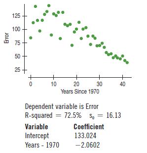
Tracking hurricanes 2012 In a previous chapter, we saw data on the errors (in nautical miles) made by the National Hurricane Center in predicting the path of hurricanes. The scatterplot at the top of the next page shows the trend in the 24-hour tracking errors since 1970(www.nhc.noaa.gov).a)
Oakland passengers 2013 The scatterplot below shows the number of passengers at Oakland (CA) airport month by month since 1997. (www.oaklandairport.com)a) Describe the patterns in passengers at Oakland airport that you see in this time plot.b) Until 2009, analysts got fairly good predictions using
Smoking 2011, women and men In Exercise 16, we examined the percentage of men aged 18–24 who smoked from 1965 to 2011 according to the Centers for Disease Control and Prevention. How about women? Here’s a scatterplot showing the corresponding percentages for both men and women:a) In what ways
Movie dramas Here’s a scatterplot of the production budgets (in millions of dollars) vs. the running time (in minutes) for major release movies in 2005. Dramas are plotted as red x’s and all other genres are plotted as blue dots. (The re-make of King Kong is plotted as a black “-”.At the
Bad model? A student who has created a linear model is disappointed to find that her R2 value is a very low 13%.a) Does this mean that a linear model is not appropriate?Explain.b) Does this model allow the student to make accurate predictions? Explain.
Good model? In justifying his choice of a model, a student wrote, “I know this is the correct model because R2 = 99.4%.”a) Is this reasoning correct? Explain.b) Does this model allow the student to make accurate predictions? Explain.
HDI 2012 revisited The United Nations Development Programme(UNDP) uses the Human Development Index (HDI) in an attempt to summarize in one number the progress in health, education, and economics of a country. The number of Internet users per 100 people is positively associated with economic
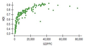
Human Development Index 2012 The United Nations Development Programme (UNDP) uses the Human Development Index (HDI) in an attempt to summarize in one number the progress in health, education, and economics of a country. In 2012, the HDI was as high as 0.955 for Norway and as low as 0.304 for Niger.
Smoking 2011 The Centers for Disease Control and Prevention track cigarette smoking in the United States.How has the percentage of people who smoke changed since the danger became clear during the last half of the 20th century? The scatterplot shows percentages of smokers among men 18–24 years of
Marriage age 2011 Is there evidence that the age at which women get married has changed over the past 100 years? The scatterplot shows the trend in age at first marriage for American women (www.census.gov).a) Is there a clear pattern? Describe the trend.b) Is the association strong?c) Is the
Average GPA An athletic director proudly states that he has used the average GPAs of the university’s sports teams and is predicting a high graduation rate for the teams. Why is this method unsafe?
Grading A team of Calculus teachers is analyzing student scores on a final exam compared to the midterm scores. One teacher proposes that they already have every teacher’s class averages and they should just work with those averages. Explain why this is problematic.
Cell phones and life expectancy The correlation between cell phone usage and life expectancy is very high. Should we buy cell phones to help people live longer?
Skinned knees There is a strong correlation between the temperature and the number of skinned knees on playgrounds. Does this tell us that warm weather causes children to trip?
Abalone again The researcher in Exercise 9 is content with the second regression. But he has found a number of shells that have large residuals and is considering removing all them. Is this good practice?
Abalone Abalones are edible sea snails that include over 100 species. A researcher is working with a model that uses the number of rings in an Abalone’s shell to predict its age. He finds an observation that he believes has been miscalculated. After deleting this outlier, he redoes the
Revenue and advanced sales The production company of Exercise 7 offers advanced sales to “Frequent Buyers”through its website. Here’s a relevant scatterplot:One performer refused to permit advanced sales. What effect has that point had on the regression to model Total Revenue from Advanced
Revenue and large venues A regression of Total Revenue on Ticket Sales by the concert production company of Exercises 2 and 4 finds the modela) Management is considering adding a stadium-style venue that would seat 10,000. What does this model predict that revenue would be if the new venue were to
Stopping times Using data from 20 compact cars, a consumer group develops a model that predicts the stopping time for a vehicle by using its weight. You consider using this model to predict the stopping time for your large SUV. Explain why this is not advisable.
Cell phone costs Noting a recent study predicting the increase in cell phone costs, a friend remarks that by the time he’s a grandfather, no one will be able to afford a cell phone. Explain where his thinking went awry.
Revenue and ticket sales The concert production company of Exercise 2 made a second scatterplot, this time relating Total Revenue to Ticket Sales.a) Describe the relationship between Ticket Sales and Total Revenue.b) How are the results for the two venues similar?c) How are they different? Total
Market segments The analyst in Exercise 1 tried fitting the regression line to each market segment separately and found the following:What does this say about her concern in Exercise 1?Was she justified in worrying that the overall model Jan = +612.07 + 0.403 Dec might not accurately summarize the
Revenue and talent cost A concert production company examined its records. The manager made the following scatterplot. The company places concerts in two venues, a smaller, more intimate theater (plotted with blue circles) and a larger auditorium-style venue(red x’s).a) Describe the relationship
Credit card spending An analysis of spending by a sample of credit card bank cardholders shows that spending by cardholders in January (Jan) is related to their spending in December (Dec):The assumptions and conditions of the linear regression seemed to be satisfied and an analyst was about to
Motorcycles designed to run off-road, often known as dirt bikes, are specialized vehicles.We have data on 114 dirt bikes (Data in Dirt Bikes 2014). Some cost as little as $1399, while others are substantially more expensive. Let’s investigate how the size and type of engine contribute to the cost
Least squares Consider the four points (200,1950),(400,1650), (600,1800), and (800,1600). The least squares line is yn = 1975 - 0.45x. Explain what “least squares” means, using these data as a specific example
Least squares Consider the four points (10,10),(20,50), (40,20), and (50,80). The least squares line is yn = 7.0 + 1.1x. Explain what “least squares” means, using these data as a specific example.
Gators Wildlife researchers monitor many wildlife populations by taking aerial photographs. Can they estimate the weights of alligators accurately from the air? Here is a regression analysis of the Weight of alligators (in pounds) and their Length (in inches) based on data collected about captured
Hard water revisited In an investigation of environmental causes of disease, data were collected on the annual mortality rate (deaths per 100,000) for males in 61 large towns in England and Wales. In addition, the water hardness was recorded as the calcium concentration (parts per million, ppm) in
Heptathlon revisited again We saw the data for the women’s 2004 Olympic heptathlon in Exercise 73. Are the two jumping events associated? Perform a regression of the long-jump results on the high-jump results.a) What is the regression equation? What does the slope mean?b) What percentage of the
Heptathlon revisited We discussed the women’s 2012 Olympic heptathlon in Chapter 6. Here are the results from the high jump, 800-meter run, and long jump for the 26 women who successfully completed all three events in the 2004 Olympics (www.espn.com):Let’s examine the association among these
Body fat again Would a model that uses the person’s Waist size be able to predict the %Body Fat more accurately than one that uses Weight? Using the data in Exercise 71, create and analyze that model.
Body fat It is difficult to determine a person’s body fat percentage accurately without immersing him or her in water. Researchers hoping to find ways to make a good estimate immersed 20 male subjects, then measured their waists and recorded their weights shown in the table at the top of the next
Climate change 2013, revisited In Exercise 69, we saw the relationship between CO2 measured at Mauna Loa and average global temperatures from 1970 to 2013. Here is a plot of average global temperatures plotted against the yearly average of the Dow Jones Industrial Average for the same time periodA
Climate change 2013 The earth’s climate is getting warmer. The most common theory attributes the increase to an increase in atmospheric levels of carbon dioxide(CO2), a greenhouse gas. Here is a scatterplot showing the mean annual CO2 concentration in the atmosphere, measured in parts per million
Birthrates 2010 The table shows the number of live births per 1000 population in the United States, starting in 1965. (National Center for Health Statistics, www.cdc.govchs/)a) Make a scatterplot and describe the general trend in Birthrates.(Enter Year as years since 1900: 65, 70, 75, etc.)b) Find
New York bridges We saw in this chapter that in Tompkins County, New York, older bridges were in worse condition than newer ones. Tompkins is a rural area. Is this relationship true in New York City as well? Here are data on the Condition (as measured by the state Department of Transportation
Cost of living 2013 Numbeo.com lists the cost of living(COL) for many cities around the world. These rankings scale New York City as 100, and express the cost of living in other cities as a percentage of the New York cost.For example, the table below shows 25 of the most expensive cities in the
A second helping of burgers In Exercise 63, you created a model that can estimate the number of Calories in a burger when the Fat content is known.a) Explain why you cannot use that model to estimate the fat content of a burger with 600 calories.b) Using an appropriate model, estimate the fat
Chicken Chicken sandwiches are often advertised as a healthier alternative to beef because many are lower in fat. Tests on 11 brands of fast-food chicken sandwiches produced the following summary statistics and scatterplot from a graphing calculator:a) Do you think a linear model is appropriate in
Burgers revisited In the last chapter, you examined the association between the amounts of Fat and Calories in fast-food hamburgers. Here are the data:a) Create a scatterplot of Calories vs. Fat.b) Interpret the value of R2 in this context.c) Write the equation of the line of regression.d) Use the
Veggie burgers Burger King introduced a meat-free burger in 2002. The nutrition label is shown here:a) Use the regression model created in this chapter, Fat = 6.8 + 0.97 Protein, to predict the fat content of this burger from its protein content.b) What is its residual? How would you explain the
More used cars 2014 Use the advertised prices for Toyota Corollas given in Exercise 59 to create a linear model for the relationship between a car’s Age and its Price.a) Find the equation of the regression line.b) Explain the meaning of the slope of the line.c) Explain the meaning of the
Showing 3100 - 3200
of 5937
First
25
26
27
28
29
30
31
32
33
34
35
36
37
38
39
Last
Step by Step Answers