New Semester Started
Get
50% OFF
Study Help!
--h --m --s
Claim Now
Question Answers
Textbooks
Find textbooks, questions and answers
Oops, something went wrong!
Change your search query and then try again
S
Books
FREE
Study Help
Expert Questions
Accounting
General Management
Mathematics
Finance
Organizational Behaviour
Law
Physics
Operating System
Management Leadership
Sociology
Programming
Marketing
Database
Computer Network
Economics
Textbooks Solutions
Accounting
Managerial Accounting
Management Leadership
Cost Accounting
Statistics
Business Law
Corporate Finance
Finance
Economics
Auditing
Tutors
Online Tutors
Find a Tutor
Hire a Tutor
Become a Tutor
AI Tutor
AI Study Planner
NEW
Sell Books
Search
Search
Sign In
Register
study help
business
probability statistics
The Practice Of Statistics For Business And Economics 3rd Edition David S. Moore, George P. McCabe, Layth C. Alwan, Bruce A. Craig, William M. Duckworth - Solutions
Normal random numbers. Use software to generate 100 observations from the standard Normal distribution. Make a histogram of these observations. How does the shape of the histogram compare with a Normal density curve? Make a Normal quantile plot of the data. Does the plot suggest any important
Deciles of Normal distributions. The deciles of any distribution are the 10th, 20th, . . . , 90th percentiles. The first and last deciles are the 10th and 90th percentiles, respectively.(a) What are the first and last deciles of the standard Normal distribution?(b) The weights of 9-ounce potato
Quartiles of Normal distributions. The median of any Normal distribution is the same as its mean. We can use Normal calculations to find the quartiles for Normal distributions.(a) What is the area under the standard Normal curve to the left of the first quartile? Use this to find the value of the
Length of pregnancies. The length of human pregnancies from conception to birth varies according to a distribution that is approximately Normal with mean 266 days and standard deviation 16 days.(a) What percent of pregnancies last fewer than 240 days (that’s about 8 months)?(b) What percent of
Use Table A. Consider a Normal distribution with mean 100 and standard deviation 10.(a) Find the proportion of the distribution with values 90 and 105. Illustrate your calculation with a sketch.(b) Find the values of x1 and x2 such that the proportion of the distribution with values between x1 and
Use Table A. Use Table A to find the value of z for each of the situations below. In each case, sketch a standard Normal curve and shade the area representing the region.(a) Ten percent of the values of a standard Normal distribution are greater than z.(b) Ten percent of the values of a standard
Use Table A. Use Table A to find the proportion of observations from a standard Normal distribution that falls in each of the following regions. In each case, sketch a standard Normal curve and shade the area representing the region.(a) z ≤ −2.30(b) z ≥ −2.30(c) z > 1.70(d) −2.30 < z <
Length of pregnancies. Some health insurance companies treat pregnancy as a “preexisting condition” when it comes to paying for maternity expenses for a new policyholder. Sometimes the exact date of conception is unknown, so the insurance company must count back from the expected due date to
Visualizing the standard deviation. Figure 1.34 shows two Normal curves, both with mean 0. Approximately what is the standard deviation of each of these curves?
Telecom revenue growth.(a) Construct a stemplot of the revenue growth for these 22 telecom stocks. You will need a 0 and a −0 on the stem. Use the tenths place of these values on the stem and the hundredths place as the leaves. For example, −0.556 rounds to −0.56 and would appear as −5|6 in
Telecom shares traded.(a) Use statistical software to create a histogram of the trading volumes for these 22 telecom stocks.(b) The histogram shows that these data are clearly right-skewed.Sketch what you think a Normal quantile plot of these data will look like.(c) Use statistical software to
Telecom revenue growth.(a) Calculate the mean and standard deviation of the 22 revenue growth values.(b) Calculate the ranges x ± s, x ± 2s, and x ± 3s.(c) Determine the percent of revenue growth values that fall into each of the three ranges that you calculated in part (b). How do these
Telecom shares traded.(a) Calculate the mean and standard deviation of the 22 tradingvolume values.(b) Calculate x ± 3s.(c) Clearly explain why your calculations in part (b) show that the distribution of trading volume is not symmetric and moundshaped.
Exploring Normal quantile plots.(a) Create three data sets: one that is clearly skewed to the right, one that is clearly skewed to the left, and one that is clearly symmetric and mound-shaped. (As an alternative to creating data sets, you can look through this chapter and find an example of each
Selling apartment buildings. Continue with the variable Sale Price Per Sqft created in the previous exercise.(a) Calculate the mean and standard deviation of the Sale Price Per Sqft values.(b) Calculate the intervals x ± s, x ± 2s, and x ± 3s.(c) Create a table that allows one to easily compare
Selling apartment buildings. Continue with the data from the previous exercise. Create a new variable (call it Sale Price Per Sqft) by dividing the selling price for each apartment building by the square footage for each apartment building.(a) When plotting selling prices or building square
Selling apartment buildings. Owning an apartment building can be very profitable, as can selling an apartment building.Data for this exercise are selling prices (in dollars) and building square footages for 18 apartment buildings sold in a particular city during 2005.(a) Use statistical software to
Assign more grades. Refer to the previous exercise.The grading policy says that the cutoffs for the other grades correspond to the following: the bottom 5% receive an F, the next 10%receive a D, the next 40% receive a C, and the next 30% receive a B. These cutoffs are based on the N(70, 10)
Total scores. Below are the total scores of 10 students in an introductory statistics course:68 54 92 75 73 98 64 55 80 70 Previous experience with this course suggests that these scores should come from a distribution that is approximately Normal with mean 70 and standard deviation 10.(a) Using
Data from Mexico. Refer to the previous exercise. A similar study in Mexico was conducted with 31 women and 20 men.The women averaged 14,704 words per day with a standard deviation of 6215. For men the mean was 15,022 and the standard deviation was 7864.(a) Answer the questions from the previous
Dowomen talk more? Conventional wisdom suggests that women are more talkative than men. One study designed to examine this stereotype collected data on the speech of 42 women and 37 men in the United States.40(a) The mean number of words spoken per day by the women was 14,297 with a standard
Gross domestic product. Refer to Exercise 1.52, where we examined the gross domestic product of 120 countries(a) Compute the mean and the standard deviation.(b) Apply the 68–95–99.7 rule to this distribution.(c) Compare the results of the rule with the actual percents within one, two, and three
Know your density. Sketch density curves that might describe distributions with the following shapes.(a) Symmetric, but with two peaks (that is, two strong clusters of observations).(b) Single peak and skewed to the left.
The effect of changing the standard deviation.(a) Sketch a Normal curve that has mean 10 and standard deviation 3.(b) On the same x axis, sketch a Normal curve that has mean 10 and standard deviation 1.(c) How does the Normal curve change when the standard deviation is varied but the mean stays the
Sketch some Normal curves.(a) Sketch a Normal curve that has mean 10 and standard deviation 3.(b) On the same x axis, sketch a Normal curve that has mean 20 and standard deviation 3.(c) How does the Normal curve change when the mean is varied but the standard deviation stays the same?
Customer service center call lengths. Figure 1.31 is a Normal quantile plot for the customer center call lengths. We looked at these data in Example 1.14, and we examined the distribution using a histogram in Figure 1.8 (page 14). There are clearly some very large outliers. In making the Normal
Length of time to start a business. In Exercise 1.40 we noted that the sample of times to start a business from 25 countries contained an outlier. For Suriname, the reported time is 694 days. This case is the most extreme in the entire data set, which includes 195 counties. Figure 1.30 shows the
Find the score that 60% of students will exceed. Consider the ISTEP scores, which are approximately Normal, N(572, 51). Sixty percent of the students will score above x on this exam. Find x.
What score is needed to be in the top 5%? Consider the ISTEP scores, which are approximately Normal, N(572, 51). How high a score is needed to be in the top 5% of students who take this exam?
Find another proportion. Use the fact that the ISTEP scores are approximately Normal, N(572, 51). Find the proportion of students who have scores between 600 and 650. Use pictures of Normal curves similar to the ones given in Example 1.34 to illustrate your calculations.
Find the proportion. Use the fact that the ISTEP scores from Exercise 1.84(page 48) are approximately Normal, N(572, 51). Find the proportion of students who have scores less than 600. Find the proportion of students who have scores greater than or equal to 600. Sketch the relationship between
SAT versus ACT. Eleanor scores 680 on the Mathematics part of the SAT. The distribution of SAT scores in a reference population is Normal, with mean 500 and standard deviation 100. Gerald takes the American CollegeTesting (ACT) Mathematics test and scores 27. ACT scores are Normally distributed
Use the 68–95–99.7 rule. Refer to the previous exercise. Use the 68–95–99.7 rule to give a range of scores that includes 99.7% of these students.
Test scores. Many states have programs for assessing the skills of students in various grades. The Indiana Statewide Testing for Educational Progress (ISTEP) is one such program.37 In a recent year, 76,531, tenth-grade Indiana students took the English/language arts exam. The mean score was 572 and
More on young men’s heights. The distribution of heights of young men is approximately Normal with mean 69 inches and standard deviation 2.5 inches. Use the 68–95–99.7 rule to answer the following questions.(a) What percent of these men are taller than 74 inches?(b) Between what heights do
Heights of young men. Product designers often must consider physical characteristics of their target population. For example, the distribution of heights of men aged 20 to 29 years is approximately Normal with mean 69 inches and standard deviation 2.5 inches. Draw a Normal curve on which this mean
Three curves. Figure 1.21 displays three density curves, each with three points marked. At which of these points on each curve do the mean and the median fall?
A uniform distribution. Figure 1.20 displays the density curve of a uniform distribution. The curve takes the constant value 1 over the interval from 0 to 1 and is 0 outside that range of values. This means that data described by this distribution take values that are uniformly spread between 0 and
A symmetric curve. Sketch a density curve that is symmetric but has a shape different from that of the curve in Figure 1.18(a).
A different type of mean. The trimmed mean is a measure of center that is more resistant than the mean but uses more of the available information than the median. To compute the 5% trimmed mean, discard the highest 5% and the lowest 5% of the observations and compute the mean of the remaining
Imputation. Various problems with data collection can cause some observations to be missing. Suppose a data set has 20 cases. Here are the values of the variable x for 10 of these cases:17 6 12 14 20 23 9 12 16 21 The values for the other 10 cases are missing. One way to deal with missing data is
Astandard deviation contest. You must choose four numbers from the whole numbers 10 to 20, with repeats allowed.(a) Choose four numbers that have the smallest possible standard deviation.(b) Choose four numbers that have the largest possible standard deviation.(c) Is more than one choice possible
Askewed distribution. Sketch a distribution that is skewed to the left. On your sketch, indicate the approximate position of the mean and the median. Explain why these two values are not equal.
Salary increase for the owners. Last year a small accounting firm paid each of its five clerks $30,000, two junior accountants $65,000 each, and the firm’s owner $355,000.(a) What is the mean salary paid at this firm? How many of the employees earn less than the mean? What is the median
Returns on Treasury bills. Figure 1.16(a)(page 37) is a stemplot of the annual returns on U.S. Treasury bills for fifty years. (The entries are rounded to the nearest tenth of a percent.)(a) Use the stemplot to find the five-number summary of T-bill returns.(b) The mean of these returns is about
x and s are not enough. The mean x and standard deviation s measure center and spread but are not a complete description of a distribution. Data sets with different shapes can have the same mean and standard deviation. To demonstrate this fact, find x and s for these two small data sets. Then make
Don’t change the median. Place 5 observations on the line by clicking below it.(a) Add 1 additional observation without changing the median.Where is your new point?(b) Use the applet to convince yourself that when you add yet another observation (there are now 7 in all), the median does not
Extreme observations. Place three observations on the line by clicking below it, two close together near the center of the line and one somewhat to the right of these two.(a) Pull the rightmost observation out to the right. (Place the cursor on the point, hold down a mouse button, and drag the
Mean = median? Place two observations on the line by clicking below it. Why does only one arrow appear?APPLET
Discovering outliers. Whether an observation is an outlier is a matter of judgment. It is convenient to have a rule for identifying suspected outliers. The 1.5 × IQR rule is in common use:1. The interquartile range IQR is the distance between the first and third quartiles, IQR = Q3 − Q1. This is
Salaries of the Chicago Cubs. The mean salary of the players on the 2008 Chicago Cubs baseball team is $5,274,108, while the median salary is $4,350,000. What explains the difference between these two measures of center?
Create a data set. Create a data set for which the median would change by a large amount if the smallest observation is deleted.
Calories in beer. Refer to the previous two exercises. The data set also gives the calories per 12 ounces of beverage.(a) Analyze the data and summarize the distribution of calories for these 86 brands of beer.(b) In Exercise 1.62 you identified one brand of beer as an outlier.To what extent is
An outlier for alcohol content of beer. Refer to the previous exercise.(a) Calculate the mean with and without the outlier. Do the same for the median. Explain howthese values change when the outlier is excluded.(b) Calculate the standard deviation with and without the outlier.Do the same for the
The alcohol content of beer. Brewing beer involves a variety of steps that can affect the alcohol content. AWeb site gives the percent alcohol for 86 domestic brands of beer.(a) Use graphical and numerical summaries of your choice to describe these data. Give reasons for your choice.(b) The data
The value of brands. A brand is a symbol or images that are associated with a company. An effective brand identifies the company and its products. Using a variety of measures, dollar values for brands can be calculated.34 The most valuable brand is Coca-Cola, with a value of $66,667 million. Coke
Variability of an agricultural product. A quality product is one that is consistent and has very little variability in its characteristics. Controlling variability can be more difficult with agricultural products than with those that are manufactured. The following table gives the weights, in
Recoverable oil. The estimated amounts of recoverable oil from 64 oil wells in the Devonian Richmond Dolomite area of Michigan are given Exercise 1.35 (page 25).(a) Find the mean and the standard deviation.(b) Find the five-number summary.(c) Draw a boxplot.(d) How do you prefer to summarize these
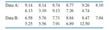
Compare U.S. and Canadian unemployment rates.Refer to the previous two exercises.(a) Use side-by-side boxplots to give a graphical summary of the two sets of unemployment rates.(b) Use a back-to-back stemplot to compare the two sets of rates. A back-to-back stemplot has a single stem with leaves on
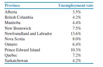
Canadian unemployment rates. Unemployment rates for 10 Canadian provinces are given in Exercise 1.28 (page 23). Answer the questions in the previous exercise for these data. The U.S. data set has 50 cases while the Canadian data set has 10 cases. Discuss how this difference influences the way in
U.S. unemployment rates. Refer to Exercise 1.27 and Table 1.2 (page 23) for the U.S. unemployment rates for each of the 50 states.(a) Find the mean and the standard deviation.(b) Find the five-number summary.(c) Draw a boxplot.(d) How do you prefer to summarize these data? Include numerical and
What do the trade balance graphical summaries show?Refer to the previous exercise.(a) Use graphical summaries to describe the distribution of the trade balance for these countries.(b) Give the names of the countries that correspond to extreme values in this distribution.(c) Reanalyze the data
Trade balance for 120 countries. Trade balance is another important variable that describes a country’s economy. It is defined as the difference between the value of a country’s exports and its imports. A negative trade balance occurs when a country imports more than it exports. Similarly, the
Use the resistant measures for GDP. Repeat parts (a)and (c) of the previous exercise using the median and the quartiles.Summarize your results and compare them with those of the previous exercise.
Gross domestic product growth in 120 countries. The gross domestic product (GDP) of a country is the total value of all goods and services produced in the country. It is an important measure of the health of a country’s economy. For this exercise, you will analyze the growth in GDP, expressed as
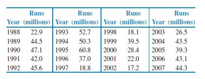
Calls to a customer service center. We displayed the distribution of the lengths of 80 calls to a customer service center in Figure 1.14 (page 32).(a) Compute the mean and the standard deviation for these 80 calls (the data are given in Table 1.1, page 14).(b) Find the five-number summary.(c) Which
First-exam scores. Below are the scores on the first exam in an introductory statistics course for 10 students. We found the mean of these scores in Exercise 1.42(page 28) and the median in Exercise 1.45 (page 29).80 73 92 85 75 98 93 55 80 90(a) Make a stemplot of these data.(b) Compute the
Time to start a business. Verify the statement in the last bullet above using the data on the time to start a business. First, use the 24 cases from Case 1.2 (page 26) to calculate a standard deviation. Next, include the country Suriname, where the time to start a business is 694 days. Show that
First-exam scores. Here are the scores on the first exam in an introductory statistics course for 10 students:80 73 92 85 75 98 93 55 80 90 Display the distribution with a boxplot. Discuss whether or not a stemplot would provide a better way to look at this distribution.
Time to start a business. Refer to the data on times to start a business in 24 countries described in Case 1.2 on page 26. Use a boxplot to display the distribution.Discuss the features of the data that you see in the boxplot, and compare it with the stemplot in Figure 1.13. Which do you prefer?
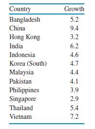
Gross domestic product. The success of companies expanding to developing regions of the world depends in part on the prosperity of the countries in those regions.Here are World Bank data on the growth of gross domestic product (percent per year)for the period 2000 to 2004 in countries in Asia (not
Find the median of the first-exam scores. Here are the scores on the first exam in an introductory statistics course for 10 students:80 73 92 85 75 98 93 55 80 90 Find the median first-exam score for these students.
Calls to a customer service center. The service times for 80 calls to a customer service center are given in Table 1.1 (page 14). Use these data to compute the median service time.
Include the outlier. Include Suriname, where the start time is 694 days, in the data set and show that the median is 40 days. Note that with this case included, the sample size is now 25 and the median is the 13th observation in the ordered list. Write out the ordered list and circle the outlier.
Find the mean of the first-exam scores. Here are the scores on the first exam in an introductory statistics course for 10 students:80 73 92 85 75 98 93 55 80 90 Find the mean first-exam score for these students.
Calls to a customer service center. The service times for 80 calls to a customer service center are given in Table 1.1 (page 14). Use these data to compute the mean service time.
Watch those scales! The impression that a time plot gives depends on the scales you use on the two axes. If you stretch the vertical axis and compress the time axis, data appear to be more variable. Compressing the vertical axis and stretching the time axis make variations appear to be smaller.
A multimillion-dollar business is threatened. Bristol Bay of Alaska, has typically produced more wild-caught sockeye salmon, Oncorhynchus nerka, than any other region in the world. In good years, the runs typically exceed 50 million fish.The sockeye salmon industry here provides thousands of jobs
Reliability of household appliances. Always ask whether a particular variable is really a suitable measure for your purpose.You are writing an article for a consumer magazine based on a survey of the magazine’s readers on the reliability of their household appliances. Of 13,376 readers who
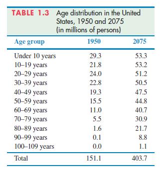
The changing age distribution of the United States. The distribution of the ages of a nation’s population has a strong influence on economic and social conditions. Table 1.3 shows the age distribution of U.S. residents in 1950 and 2075, in millions of people.The 1950 data come from that year’s
Is the supply adequate? How much oil the wells in a given field will ultimately produce is key information in deciding whether to drill more wells. Here are the estimated total amounts of oil recovered from 64 wells in the Devonian Richmond Dolomite area of the Michigan basin, in thousands of
Left-skew. Sketch a histogram for a distribution that is skewed to the left. Suppose that you and your friends emptied your pockets of coins and recorded the year marked on each coin.The distribution of dates would be skewed to the left. Explain why.
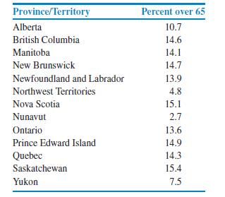
The Canadian market. Refer to Exercise 1.31. Here are similar data for the 13 Canadian provinces and territories:(a) Display the data graphically and describe the major features of your plot.(b) Explain why you chose the particular format for your graphical display. What other types of graph could
U.S. population 65 and older. Make a stemplot of the percent of residents aged 65 and older in the states other than Alaska and Florida by splitting stems 8 to 15 in the plot from the previous exercise. Which plot do you prefer? Why?
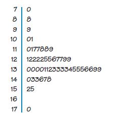
Products for senior citizens. The market for products designed for senior citizens in the United States is expanding.Here is a stemplot of the percents of residents aged 65 and older in the 50 states, for 2006, as estimated by the U.S. Census Bureau.25 The stems are whole percents and the leaves
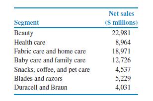
Procter & Gamble sales. The 2007 annual report of the Procter & Gamble Company (P&G) states that global net sales were over $76 billion. The sales information is organized into global segments. The following summary gives the net sales for each global segment of P&GSummarize these
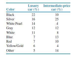
Vehicle colors. Vehicle colors differ among types of vehicle.Here are data on the most popular colors in 2007 for luxury cars and for intermediate-price cars in North America:(a) Make a bar graph for the luxury car percents.(b) Make a bar graph for the intermediate-price car percents.(c) Now, be
Unemployment rates in Canadian provinces. Here are 2007 unemployment rates for 10 Canadian provinces:(a) Construct a histogram of these rates.(b) Prepare a stemplot of the rates.(c) Discuss the advantages and disadvantages of (a) and (b).Which do you prefer for this set of data? Explain your
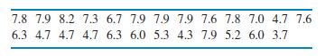
U.S. unemployment rates. An unemployment rate is the number of people who are not working but who are available for work divided by the total number of people in the workforce, expressed as a percent. Table 1.2 gives the U.S. unemployment rates for each state as of August 2008.2(a) Construct a
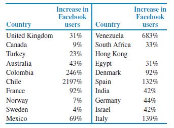
Facebook use increases, by country. Facebook use has been increasing rapidly. Data are available on the increases between February 8, 2008, and September 29, 2008.20 FACEBOOKINCREASES The table below gives the percent increase in the numbers of Facebook users for the same 20 countries that we
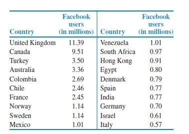
Your Facebook app can generate a million dollars a month. A report on Facebook suggests that Facebook apps can generate large amounts of money, as much as one million dollars a month.18 The market is international. The following table gives the numbers of Facebook users by country for the top 20
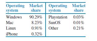
Market share for computer operating systems. The following table gives the market share for the major computer operating systems.17(a) Make a bar graph of this market share data.(b) Write a short paragraph summarizing these data. Operating Market Operating Market system share system share Windows
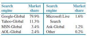
Market share for search engines. The following table gives the market share for the major search engines(a) Use a bar graph to display the market shares.(b) Summarize what the graph tells you about market shares for search engines. Search Market Search Market engine share engine share Google-Global
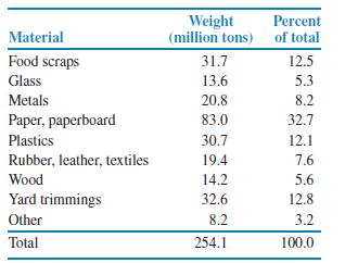
Garbage is big business. The formal name for garbage is “municipal solid waste.” In the United States, approximately 254 million tons of garbage are generated in a year. Below is a breakdown of the materials that made up American municipal solid waste in 2007.1(a) Add the weights. The sum is
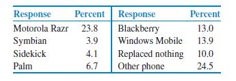
What did the iPhone replace? The survey in the previous exercise also asked iPhone users what phone, if any, did the iPhone replace. Here are the responses:Make a bar graph for these data. Carefully consider howyou will order the responses. Explain why you chose the ordering that you did. Response
Market share doubles in a year. The market share of iPhones doubled from 5.3% to 10.8% between the first quarter of 2008 and the first quarter of 2009.13 One of the attractions of the iPhone is the Web browser, which they market as the most advanced Web browser on a mobile device. Users of iPhones
Least-favorite colors. Refer to the previous exercise. The same study also asked people about their least-favorite color.Here are the results: orange, 30%; brown, 23%; purple, 13%;yellow, 13%; gray, 12%; green, 4%; white, 4%; red, 1%; black, 0%; and blue, 0%. Make a bar graph of these percents and
What color should you use for your product? What is your favorite color? One survey produced the following summary of responses to that question: blue, 42%; green, 14%; purple, 14%; red, 8%; black, 7%; orange, 5%; yellow, 3%; brown, 3%; gray, 2%; and white, 2%.12 Make a bar graph of the percents
Study habits of students. You are planning a survey to collect information about the study habits of college students. Describe two categorical variables and two quantitative variables that you might measure for each student. Give the units of measurement for the quantitative variables.
What questions would you ask? Refer to the previous exercise. Make up your own survey questions with at least six questions. Include at least two categorical variables and at least two quantitative variables. Tell which variables are categorical and which are quantitative. Give reasons for your
Showing 1300 - 1400
of 8686
First
7
8
9
10
11
12
13
14
15
16
17
18
19
20
21
Last
Step by Step Answers