New Semester Started
Get
50% OFF
Study Help!
--h --m --s
Claim Now
Question Answers
Textbooks
Find textbooks, questions and answers
Oops, something went wrong!
Change your search query and then try again
S
Books
FREE
Study Help
Expert Questions
Accounting
General Management
Mathematics
Finance
Organizational Behaviour
Law
Physics
Operating System
Management Leadership
Sociology
Programming
Marketing
Database
Computer Network
Economics
Textbooks Solutions
Accounting
Managerial Accounting
Management Leadership
Cost Accounting
Statistics
Business Law
Corporate Finance
Finance
Economics
Auditing
Tutors
Online Tutors
Find a Tutor
Hire a Tutor
Become a Tutor
AI Tutor
AI Study Planner
NEW
Sell Books
Search
Search
Sign In
Register
study help
business
probability statistics
The Practice Of Statistics For Business And Economics 3rd Edition David S. Moore, George P. McCabe, Layth C. Alwan, Bruce A. Craig, William M. Duckworth - Solutions
Best countries for business with logs. Refer to the previous exercise. Figure 2.8 (page 86) is a scatterplot of the log gross domestic product per capita versus the log unemployment rate for 99 countries.(a) Plot the data and add the least-squares regression line to the plot.(b) Is it appropriate
Best countries for business. Figure 2.7 (page 85) is a scatterplot of the gross domestic product per capita versus the unemployment rate for 99 countries.(a) Plot the data and add the least-squares regression line to the plot.(b) Is it appropriate to use this least-squares regression line to
Always plot your data! Table 2.1 presents four sets of data prepared by the statistician Frank Anscombe to illustrate the dangers of calculating without first plotting the data.(a) Without making scatterplots, find the correlation and the least-squares regression line for all four data sets. What
Employee absenteeism and raises. Data on number of days of work missed and annual salary increase for a company’s employees show that in general employees who missed more days of work during the year received smaller raises than those who missed fewer days. Number of days missed explained 64%of
Influence in regression. As in the previous exercise, create a group of 10 points in the lower-left corner of the scatterplot with a strong straight-line pattern (correlation at least 0.9). Click the “Show least-squares line” box to display the regression line.(a) Add 1 point at the upper right
Influence on correlation. The Correlation and Regression applet at www.whfreeman.com/psbe allows you to create a scatterplot and to move points by dragging with the mouse. Click to create a group of 10 points in the lowerleft corner of the scatterplot with a strong straight-line pattern(correlation
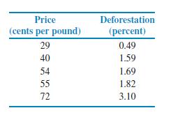
Prices paid to producers and additional land for production.Continue your analysis of the effect of coffee prices on deforestation, begun in Exercise 2.42 (page 98). The slope of the regression line for predicting percent of deforestation from coffee price is an important measure of how serious the
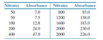
Monitoring the water quality near a manufacturing plant. Manufacturing companies (and the Environmental Protection Agency) monitor the quality of the water near their facilities.Measurements of pollutants in water are indirect—a typical analysis involves forming a dye by a chemical reaction with
Add a different outlier. Refer to the previous two exercises.Add an additional observation with y = 29 and x = 50 to the original data set.(a) Repeat the analysis that you performed in the first exercise and summarize your results, paying particular attention to the effect of this outlier.(b) In
Add an outlier. Refer to the previous exercise. Add an additional observation with y = 50 and x = 30 to the data set. Repeat the analysis that you performed in the previous exercise and summarize your results, paying particular attention to the effect of this outlier.
Data generated by software. The following 20 observations on y and x were generated by a computer program.(a) Make a scatterplot and describe the relationship between y and x.(b) Find the equation of the least-squares regression line and add the line to your plot (c) Plot the residuals versus x.(d)
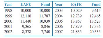
Mutual fund performance. Refer to Exercise 2.46, where you examined the relationship between returns for the Vanguard International Growth Fund and the Morgan Stanley Europe, Australasia, Far East (EAFE) index of overseas stock market performance.(a) Make a scatterplot suitable for predicting fund
Carbohydrates and alcohol in beer revisited. Refer to the previous exercise. The data that you used to compute the least-squares regression line includes an outlier.(a) Remove the outlier and recompute the least-squares regression line.(b) Write a short paragraph about the possible effects of
Predict one characteristic of a product using another characteristic. Figure 2.10 (page 90) is a scatterplot of carbohydrates versus percent alcohol in 86 brands of beer. In Exercise 2.35 you calculated the correlation between these two variables.Find the equation of the least-squares regression
Compare the cell phone payment plans. A cellular telephone company offers two plans. Plan A charges $25 a month for up to 100 minutes of airtime and $0.50 per minute above 100 minutes. Plan B charges $30 a month for up to 200 minutes and$0.45 per minute above 200 minutes.(a) Drawa graph of the
Inventory of DVD players. A local consumer electronics store sells exactly 6 DVD players of a particular model each week. The store expects no more shipments of this particular model, and they have 96 such units in their current inventory.(a) Give an equation for the number of DVD players of this
Production costs for cell phone batteries. A company manufactures batteries for cell phones. The overhead expenses of keeping the factory operational for a month—even if no batteries are made—total $600,000. Batteries are manufactured in lots (1000 batteries per lot) costing $8000 to make. In
What is the equation for the selling price? You buy items at a cost of x and sell them for y. Assume that your selling price includes a profit of 10% plus a fixed cost of $5.00. Give an equation that can be used to determine y from x.
The influence of Bobax. Make a plot similar to Figure 2.24 giving regression lines with and without Bobax. Explain how the influence of Bobax differs from that of Srizbi.
Identify the three botnets. In Figure 2.21, three botnets are identified by name: Ozdok, Bobax, and Srizbi. The dashed lines in the plot represent the residuals.(a) Make a sketch of the residual plot in Figure 2.22, and write in the names of the botnets Ozdok, Bobax, and Srizbi.(b) Explain how you
Sum the botnet residuals. What is the sum of the residuals for the spam botnet data? Is there a deviation from the expected sum due to roundoff error?
Residual for Bobax. The botnet Bobax has 185 bots that send 9 (billion) spam messages per day.(a) Find the predicted number of spam messages per day for Bobax.(b) Find the residual for Bobax.(c) Which botnet, Srizbi or Bobax, has a greater deviation from the regression line?
Is regression useful? In Exercise 2.45 (page 98) you used the Correlation and Regression applet to create three scatterplots having correlation about r = 0.8 between the horizontal variable x and the vertical variable y. Create three similar scatterplots again, after clicking the “Show
The “January effect.” Some people think that the behavior of the stock market in January predicts its behavior for the rest of the year. Take the explanatory variable x to be the percent change in a stock market index in January and the response variable y to be the change in the index for the
Predicted values and residuals for GDP and assets. Refer to the world financial markets data in Example 2.12.(a) Use software to compute the coefficients of the regression equation. Indicate where to find the slope and the intercept on the output, and report these values.(b) Make a scatterplot of
A regression line. A regression equation is y = 10 + 20x.(a) What is the slope of the regression line?(b) What is the intercept of the regression line?(c) Find the predicted values of y for x = 10, for x = 20, and for x = 30.(d) Plot the regression line for values of x between 0 and 50.
Positive and negative prediction errors. Examine Figure 2.17 carefully. How many of the prediction errors are positive? How many are negative?
Find a prediction error. Use Figure 2.17 to estimate the net assets per capita for a country that has a GDP per capita of $50 thousand. If the actual net assets per capita are $280, find the prediction error.
Sloppy writing about correlation. Each of the following statements contains a blunder. Explain in each case what is wrong.(a) “There is a high correlation between the make of an automobile and its quality.”(b) “In an introductory statistics course, there is a very high correlation(r = 1.2)
Investment reports and correlations. Investment reports often include correlations. Following a table of correlations among mutual funds, a report adds, “Two funds can have perfect correlation, yet different levels of risk. For example, Fund A and Fund B may be perfectly correlated, yet Fund A
CEO compensation and stock market performance. An academic study concludes, “The evidence indicates that the correlation between the compensation of corporate CEOs and the performance of their company’s stock is close to zero.” A business magazine reports this as “Anewstudy shows that
Add a different outlier. Refer to the previous two exercises.Add an additional observation with y = 29 and x = 50 to the original data set.(a) Make a scatterplot of the 21 observations and explain why this additional observation is an outlier.(b) Compute the correlation and compare it with the
Add an outlier. Refer to the previous exercise. Add an additional observation with y = 50 and x = 30 to the data set.(a) Make a scatterplot of the 21 observations and explain why the additional observation is an outlier.(b) Compute the correlation and compare it with the correlation that you
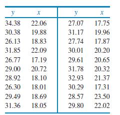
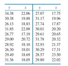
Make a plot and find the correlation. The following 20 observations on y and x were generated by a computer program(a) Make a scatterplot and describe the relationship between y and x.(b) Find the correlation between y and x. y x y X 34.38 22.06 27.07 17.75 30.38 19.88 31.17 19.96 26.13 18.83 27.74
What is the correlation? Suppose that women always married men 2 years older than themselves. Draw a scatterplot of the ages of 5 married couples, with the wife’s age as the explanatory variable. What is the correlation r for your data? Why?2.48 Stretching a scatterplot. Changing the units of
Stretching a scatterplot. Changing the units of measurement can greatly alter the appearance of a scatterplot. Consider the following data:Make a scatterplot suitable for predicting fund returns fromEAFE returns. Is there a clear straight-line pattern? How strong is this pattern? (Give a numerical
What is the correlation? Suppose that women always married men 2 years older than themselves. Draw a scatterplot of the ages of 5 married couples, with the wife’s age as the explanatory variable. What is the correlation r for your data? Why?
Mutual fund performance. Many mutual funds compare their performance with that of a benchmark, an index of the returns on all securities of the kind that the fund buys. TheVanguard International Growth Fund, for example, takes as its benchmark the Morgan Stanley Europe, Australasia, Far East (EAFE)
Match the correlation. The Correlation and Regression applet at www.whfreeman.com/psbe allows you to create a scatterplot by clicking and dragging with the mouse. The applet calculates and displays the correlation as you change the plot. You will use this applet to make scatterplots with 8 points
Prices and land. Refer to the previous two exercises. These data show that deforestation in a national park in Indonesia goes up when high prices for coffee encourage farmers to clear forest in order to plant more coffee. There are only 5 observations, so we worry that the apparent relationship may
Prices and land. Coffee is currently priced in dollars. If it were priced in euros, and the dollar prices in the previous exercise were translated into the equivalent prices in euros, would the correlation between coffee price and percent deforestation change? Explain your answer.
Prices paid to producers and additional land for production. Coffee is a leading export from several developing countries. When coffee prices are high, farmers often clear forest to plant more coffee trees. Here are data for five years on prices paid to coffee growers in Indonesia and the rate of
Let’s look at Europe. Refer to the previous exercise. Figure 2.14 (page 92) is a scatterplot of the same data for the 48 European countries in the data set.(a) Make a plot of the data similar to Figure 2.14.(b) Report the correlation.(c) Summarize the differences and similarities between the
World Bank data on living longer and using the Internet. Figure 2.13 is a scatterplot of life expectancy versus the number of Internet users per 100 people for 181 countries.In Exercise 2.22 you described this relationship. Make a plot of the data similar to Figure 2.13 and report the correlation.
Compare the provinces with the territories. Refer to the previous exercises. The three Canadian territories are the Northwest Territories, Nunavut, and theYukon Territories. All the other entries in Figure 2.11 are provinces.(a) Generate a scatterplot of the Canadian demographic data similar to
Nunavut. Refer to the previous exercise and to the data given in Figure 2.11 (page 91).(a) Doyou think that Nunavut is an outlier? Explain your answer.(b) Find the correlation without Nunavut. Using your work from the previous exercise, summarize the effect of Nunavut on the correlation.
Marketing in Canada. In Exercise 2.20 (page 90) you examined the relationship between the percent of the population over 65 and the percent under 15 for the 13 Canadian provinces and territories. Figure 2.12 is a scatterplot of the data. Find the value of the correlation r . Does this numerical
Alcohol and carbohydrates in beer revisited. Refer to the previous exercise. The data that you used to compute the correlation includes an outlier.(a) Remove the outlier and recompute the correlation.(b) Write a short paragraph about the possible effects of outliers on a correlation, using this
Alcohol and carbohydrates in beer. Figure 2.10(page 90) is a scatterplot of carbohydrates versus percent alcohol in 86 brands of beer. Compute the correlation for these data.
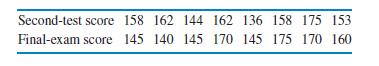
Add an outlier. Refer to the previous exercise. Add a ninth student whose scores on the second test and final exam would lead you to classify the additional data point as an outlier.(a) Highlight the outlier on your scatterplot.(b) Find the correlation and describe the effect of the outlier on the
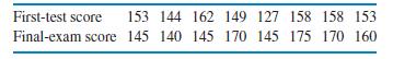
Second test and final exam. Refer to the previous exercise.Here are the data for the second test and the final exam for the same students:(a) Explain why you should use the second-test score as the explanatory variable.(b) Make a scatterplot and describe the relationship.(c) Find the
First test and final exam. How strong is the relationship between the score on the first test and the score on the final exam in an elementary statistics course? Here are data for eight students from such a course:(a) Do you think that one of these variables should be an explanatory variable and
Best countries for business with logs. Figure 2.8(page 86) is a scatterplot of the log gross domestic product per capita versus the log unemployment rate for 99 countries.(a) Do you think that the correlation is a good statistic to describe the strength of the relationship between these two
Best countries for business. Figure 2.7 (page 85) is a scatterplot of the gross domestic product per capita versus the unemployment rate for 99 countries.(a) Do you think that the correlation is a good statistic to describe the strength of the relationship between these two variables?Explain your
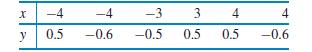
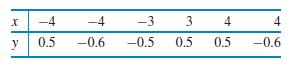
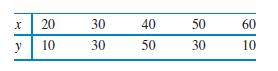
Strong association but no correlation. Here is a data set that illustrates an important point about correlation:(a) Make a scatterplot of y versus x.(b) Describe the relationship between y and x. Is it weak or strong? Is it linear?(c) Find the correlation between y and x.(d) What important point
Brand names and generic products.(a) If a store always prices its generic “store brand” products at 90% of the brand name products’ prices, what would be the correlation between the prices of the brand name products and the store brand products? (Hint: Draw a scatterplot for several
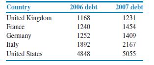
Correlation for debt. Figure 2.6 (page 84) is a scatterplot of 2007 debt versus 2006 debt for 24 countries. Is the correlation r for these data near −1, clearly negative but not near −1, near 0, clearly positive but not near 1, or near 1? Explain your answer.
Change the units. In the previous exercise bots were given in thousands and spam messages per day were recorded in billions. In Exercise 2.6 you created a data set using the actual values. For example, Srizbi has 315,000 bots and generates 60,000,000,000 spam messages per day.(a) Find the
Spam botnets. In Exercise 2.3 you made a data set for the botnet data.Use that data set to compute the correlation between the number of bots and the number of spam messages per day.
How would you make a better plot? In the previous two exercises, we looked at the relationship between life expectancy and Internet use. First, we examined a scatterplot for all 181 countries in the data set. Then we examined one for the subset of 48 European countries. Explain how you would
Let’s look at Europe. Refer to the previous exercise.Figure 2.14 is a scatterplot of only the 48 European countries in the data set. Compare this figure with Figure 2.13, which plots the data for all 181 countries in the data set. Write a paragraph summarizing the relationship between life
World Bank data on living longer and using the Internet. The World Bank collects data on many variables related to development for countries throughout the world. Two of these variables are Internet use (in number of users per 100 people) and life expectancy (in years).10 Figure 2.13 is a
Compare the provinces with the territories. Refer to the previous exercise. The three Canadian territories are the Northwest Territories, Nunavut, and the Yukon Territories. All of the other entries in Figure 2.11 are provinces.(a) Generate a scatterplot of the Canadian demographic data similar to
Marketing in Canada. Many consumer items are marketed to particular age groups in a population. To plan such marketing strategies, it is helpful to know the demographic profile for different areas. Statistics Canada provides a great deal of demographic data organized in different ways.9 Figure 2.11
More beer. Refer to the previous exercise.(a) Make a scatterplot of calories versus percent alcohol using the data file without the outlier.(b) Describe the relationship between these two variables.
Brand-to-brand variation in a product. Beer100.com advertises itself as “Your Place for All Things Beer.” One of their“things” is a list of 86 domestic beer brands with the percent alcohol, calories per 12 ounces, and carbohydrates (in grams)(a) Figure 2.10 gives a scatterplot of
Can you conclude that the numbers are similar? Examine the scatterplot that you produced in the previous exercise.(a) Can you conclude from the strength of the relationship that the numbers of uninsured in these age groups remained approximately the same from 2006 to 2007? Explain your answer.(b)
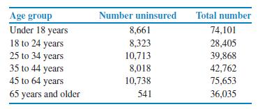
Numbers of uninsured in 2006 and 2007. In the previous three exercises, we looked at data on uninsured persons for 2006.Here are similar data for 2007:(a) Make a scatterplot of the number of uninsured persons in 2007 versus the number in 2006. Note that each point in your scatterplot corresponds to
Compare the two percents. In the previous two exercises, you computed percents in two different ways and generated plots versus age group. Describe the difference between the two ways with an emphasis on what kinds of conclusions can be drawn from each.
Which age groups have higher percents of uninsured?Refer to the previous exercise. Let’s take a look at the data from a different point of view.(a) For each age group calculate the percent that are uninsured using the number of uninsured persons and the total number of persons in each group.(b)
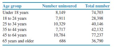
Is the cost too high? Because it is so costly, many individuals and families cannot afford to purchase health insurance. The Current Population Survey collected data on the characteristics of the uninsured.7 Below are the numbers of uninsured and the total number of people classified by age. The
Financing a college education. Howwell does the income of a college student’s parents predict how much the student will borrow to pay for college?We have data on parents’ income and college debt for a sample of 1200 recent college graduates. What are the explanatory and response variables? Are
Make some sketches. For each of the following situations, make a scatterplot that illustrates the given relationship between two variables.(a) A strong negative linear relationship.(b) No apparent relationship.(c) A weak positive relationship.(d) A more complicated relationship. Explain the
What’s wrong? Explain what is wrong with each of the following:(a) A boxplot can be used to examine the relationship between two variables.(b) In a scatterplot we put the response variable on the y axis and the explanatory variable on the x axis.(c) If two variables are positively associated,
What about the countries with very large debts. In Exercise 2.7 we excluded six countries. The original data file did not list a value for Japan’s debt in 2007. Here are the debts, in US$ billions, for the other five countries:Add the data for these five countries to your data set and make a
Are the debts in 2006 and 2007 approximately the same? Use the methods you learned in Chapter 1 to examine whether or not the central government debts in 2006 and 2007 are approximately the same. (Hint: Think about creating a new variable that would help you to answer this question.)
Change the units.(a) Create a spreadsheet with the spam botnet data using the actual values. In other words, for Srizbi use 315,000 for the number of bots and 60,000,000,000 for the number of spam messages per day.(b) Make a scatterplot for the data coded in this way.(c) Describe how this
Make a scatterplot.(a) Make a scatterplot similar to Figure 2.1 for the spam botnet data.(b) Mark the location of the botnet Bobax on your plot.
Use your data set. Using the data set that you created in the previous exercise, find graphical and numerical summaries for bots and spam messages per day.The most common way to display the relation between two quantitative variables is a scatterplot. Figure 2.1 shows an example of a scatterplot.
Make a data set.(a) Create a spreadsheet that contains the spam botnet data.(b) How many cases are in your data set?(c) Describe the labels, variables, and values that you used.(d) Which columns give quantitative variables?
Price versus size. You visit a local Starbucks to buy a Mocha Frappuccino©. The barista explains that this blended coffee beverage comes in three sizes and asks if you want a Tall, a Grande, or a Venti. The prices are $3.50, $4.00, and $4.50, respectively.(a) What are the variables and cases?(b)
Relationship between worker productivity and sleep. A study is designed to examine the relationship between howeffectively employeeswork and howmuch sleep they get. Think about making a data set for this study.(a) What are the cases?(b) Would your data set have a label variable? If yes, describe
Simulated observations. Most statistical software packages have routines for simulating values of variables having specified distributions. Use your statistical software to generate 25 observations from the N(30, 5) distribution.Compute the mean and standard deviation x and s of the 25 values you
Canadian government revenue and expenditures by province and territory. Visit the Web pages www40.statcan.ca/l01/cst01/govt08a.htm, www40.statcan.ca/l01/cst01/govt08b.htm, and www40.statcan.ca/l01/cst01/govt08c.htm. You need to look at the three pages to obtain data for all provinces and
Canada’s balance of international payments. Visit the Web page www40.statcan.ca/l01/cst01/econ01a.htm, which provides data on Canada’s balance of international payments.Select some data from thisWeb page and use the methods that you learned in this chapter to create graphical and numerical
The Statistical Abstract of the United States. Find in the library or at the U.S. Census BureauWeb site (www.census.gov)the most recent edition of the annual Statistical Abstract of the United States. Look up data on (a) the number of businesses started (“business starts”) and (b) the number of
Grading managers. Some companies “grade on a bell curve” to compare the performance of their managers. This forces the use of some low performance ratings, so that not all managers are graded “above average.”Acompany decides to giveA’s to the managers and professional workers who score in
The 1.5 × IQR rule. Exercise 1.67 (page 39) describes the most common rule for identifying suspected outliers. Find the interquartile range IQR for the oil recovery data in the previous exercise. Are there any outliers according to the 1.5×IQR rule?
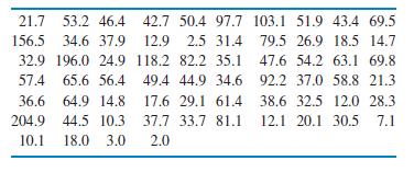
How much oil? How much oil the wells in a given field will ultimately produce is key information in deciding whether to drill more wells. The table below gives the estimated total amount of oil recovered from 64 wells in the Devonian Richmond Dolomite area of the Michigan basin(a) Graph the
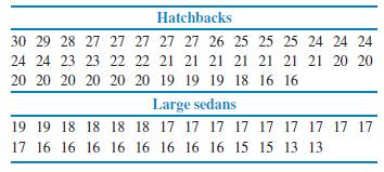
Fuel efficiency of hatchbacks and large sedans. Let’s compare the fuel efficiencies (mpg) of model year 2009 hatchbacks and large sedans.Give graphical and numerical descriptions of the fuel efficiencies for these two types of vehicle. What are the main features of the distributions? Compare the
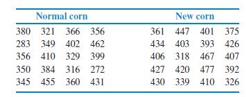
Evaluating the improvement in a product. Corn is an important animal food. Normal corn lacks certain amino acids, which are building blocks for protein. Plant scientists have developed new corn varieties that contain these amino acids. To test a new corn as an animal food, a group of 20 one-day-old
What influences buying? Product preference depends in part on the age, income, and gender of the consumer. A market researcher selects a large sample of potential car buyers. For each consumer, she records gender, age, household income, and automobile preference. Which of these variables are
Telecom revenue growth. Take the N(−0.0224, 0.2180)distribution as the model for telecom revenue growth as described in the previous exercise and answer the following questions.(a) What percent of telecom companies had negative revenue growth over the past year? Show your work.(b) What does
Telecom revenue growth. The data on revenue growth for a random sample of telecommunications companies displayed before Exercise 1.105 (page 62) closely follow a Normal distribution with a mean of −0.0224 and a standard deviation of 0.2180. Take as a model for telecom revenue growth the
A closer look at customer refunds. A retail store specializing in children’s clothing and toys has a relatively strict “no refunds” policy. Exceptions to this policy are sometimes granted in specific cases as determined by management. The store would like to look at refund activity for the
Help-wanted advertising in newspapers. One source of revenue for newspapers is printing help-wanted ads for companies that are looking for new employees. For this exercise we will use monthly data on help-wanted advertising in newspapers from January 1951 to April 2005. The time series uses an
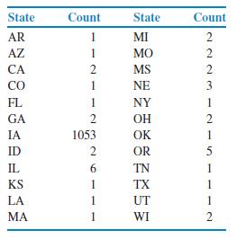
Customers’ home state. A sample of 1095 customers entering a retail store were asked to fill out a brief survey. One question on the survey asked each person to identify his or her current state of residency. The data from this question are summarized in the table below.(a) The state in which the
Howmuchdoes it cost tomake amovie? Makingmovies is a very expensive activity and many cost more than they earn.On the other hand, enormous profits are also a possibility. For this exercise you will analyze the budgets for 160 films made between 2003 and 2007.4(a) Examine the distribution of the
Identify the histograms. Asurvey of a large college class asked the following questions:(a) Are you female or male? (In the data, male = 0, female = 1.)(b) Are you right-handed or left-handed? (In the data, right = 0, left = 1.)(c) What is your height in inches?(d) How many minutes do you study on
Uniform random numbers. Use software to generate 100 observations from the distribution described in Exercise 1.80(page 44). (The software will probably call this a “uniform distribution.”)Make a histogram of these observations. How does the histogram compare with the density curve in Figure
Showing 1200 - 1300
of 8686
First
6
7
8
9
10
11
12
13
14
15
16
17
18
19
20
Last
Step by Step Answers