

Question: For the data given in Table 23.1, use a graphics package or a spreadsheet, such as Excel, to construct the following graphs: a. Pie chart
For the data given in Table 23.1, use a graphics package or a spreadsheet, such as Excel, to construct the following graphs:
a. Pie chart
b. Line chart
c. Bar chart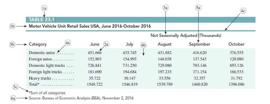
(lb) (5b) (5c 6a (la) TABLE 23.1 Motor Vehicle Unit Retail Sales USA, June 2016-October 2016 4a Category Domestic autos. Foreign autos... Domestic light trucks Foreign light trucks.. Heavy trucks.. Total* June 2a 451.666 152.803 726.841 181.690 35.722 1548.722 July 4b 435.745 154.993 731.250 194.684 30.147 1546.819 *Sum of all categories Source: Bureau of Economic Analysis (BEA), November 2, 2016 (3a) Sa Not Seasonally Adjusted (Thousands) August 431.882 148.038 729.080 197.233 33.556 1539.789 September 416.620 137.543 703.146 171.154 32.357 1460.820 4c October 376.555 128.080 693.126 166.533 31.792 1396.086
Step by Step Solution
3.44 Rating (151 Votes )
There are 3 Steps involved in it
a Pie Chart The data presented in the pie chart shows the sales distribution of ve... View full answer

Get step-by-step solutions from verified subject matter experts