

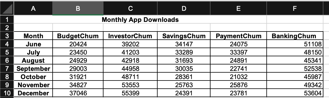
Question: DO IN EXCEL Tasks: Using the data in the Monthly_App_Downloads worksheet, create a new worksheet called App_Downloads_Report with the following four charts (All your charts
DO IN EXCEL
Tasks:
Using the data in the Monthly_App_Downloads worksheet, create a new worksheet called App_Downloads_Report with the following four charts (All your charts should be formatted, labelled and titled ppropriately).
1. A clustered column chart showing the number of downloads for each mobile application over the course of the months from June to December. For this chart, your horizontal axis should consist of month names, and your vertical columns should be based on the downloads for each app during those months.
2. A 2-D regular pie chart showing the breakdown of downloads among the five apps for the month of December.
Based on the information in the chart, what would be the estimate for downloads for the upcoming month (January)? Provide your answer in the Questions box on the right.
3. A clustered column chart showing the performance of the InvestorChum and SavingChum apps over the course of the months from June to December. The chart should contain a data table at the bottom and a linear trend line for each app to highlight the overall traffic trend. Color an increasing trendline as green, a decreasing one as red, and a stable one as black (you will have to format the trend lines manually).
4. A scatter chart for the InvestorChum app over the course of the months from June to December. Select the appropriate layout that highlights the linear trend line equation estimating the data points for the InvestorChum app.
Based on the information in the chart, what would be the estimate for downloads for the upcoming month (January)? Provide your answer in the Questions box on the right.
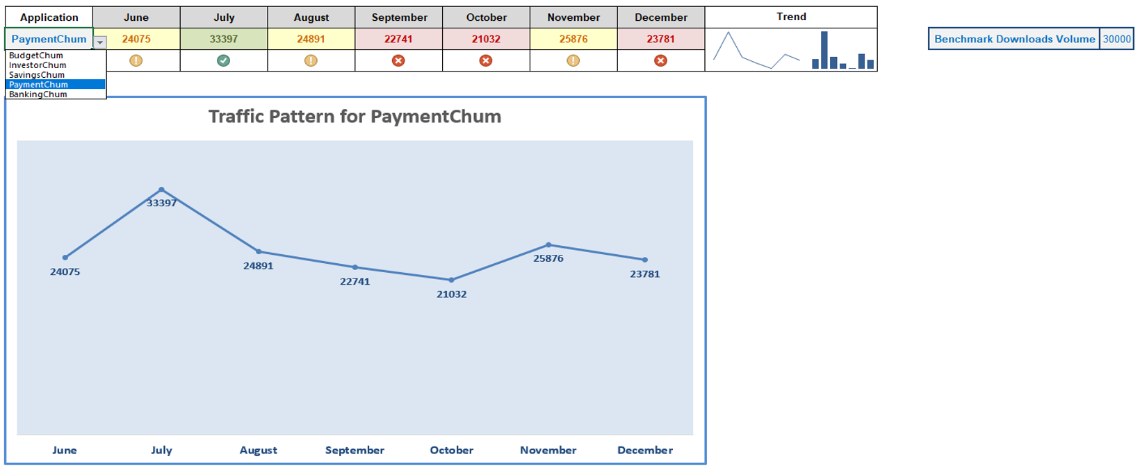
5. Create a new worksheet called Apps_Dashboard_Tool and create a dashboard that looks like the one shown in Dashboard-Screenshot worksheet.
- As shown in the screenshot, this dashboard displays data, sparklines (line and column), and a line chart with markers. Each of these components changes based on the app selected in the Apps dropdown menu.
- Use conditional formatting (see criteria below) on the apps data to format the downloads values as either Red-on-Red or Yellow-on-Yellow or Green-on-Green. The conditional formatting should be dependent on the Benchmark Downloads (users should be able to change this value manually and see the changes in the dashboard).
- Use conditional formatting icon sets under the traffic values to depict three levels
- Conditional Formatting Criteria: App downloads that meets or exceeds the benchmark value should be colored as Green-on-Green. Icon should be a green/check. App downloads that are at least 80% of the benchmark value should be colored as Yellow-on-Yellow. Icon should be yellow/exclaimation.
App downloads that are less than 80% of the benchmark value should be colored as Red-on-Red. Icon should be red/cross.
- Make sure your dashboard looks the same as the screenshot. Try to replicate all formatting elements of the graphics shown (no grid lines on worksheet, no colum/row headers, matching chart layout etc.)
Step by Step Solution
There are 3 Steps involved in it

Get step-by-step solutions from verified subject matter experts