

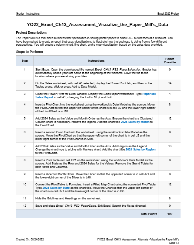
Question: Grader - Instructions Excel 2 0 2 2 Project YO 2 2 _ Excel _ Ch 1 3 _ Assessment _ Visualize _ the _
Grader Instructions
Excel Project
YOExcelChAssessmentVisualizethePaperMill'sData
Project Description:
The Paper Mill is a midsized business that specializes in selling printer paper to small US businesses at a discount. You have been asked to create a report that uses visualizations to illustrate how the business is doing from a few different perspectives. You will create a column chart, line chart, and a map visualization based on the sales data provided.
Steps to Perform:
tableStepInstructions,tablePointsPossibletableStart Excel. Open the downloaded file named ExcelCHPSPaperSales xlax. Grader hasautomatically added your last name to the beginning of the filename. Save the file to thelocation where you are storing your files.tableOn the Sales worksheet, with cell A selected, display the Power Pivot tab, and then in theTables group, click or press Add to Data Model.tableClose the Power Pivot for Excel window. Display the SalesReport worksheet. Type Paper MillSales Report in cell A changing the font to and bold.tableInsert a PivotChart into the worksheet using the workbook's Data Model as the source. Movethe PivotChart so that the upperleft corner of the chart is in cell B and the lowerright comerof the PivotChart is in ItableAdd Sales as the Value and Month Order as the Axis. Ensure the chart is a ClusteredColumn chart. If necessary, remove the legend. Add the chart fitle Sales by Month tothe PivotChart.tableInsert a second PivotChart into the worksheet using the workbook's Data Model as thesource Move the PivotChart so that the upperleft comer of the chart is in cell J and thelowerright corner of the PivotChart is in QtableAdd Sales as the Value and Month Order as the Axis. Add Region as the Legend.Change the chart type to a Line with Markers chart. Add the chart fitle Sales by Regionto the PivotChart.tableInsert a PivotTable into cell C on the worksheet using the workbook's Data Model as thesource Add State as the Row and Sales for the Values. Remove the Grand Totals forboth Rows and Columns.tableInsert a slicer for Month Order. Move the Slicer so that the upperleft comer is in cell J andthe lowerright corner of the Slicer is in LtableConvert the Pivot Table to Formulas. Insert a Filled Map Chart using the converted PivotTable.Type Sales by State as the chart title. Move the Chart so that the upperleft corner ofthe chart is in cell C and the lowerright corner of the chart is in Hide the Gridlines and Headings on the worksheet.,Save and close ExcelCHPSPaperSales. Exit Excel. Submit the file as directed.,Total Points,
Created On:
YOExcelCHAssessmentAtemate Visualize the Paper Mills
Data
Step by Step Solution
There are 3 Steps involved in it
1 Expert Approved Answer
Step: 1 Unlock

Question Has Been Solved by an Expert!
Get step-by-step solutions from verified subject matter experts
Step: 2 Unlock
Step: 3 Unlock