

Question: The figure below plots the historical risk-return relation for various assets. 2596 |- | = stocks 1-50 Small Stocks stocks 51-400 stocks 401-500 20% Mid-Cap
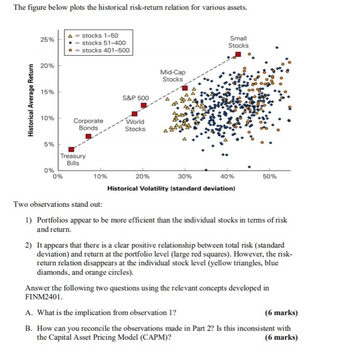
The figure below plots the historical risk-return relation for various assets. 2596 |- | = stocks 1-50 Small Stocks stocks 51-400 stocks 401-500 20% Mid-Cap Stocks... * 15% S&P 500 10% Corporate World BondsStocks 5% Treasury Bills 096 0% 10% 20% 30% 40% 50% Historical Volatility (standard deviation) Two observations stand out 1) Portfolios appear to be more efficient than the individual stocks in terms of risk and return. 2) It appears that there is a clear positive relationship between total risk (standard deviation) and return at the portfolio level (large red squares). However, the risk- return relation disappears at the individual stock level (yellow triangles, blue diamonds, and orange circles). Answer the following two questions using the relevant concepts developed in FINM2401 A. What is the implication from observation 1? B. How can you reconcile the observations made in Part 2? Is this inconsistent with (6 marks) the Capital Asset Pricing Model (CAPM)? (6 marks)
Step by Step Solution
There are 3 Steps involved in it

Get step-by-step solutions from verified subject matter experts