

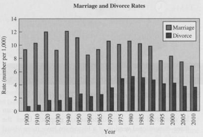
The graph in Figure 3.24 depicts the U.S. marriage and divorce rates for selected years since 1900.
Question:
The graph in Figure 3.24 depicts the U.S. marriage and divorce rates for selected years since 1900. The marriage rates are depicted by the blue bars and the divorce rates are depicted by the red bars. Both rates are given in units of marriages/divorces per 1,000 people in the population (Department of Health and Human Services).
a. Why do these data consist of marriage and divorce rates rather than total numbers of marriages and divorces? Comment on any trends that you observe in these rates, and give plausible historical and sociological explanations for these trends.
b. Construct a stack plot of the marriage and divorce rate data. For each bar, place the divorce rate above the marriage rate. Which graph makes the comparisons easier: the multiple bar graph shown here or the stack plot? Explain.
Figure 3.24
Step by Step Answer:
a Total numbers in both categories have gone up due to increasing population so the rates gi...View the full answer


Statistical Reasoning for Everyday Life
ISBN: 978-0321817624
4th edition
Authors: Jeff Bennett, Bill Briggs, Mario F. Triola
