

Question: please help !! please help! I need the graph 2) Plot the freezing point data. ( 8pts ) Plot each data set on a separate
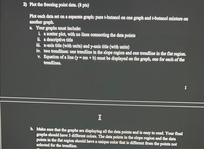
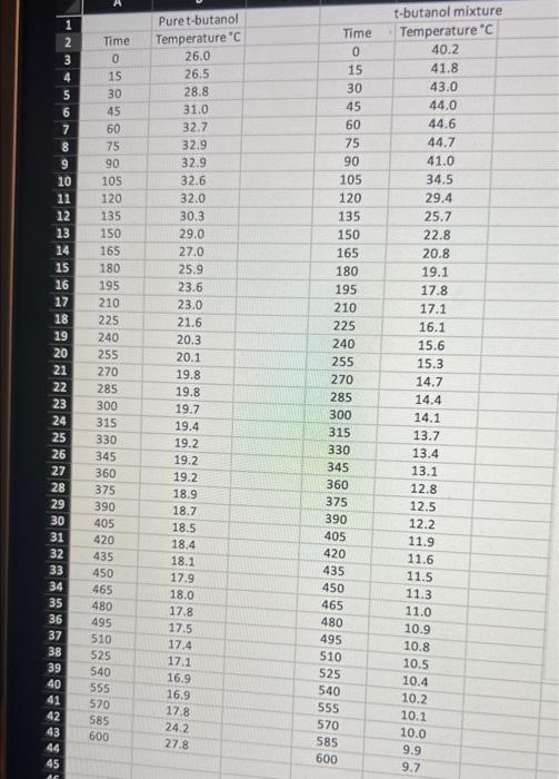
2) Plot the freezing point data. ( 8pts ) Plot each data set on a separate graph: pure t-butanol on one graph and t-butanol mixture on another graph. a. Your graphs must include: i. a scatter plot, with no lines connecting the data points ii. a descriptive title iii. x-axis title (with units) and y-axis title (with units) iv. two trendlines: one trendline in the slope region and one trendline in the flat region. v. Equation of a line (y=mx+b) must be displayed on the graph, one for each of the trendlines. b. Make sure that the graphs are displaying all the data points and is easy to read. Your final graphs should have 3 different colors. The data points in the slope region and the data points in the flat region should have a unique color that is different from the points not selected for the trendline
Step by Step Solution
There are 3 Steps involved in it

Get step-by-step solutions from verified subject matter experts