

The data below show the median weekly earnings (in s) of those in full time employment in
Question:
The data below show the median weekly earnings (in £s) of those in full time employment in Great Britain in 1992, by category of education.
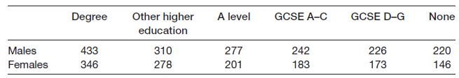
(a) In what fundamental way do the data in this table differ from those in Problem 1.1?
(b) Construct a bar chart showing male and female earnings by education category. What does it show?
(c) Why would it be inappropriate to construct a stacked bar chart of the data? How should one graphically present the combined data for males and females? What extra information is necessary for you to do this?
Problem 1.1
Fantastic news! We've Found the answer you've been seeking!
Step by Step Answer:
a The fundamental difference between the data in this table and the data in Problem 11 is that these ...View the full answer

Answered By
User l_960928
I completed my degree in 2017. I am working as an Accountant.But I can manage all the subjects and I am expert in that.I did tuitions to some of the childrens up to plustwo.So I have the experience.
0 Reviews
10+ Question Solved
Related Book For 
Statistics For Economics Accounting And Business Studies
ISBN: 978027368308
4th Edition
Authors: Michael Barrow
Question Posted:
