New Semester Started
Get
50% OFF
Study Help!
--h --m --s
Claim Now
Question Answers
Textbooks
Find textbooks, questions and answers
Oops, something went wrong!
Change your search query and then try again
S
Books
FREE
Study Help
Expert Questions
Accounting
General Management
Mathematics
Finance
Organizational Behaviour
Law
Physics
Operating System
Management Leadership
Sociology
Programming
Marketing
Database
Computer Network
Economics
Textbooks Solutions
Accounting
Managerial Accounting
Management Leadership
Cost Accounting
Statistics
Business Law
Corporate Finance
Finance
Economics
Auditing
Tutors
Online Tutors
Find a Tutor
Hire a Tutor
Become a Tutor
AI Tutor
AI Study Planner
NEW
Sell Books
Search
Search
Sign In
Register
study help
business
probability statistics
The Basic Practice Of Statistics 8th Edition David S. Moore, William I. Notz, Michael A. Fligner - Solutions
5.57 Is regression useful? In Exercise 4.43 (page 124), you used the Correlation and Regression applet to create three scatterplots having correlation about r = 0.7 between the horizontal variable x and the vertical variable y. Create three similar scatterplots again, and click the "Show
5.56 Regression to the mean. We expect that students who do well on the midterm exam in a course will usually also do well on the final exam. Gary Smith of Pomona College looked at the exam scores of all 346 students who took his statistics class over a 10-year period.25 The least-squares line for
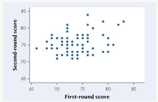
predicted second-round scores for a player who shot 80 in the first round and for a player who shot 70. The mean second-round score for all players was 75.02. So, a player who does well in the first round is predicted to do less well, but still better than average, in the second round. In addition,
5.55 Regression to the mean. Figure 4.8 (page 119) displays the relationship between golfers' scores on the first and second rounds of the 2016 Masters Tournament. The least-squares line for predicting second-round scores (y) from first-round scores (x) has equation y = 62.9 1 + 0.1 64x. Find the
5.54 Some regression math. Use the equation of the least-squares regression line (box on page 132) to show that the regression line for predicting y from x always passes through the point (x, y)(, ). That is, when x=x=7, the equation gives y=yy=
5.53 Workers' incomes. Here is another example of the group effect cautioned about in the previous exercise. Explain how, as a nation's population grows older, median income can go down for workers in each age group, yet still go up for all workers.
5.52 Grade inflation and the SAT. The effect of a lurking variable can be surprising when individuals are divided into groups. In recent years, the mean SAT score of all high school seniors has increased. But the mean SAT score has decreased for students at each level of high school grades (A, B,
5.51 SAT scores and teacher salaries, continued. The data set "tchsal2" gives the mean Mathematics SAT score and mean salary of teachers in each of the 50 states and the District of Columbia in 2015. It also includes a categorical variable, pct. taking, that indicates whether the percentage taking
5.50 SAT scores and teacher salaries. The data set "tchsal" gives the mean Mathematics SAT score and mean salary of teachers in each of the 50 states and the District of Columbia in 2015.24 The correlation between mean Mathematics SAT score and mean teacher salary is r = -0.308. TCHSAL (a) Find the
5.49 Learning online. Many colleges offer online versions of courses that are also taught in the classroom. It often happens that the students who enroll in the online version do better than the classroom students on the course exams. This does not show that online instruction is more effective
5.48 Does diet soda cause weight gain? Researchers analyzed data from more than 5000 adults and found that the more diet sodas a person drank, the greater their weight gain.23 Does this mean that drinking diet soda causes weight gain? Give a more plausible explanation for this association.
5.47 A few more dollars, one more year. Data on the average income of all men who died in the past year in several U.S. counties showed a positive correlation with average age of death of men who died in the past year in the counties. Would the correlation be greater, smaller, or about the same if
5.46 Are you happy? Exercise 4.26 (page 120) discusses a study in which the mean BRFSS life-satisfaction score of individuals in each state was compared with the mean of an objective measure of well-being (based on the "compensating- differentials method") for each state. Suppose that instead of
5.45 Managing diabetes, continued. Add three regression lines for predicting FPG from HbA to your scatterplot from Exercise 5.43: for all 18 subjects, for all except Subject 15, and for all except Subject 18. Is either Subject 15 or Subject 18 strongly influential for the least-squares line?
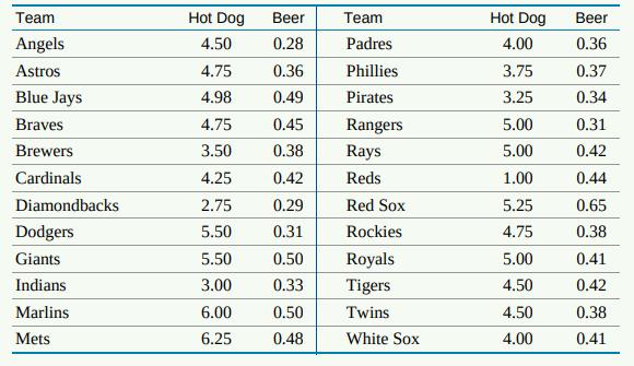
5.44 The effect of changing units. The equation of a regression line, unlike the correlation, depends on the units we use to measure the explanatory and response variables. Return to the data on beer and hot dog prices in major- league ballparks in Exercise 5.20: BEER2Beer prices are measured in
5.43 Managing diabetes. People with diabetes must manage their blood sugar levels carefully. They measure their fasting plasma glucose (FPG) several times a day with a glucose meter. Another measurement, made at regular medical checkups, is called HbA. This is roughly the percent of red blood cells
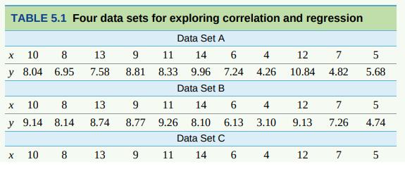
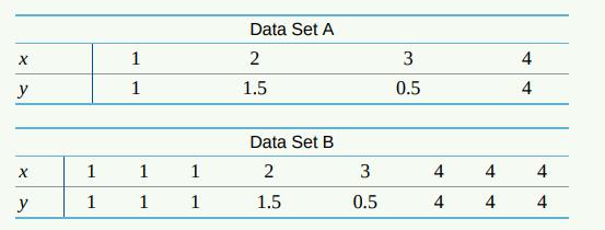
5.42 Always plot your data! Table 5.1 presents four sets of data prepared by the statistician Frank Anscombe to illustrate the dangers of calculating without first 21 plotting the data. ANSCOMBE A, B, C, and D(a) Without making scatterplots, find the correlation and the least-squares regression
5.41 Our brains don't like losses. Exercise 4.30 (page 121) describes an experiment that showed a linear relationship between how sensitive people are to monetary losses ("behavioral loss aversion") and activity in one part of their brains ("neural loss aversion"). LOSSES (a) Make a scatterplot
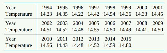
5.40 Global warming. Exercise 4.44 (page 124) gives data on annual average global temperatures for the last 22 years in degrees Celsius. GTEMPS (a) Find the least-squares regression line for predicting average global temperature from year. Make a scatterplot and draw your line on the plot. (b)
5.39 Sparrowhawk colonies. One of nature's patterns connects the percent of adult birds in a colony that return from the previous year and the number of new adults that join the colony. Here are data for 13 colonies of sparrowhawks:20 SPARROW Percent return x New adults y 74 66 81 52 73 62 52 45 62
5.38 Keeping water clean. Keeping water supplies clean requires regular measurement of levels of pollutants. The measurements are indirect-a typical analysis involves forming a dye by a chemical reaction with the dissolved pollutant, then passing light through the solution and measuring its
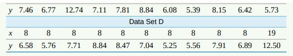
5.37 Sisters and brothers. How strongly do physical characteristics of sisters and brothers correlate? Here are data on the heights (in inches) of 12 adult pairs: 18 BROSIS Brother Sister 71 68 66 67 70 71 70 73 72 65 66 70 69 64 65 63 65 62 64 66 59 62 64 65 (a) Use your calculator or software to
5.36 More exercise, more weight loss. In the study described in Example 5.5, the researchers found that, in general, subjects who engaged in more physical activity had higher total energy expenditures. In particular, they found that physical activity explained 3.3% of the variation in total energy
5.35 What's my grade? In Professor Krugman's economics course, the correlation between the students' total scores prior to the final examination and their final- examination scores is r = 0.5. The pre-exam totals for all students in the course have mean 280 and standard deviation 40. The final-exam
5.34 Husbands and wives. The mean height of American women in their twenties is about 64.3 inches, and the standard deviation is about 2.7 inches. The mean height of men the same age is about 69.9 inches, with standard deviation about 3.1 inches. Suppose that the correlation between the heights of
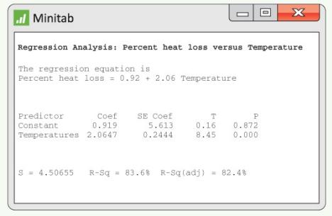
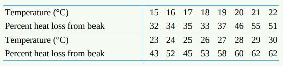
5.33 Toucan's beak. Exercise 4.46 (page 125) gives data on beak heat loss, as a percent of total body heat loss from all sources, at various temperatures. The data show that beak heat loss is higher at higher temperatures and that the relationship is roughly linear. Figure 5.12 shows Minitab
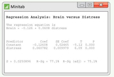
5.32 Does social rejection hurt? Exercise 4.47 (page 125) gives data from a study that shows that social exclusion causes “real pain.” That is, activity in an area of the brain that responds to physical pain goes up as distress from social exclusion goes up. A scatterplot shows a moderately
5.31 The price of diamond rings. A newspaper advertisement in the Straits Times of Singapore contained pictures of diamond rings and listed their prices, diamond weight (in carats), and gold purity. Based on data for only the 20-carat gold ladies' rings in the advertisement, the least-squares
5.30 Penguins diving. A study of king penguins looked for a relationship between 16 how deep the penguins dive to seek food and how long they stay underwater. For all but the shallowest dives, there is a linear relationship that is different for different penguins. The study report gives a
5.29 Researchers measured the percent body fat and the preferred amount of salt (percent weight/volume) for several children. Here are data for seven children: SALT 15 Preferred amount of salt x Percent body fat y 0.2 0.3 0.4 0.5 0.6 0.8 0.8 1.1 20 30 22 30 38 23 30 Using your calculator or
5.28 The software used to compute the least-squares regression line in Exercise 5.25 says that =0.98. This suggests that (a) although degree-days and gas used are correlated, degree-days do not predict gas used very accurately. (b) gas used increases by 0.98-0.99 0.98-0.99 cubic feet for each
5.27 By looking at the equation of the least-squares regression line in Exercise 5.25, you can see that the correlation between amount of gas used and degree-days is (a) greater than zero. (b) less than zero.(c) unable to be determined without seeing the data.
5.26 According to the regression line in Exercise 5.25, the predicted amount of gas used when the outside temperature is 20 degree-days is about (a) 405 cubic feet. (b) 320 cubic feet. (c) 105 cubic feet.
5.25 An owner of a home in the Midwest installed solar panels to reduce heating costs. After installing the solar panels, he measured the amount of natural gas used y (in cubic feet) to heat the home and outside temperature x (in degree- days, where a day's degree-days are the number of degrees its
5.24 Smokers don't live as long (on the average) as nonsmokers, and heavy smokers don't live as long as light smokers. You regress the age at death of a group of male smokers on the number of packs per day they smoked. The slope of your regression line (a) will be greater than 0. (b) will be less
5.23 Fred keeps his savings in his mattress. He began with $1000 from his mother and adds $100 each year. His total savings y after x years are given by the equation (a) y 1000+100x. (b) y 100+1000x. (c) y = 1000 + x.
5.22 The points on a scatterplot lie close to the line whose equation is y = 3 - 4x. The slope of this line is (a) 3. (b) 4. (c) -4.
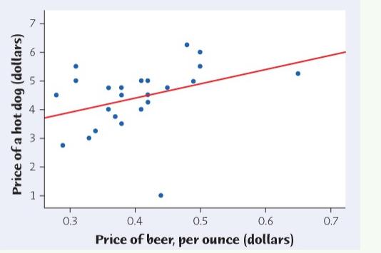
5.21 The slope of the line in Figure 5.10 is closest to (a) -2.4. (b) 0.2. (c) 5.0.
5.20 Figure 5.10 is a scatterplot of the price of a hot dog against the price of beer (per ounce) at 24 major-league ballparks in 2015.13 The line is the least-squares regression line for predicting the price of a hot dog from the price of beer. If another ballpark charges 0.60 dollar per ounce for
5.19 To Earn More, Get Married? Data show that men who are married, and also divorced or widowed men, earn quite a bit more than men the same age who have never been married. This does not mean that a man can raise his income by getting married because men who have never been married are different
5.18 Education and Income. There is a strong positive association between workers' education and their income. For example, the U.S. Census Bureau reported in 2014 that the mean income of young adults (ages 25-34) who worked full-time year round increased from $28,780 for those with less than a
5.17 Another Reason Not to Smoke? A stop-smoking booklet says, "Children of mothers who smoked during pregnancy scored nine points lower on intelligence tests at ages three and four than children of nonsmokers." Suggest some lurking variables that may help explain the association between smoking
5.16 Is Math the Key to Success in College? A College Board study of 15,941 high school graduates found a strong correlation between how much math minority students took in high school and their later success in college. News articles quoted the head of the College Board as saying that “math is
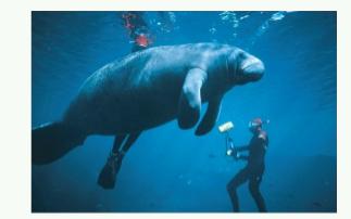
5.15 The Endangered Manatee. Table 4.1 gives 39 years of data on boats registered in Florida and manatees killed by boats. Figure 4.2 (page 108) shows a strong positive linear relationship. The correlation is r = 0.953. MANATEE(a) Find the equation of the least-squares line for predicting manatees
5.14 SAT Scores. The correlation between mean 2015 Mathematics SAT scores and mean 2015 Writing SAT scores for all 50 states and the District of Columbia is 0.983. Would you expect the correlation between the mean state SAT scores for these two tests to be lower, about the same, or higher than the
5.13 Outsourcing by Airlines. Exercise 4.5 (page 105) gives data for nine airlines on the percent of major maintenance outsourced and the percent of flight delays blamed on the airline. AIRLINE (a) Make a scatterplot with outsourcing percent as x and delay percent as y. Would you consider Hawaiian
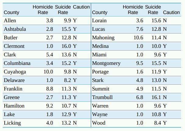
5.12 Death by Intent. Return to the data of Exercise 5.5 (page 134) on homicide rate and suicide rate. We will use these data to illustrate influence. DEATH4 (a) Make a scatterplot of the data that are suitable for predicting suicide rate from homicide rate, with two new points added. Point A:
5.11 Influence in Regression. The Correlation and Regression applet allows you to animate Figure 5.9. Click to create a group of 10 points in the lower-left corner of the scatterplot with a strong straight-line pattern (correlation about 0.9). Click the "Show least-squares line" box to display the
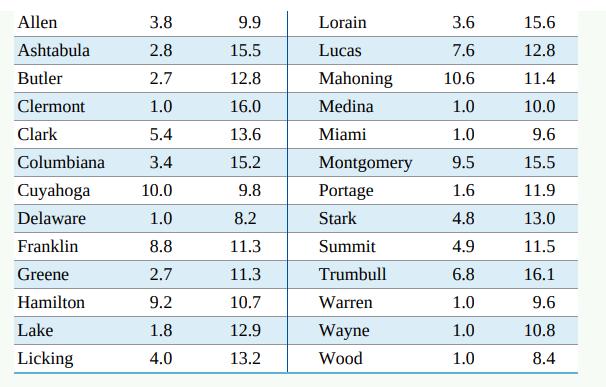
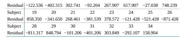
5.10 Not Obvious to the Naked Eye. The data set "resids" contains the values of a response y, an explanatory variable x, and the residuals from the least-squares regression line for predicting y from x. RESIDS (a) Make a scatterplot of the observations, and draw the regression line on your plot.
5.9 Does Fast Driving Waste Fuel? Exercise 4.8 (page 109) gives data on the fuel consumption y of a car at various speeds x. Fuel consumption is measured in mpg, and speed is measured in miles per hour. Software tells us that the equation of the least-squares regression line is FASTDR2
5.8 Residuals by Hand. In Exercise 5.4 (page 134), you found the equation of the least-squares line for predicting coral growth y from mean sea surface temperature x. (a) Use the equation to obtain the seven residuals step by step. That is, find the prediction y for each observation and then find
5.5 Death by Intent. Homicide and suicide are both intentional means of ending a life. However, the reason for committing a homicide is different from that for suicide, and we might expect homicide and suicide rates to be uncorrelated. On the other hand, both can involve some degree of violence, so
5.4 Coral Reefs. Exercises 4.2 and 4.10 discuss a study in which scientists examined data on mean sea surface temperatures (in degrees Celsius) and mean coral growth (in centimeters per year) over a several-year period at locations in the Gulf of Mexico and the Caribbean. Here are the data for the
5.3 Shrinking Forests. Scientists measured the annual forest loss (in square kilometers) in Indonesia from 2000-2012.3 They found the regression line forest loss 7500+ (1021x year since 2000) for predicting forest loss in square kilometers from years since 2000. (a) What is the slope of this line?
5.2 What's the Line? An online article suggested that for each additional person who took up regular running for exercise, the number of cigarettes smoked daily would decrease by 0.178. If we assume that 48 million cigarettes would be smoked per day if nobody ran, what is the equation of the
5.1 City Mileage, Highway Mileage. We expect a car's highway gas mileage to be related to its city gas mileage (in mpg). Data for all 1209 vehicles in the government's 2016 Fuel Economy Guide give the regression line highway mpg = 7.903 + (0.993 city mpg) for predicting highway mileage from city
4.49 4step Teacher salaries. For each of the 50 states and the District of Columbia, average Mathematics SAT scores and average high school teacher salaries for 2015 are available. 28 Discuss whether the data support the idea that higher teacher salaries lead to higher Mathematics SAT scores. TCHSAL
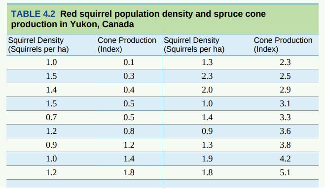
4.48 4step Yukon squirrels. The population density of North American red squirrels in Yukon, Canada, fluctuates annually. Researchers believe one reason for the fluctuation may be the availability of white spruce cones in the spring, a significant source of food for the squirrels. To explore this,
4.47 4step Does social rejection hurt? We often describe our emotional reaction to social rejection as "pain." Does social rejection cause activity in areas of the brain that are known to be activated by physical pain? If it does, we really do experience social and physical pain in similar ways.
4.46 4step Toucan's beak. The toco toucan, the largest member of the toucan family, possesses the largest beak relative to body size of all birds. This exaggerated feature has received various interpretations, such as being a refined adaptation for feeding. However, the large surface area may also
4.45 4step Will women outrun men? Does the physiology of women make them better suited than men to long-distance running? Will women eventually outperform men in long-distance races? In 1992, researchers examined data on world record times (in seconds) for men and women in the marathon. Here are
4.44 4step Global warming. Have average global temperatures been increasing in recent years? Here are annual average global temperatures for the last 22 years in degrees Celsius:23 GTEMPSDiscuss what the data show about change in average global temperatures over time. Year Temperature Year
4.43 correlation. Always plot your data to check for outlying points. Match the correlation. You are going to use the Correlation and Regression applet to make scatterplots with 10 points that have correlation close to 0.7. The lesson is that many patterns can have the same correlation. Always plot
4.42 PPLET Correlation is not resistant. Go to the Correlation and Regression applet. Click on the scatterplot to create a group of 10 points in the lower-left corner of the scatterplot with a strong straight-line pattern (correlation about 0.9). (a) Add one point at the upper right that is in line
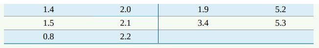
4.41 More about scatterplots and correlation. Here are two sets of data:(a) Make a scatterplot of both sets of data. Comment on any differences you see in the two plots. (b) Compute the correlation for both sets of data. Comment on any differences in the two values. Are these differences what you
4.40 Sloppy writing about correlation. Each of the following statements contains a blunder. Explain in each case what is wrong. (a) "There is a high correlation between the sex of American workers and their income." (b) "We found a high correlation (r = 1.09) between students' ratings of faculty
4.39 Teaching and research. A college newspaper interviews a psychologist about student ratings of the teaching of faculty members. The psychologist says, "The evidence indicates that the correlation between the research productivity and teaching rating of faculty members is close to zero." The
4.38 Statistics for investing. A mutual funds company's newsletter says, "A well- diversified portfolio includes assets with low correlations." The newsletter includes a table of correlations between the returns on various classes of investments. For example, the correlation between municipal bonds
4.37 Statistics for investing. Investment reports now often include correlations. Following a table of correlations among mutual funds, a report adds: "Two funds can have perfect correlation, yet different levels of risk. For example, Fund A and Fund B may be perfectly correlated, yet Fund A moves
4.36 The effect of changing units. Changing the units of measurement can dramatically alter the appearance of a scatterplot. Return to the data on percent body fat and preferred amount of salt in Exercise 4.24: SALT2 Preferred amount of salt x Percent body fat y 0.2 0.3 0.4 0.5 0.6 0.8 1.1 20 30 22
4.35 Thinking about correlation. Exercise 4.27 presents data on wine intake and the relative risk of breast cancer in women. (a) If wine intake is measured in ounces of alcohol per day rather than grams per day, how would the correlation change? (There is 0.035 ounce in a gram.) (b) How would r
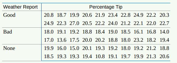
4.34 Good weather and tipping. Favorable weather has been shown to be associated with increased tipping. Will just the belief that future weather will be favorable lead to higher tips? Researchers gave 60 index cards to a waitress at an Italian restaurant in New Jersey. Before delivering the bill
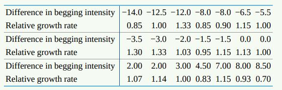
4.33 Feed the birds. Canaries provide more food to their babies when the babies beg more intensely. Researchers wondered if begging was the main factor determining how much food baby canaries receive or if parents also take into account whether the babies are theirs or not. To investigate,
4.32 Poverty and life expectancy. Exercise 4.31 discusses a study of the relationship between poverty level and life expectancy of men in 2010 in 20 groups of U.S. counties. The researchers were also interested in the relationship between poverty level and life expectancy of women in 2010 in these
4.31 Poverty and life expectancy. Do poorer people tend to have shorter lives than richer people? Two researchers ranked all counties in the United States by their poverty level and then divided them into 20 groups, each representing approximately 5% of the overall U.S. population. The bottom 5%
4.30 Our brains don't like losses. Most people dislike losses more than they like gains. In money terms, people are about as sensitive to a loss of $10 as to a gain of $20. To discover what parts of the brain are active in decisions about gain and loss, psychologists presented subjects with a
4.29 Sparrowhawk colonies. One of nature's patterns connects the percent of adult birds in a colony that return from the previous year and the number of new adults that join the colony. Here are data for 13 colonies of sparrowhawks: 18 SPARROWPercent return New adults 74 66 81 52 73 62 52 45 62 46
4.28 Ebola and gorillas. The deadly Ebola virus is a threat to both people and gorillas in Central Africa. An outbreak in 2002 and 2003 killed 91 of the 95 gorillas in seven home ranges in the Congo. To study the spread of the virus, measure "distance" by the number of home ranges separating a
4.27 Wine and cancer in women. Some studies have suggested that a nightly glass of wine may not only take the edge off a day but also improve health. Is wine good for your health? A study of nearly 1.3 million middle-aged British women examined wine consumption and the risk of breast cancer. The
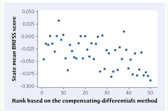
4.26 Happy states. Human happiness or well-being can be assessed either subjectively or objectively. Subjective assessment can be accomplished by listening to what people say. Objective assessment can be made from data related to well-being such as income, climate, availability of entertainment,
4.25 Scores at the masters. The Masters is one of the four major golf tournaments. Figure 4.8 is a scatterplot of the scores for the first two rounds of the 2016 Masters for all the golfers entered. Only the 50 golfers with the lowest two- round total, plus all golfers tied for 50th place, plus any
4.24 Researchers measured the percent body fat and the preferred amount of salt (percent weight/volume) for several children. Here are data for seven children: 13 .13 SALT Preferred amount of salt x Percent body fat y 0.2 0.3 0.4 0.5 0.6 0.8 1.1. 20 30 22 30 38 23 30 Use your calculator or
4.23 Researchers asked mothers how much soda (in ounces) their kids drank in a typical day. They also asked these mothers to rate how aggressive their kids were on a scale of 1 to 10, with larger values corresponding to a greater degree of aggression. 12 The correlation between amount of soda
4.22 A statistics professor warns her class that her second exam is always harder than the first. She tells her class that students always score 10 points worse on the second exam compared to their score on the first exam. This means that the correlation between students' scores on the first and
4.21 The points on a scatterplot lie very close to a straight line. The correlation between x and y is close to (a) -1. (b) 1. (c) either -1 or 1, we can't say which.
4.20 If the correlation between two variables is close to 0, you can conclude that a scatterplot would show (a) a strong straight-line pattern. (b) a cloud of points with no visible pattern.(c) no straight-line pattern, but there might be a strong pattern of another form.
4.19 What are all the values that a correlation r can possibly take? (a) r0 (b) 0r1 (c) -1r1
4.18 If we leave out the low outlier, the correlation for the remaining 23 points in Figure 4.7 is closest to (a) 0.6. (b) -0.6. (c) 0.1.
4.17 Figure 4.7 is a scatterplot of the price of a hot dog against the price of beer (per ounce) at 24 major-league ballparks in 2015.11 There is one low outlier in the plot. The price of beer (per ounce) and price of a hot dog for this ballpark are (a) price of beer (per ounce) = $0.44, price of a
4.16 Examining the data in the previous exercise, one finds that cars with bigger engines tend to have lower gas mileages. In a scatterplot of the engine size and the gas mileage, you expect to see (a) a positive association. (b) very little association. (c) a negative association.
4.15 The Department of Energy website contains data on 1209 model year 2016 cars and SUVs. 10 Included in the data are the engine size (as measured by engine displacement in liters) and combined city and highway gas mileage (in miles per gallon). When you make a scatterplot to predict gas mileage
4.14 Strong Association but No Correlation. The gas mileage of an automobile first increases and then decreases as the speed increases. Suppose this relationship is very regular, as shown by the following data on speed (miles per hour) and mileage (miles per gallon): MPG Speed Mileage 30 40 50 60
4.13 Changing the Correlation. Use your calculator, software, or the Two- Variable Statistical Calculator applet to demonstrate how outliers can affect correlation. (a) What is the correlation between homicide rate and suicide rate for the 26 counties in Exercise 4.4? DEATH (b) Make a scatterplot
4.12 Changing the Units. The sea surface temperatures in Exercise 4.10 are measured in degrees Celsius and growth in centimeters per year. The correlation between sea surface temperature and coral growth is r = -0.8111. If the measurements were made in degrees Fahrenheit and inches per year, would
4.11 Brain Size and Intelligence. For centuries, people have associated intelligence with brain size. A recent study used magnetic resonance imaging to measure the brain size of several individuals. The IQ and brain size (in units of 10,000 pixels) of six individuals are as follows: Brain size: IQ:
4.10 Coral Reefs. Exercise 4.2 discusses a study in which scientists examined data on mean sea surface temperatures (in degrees Celsius) and mean coral growth (in centimeters per year) over a several-year period at locations in the Gulf of Mexico and the Caribbean. Here are the data for the Gulf of
4.9 Death by Intent The data described in Exercise 4.4 also indicated that the homicide rates for some counties should be treated with caution because of low counts: DEATH2(a) Make a scatterplot of homicide rate versus suicide rate for all 26 counties. Use separate symbols to distinguish counties
4.8 Does Fast Driving Waste Fuel? How does the fuel consumption of a car change as its speed increases? Here are data for a 2014 Chevrolet Cruze Turbo Diesel. Speed is measured in miles per hour, and fuel consumption is measured in miles per gallon:6 FASTDR Speed 10 20 30 40 50 60 70 80 Fuel 38.1
4.7 Outsourcing by Airlines. Does your plot for Exercise 4.5 show a positive, negative, or no association between maintenance outsourcing and delays caused by the airline? If it shows association, is the relationship very strong? Are there any outliers? AIRLINE
4.6 Death by Intent. Describe the direction, form, and strength of the relationship between homicide rate and suicide rate, as displayed in your plot for Exercise 4.4. Are there any deviations from the overall pattern? DEATH
Showing 4900 - 5000
of 8686
First
43
44
45
46
47
48
49
50
51
52
53
54
55
56
57
Last
Step by Step Answers