New Semester
Started
Get
50% OFF
Study Help!
--h --m --s
Claim Now
Question Answers
Textbooks
Find textbooks, questions and answers
Oops, something went wrong!
Change your search query and then try again
S
Books
FREE
Study Help
Expert Questions
Accounting
General Management
Mathematics
Finance
Organizational Behaviour
Law
Physics
Operating System
Management Leadership
Sociology
Programming
Marketing
Database
Computer Network
Economics
Textbooks Solutions
Accounting
Managerial Accounting
Management Leadership
Cost Accounting
Statistics
Business Law
Corporate Finance
Finance
Economics
Auditing
Tutors
Online Tutors
Find a Tutor
Hire a Tutor
Become a Tutor
AI Tutor
AI Study Planner
NEW
Sell Books
Search
Search
Sign In
Register
study help
business
inferential statistics
Intro Stats 6th Edition Richard D. De Veaux, Paul F. Velleman, David Bock - Solutions
Movie genres and ratings The following table summarizes 1529 films from 2014 and 2015 that have been classified into a genre and have a MPAA rating. (Data from Movies 06-15)a) What percent of these films were rated R?b) What percent of these films were R-rated comedies?c) What percent of R-rated
Covid and blood type Public health scientists confronted with a new disease must search for variables that may predict infection or complications. Some of the apparent associations may, in time, turn out to be false leads, but without any other information they are followed. Scientists observed
Diet and politics III Are the patterns seen in Exercises 5 and 6 relating diet to political opinion the same for men and women?Here are two contingency tables:a) Are women or men more likely to be conservative carnivores?b) Are liberal vegetarians more likely to be women or men?
College value? revisited Here is a mosaic plot of the data from Exercise 1 on whether college provides value from a survey of U.S. adults and college presidents:a) From the mosaic plot, about what percent of the respondents were college presidents?b) From the mosaic plot, is it easy to see if there
Fish and prostate cancer revisited Here is a mosaic plot of the data on Fish consumption and Prostate cancer from the StepbyStep Example on page 74. (Data in Fish diet)a) From the mosaic plot, about what percent of all men in this survey were diagnosed with prostate cancer?b) Are there more men who
Diet and politics revisited Here are the same data as in Exercise 5 but displayed differently:a) Describe what this plot shows using the concept of a conditional distribution.b) Do you think the differences here are real? Explain.
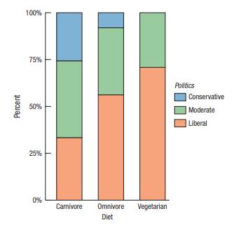
Diet and politics The survey of 299 undergraduate students from Exercise 86 in Chapter 2 (data in Student Survey) asked about respondents’ diet preference (Carnivore, Omnivore, Vegetarian) and political alignment (Liberal, Moderate, Conservative). Here is a stacked bar chart of the 285 responses:
Who is in the lead? II Which studio earned the least from films with leads from underrepresented populations? Which studio earned the least on average from those films?
College value again Consider the survey data in Exercise 1.a) What is the conditional distribution (in percents) of college presidents’ opinions about the value of college?b) Find the conditional distribution of the opinions of U.S. adults when the categories are combined into Negative (poor),
Who is the lead? The Annenberg Inclusion Initiative(http://assets.uscannenberg.org/docs/aii-inequality-leads-coleads-20200103.pdf) tallied the number of films released bya) Walt Disney Studios earned the most revenue on these films, but Universal released the most films in both categories.What
College value? The Pew Research Center asked 2143 U.S.adults and 1055 college presidents to “rate the job the higher education system is doing in providing value for the money spent by students and their families” as Excellent, Good, Only Fair, or Poor.seven top distributors in 2019 that had
Student survey The data set Student survey contains 299 responses to a student survey from a statistics project. The questions asked included:◆◆ How would you rate yourself politically? 1 = Far left, 9 = Far right◆◆ What is your gender?◆◆ Do you believe in God?◆◆ Pick a random
Population growth 2010 The following data show the percentage change in population for the 50 states and the District of Columbia from the 2000 census to the 2010 census. Using appropriate graphical displays and summary statistics, write a report on the percentage change in population by state.
Boomtowns 2020 In 2020, the website NewGeography.com(http://www.newgeography.com/content/005974-all-citiesrankings-2018-best-cities-job-growth) listed its ranking of the best cities for job growth in the United States. The magazine’s top 20 large cities, along with their weighted job rating
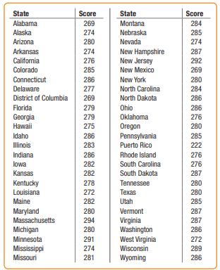
Math scores 2019 The National Center for Education Statistics reports average mathematics achievement scores for eighth graders in all 50 states, the District of Columbia, and Puerto Rico (nces.ed.govationsreportcard/):a) Using technology and the provided data file, find the median, IQR, mean, and
ZIP codes revisited Here are some summary statistics to go with the histogram of the ZIP codes of 500 customers from the Holes-R-Us Internet Jewelry Salon that we saw in Exercise 81:
ZIP codes Holes-R-Us, an Internet company that sells piercing jewelry, keeps transaction records on its sales. At a recent sales meeting, one of the staff presented a histogram of the ZIP codes of the last 500 customers, so that the staff might understand where sales are coming from. Comment on the
Final grades revisited After receiving many complaints about his final-grade histogram from students currently taking a statistics course, the professor from Exercise 79 distributed the following revised histogram:a) Comment on this display.b) Describe the distribution of grades.
Final grades A professor (of something other than statistics!)distributed the following histogram to show the distribution of grades on his 200-point final exam. Comment on the display
Marijuana 2015 In 2015 the Council of Europe published a report entitled The European School Survey Project on Alcohol and Other Drugs (www.espad.org). Among other issues, the survey investigated the percentages of 16-year-olds who had used marijuana. Shown here are the results for 38 European
Acid rain Two researchers measured the pH (a scale on which a value of 7 is neutral and values below 7 are acidic) of water collected from rain and snow over a 6-month period in Allegheny County, Pennsylvania:4.57 5.62 4.12 5.29 4.64 4.31 4.30 4.39 4.45 5.67 4.39 4.52 4.26 4.26 4.40 5.78 4.73
Counting Birds The Cornell Lab of Ornithology holds an annual Christmas Bird Count (www.birdsource.org), in which bird watchers at various locations around the country see how many different species of birds they can spot.a) Comment on this graphb) Create your own histogram of the data
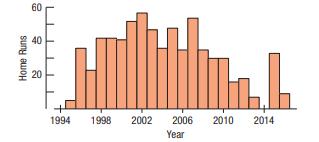
A-Rod again Students were asked to make a histogram of the number of home runs Alex Rodriguez hit from 1994 to 2016(see Exercise 73). One student submitted the following display:a) Comment on this graph.b) Create your own histogram of the data. Home Runs 60 40 20 1994 1998 2002 2006 2010 2014 Year
Major hurricanes The following data give the numbers of hurricanes classified as major hurricanes in the Atlantic Ocean each year from 1944 through 2013 (www.nhc.noaa.gov/data/):3, 3, 1, 2, 4, 3, 8, 5, 3, 4, 2, 6, 2, 2, 5, 2, 2, 7, 1, 2, 6, 1, 3, 1, 0, 5, 2, 1, 0, 1, 2, 3, 2, 1, 2, 2, 2, 3, 1, 1,
A-Rod Alex Rodriguez (known to fans as A-Rod) was the youngest player ever to hit 500 home runs. Here is a stem-and-leaf display of the number of home runs hit by A-Rod during the 1994–2016 seasons. Describe the distribution, mentioning its shape and any unusual features. (Data are given in the
Wayne Gretzky In Exercise 70, you examined the number of games played by hockey great Wayne Gretzky during his 20-year career in the NHL.a) Would you use the median or the mean to describe the center of this distribution? Why?b) Find the median.c) Without actually finding the mean, would you expect
States The stem-and-leaf display shows populations of the 50 states, in millions of people, according to the 2010 census.a) From the stem-and-leaf display, find the median and the interquartile range.b) Write a few sentences describing this distribution.
The great one During his 20 seasons in the NHL, Wayne Gretzky scored 50% more points than anyone who ever played professional hockey. He accomplished this amazing feat while playing in 280 fewer games than Gordie Howe, the previous record holder. Here are the number of games Gretzky played during
Gasoline Sixteen gas stations in eastern Wisconsin posted these prices for a gallon of regular gasoline:3.23 3.26 3.23 3.39 3.45 3.43 3.42 3.45 3.46 3.11 3.15 3.22 3.21 3.26 3.27 3.28a) Make a stem-and-leaf display of these gas prices. Use split stems; for example, use two 3.2 stems—one for
Cold weather A meteorologist preparing a talk about global warming compiled a list of weekly low temperatures (in degrees Fahrenheit) he observed at his southern Florida home last year.The coldest temperature for any week was 36°F, but he inadvertently recorded the Celsius value of 2°. Assuming
Movie earnings 2015 The histogram shows total gross earnings (in millions of dollars) of the top 200 major release movies in 2015. (Data extracted from Movies_06-15)An industry publication reports that the typical movie makes $23.2 million, but a watchdog group concerned with rising ticket prices
Fitbit sleep, revisited The Fitbit sleep data also estimated the number of minutes of deep sleep, which is displayed in the following histogram. Comment on this display
Movie lengths II 2010 Exercise 63 looked at the running times of movies released in 2010. The standard deviation of these running times is 16.6 minutes, and the quartiles are Q1 = 98 minutes and Q3 = 116 minutes.a) Write a sentence or two describing the spread in running times based on i. the
Fitbit sleep scores One of the contributing authors recorded their sleep quality data over the course of 113 nights from their Fitbit activity tracking wristband. Here is a histogram of their overall sleep score. Comment on the display
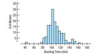
Movie lengths 2010 The histogram shows the running times in minutes of the 150 top-grossing feature films released in 2010. (Data in Movie Lengths 2010)a) You plan to see a movie this weekend. Based on these movies, how long do you expect a typical movie to run?b) Would you be surprised to find
Neck sizes again Look again at the histogram of men’s neck sizes in Exercise 60.a) Is the mean closer to 14, 15, or 16 inches? Why?b) Is the standard deviation closer to 1 inch, 3 inches, or 5 inches? Explain.
Pizza prices again Look again at the histogram of the pizza prices in Exercise 59.a) Is the mean closer to $2.40, $2.60, or $2.80? Why?b) Is the standard deviation closer to $0.15, $0.50, or $1.00?Explain.
Neck size The histogram shows the neck sizes (in inches) of the 250 men recruited for the health study in Utah from Exercise 9. (Data in Bodyfat)Neck Size (inches)Which summary statistics would you choose to summarize the center and spread in these data? Why?
Pizza prices The histogram shows the distribution of the prices of plain pizza slices (in $) for 156 weeks in Dallas, TX.Which summary statistics would you choose to summarize the center and spread in these data? Why?
Tornadoes 2020 II Using the data from Exercise 56, write a short report describing the distribution of the number of deaths in the United States from tornadoes during this time period.
Floods 2019 II Using the data from Exercise 55, write a short report describing the distribution of the number of deaths in the United States from floods during this time period.
Tornadoes 2020 Here are the annual numbers of deaths from tornadoes in the United States from 1995 through 2020:30, 25, 67, 130, 94, 41, 40, 55, 54, 35, 38, 67, 81, 126, 21, 45, 553, 68, 55, 47, 36, 18, 35, 10, 41(Source:
Floods 2019 Here are the annual numbers of deaths from floods in the United States from 1995 through 2018:80, 131, 118, 136, 68, 38, 48, 49, 86, 82, 43, 76, 87, 82, 56, 103, 113, 29, 82, 38, 176, 126, 116, 80, 92(Source:
Sick days During contract negotiations, a company seeks to change the number of sick days employees may take, saying that the annual “average” is 7 days of absence per employee.The union negotiators counter that the “average” employee misses only 3 days of work each year.a) Explain how both
Mistake A clerk entering salary data into a company spreadsheet accidentally put an extra “0” in the boss’s salary, listing it as $2,000,000 instead of $200,000. Explain how this error will affect these summary statistics for the company payroll:a) measures of center: median and meanb)
Test scores, small class Test scores from a calculus section of 40 students are shown in the histogram below.Describe the distribution of scores. Why might you be less sure of the description of the shape as compared to the histogram in Exercise 51?
Test scores, large class Test scores from a large calculus class of 400 are shown in the histogram below.a) Describe the distribution of scores. What might account for this shape?b) Why might both the mean and median score be misleading as a summary of the center?
Super Bowl edge 2020 In the Super Bowl, by how many points does the winning team outscore the losers? Here are the winning margins for the first 54 Super Bowl games. (Data in Super Bowl 2020)25, 19, 9, 16, 3, 21, 7, 17, 10, 4, 18, 17, 4, 12, 17, 5, 10, 29, 22, 36, 19, 32, 4, 45, 1, 13, 35, 17, 23,
Super Bowl points 2020 How many points do football teams score in the Super Bowl? Here are the total numbers of points scored by both teams in each of the first 54 Super Bowl games.(Data in Super Bowl 2020)
Bird species 2013 The Cornell Lab of Ornithology holds an annual Christmas Bird Count (www.birdsource.org), in which bird watchers at various locations around the country see how many different species of birds they can spot. Here are the number of species counted from the 20 sites with the most
Heart attack stays The histogram shows the lengths of hospital stays (in days) for all the female patients admitted to hospitals in New York during one year with a primary diagnosis of acute myocardial infarction (heart attack).a) From the histogram, would you expect the mean or median to be
Run times One of the authors collected the times (in minutes)it took him to run 4 miles on various courses during a 10-year period. Here is a histogram of the times:Describe the distribution and summarize the important features.What is it about running that might account for the shape you see?
Cereals The histogram shows the carbohydrate content of 77 breakfast cereals (in grams).a) Describe this distribution.b) If you can, open the data set and identify the cereals with the highest carbohydrate content
Modalities A survey of athletic trainers asked what modalities(treatment methods such as ice, whirlpool, ultrasound, or exercise) they commonly use to treat injuries. Respondents were each asked to list three modalities. The article included the following figure reporting the modalities used:a)
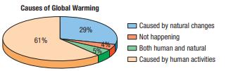
Global warming The Yale Program on Climate Change Communication surveyed 911 American adults in May of 2020 and asked them about their attitudes on global climate change.Here’s a display of the percentages of respondents choosing each of the major alternatives offered to account for global
Summer Olympics 2016 Fifty-nine countries won gold medals in the 2016 Summer Olympics. The table lists them, along with the total number of gold medals each won.a) Try to make a display of these data. What problems do you encounter?b) Organize the data so that the graph is more successful.
Movie genres once more The movie genres listed in Exercise 35 were originally listed as these:a) What problem would you encounter in trying to make a display of these data?b) How did the creators of the bar chart in Exercise 35 solve this problem?
Plane crashes An investigator compiled information about recent nonmilitary plane crashes. The causes, to the extent that they could be determined, are summarized in the table.a) Is it reasonable to conclude that the weather or mechanical failures caused only about 37% of recent plane crashes?b)
Causes of death 2017 The Centers for Disease Control and Prevention lists causes of death in the United States during 2017:a) Is it reasonable to conclude that heart or lung diseases were the cause of approximately 29.4% of U.S. deaths in 2017?b) What percentage of deaths were from causes not
Beer consumption Here are the annual amount of per capita beer consumption (in gallons) in America from 1981 to 2010.1.39, 1.38, 1.37, 1.35, 1.33, 1.34, 1.34, 1.33, 1.31, 1.34, 1.29, 1.29, 1.26, 1.25, 1.23, 1.23, 1.22, 1.22, 1.23, 1.22, 1.23, 1.23, 1.21, 1.21, 1.19, 1.2, 1.21, 1.2, 1.17, 1.13a)
Wine consumption Here are the annual numbers of per capita wine consumption (in gallons) in America from 1981 to 2010.(Source: pubs.niaaa.nih.gov/publications/Surveillance95/tab1_10.htm)0.35, 0.36, 0.36, 0.37, 0.38, 0.39, 0.38, 0.36, 0.34, 0.33, 0.30, 0.30, 0.28, 0.28, 0.29, 0.30, 0.30, 0.30, 0.31,
Movie ratings again Here is a bar chart summarizing the movie ratings from the 891 movies shown in Exercise 4.a) Which was the least common rating?b) Is it easier to answer the question from the bar chart from the pie chart in Exercise 4? Explain.
(Data extracted from Movies 06-15)a) Were Thriller/Suspense or Adventure films more common?b) Is it easier to answer the question from the bar chart or from the pie chart in Exercise 3? Explain.
Movie genres again Here is a bar chart summarizing the movie genres from the 891 movies in Exercise
More shapes Would you expect distributions of these variables to be uniform, unimodal, or bimodal? Symmetric or skewed? Explain why.a) Ages of people at a Little League gameb) Number of siblings of people in your classc) Pulse rates of college-age malesd) Number of times each face of a die shows in
Thinking about shape Would you expect distributions of these variables to be uniform, unimodal, or bimodal? Symmetric or skewed? Explain why.a) The number of speeding tickets each student in the senior class of a college has ever hadb) Players’ scores (number of strokes) at the U.S. Open golf
Spreads in the news Find an article in a newspaper, a magazine, or the Internet that discusses a measure of spread.a) Does the article discuss the W’s for the data?b) What are the units of the variable?c) Does the article use the range, IQR, or standard deviation?d) Is the choice of measure of
Centers in the news Find an article in a newspaper, a magazine, or the Internet that discusses an “average.”a) Does the article discuss the W’s for the data?b) What are the units of the variable?c) Is the average used the median or the mean? How can you tell?d) Is the choice of median or mean
Not a histogram Find a graph other than a histogram that shows the distribution of a quantitative variable in a newspaper, a magazine, or the Internet.a) Does the article identify the W’s?b) Discuss whether the display is appropriate for the data.c) Discuss what the display reveals about the
Histogram Find a histogram that shows the distribution of a variable in a newspaper, a magazine, or the Internet.a) Does the article identify the W’s?b) Discuss whether the display is appropriate.c) Discuss what the display reveals about the variable and its distribution.d) Does the article
Tables in the news II Find a table of categorical data from a newspaper, a magazine, or the Internet.a) Is it clearly labeled?b) Does it display percentages or counts?c) Does the accompanying article tell the W’s of the variables?d) Do you think the article correctly interprets the data?
Tables in the news Find a frequency table of categorical data from a newspaper, a magazine, or the Internet.a) Is it clearly labeled?b) Does it display percentages or counts?c) Does the accompanying article tell the W’s of the variable?d) Do you think the article correctly interprets the data?
Graphs in the news II Find a pie chart of categorical data from a newspaper, a magazine, or the Internet.a) Is the graph clearly labeled?b) Does it violate the area principle?c) Does the accompanying article tell the W’s of the variable?d) Do you think the article correctly interprets the
Graphs in the news Find a bar chart of categorical data from a newspaper, a magazine, or the Internet.a) Is the graph clearly labeled?b) Does it violate the area principle?c) Does the accompanying article tell the W’s of the variable?d) Do you think the article correctly interprets the data?
Shoe sizes III For the shoe sizes in Exercise 16, what might be the problem with either the standard deviation or the IQR as a measure of spread?
How big is your bicep III? For the bicep measurements in Exercise 10, would you report the standard deviation or the IQR? Explain briefly.
Adoptions III For the number of adoptions in Exercise 12,a) Would you report the standard deviation or the IQR?b) Justify your answer briefly.
III For the brewpubs in Exercise 15,a) Would you report the standard deviation or the IQR?b) Justify your answer briefly.
Shoe sizes II For the shoe sizes in Exercise 16, what might be the problem with either the mean or the median as a measure of center?
How big is your bicep II? For the bicep measurements in Exercise 10, would you report the mean, the median, or both?Explain briefly.
Adoptions II For the number of adoptions in Exercise 12,a) Which would you expect to be larger: the median or the mean? Explain briefly.b) Which would you report: the mean or the median? Explain briefly.
Brewpubs II For the brewpubs in Exercise 15,a) Which would you expect to be larger: the median or the mean? Explain briefly.b) Which would you report: the mean or the median? Explain briefly.
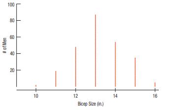
Shoe sizes A last is a form, traditionally made of wood, in the shape of the human foot. Lasts of various sizes are used by shoemakers to make shoes. In the United States, shoe sizes are defined differently for men and women:U.S. men’s shoe size = 1last size in inches * 32 - 24.U.S. women’s
Brewpubs The number of brewpubs in the United States has changed over the past two decades. Here is a histogram of the number of brewpubs in each year from 1994 through 2019.
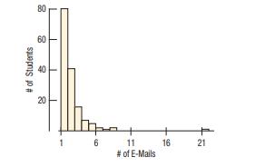
E-mails II For the distribution of e-mails sent by students in Exercise 11, describe the shape.
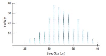
Biceps revisited Describe the shape of the distribution of bicep circumferences (in inches) for the 250 men in the study of Exercise 10.
Adoptions The U.S. Census Bureau keeps track of the number of adoptions in each state (and Washington, DC). (www.census.gov) The upper histogram shows the distribution of adoptions.The lower histogram shows the population of each state(and DC).a) What do the histograms say about the
E-mails A university teacher saved every e-mail received from students in a large introductory statistics class during an entire term. He then counted, for each student who had sent him at least one e-mail, how many e-mails each student had sent.What does the histogram say about the distribution of
How big is your bicep in cm? The study in Exercise 9 actually measured the bicep circumference in centimeters. The dotplot in Exercise 9 was formed by dividing each measurement by 2.54 to convert it to inches. Here is the dotplot of the original values in cm. Do the two dotplots look different?
How big is your bicep? A study of body fat on 250 men collected measurements of 12 body parts as well as the percentage of body fat that the men carried. Here is a dotplot of their bicep circumferences (in inches). What does the dotplot say about the distribution of the size of men’s biceps?
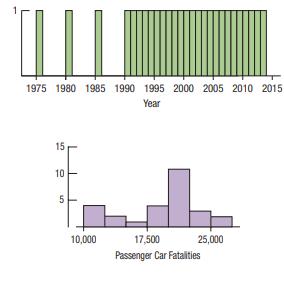
However, the two groups of fatalities have been highlighted, and the corresponding bars in the Year histogram are also highlighted
Traffic fatalities again Here are the same histograms as in Exercise
Traffic fatalities Here are two histograms showing the annual number of traffic fatalities in passenger cars. (Source: National Highway Transportation Safety Association) One plots the years, and the other plots the fatalities. 1975 1980 1985 1990 1995 2000 2005 2010 2015 Year 15 10 5 10,000
Marriage in decline Changing attitudes about marriage and families prompted Pew Research to ask how people felt about particular recent trends. (pewresearch.org/pubs/1802/declinemarriage-rise-new-families) For each trend, participants were asked whether the trend “is a good thing,” “is a bad
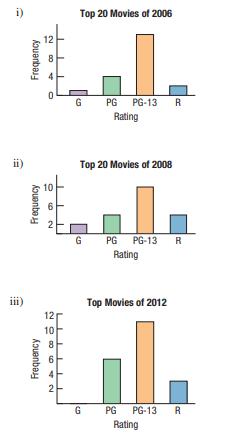
Movie ratings The ratings of the 20 top-grossing movies in the years 2006, 2008, 2012, and 2014 are shown in the following bar charts. The pie charts show the same data but are unlabeled.Match each pie chart with the correct year. (Data extracted from Movies 06-15) ii) Frequency 4 00 2 Frequency
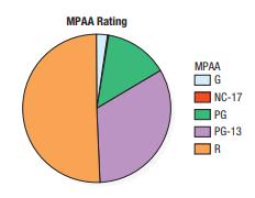
Movie ratings The Motion Picture Association of America(MPAA) rates each film to designate the appropriate audience.The ratings are G, NC-17, PG, PG-13, and R. The pie chart shows the MPAA ratings of 891 movies. MPAA Rating MPAA G NC-17 PG PG-13 R
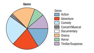
Movie genres The pie chart summarizes the genres of the 1300 movies released between 2006 and 2018. (Data in More Movies)a) Is this an appropriate display for the genres? Why or why not?b) Which category was least common? Genre Genre Action Adventure Comedy Concert/Musical Documentary Drama Horror
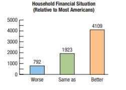
Comparing financial situations. The American adults surveyed in Exercise 1 were also asked to rate their own household financial situations using the same categories. This bar chart shows the breakdown of respondents’ perceived own household financial situation relative to that of most Americans.
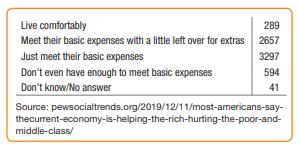
Financial situations of most Americans. In 2019, Pew Research Center conducted a survey of 6878 American adults, asking “How would you describe the financial situation of most Americans?” Participants were asked to choose one of the following options for their response: “live comfortably,”
Indy 500 2020 on the computer Load the Indy 500 2020 data into your preferred statistics package and answer the following questions:a) What was the average speed of the winner in 1920?b) How many times did Bill Vukovich win the race in the 1950s?c) How many races took place during the 1940s?
Showing 3000 - 3100
of 4734
First
24
25
26
27
28
29
30
31
32
33
34
35
36
37
38
Last
Step by Step Answers