New Semester
Started
Get
50% OFF
Study Help!
--h --m --s
Claim Now
Question Answers
Textbooks
Find textbooks, questions and answers
Oops, something went wrong!
Change your search query and then try again
S
Books
FREE
Study Help
Expert Questions
Accounting
General Management
Mathematics
Finance
Organizational Behaviour
Law
Physics
Operating System
Management Leadership
Sociology
Programming
Marketing
Database
Computer Network
Economics
Textbooks Solutions
Accounting
Managerial Accounting
Management Leadership
Cost Accounting
Statistics
Business Law
Corporate Finance
Finance
Economics
Auditing
Tutors
Online Tutors
Find a Tutor
Hire a Tutor
Become a Tutor
AI Tutor
AI Study Planner
NEW
Sell Books
Search
Search
Sign In
Register
study help
business
inferential statistics
Intro Stats 6th Edition Richard D. De Veaux, Paul F. Velleman, David Bock - Solutions
Second stage 2020 Look once more at the data from Tour de France 2020. In Exercise 52, we looked at the whole history of the race, but now let’s consider just the modern era from 1967 ona) Make a scatterplot and find the regression of Avg Speed by Year only for years from 1967 to the present. Are
Inflation 2020 The Consumer Price Index (CPI) tracks the prices of consumer goods in the United States, as shown in the following table. The CPI is reported monthly, but we can look at selected values. The table shows the January CPI at five-year intervals. It indicates, for example, that the
Tour de France 2020 We met the Tour de France dataset in Chapter 1 (in Just Checking). One hundred years ago, the fastest rider finished the course at an average speed of about 25.3 kph (around 15.8 mph). By the 21st century, winning riders were averaging over 40 kph (nearly 25 mph).a) Make a
Fertility and life expectancy 2018 The World Bank reports many demographic statistics about countries of the world.The data file holds the Fertility rate (births per woman) and the female Life expectancy at birth (in years) for nearly 200 countries of the world.
Bridges covered In Chapter 7, we found a relationship between the age of a bridge in Tompkins County, New York, and its condition as found by inspection. (Data in Tompkins County Bridges 2016) But we considered only bridges built or replaced since 1900. Tompkins County is the home of the oldest
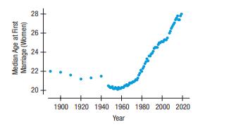
Here is a regression model for the data on women, along with a residuals plot:a) What does the model predict the marriage age will be for women in 2025?b) How much faith do you place in this prediction? Explain.c) Would you use this model to make a prediction about your grandchildren, say, 50 years
Marriage age 2019 predictions Look again at the graph of the age at first marriage for women in Exercise
Another swim In Exercise 46, we saw in the Swim the Lake 2019 data that Vicki Keith’s round-trip swim of Lake Ontario was an obvious outlier among the other one-way times.a) In this new model, the value of se is smaller. Explain what that means in this context.b) Are you more convinced (compared
Elephants and hippos We removed humans from the scatterplot of the Gestation data in Exercise 45 because our species was an outlier in life expectancy. The resulting scatterplot(below) shows two points that now may be of concern. The point in the upper right corner of this scatterplot is for
Swim the lake 2019 People swam across Lake Ontario from Niagara on the Lake to Toronto (52 km, or about 32.3 mi) 65 times between 1954 and 2019. We might be interested in whether the swimmers are getting any faster or slower. Here are the regression of the crossing Times (minutes) against the Year
Gestation For humans, pregnancy lasts about 280 days. In other species of animals, the length of time from conception to birth varies. Is there any evidence that the gestation period is related to the animal’s life span? The first scatterplot shows Gestation Period (in days) vs. Life Expectancy
Marriage age 2019 again Has the trend of decreasing difference in age at first marriage seen in Exercise 42 gotten stronger recently?The scatterplot and residual plot for the data from 1980 through 2019, along with a regression for just those years, are below.a) Is this linear model appropriate for
TBill rates 2020 revisited In Exercise 41, you investigated the federal rate on 3-month Treasury bills between 1950 and 1980.The scatterplot below shows that the trend changed dramatically after 1980, so we computed a new regression model for the years 1981 to 2019.a) How does this model compare to
Marriage age, 2019 The graph shows the ages of both men and women at first marriage (www.census.gov).Clearly, the patterns for men and women are similar. But are the two lines getting closer together?Here are a timeplot showing the difference in average age (men’s age - women’s age) at first
TBill rates 2020 Here are a plot and regression output showing the federal rate on 3-month Treasury bills from 1950 to 1980, and a regression model fit to the relationship between the Rate (in %) and Years Since 1950 (https://fred.stlouisfed.org/series/TB3MS).a) What is the correlation between Rate
Speed How does the speed at which you drive affect your fuel economy? To find out, researchers drove a compact car for 200 miles at speeds ranging from 35 to 75 miles per hour. From their data, they created the model Fuel Efficiency = 32 - 0.1 Speed and created this residual plot:a) Interpret the
Heating After keeping track of his heating expenses for several winters, a homeowner believes he can estimate the monthly cost from the average daily Fahrenheit temperature by using the model Cost = 133 - 2.13 Temp. Here is the residuals plot for his data:
Grades A college admissions officer, defending the college’s use of SAT scores in the admissions process, produced the following graph. It shows the mean GPAs for last year’s freshmen, grouped by SAT scores. How strong is the evidence that SAT Score is a good predictor of GPA? What concerns you
Reading To measure progress in reading ability, students at an elementary school take a reading comprehension test every year. Scores are measured in “grade-level” units; that is, a score of 4.2 means that a student is reading at slightly above the expected level for a fourth grader. The school
What’s the effect? A researcher studying violent behavior in elementary school children asks the children’s parents how much time each child spends playing computer games and has their teachers rate each child on the level of aggressiveness they display while playing with other children.
What’s the cause? Suppose a researcher studying health issues measures blood pressure and the percentage of body fat for several adult males and finds a strong positive association.Describe three different possible cause-and-effect relationships that might be present.
Match each of the red points (a–e) with the slope of the line after that one point is added:
The extra point revisited The original five points in Exercise 33 produce a regression line with slope
Suppose one additional data point is added at one of the five positions suggested below in red. Match each point (a–e)with the correct new correlation from the list given.
The extra point The scatterplot shows five blue data points at the left. Not surprisingly, the correlation for these points is r =
More unusual points Each of the following scatterplots shows a cluster of points and one “stray” point. For each, answer these questions:1) In what way is the point unusual? Does it have high leverage, a large residual, or both?2) Do you think that point is an influential point?3) If that point
Unusual points Each of these four scatterplots shows a cluster of points and one “stray” point. For each, answer these questions:1) In what way is the point unusual? Does it have high leverage, a large residual, or both?2) Do you think that point is an influential point?3) If that point were
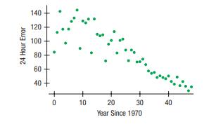
Tracking hurricanes 2018 In Chapter 6, we saw data on the errors (in nautical miles) made by the National Hurricane Center in predicting the path of hurricanes. The scatterplot below shows the trend in the 24-hour tracking errors from 1970 to 2018 (www.nhc.noaa.gov).a) Interpret the slope and
Oakland passengers 2016 The scatterplot below shows the number of passengers at Oakland (CA) airport month by month since 1997 (oaklandairport.com/news/statistics/passenger-history/).a) Describe the patterns in passengers at Oakland airport that you see in this time plot.b) Until 2009, analysts got
Smoking 2018, all adults In Exercise 22, we examined the percentage of adults who smoked from 1944 to 2018 according to the Gallup Poll. The Centers for Disease Control and Prevention (CDC) also collects similar data. Here’s a scatterplot showing the corresponding percentages for both men and
Movie dramas Here’s a scatterplot of the production budgets(in millions of dollars) vs. the running time (in minutes) for major release movies in 2005. Dramas are plotted as red x’s and all other genres are plotted as blue dots. (The re-make of King Kong is plotted as a black “-”. At the
Bad model? A student who has created a linear model is disappointed to find that her R2 value is a very low 13%.a) Does this mean that a linear model is not appropriate?Explain.b) Does this model allow the student to make accurate predictions? Explain.
Good model? In justifying his choice of a model, a student wrote, “I know this is the correct model because R2 = 99.4,.”a) Is this reasoning correct? Explain.b) Does this model allow the student to make accurate predictions? Explain.
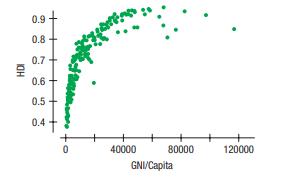
HDI 2018 revisited As explained in Exercise 23, the Human Development Index (HDI) is a measure that attempts to summarize in one number the progress in health, education, and economics of a country. The percentage of older people(65 and older) in a country is positively associated with its HDI. Can
Human Development Index 2018 The United Nations Development Programme (UNDP) uses the Human Development Index (HDI) in an attempt to summarize in one number the progress in health, education, and economics of a country (hdr.undp.org/en/data#). In 2018, the HDI was as high as 0.95 for Norway and as
Smoking 2018 The Gallup Poll has tracked cigarette smoking in the United States since World War II. How has the percentage of people who smoke changed since the health dangers of smoking became clear during the last half of the 20th century?The scatterplot shows percentages of smokers among adults,
Marriage age 2019 Is there evidence that the age at which women get married has changed over the past 100 years? The scatterplot shows the trend in age at first marriage for American women (www.census.gov).a) Is there a clear pattern? Describe the trend.b) Is the association strong?c) Is the
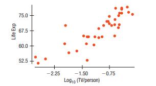
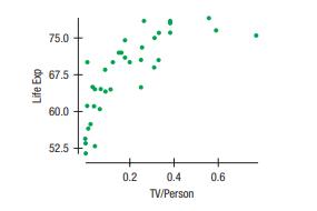
TVs and life expectancy Exercise 18 revisited the relationship between life expectancy and TVs per capita and saw that re-expression to the square root of TVs per capita made the plot more nearly straight. But was that the best choice of re-expression? Here is a scatterplot of life expectancy vs.
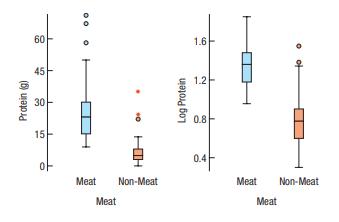
BK protein again Exercise 17 looked at the distribution of protein in the Burger King menu items, comparing meat and non-meat items. That exercise offered the logarithm as a re-expression of Protein. Here are two other alternatives, the square root and the reciprocal. Would you still prefer the
TVs and life expectancy Recall the example of life expectancy vs. TVs per person in the chapter. In that example, we use the square root of TVs per person. Here are the original data and the re-expressed version. Which of the goals of re-expression does this illustrate? (Data in Doctors and life
Here are boxplots of protein content comparing items that contain meat with those that do not. The plot on the right graphs log(Protein). Which of the goals of re-expression does this illustrate? (Data in Burger King menu items) Protein (g) 60 45 30 15 00 . 0 Meat Non-Meat Meat Log Protein 1.6-
BK protein Recall the data about the Burger King menu items in Chapter
More residuals Suppose you have fit a linear model to some data and now take a look at the residuals. For each of the following possible residuals plots, tell whether you would try a re-expression and, if so, why
Residuals Suppose you have fit a linear model to some data and now take a look at the residuals. For each of the following possible residuals plots, tell whether you would try a re-expression and, if so, why
Improving GPA Officials at a high school excitedly report that the correlation between time (represented by Year) and the average GPA across all students is 0.9, potentially showing that increased investments in the school’s infrastructure are working. Explain why this might overstate the
Grading A team of Calculus teachers is analyzing student scores on a final exam compared to the midterm scores. One teacher proposes that they already have every teacher’s class averages and they should just work with those averages.Explain why this is problematic.
Cell phones and life expectancy The correlation between cell phone usage and life expectancy is very high. Should we buy cell phones to help people live longer?
Skinned knees There is a strong correlation between the temperature and the number of skinned knees on playgrounds. Does this tell us that warm weather causes children to trip?
Abalone again The researcher in Exercise 9 is content with the second regression. But he has found a number of shells that have large residuals and is considering removing all of them. Is this good practice?
Abalone Abalones are edible sea snails that include over 100 species. A researcher is working with a model that uses the number of rings in an Abalone’s shell to predict its age.He finds an observation that he believes has been miscalculated. After deleting this outlier, he redoes the
Revenue and advanced sales The production company of Exercise 7 offers advanced sales to “Frequent Buyers” through its website. Here’s a relevant scatterplot:
Revenue and large venues A regression of Total Revenue on Ticket Sales by the concert production company of Exercises 2 and 4 finds the model Revenue = -14,228 + 36.87 Ticket Sales.a) Management is considering adding a stadium-style venue that would seat 10,000. What does this model predict that
Stopping times Using data from 20 compact cars, a consumer group develops a model that predicts the stopping time for a vehicle by using its weight. You consider using this model to predict the stopping time for your large SUV. Explain why this is not advisable.
Cell phone costs Noting a recent study predicting the increase in cell phone costs, a friend remarks that by the time he’s a grandfather, no one will be able to afford a cell phone. Explain where his thinking went awry.
Revenue and ticket sales The concert production company of Exercise 2 made a second scatterplot, this time relating Total Revenue to Ticket Sales.
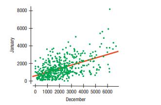
Market segments The analyst in Exercise 1 tried fitting the regression line to each market segment separately and found the following:What does this say about her concern in Exercise 1?Was she justified in worrying that the overall model Jan = $612.07 + 0.403 Dec might not accurately summarize the
Revenue and talent cost A concert production company examined its records. The manager made the following scatterplot. The company places concerts in two venues, a smaller, more intimate theater (plotted with blue circles)and a larger auditorium-style venue (red x’s).a) Describe the relationship
Credit card spending An analysis of spending by a sample of credit card bank cardholders shows that spending by cardholders in January (Jan) is related to their spending in December (Dec): The assumptions and conditions of the linear regression seemed to be satisfied and an analyst was about to
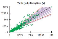
Receivers 2019 The data file Receivers 2019 holds information about the 488 NFL players who caught at least one pass during the 2019 football season. A typical 53-man roster has about 13 players who would be expected to catch passes (primarily wide receivers, tight ends, and running backs). We’ll
Fuel economy 2016 revisited Exercise 41 of Chapter 6 looked at a sample of 35 vehicles to examine the relationship between gas mileage and engine displacement. The full dataset holds data on 1211 cars. How well did our sample of 35 represent the underlying relationship between displacement and fuel
Least squares Consider the four points (200, 1950),(400, 1650), (600, 1800), and (800, 1600). The least squares line is yn = 1975 - 0.45x. Explain what “least squares” means, using these data as a specific example.
Least squares Consider the four points (10, 10), (20, 50),(40, 20), and (50, 80). The least squares line is yn = 7.0 + 1.1x. Explain what “least squares” means, using these data as a specific example.
Gators Wildlife researchers monitor many wildlife populations by taking aerial photographs. Can they estimate the weights of alligators accurately from the air? Here is a regression analysis of the Weight of alligators (in pounds) and their Length (in inches) based on data collected about captured
Hard water In an investigation of environmental causes of disease, data were collected on the annual mortality rate (deaths per 100,000) for males in 61 large towns in England and Wales.In addition, the water hardness was recorded as the calcium concentration (parts per million, ppm) in the
Are the two jumping events associated? Perform a regression of the long-jump results on the high-jump results.a) What is the regression equation? What does the slope mean?b) What percentage of the variability in long jumps can be accounted for by high-jump performances?c) Do good high jumpers tend
Heptathlon revisited again We saw the data for the women’s 2016 Olympic heptathlon in Exercise
Here are the results from the high jump, 800-meter run, and long jump for the 27 women who successfully completed all three events in the 2016 Olympics:
Women’s heptathlon revisited We discussed the women’s 2016 Olympic heptathlon in Chapter
Body fat again Would a model that uses the person’s Waist size be able to predict the %Body Fat more accurately than one that uses Weight? Using the data in Exercise 71, create and analyze that model.
Body fat It is difficult to determine a person’s body fat percentage accurately without immersing that person in water. Researchers hoping to find ways to make a good estimate immersed 20 male subjects, then measured their waists and recorded their weights shown in the table.a) Create a model to
CO2 levels. The level of carbon dioxide in the atmosphere has been measured monthly since 1958 at the top of Maun Loa in Hawaii. The hope is that measurements in the middle of the Pacific will not be influenced by local traffic or industry. A timeplot of CO2 levels (parts per million) vs.
Climate change 2019 The earth’s climate is getting warmer.Climate scientists attribute the increase to an increase in atmospheric levels of carbon dioxide (CO2), a greenhouse gas. Here is a scatterplot showing the mean annual temperature anomaly(the difference between the mean global temperature
Birthrates 2015 The table shows the number of live births per 1000 population in the United States, starting in 1965. (National Center for Health Statistics, www.cdc.gov/nchs/)a) Make a scatterplot and describe the general trend in Birthrates. (Enter Year as years since 1900: 65, 70, 75, etc.)b)
New York bridges 2016 We saw in this chapter that in Tompkins County, New York, older bridges were in worse condition than newer ones. Tompkins is a rural area. Is this relationship true in New York City as well? Here are data on the Condition (as measured by the state Department of Transportation
Cost of living 2020 Numbeo.com lists the cost of living (COL)for 514 cities around the world. It reports the typical cost of a number of staples. Here is a scatterplot relating the cost of a restaurant meal to the cost of groceries. (Both are m?a) Using this information, describe the association
A second helping of burgers In Exercise 63, you created a model that can estimate the number of Calories in a burger when the Fat content is known.a) Explain why you cannot use that model to estimate the fat content of a burger with 600 calories.b) Using an appropriate model, estimate the fat
Chicken Chicken sandwiches are often advertised as a healthier alternative to beef because many are lower in fat. Tests on 11 brands of fast-food chicken sandwiches produced the following summary statistics and scatterplot from a graphing calculator:a) Do you think a linear model is appropriate in
Burgers revisited In Chapter 6, you examined the association between the amounts of Fat and Calories in fast-food hamburgers. Here are the data:a) Create a scatterplot of Calories vs. Fat.b) Interpret the value of R2 in this context.c) Write the equation of the line of regression.d) Use the
Veggie burger 2014 Burger King introduced a meat-free burger in 2002. The nutrition label for the 2014 BK Veggie burger (no mayo) is shown here:a) Use the regression model created in this chapter, Fat = 8.4 + 0.91 Protein, to predict the fat content of this burger from its protein content given
More used convertibles 2020 Use the advertised prices for used convertibles in Exercise 59 to find a linear model to predict Price from Age.a) Find the equation of the regression model.b) Explain the meaning of the slope.c) Interpret the intercept.d) What might be a fair price for a 10-year old
Drug abuse revisited Chapter 6, Exercise 42 examines results of a survey conducted in the United States and 10 countries of Western Europe to determine the percentage of teenagers who had used marijuana and other drugs. Below is the scatterplot.Summary statistics showed that the mean percent that
Used convertibles 2020 Carfax.com lists used cars available for sale in your area. A search for a convertible turns up the following data:a) Make a scatterplot of Price vs. Age.b) Describe the association of these variables.c) Do you think a linear model is appropriate?d) Computer software finds
Wildfires 2015—sizes We saw in Exercise 57 that the number of fires was nearly constant. But has the damage they cause remained constant as well? Here’s a regression that examines the trend in Acres per Fire (in hundreds of thousands of acres)together with some supporting plots:a) Is the
Wildfires 2015 The National Interagency Fire Center (www.nifc.gov) reports statistics about wildfires. Here’s an analysis of the number of wildfires between 1985 and 2015.a) Is a linear model appropriate for these data? Explain.b) Interpret the slope in this context.c) Can we interpret the
Success, part 2 Based on the statistics for college freshmen given in Exercise 54, what SAT score would you predict for a freshman who attained a first-semester GPA of 3.0?
SAT, take 2 Suppose we wanted to use SAT math scores to estimate verbal scores based on the information in Exercise 53.a) What is the correlation?b) Write the equation of the line of regression predicting verbal scores from math scores.c) In general, what would a positive residual mean in this
Success in college Colleges use SAT scores in the admissions process because they believe these scores provide some insight into how a high school student will perform at the college level.Suppose the entering freshmen at a certain college have mean combined SAT Scores of 1222, with a standard
SAT scores The SAT is a test often used as part of an application to college. SAT scores are between 200 and 800, but have no units.Tests are given in both Math and Verbal areas. SAT-Math problems require the ability to read and understand the questions, but can a person’s verbal score be used to
Online clothes II For the online clothing retailer discussed in the previous problem, the scatterplot of Total Yearly Purchases by Income looks like this:a) What is the linear regression equation for predicting Total Yearly Purchase from Income?b) Do the assumptions and conditions for regression
Online clothes An online clothing retailer keeps track of its customers’ purchases. For those customers who signed up for the company’s credit card, the company also has information on the customer’s Age and Income. A random sample of 500 of these customers shows the following scatterplot of
Interest rates and mortgages 2020 again In Chapter 6, Exercise 40, we saw a plot of mortgages in the United States(in trillions of dollars) vs. the interest rate at various times over the past 25 years. The correlation is r = -0.867. The mean mortgage amount is $8.846 T and the mean interest rate
Income and housing revisited In Chapter 6, Exercise 39, we learned that the Office of Federal Housing Enterprise Oversight(OFHEO) collects data on various aspects of housing costs around the United States. Here’s a scatterplot (by state) of the HOUSING COST INDEX (HCI) vs. the Median Family
Attendance 2019, last inning Refer again to the regression analysis for home average attendance and games won by baseball teams, seen in Exercise 44.a) Write the equation of the regression line.b) Estimate the Home Average Attendance for a team with 750 Runs.c) Interpret the meaning of the slope of
Last cigarette Take another look at the regression analysis of tar and nicotine content of the cigarettes in Exercise 43.a) Write the equation of the regression line.b) Estimate the Nicotine content of cigarettes with 4 milligrams of Tar.c) Interpret the meaning of the slope of the regression line
Attendance 2019, revisited Consider again the regression of Home Average Attendance on Runs for the baseball teams examined in Exercise 44.a) What is the correlation between Runs and Home Average Attendance?b) What would you predict about the Home Average Attendance for a team that is 2 standard
Another cigarette Consider again the regression of Nicotine content on Tar (both in milligrams) for the cigarettes examined in Exercise 43.a) What is the correlation between Tar and Nicotine?b) What would you predict about the average Nicotine content of cigarettes that are 2 standard deviations
Attendance 2019, revisited In Chapter 6, Exercise 45 looked at the relationship between the number of runs scored by American League baseball teams and the average attendance at their home games for the 2019 season. Here are the scatterplot, the residuals plot, and part of the regression analysis
Cigarettes Is the nicotine content of a cigarette related to the“tar”? A collection of data (in milligrams) on 816 cigarettes produced the scatterplot, residuals plot, and regression analysis shown:a) Do you think a linear model is appropriate here? Explain.b) Explain the meaning of R2 in this
Last ride Consider the roller coasters (with the outlier removed) described in Exercise 30 again. The regression analysis gives the model Duration = 87.22 + 0.389 Drop.a) Explain what the slope of the line says about how long a roller coaster ride may last and the height of the coaster.b) A new
NYC water again The regression model of Daily Water Consumption on Year for the New York water data of Exercise 29 is water consumed per capita = 5715.90 - 2.78 Year.a) Explain what the slope says about water consumption during these years.b) What would you predict for the water consumption in
Showing 2600 - 2700
of 4734
First
20
21
22
23
24
25
26
27
28
29
30
31
32
33
34
Last
Step by Step Answers