New Semester
Started
Get
50% OFF
Study Help!
--h --m --s
Claim Now
Question Answers
Textbooks
Find textbooks, questions and answers
Oops, something went wrong!
Change your search query and then try again
S
Books
FREE
Study Help
Expert Questions
Accounting
General Management
Mathematics
Finance
Organizational Behaviour
Law
Physics
Operating System
Management Leadership
Sociology
Programming
Marketing
Database
Computer Network
Economics
Textbooks Solutions
Accounting
Managerial Accounting
Management Leadership
Cost Accounting
Statistics
Business Law
Corporate Finance
Finance
Economics
Auditing
Tutors
Online Tutors
Find a Tutor
Hire a Tutor
Become a Tutor
AI Tutor
AI Study Planner
NEW
Sell Books
Search
Search
Sign In
Register
study help
business
statistics econometrics
Essentials Of Statistics For The Behavioral Sciences 4th Edition Susan A. Nolan, Thomas Heinzen - Solutions
Hypotheses and the school psychologist career survey: Continuing with the study described in Exercise 5.34, once the researcher had randomly selected the sample of 100 Canadian psychologists, she decided to randomly assign 50 of them to receive, as part of their survey materials, a
Random selection and a school psychologist career survey: The Canadian government reported that there are 7550 psychologists working in Canada (2013). A researcher wants to randomly select 100 of the Canadian psychologists for a survey study regarding aspects of their jobs. Use this excerpt from a
Random numbers and PINs: How random is your personal identification number or PIN? Your PIN is one of the most important safeguards for the accounts that hold your money and valuable information about you. The BBC reported that, when choosing a four-digit PIN, “people drift towards a small subset
Coincidence and the lottery: “Woman wins millions from Texas lottery for 4th time” read the headline about Joan Ginther’s amazing luck (Baird, 2010). Two of the tickets were from the same store, whose owner, Bob Solis, said, “This is a very lucky store.” Citing concepts from the chapter,
Indicate whether each of the following statements refers to personal probability or to expected relative-frequency probability. Explain your answers.
Convert the following percentages to proportions:1. 62.7%2. 0.3%3. 4.2%
Convert the following proportions to percentages:
Airport security makes random checks of passenger bags every day. If 1 in every 10 passengers is checked, use the random numbers table in Exercise 5.20 to determine the first 6 people to be checked. Work from top to bottom, starting in the fourth column (the fourth digit from the left in the top
If 7 out of every 280 people in prison are innocent, what is the rate of Type I errors?
A university lowers the heat during the winter to save money, and professors wonder whether students will perform more poorly, on average, under cold conditions.
State the difference that might be expected, based on the null hypothesis, between the average test grades of students who attend review sessions versus those who do not.
At the end of a study, what does it mean to reject the null hypothesis?
Calculate the probability for each of the following instances.
For each of the following scenarios, state whether, from a practical standpoint, random selection could have been used. Explain your answer, including in it a description of the population to which the researcher likely wants to generalize. Then state whether random assignment could have been used,
Use the excerpt from Table 5-1 to randomly assign these six people to one of two experimental conditions, numbered 0 and 1. This time, start at the top of the first column (with a 0 on top) and go down. When you get to the bottom of that column, start at the top of the second column (with a 4 on
Use the excerpt from the random numbers table (Table 5-1) on page 109 to select 6 people out of a sample of 80. Start by assigning each person a number from 01 to 80. Then select 6 of these people by starting in the fourth row and going across. List the numbers of the 6 people who were selected.
What are the risks of sampling?
Central tendency and outliers for data on traffic deaths: Below are estimated numbers of annual road traffic deaths for 12 countries based on data from the World Health Organization (http://apps.who.int/gho/data/view.main.51310):
Descriptive statistics and basketball wins: Here are the numbers of wins for the 30 National Basketball Association teams in the 2012–2013 season.60 44 39 29 23 57 50 43 37 27 49 42 37 29 19 56 51 40 33 26 48 42 31 25 18 53 44 40 29 23
Range, world records, and a long chain of friendship bracelets:Guinness World Records reported that, as part of an anti-bullying campaign, elementary school students in Pennsylvania created a chain of friendship bracelets that was a world-record 2678 feet long
Standard deviation and a texting intervention for parents of preschoolers: Researchers investigated READY4K, a program in which parents received text messages over an 8-month period (York & Loeb, 2014).The goal of the text messages was to help parents prepare their preschool-aged children for
Median ages and technology companies: In an article titled“Technology Workers Are Young (Really Young),” the New York Times reported median ages for a number of companies (Hardy, 2013). The reporter wrote: “The seven companies with the youngest workers, ranked from youngest to highest in
Mean versus median for age at first marriage: The mean age at first marriage was 31.1 for men and 29.1 for women in Canada in 2008(http://www4.hrsdc.gc.ca/.3ndic.1t.4r@-eng.jsp?iid=78). The median age at first marriage was 28.9 for men and 26.9 for women in the United States in
Teaching assistants, race, and standard deviations: Researchers reported that the race of the teaching assistants (TAs) for a class had an effect on student outcome (Lusher, Campbell, & Carrell, 2015). They reported that “Asian students receive a 2.3% of a standard deviation increase in course
Central tendency and outliers from growth-chart data: When the average height or average weight of children is plotted to create growth charts, do you think it would be appropriate to use the mean for these data? There are often outliers for height, but why might we not have to be concerned with
Outliers, H&M, and designer collaborations: The relatively low-cost Swedish fashion retailer H&M occasionally partners with high-end designers.For example, they collaborated with the designer Martin Margiela, and his line quickly sold out. If H&M were to report the average number of sales per item
Outliers, Hurricane Sandy, and a rat infestation: In a New York Times article, reporter Cara Buckley described the influx of rats inland from the New York City shoreline following the flooding caused by Hurricane Sandy (2013).Buckley interviewed pest-control expert Timothy Wong, who noted that rat
Shapes of distributions, chemistry grades, and first-generation college students: David Laude was a chemistry professor at the University of Texas at Austin (and a former underprepared college student) who developed an intervention that led underprepared students to perform at the same average
Central tendency and the shapes of distributions: Consider the many possible distributions of grades on a quiz in a statistics class; imagine that the grades could range from 0 to 100. For each of the following situations, give a hypothetical mean and median (that is, make up a mean and a median
Statistics versus parameters: For each of the following situations, state whether the mean would be a statistic or a parameter. Explain your answer.1. According to Canadian census data, the median family income in British Columbia was $66,970, lower than the national average of $69,860.2. The
Descriptive statistics for data from the National Survey of Student Engagement: Every year, the National Survey of Student Engagement (NSSE) asks U.S. university students how many 20-page papers they had been assigned. Here are the percentages, for 1 year, of students who said they had been
Range of data for Canadian TV ratings: Numeris (formerly BBM Canada) collects Canadian television ratings data (http://en.numeris.ca/). The following are the average number of viewers per minute (in thousands) for the top 30 English-language shows for 1 week. The NHL playoffs are listed at 1198,
Descriptive statistics in the media: When there is an ad on TV for a body-shaping product (e.g., an abdominal muscle machine), often a person with a wonderful success story is featured in the ad. The statement “Individual results may vary” hints at what kind of data the advertisement may be
Descriptive statistics in the media: Find an advertisement for an antiaging product either online or in the print media—the more unbelievable the claims, the better!
Mean versus median in “real life”: Briefly describe a real-life situation in which the median is preferable to the mean. Give hypothetical numbers for the mean and median in your explanation. Be original! (Don’t use home prices or another example from the chapter.)
Measures of central tendency for measures of baseball performance:Here are winning percentages for 11 baseball players for their best 4-year pitching performances:
Outliers, central tendency, and data on wind gusts: There appears to be an outlier in the data for peak wind gust recorded on top of Mount Washington (see the data in Exercise 4.19). Where do you see an outlier and how does excluding this data point affect the different calculations of central
Measures of central tendency for weather data: The “normal” weather data from the Mount Washington Observatory are broken down by month.Why might you not want to average across all months in a year? How else could you summarize the year?
Mean versus median for depression scores: A depression research unit recently assessed seven participants chosen at random from the university population. Is the mean or the median a better indicator of the central tendency of these seven participants? Explain your answer.
Mean versus median for temperature data: For the data in Exercise 4.19, the “normal” daily maximum and minimum temperatures recorded at the Mount Washington Observatory are presented for each month. These are likely to be measures of central tendency for each month over time. Explain why these
Mean versus median for salary data: In Exercises 4.17 and 4.18, we saw how the mean and median changed when an outlier was included in the computations. If you were reporting the “average” salary at a company, how might the mean and median give different impressions to potential applicants?
21.6 40.6 51.2 50.5 69.4 42.4 68.3 8.5 12.4 18.0 30.4 31.4 51.3 47.5 49.4 54.6 63.5 7.7 12.8 18.8 25.5 28.0 33.4 38.3 25.0 49.4 56.7 7.0 10.1 24.3 23.0 32.7 46.0 52.4 31.6 44.7 62.8 16.3 18.0 16.4 33.3 40.0 35.5 67.6 43.2 57.9 63.3 9.7 18.4 26.7 39.9 34.6 39.6 46.6 34.5 47.3 61.1 7.1 16.5 18.1 21.9
Here are recent U.S. News & World Report data on acceptance rates at the top 70 national universities. These are the percentages of accepted students out of all students who applied.6.3 14.0
Why is the interquartile range you calculated for the previous exercise so much smaller than the range you calculated in Exercise 4.19?
Using the data presented in Exercise 4.19, calculate the interquartile range for peak wind gust.
Calculate the range and the interquartile range for the following set of data. Explain why they are so different.83 99 103 65 66 77 55 82 93 93 108 543 72 109 115 85 92 74 101 98 84
The Mount Washington Observatory (MWO) in New Hampshire claims to have the world’s worst weather. Below are some data on the weather extremes recorded at the MWO.
Use the following salary data for this exercise:$44,751 $38,862$52,000 $51,380$41,500 $61,774 1. Calculate the mean, the median, and the mode.2. Add another salary, $97,582. Calculate the mean, median, and mode again. How does this new salary affect the calculations?3. Calculate the range,
121.2 125.8 120.2 123.8 120.5 119.8 126.3 123.6 3. 0.100 0.866 0.781 0.555 0.222 0.245 0.234
Developing research questions from graphs: Graphs not only answer research questions, but can spur new ones. Figure 3-8 on page 56 depicts the pattern of changing attitudes, as expressed through Twitter.
Type of graph describing the effect of romantic songs on ratings of attractiveness: Guéguen, Jacob, and Lamy (2010) wondered if listening to romantic songs would affect the dating behavior of the French heterosexual women who participated in their study. The women were randomly assigned to listen
Multivariable graphs and shipwrecks: The cliché “women and children first” originated in part because of the Titanic captain’s famous directive as his ship was sinking. Yet, the cliché is not grounded in reality. See the following multivariable graph.
Comparing word clouds and subjective well-being: Social science researchers are increasingly using word clouds to convey their results. A research team from the Netherlands asked 66 older adults to generate a list of what they perceive to be important to their well-being (Douma, Steverink, Hutter,
Critiquing a graph about gun deaths: In this chapter, we learned about graphs that include statistical lies and graphs designed to be unclear. Think about the problems in the graph shown here.
Interpreting a graph about traffic flow: Go to http://maps.google.com/.On a map of your country, select “Traffic” from the drop-down menu in the upper left corner.
Thinking critically about a graph about international students:Researchers surveyed Canadian students on their perceptions of the globalization of their campuses (Lambert & Usher, 2013). The 13,000 participants were domestic undergraduate and graduate students—that is, they were not recently from
Thinking critically about a graph of the frequency of psychology degrees: The American Psychological Association (APA) compiles many statistics about training and careers in the field of psychology. The accompanying graph tracks the number of bachelor’s, master’s, and doctoral degrees conferred
Interpreting a graph about two kinds of career regrets: The Yerkes–Dodson graph demonstrates that graphs can be used to describe theoretical relations that can be tested. In a study that could be applied to the career decisions made during college, Gilovich and Medvec (1995) identified two types
Graphs in the popular media: Find an article in the popular media(newspaper, magazine, Web site) that includes a graph in addition to the text.
Creating the perfect graph: What advice would you give to the creators of each of the following graphs? Consider the basic guidelines for a clear graph, for avoiding chartjunk, and regarding the ways to mislead through statistics. Give three pieces of advice for each graph. Be specific—don’t
Types of graph appropriate for behavioral science research: Give an example of a study—real or hypothetical—in the behavioral sciences for which the researchers could use each type of graph. State the independent variable(s) and dependent variable, including levels for any nominal variables.
Multivariable graphs and college rankings by academics and sexiness: Buzzfeed.com published a multivariable graph that purported to rank colleges by academics and “hotness.” The data from this graph are represented here.
Software defaults of graphing programs and perceptions of health care advice: For this exercise, use the data in the pie chart from the Fitbit report in the previous exercise.
Bar graph versus pie chart and perceptions of health care advice:The company that makes Fitbit, the wristband that tracks exercise and sleep, commissioned a report that included the pie chart shown here (2013).
Bar graph versus time series plot of graduate school mentoring:Johnson, Koch, Fallow, and Huwe (2000) conducted a study of mentoring in two types of psychology doctoral programs: experimental and clinical.Students who graduated from the two types of programs were asked whether they had a faculty
Bar graph versus Pareto chart of countries’ gross domestic product:In How It Works 3.2, we created a bar graph for the 2012 GDP, in U.S. dollars per capita, for each of the G8 nations. In How It Works 3.3, we created a Pareto chart for these same data.
Bar graph of acceptance rates for different types of psychology doctoral programs: The American Psychological Association gathered data from almost 1000 psychology doctoral programs (2015). (Note: If a school offered four different psychology doctorates, each would be counted separately.) The table
Time series plot of organ donations: The Canadian Institute for Health Information (CIHI) is a nonprofit organization that compiles data from a range of institutions—from governmental organizations to hospitals to universities.Among the many topics that interest public health specialists is the
Scatterplot of gross domestic product and education levels: The Group of Eight (G8) consists of many of the major world economic powers. It meets annually to discuss pressing world problems. In 2013, for example, the G8 met in the United Kingdom with an agenda that included international security.
Scatterplot of daily cycling distances and type of climb: Every summer, the touring company America by Bicycle conducts the “Cross Country Challenge,” a 7-week bicycle journey across the United States from San Francisco, California, to Portsmouth, New Hampshire. At some point during the trip,
Type of graph for comparative suicide rates: The World Health Organization tracks suicide rates by gender across countries. For example, in 2011, the rate of suicide per 100,000 men was 17.3 in Canada, 17.7 in the United States, 44.6 in Sri Lanka, 53.9 in the Russian Federation, 1.4 in South
Type of graph for the effects of cognitive-behavioral therapy on depression: A social worker tracked the depression levels of clients being treated with cognitive-behavioral therapy for depression. For each client, depression was assessed at weeks 1 to 20 of therapy. She calculated a mean for all
Graphing the relation between international researchers and the impact of research: Does research from international teams make a bigger splash? Researchers explored whether research conducted by multinational research teams had a bigger impact than research from teams with less international
The scatterplot in How It Works 3.1 depicts the relation between fertility and life expectancy. Each dot represents a country.
The following figure presents the enrollment of graduate students at a university, across six fall terms, as a percentage of the total student population.
You are exploring the relation between gender and video game performance, as measured by final scores on a game.
represents data testing the hypothesis that exposure to the sun can impair IQ. Further imagine that the researcher has recruited groups of people and randomly assigned them to different levels of exposure to the sun: 0, 1, 6, and 12 hours per day(enhanced, in all cases, by artificial sunlight when
Imagine that the graph in Figure
Decisions about which kind of graph to use depend largely on how variables are measured. Imagine a researcher is interested in how “quality of sleep” is related to statistics exam grade (measured by the number of errors made). For each of the measures of sleep below, decide which kind of graph
What is chartjunk?
What type of visual display of data allows us to calculate or evaluate how a variable changes over time?
How are scatterplots and line graphs similar?
Which of the two following graphs is misleading? Which seems to be a more accurate depiction of the data? Explain your answer.
Referring to Figure 3-4, the inaccurate values lie, calculate how many more nurses there were in 2011–2012 than in 2010–2011. Explain why this is an example of a graphing lie.
What is the purpose of a graph?
Frequencies, distributions, and graduate advising: In a study of mentoring in chemistry fields, a team of chemists and social scientists identified the most successful U.S. mentors—professors whose students were hired by the top 50 chemistry departments in the United States (Kuck et al., 2007).
Developing research ideas from frequency distributions: Below are frequency distributions for two sets of the friends data described in Exercise 2.44, one for the students and one for the faculty members studied.
Frequencies, distributions, and breast-feeding duration: The Centers for Disease Control and other organizations are interested in the health benefits of breast-feeding for infants. The National Immunization Survey includes questions about breast-feeding practices, including: “How long was[your
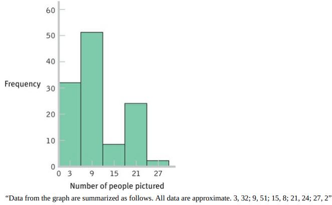
Frequencies, distributions, and numbers of friends: A college student is interested in how many friends the average person has. She decides to count the number of people who appear in photographs on display in dorm rooms and offices across campus. She collects data on 84 students and 33 faculty
Use the NBA data from Exercise 2.36 to create a stem-and-leaf plot. For each score, use the first digit for the stem and the second digit for the leaf.
Use the NBL data in Exercise 2.36(d) to create a stem-and-leaf plot. For each score, use the first digit for the stem and the second digit for the leaf. For values under 10, use 0 as the stem and single digit for the leaf.
Skew and movie ratings: IMDb (Internet Movie Database) publishes average ratings of movies worldwide. Anyone can log on and rate a film.What’s the worst-rated film of the more than 235,000 that are listed on IMDb?The Bollywood action-romance Gunday, which earned a rating of 1.4 on a scale of
Skew and surname frequencies: Researchers published a summary of the frequency of surnames based on U.S. Census data (Word, Coleman, Nunziata, & Kominski, 2008). The table lists the frequencies of last names in the left column, the number of last names with that level of frequency in the next
Number of televisions and a grouped frequency distribution: The Canadian Radio-television and Communications Commission(http://www.crtc.gc.ca/eng/publications/reports/radio/srg.htm) gathers data on the numbers of television sets in Canadian homes. Two percent of homes had no television; 28% had one
Type of frequency distribution and type of graph: For each of the types of data described below, first state how you would present individual data values or grouped data when creating a frequency distribution. Then, state which visual display(s) of data would be most appropriate to use. Explain
Types of distributions: Consider these three variables: finishing times in a marathon, number of university dining hall meals eaten in a semester on a three-meal-a-day plan, and scores on a scale of extroversion.
Frequency tables, histograms, and basketball wins: Here are the number of wins for the 30 U.S. National Basketball Association (NBA) teams for the 2012–2013 NBA season.
Frequency tables, histograms, polygons, and life expectancy rates:The United Nations Development Programme (2015b) recently published life expectancy rates—the number of years an adult can expect to live—for 195 countries around the world. Below is a randomly selected sample of 30 of them for
Frequency tables, histograms, and the Survey of Earned Doctorates:The Survey of Earned Doctorates regularly assesses the numbers and types of doctorates awarded at U.S. universities. It also provides data on the length of time in years that it takes to complete a doctorate. Each data point is the
Frequency tables, histograms, and the National Survey of Student Engagement: The National Survey of Student Engagement (NSSE) surveys freshmen and seniors about their level of engagement in campus and classroom activities that enhance learning. Hundreds of thousands of students at almost 1000
Showing 2800 - 2900
of 7357
First
22
23
24
25
26
27
28
29
30
31
32
33
34
35
36
Last
Step by Step Answers