

Question: Figure 1 shows a scatterplot of the acidity (pH) for a sample of n=53 Florida lakes vs the average mercury level (ppm) found in fish
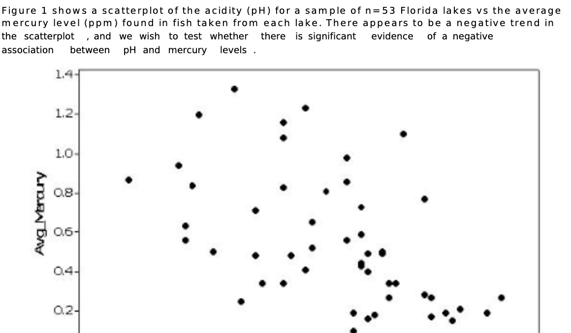

Figure 1 shows a scatterplot of the acidity (pH) for a sample of n=53 Florida lakes vs the average mercury level (ppm) found in fish taken from each lake. There appears to be a negative trend in the scatterplot .and we wish to test whether there is signicant evidence of a negative association between pH and mercury levels. 1.4 1.2 1.0 0.3 06 0.4 02
Step by Step Solution
There are 3 Steps involved in it
1 Expert Approved Answer
Step: 1 Unlock

Question Has Been Solved by an Expert!
Get step-by-step solutions from verified subject matter experts
Step: 2 Unlock
Step: 3 Unlock