New Semester
Started
Get
50% OFF
Study Help!
--h --m --s
Claim Now
Question Answers
Textbooks
Find textbooks, questions and answers
Oops, something went wrong!
Change your search query and then try again
S
Books
FREE
Study Help
Expert Questions
Accounting
General Management
Mathematics
Finance
Organizational Behaviour
Law
Physics
Operating System
Management Leadership
Sociology
Programming
Marketing
Database
Computer Network
Economics
Textbooks Solutions
Accounting
Managerial Accounting
Management Leadership
Cost Accounting
Statistics
Business Law
Corporate Finance
Finance
Economics
Auditing
Tutors
Online Tutors
Find a Tutor
Hire a Tutor
Become a Tutor
AI Tutor
AI Study Planner
NEW
Sell Books
Search
Search
Sign In
Register
study help
business
business statistics communicating
Essential Statistics Exploring The World Through Data 2nd Global Edition Robert Gould, Colleen N. Ryan, Rebecca Wong - Solutions
5.7 Magistrate’s Court District Judges Cases of a particular district are assigned to district judges (Magistrate’s Court) randomly.The list of the district judges for Western District (UK) (taken from the Courts and Tribunals Judiciary website, www.judiciary.gov.uk), is given in the table.
5.6 Empirical vs. Theoretical A magician claims that he has a fair coin—“fair” because both sides, heads and tails, are equally likely to land face up when the coin is flipped. He tells you that if you flip the coin three times, the probability of getting three tails is 1>8. Is this an
5.5 Empirical vs. Theoretical A friend flips a coin 10 times and says that the probability of getting a head is 60% because he got six heads. Is the friend referring to an empirical probability or a theoretical probability? Explain.
5.4 Empirical vs. Theoretical A person was trying to understand the probability of drawing a black card from a fair deck of cards. He drew a card 20 times, and in these 20 times, a black card was drawn 12 times. On the basis of this, he claims that the probability of drawing a black card from a
5.3 Empirical vs. Theoretical A Monopoly player claims that the probability of getting a 4 when rolling a six-sided die is 1/6 because the die is equally likely to land on any of the six sides. Is this an example of an empirical probability or a theoretical probability?Explain.
5.2 Simulation Suppose you are carrying out a randomized experiment to test whether loud music interferes with memorizing numbers. You have 20 college student participants. You want each participant to have a 50% chance of being assigned to the experimental group (memorizes numbers while music
5.1 Simulation (Example 1) If we flip a coin 10 times, how often do we get 6 or more heads? A first step to answering this question would be to simulate 10 flips. Use the random number table in Appendix A to simulate flipping a coin 10 times. Let odd digits (1, 3, 5, 7, 9) represent heads, and let
4.102 Test Scores Suppose that students who scored much lower than the mean on their first statistics test were given special tutoring in the subject. Suppose that they tended to show some improvement on the next test. Explain what might cause the rise in grades other than the tutoring program
4.101 Decrease in Cholesterol A doctor is studying cholesterol readings in his patients. After reviewing the cholesterol readings, he calls the patients with the highest cholesterol readings (the top 5% of readings in his office) and asks them to come back to discuss cholesterol-lowering methods.
4.100 Blackjack Tips The figure shows the amount of money won by people playing blackjack and the amount of tips they gave to the dealer (who was a statistics student), in dollars.Would it make sense to find a correlation for this data set?Explain. 40 40 30- Tips (dollars) 20- 20 10- 0 0 10 20 30
4.99 Children’s Ages and Heights The figure shows information about the ages and heights of several children. Why would it not make sense to find the correlation or to perform linear regression with this data set? Explain. Height (inches) 65 60 55- 50 45 40- 35 30 0 2 4 6 8 10 12 14 16 Age (years)
4.98 Hours of Exercise and Hours of Homework The scatterplot shows the number of hours of exercise per week and the number of hours of homework per week for some students. Explain what it shows. 35 30 25 Homework Hours 20 15 10 50 :. 02 4 6 8 10 12 Exercise Hours T 14
4.97 Do Students Taking More Units Study More Hours? The figure shows the number of units that students were enrolled in and the number of hours (per week) that they reported studying. Do you think there is a positive trend, a negative trend, or no noticeable trend? Explain what this means about
4.96 Wages and Education The figure shows a scatterplot of the wages and educational level of some people. Describe what you see. Explain the trend and mention any unusual points. (Source:www.stat.ucla.edu) Wages (dollars per hour) 70 60 50 40 30 20 10 0 8 10 12 14 16 18 20 Years of Education
4.95 The figure shows a scatterplot of the educational level of twins. Describe the scatterplot. Explain the trend and mention any unusual points. (Source: www.stat.ucla.edu) Education of Other Twin (years) 20 20 18- 16- 14- 12- 10 8 T 0 5 10 15 Education of One Twin (years) 20
4.94 Construct a set of numbers (with at least three points) with a strong positive correlation. Then add one point (an influential point)that changes the correlation to negative. Report the data and give the correlation of each set.
4.93 Construct a set of numbers (with at least three points) with a strong negative correlation. Then add one point (an influential point) that changes the correlation to positive. Report the data and give the correlation of each set.
4.92 Construct a small set of numbers with at least three points with a perfect negative correlation of -1.00.
4.91 Construct a small set of numbers with at least three points with a perfect positive correlation of 1.00.
4.90 Bar-Passing Rate To become a lawyer, you must pass the bar exam in your state, and law schools often attract students by advertising their bar-passing rate: the percentage of their graduates who pass the bar exam. What qualities make for a good law school?You might think that a low
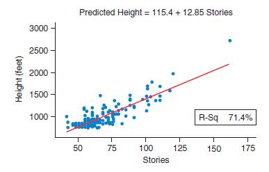
4.89╇ Tall Buildings The scatterplot shows information about the world’s tallest 169 buildings. “Stories” means “Floors.”a. What does the trend tell us about the relationship between stories and height (feet)?b. The regression line for predicting the height (in feet) from the
4.88╇ Gas Mileage of Cars╇ The table gives the number of miles per gallon in the city and on the highway for the coupes and compact cars reported to have the best gasoline mileage, according to autobytel.com. Make a scatterplot, using the city mileage as the predictor. Find the
4.87╇ Film Budgets and Grosses╇ Movie studios exert much effort trying to predict how much money their movies will make.One possible predictor is the amount of money spent on the�production of the movie. The table shows the budget and the amount of money made worldwide for the ten
4.86╇ Salary and Education╇ Does education pay? The salary per year in dollars, the number of years employed (YrsEm), and the number of years of education after high school (Educ) for the employees of a company were recorded. Determine whether number of years employed or number of
4.85╇ Tree Heights╇ Loggers gathered information about some trees. The diameter is in inches, the height is in feet, and the volume of the wood is in cubic feet. Loggers are interested in whether they can estimate the volume of the tree given any single dimension.Which is the better
4.84╇ Age and Happiness╇ Happiness ratings were from 1 (least happy) to 100 (most happy). Data are at the text’s website. Use age as the independent variable. (Source: StatCrunch: Responses to Happiness Survey. Owner: Webster West)a. Make a graph and report whether the trend is
4.83 Prices at Target and Whole Foods The price (in dollars)is given for some foods at Target and at Whole Foods.Assume the price at Target is the predictor. (Source: StatCrunch:organic food price comparison fall 2011. Owner: kerrypaulson)Food Target Whole bananas/1 lb 0.79 0.99 grape tomato 4.49
4.82 Heights and Test Scoresa. The figure shows hypothetical data for a group of children. By looking at the figure, state whether the correlation between height and test score is positive, negative, or near zero.b. The shape and color of the each marker show what grade these children were in at
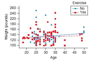
4.81 Age and Weight The scatterplot shows the age and weight for some women. Some of them exercised regularly, and some did not. Explain what it means that the blue line (for those who did not exercise) is a bit steeper than the red line (for those who did exercise).(Source: StatCrunch: 2012
4.80 Age and Sleep The scatterplot shows the age in years and the number of hours of sleep for some college men (M) and women (F).a. How do we interpret the fact that both lines have a negative slope?b. How do we interpret the fact that the slopes are the same for both lines?c. How do we interpret
4.79╇ Shoe Size and Height╇ The scatterplot shows the shoe size and height for some men (M) and women (F).a. Why did we not extend the red line (for the women) all the way to 74 inches, instead stopping at 69 inches?b. How do we interpret the fact that the blue line is above the red
4.78╇ Alcohol and Calories in Beer╇ At the text’s website there is a data set that provides the number of calories per 12 ounces of beer and the percentage alcohol for several different brands of beer.a. Refer to the scatterplot that follows. Is a linear analysis appropriate?Why or
4.77╇ Homes╇ The table shows the asking price (in thousands of dollars) and area (square feet) of 30 homes in a town in Texas.(Source: Yahoo Real Estate, accessed via StatCrunch. Owner:Webster West)Price Sqft 2400 4918 680 3645 570 1900 400 3123 320 2365 280 3361 260 2383 229 3770 215
4.76╇ Heights and Weights of Men╇ The table shows the heights (in inches) and weights (in pounds) of 14 college men. The scatterplot shows that the association is linear enough to proceed.Height (inches)Weight (pounds)Height (inches)Weight (pounds)68 205 70 200 68 168 69 175 74 230 72
4.75 Heights and Weights of People The table shows the heights and weights of some people. The scatterplot shows that the association is linear enough to proceed.Height (inches) Weight (pounds)60 105 66 140 72 185 70 145 63 120a. Calculate the correlation, and find and report the equation of the
4.74 Salaries Assume that data are collected on salaries in two cities (City A and City B). Assume that the association between these salaries is linear. Here are the summary statistics:City A: Mean = $20,000, Standard deviation = $1,500 City B: Mean = 20,000, Standard deviation = $1,500 Also, r =
4.73 Test Scores Assume that in a political science class, the teacher gives a midterm exam and a final exam. Assume that the association between midterm and final scores is linear. The summary statistics have been simplified for clarity.Midterm: Mean = 75, Standard deviation = 10 Final: Mean = 75,
4.72 Heights of Fathers and Sons The table shows some data from a sample of heights of fathers and their sons.The scatterplot (not shown) suggests a linear trend.a. Find and report the regression equation for predicting the son’s height from the father’s height. Then predict the height of a son
4.71╇ Education of Fathers and Mothers╇ The data shown in the table are the numbers of years of formal education of the fathers and mothers of a sample of 29 statistics students at a small community college in an area with many recent immigrants. (The means are both about 8, and the
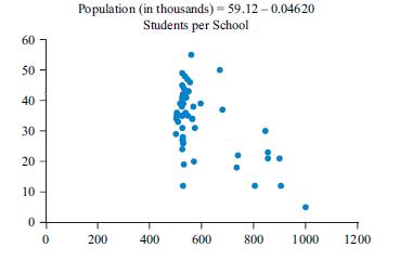
4.70╇ Population and Schools╇ The scatterplot shows the average population of some cities and the number of students per school in those cities. Comment on the appropriateness of the regression.What do you think accounts for the relationship? Do you think you could reduce the
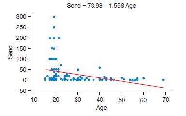
4.69╇ Age and Text Messages╇ The scatterplot shows the relationship between age and number of text messages sent in a day.Comment on the appropriateness of linear regression. (Source:StatCrunch: Responses to survey How often do you text? Owner:Webster West) Send 300 250- 200- 150 100
4.68╇ Attendance and Tests╇ Data were collected that included information on the number of first-grade students in different sections who are present in one week and the number of tests in that week. The figure shows a scatterplot with the regression line.a. Is the trend positive or
4.67 Does Having a Job Affect Students’ Grades?(Example 10) Grades on a political science test and the number of hours of paid work in the week before the test were recorded. The instructor was trying to predict the grade on a test from the hours of work. The figure shows a scatterplot and the
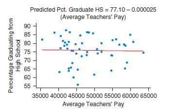
4.66 Teachers’ Pay The figure shows a scatterplot with a regression line for the average teacher’s pay and the percentage of students graduating from high school for each state in 2007, according to The 2009 World Almanac and Book of Facts. On the basis of the graph, do you think the
4.65 Teachers’ Pay and Costs of Education (Example 9)The figure shows a scatterplot with a regression line for teachers’average pay and the expenditure per pupil for each state for public schooling in 2007, according to The 2009 World Almanac and Book of Facts.a. From the graph, is the
4.64 Iraq Casualties and Population of Hometowns The figures show the number of Iraq casualties through October 2009 and the population of some hometowns from which the servicemen or servicewomen came, according to the Los Angeles Times. Comment on the difference in graphs and in the coefficient of
4.63 Cost of Turkeys The table shows the weights and prices of some turkeys at different supermarkets.a. Make a scatterplot with weight on the x-axis and cost on the y-axis.Include the regression line on your scatterplot.b. Find the numerical value for the correlation between weight and
4.62 KMPL: Highway and City The figure shows the relationship between the number of kilometers per liter on the highway and that in the city for some cars.a. Report the slope and explain what it means.b. Either interpret the intercept (0.2289) or explain why it is not appropriate to interpret the
4.61 Salary and Year of Employment (Example 8) The equation for the regression line relating the salary and the year first employed is given above the figure.a. Report the slope and explain what it means.b. Either interpret the intercept (4,255,000) or explain why it is not appropriate to interpret
4.60 Blood Pressure Suppose a doctor telephones those patients who are in the highest 10% with regard to their recently recorded blood pressure and asks them to return for a clinical review. When she retakes their blood pressures, will those new blood pressures, as a group (that is, on average),
4.59 Up the Down Market Dinner Up the Down Market Dinner is a stock market game where, each year, in four cities across Canada, finance heavyweights meet and invest in made-up companies. They pick several individuals with Down syndrome and collectively raise a million dollars in their support.
4.58 Coefficient of Determination Does a correlation of-0.70 or +0.50 give a larger coefficient of determination? We say that the linear relationship that has the larger coefficient of determination is more strongly correlated. Which of the values shows a stronger correlation?
4.57 Coefficient of Determination If the correlation between height and weight of a large group of people is 0.67, find the coefficient of determination (as a percent) and explain what it means.Assume that height is the predictor and weight is the response, and assume that the association between
4.56 Suppose that the growth rate of children looks like a straight line if the height of a child is observed at the ages of 24 months, 28 months, 32 months, and 36 months. If you use the regression obtained from these ages and predict the height of the child at 21 years, you might find that the
4.55 If there is a positive correlation between number of years studying math and shoe size (for children), does that prove that larger shoes cause more studying of math, or vice versa? Can you think of a confounding variable that might be influencing both of the other variables?
4.54 Answer the questions, using complete sentences.a. What is extrapolation and why is it a bad idea in regression analysis?b. How is the coefficient of determination related to the correlation, and what does the coefficient of determination show?c. When testing the IQ of a group of adults (aged
4.53 Answer the questions using complete sentences.a. What is an influential point?b. It has been noted that people who go to church frequently tend to have lower blood pressure than people who don’t go to church. Does this mean you can lower your blood pressure by going to church? Why or why
4.52 Text Messages The table shows the number of text messages sent and received by some people in one day. (Source:StatCrunch: Responses to survey How often do you text? Owner:Webster West. A subset was used.)a. Make a scatterplot of the data, and state the sign of the slope from the scatterplot.
4.51╇ Pitchers╇ The table shows the number of wins and the number of strike-outs (SO) for 40 baseball pitchers in the major leagues in 2011. (Source: 2011 MLB PITCHING STATS, http://www.baseball-reference.com/leagues/MLB/2011-pitching-leaders.shtml, accessed via StatCrunch. Owner:
4.50╇ Semesters and Units╇ The table shows the self-reported number of semesters completed and the number of units completed for 15 students at a community college. All units were counted, but attending summer school was not included as a semester.a. Make a scatterplot with the number
4.49╇ Do Countries with Higher Populations Have More Billionaires?╇ The table gives the number of billionaires and the population (in hundreds of thousands) for various countries in the world in 2015. The number of billionaires comes from Forbes Magazine in July 2015.a. Without doing
4.48 Gender Gap in Universities This problem concerns the increasing gender gap in the UK universities. The Guardian surveyed and collected data on various students pursuing higher studies in different subject areas. Reported in the table are the number of students in various subject areas and the
4.47 How is the time of a flight related to the distance of the flight? The table gives the distance from Boston to each city(in thousands of miles) and gives the time for one randomly chosen, commercial airplane to make that flight. Do a complete regression analysis that includes a scatterplot
4.46 Do Cricketers Tend to Have Longer Careers Than Tennis Players? The figure shows mean length of career versus playing age expectancy (in years) for cricketers and tennis players, until the age of 50. Cricketers are represented by blue diamonds, and tennis players are represented by red
4.45 Athletes’ Age and Speed The figure shows a graph of the running speed and age of a few athletes. The numbers came from various athletic records.a. Explain what the graph tells us about athletes at different ages, and state which ages show the fastest athletes and which show the slowest
4.44 Effect of Fathers Playing Video Games on Children The figure shows a scatterplot with a regression line. The data are for 40 schools. The predictor is the percentage of fathers who play video games. The response is the percentage of those fathers’ offspring who are addicted to video games.a.
4.43 Percentage of Smoke-Free Homes and Percentage of High School Students Who Smoke (Example 7) The figure shows a scatterplot with the regression line. The data are for the 50 states. The predictor is the percentage of smoke-free homes.The response is the percentage of high school students who
4.42 Choosing the Predictor and Response Indicate which variable you think should be the predictor (x) and which variable should be the response (y). Explain your choices.a. Weights of nuggets of gold (in ounces) and their market value over the last few days are provided, and you wish to use this
4.41 Choosing the Predictor and Response (Example 6)Indicate which variable you think should be the predictor (x) and which variable should be the response (y). Explain your choices.a. You collect data on the number of gallons of gas it takes to fill up the tank after driving a certain number of
4.40 Seesaw The figure shows a scatterplot of the height of the left seat of a seesaw and the height of the right seat of the same seesaw. Estimate the numerical value of the correlation, and explain the reason for your estimate. 4 3 2 Left Seat Height (feet) - 0 2 3 4 Right Seat Height (feet) 1
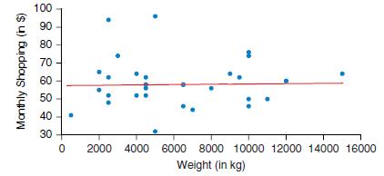
4.39 Monthly Shopping and Weight The figure shows a scatterplot of the monthly shopping (in $) and weights (in kg) of some residents in a locality.a. If a regression line were drawn on this graph, would it have a positive slope, a negative slope, or a slope near 0?b. Give an estimate of the
4.38 Height and Head Circumference for Students and Teachers The scatterplot shows a solid blue line for predicting head circumference from height of teachers; the dotted red line is for predicting head circumference from height of students. The data were collected from a college.a. Which line is
4.37 Comparing Correlation for Height and Weight The correlation between height and weight in a sample of students was found to be r = 0.865. The correlation between height and weight in a sample of teachers was found to be r = 0.912. Assuming both associations are linear, which association—the
4.36 Hand Length and Foot Length for Men Measurements were made for a sample of adult men. Assume that the association between their hand length and foot length is linear. Output for predicting foot length from hand length is provided from several different statistical technologies.a. Report the
4.35 Height and Armspan for Men (Example 5)Measurements were made for a sample of adult men. A regression line was fit to predict the men’s armspan from their height. The output from several different statistical technologies is provided.The scatterplot confirms that the association between
4.34 Hand and Foot Length for Women The computer output shown below is for predicting foot length from hand length (in cm) for a group of women. Assume the trend is linear. Summary statistics for the data are shown in the table below.Mean Standard Deviation Hand, x 17.682 1.168 Foot, y 23.318
4.33 Height and Armspan for Women (Example 4) TI-84 output from a linear model for predicting armspan (in centimeters)from height (in inches) is given in the figure. Summary statistics are also provided.Mean Standard Deviation Height, x 63.59 3.41 Armspan, y 159.86 8.10 To do parts a–c, assume
4.32 Home Prices and Areas of Four Bedroom Homesa. Using the graph, estimate the predicted price for a home with 3000 square feet.b. Use the equation to predict the price for a home with 3000 square feet. Price (thousands of dollars) 700 600 500- 400- 300- 200 100 Predicted Price = -11.77 +0.1146
4.31 Median Annual Score The scatterplot shows the median annual score obtained by students of different schools in the third grade and obtained by the same students when promoted in the seventh grade. The correlation is 0.794. The regression equation is above the graph.a. Find a rough estimate (by
4.30 Mother and Daughter Heights The graph shows the heights of mothers and daughters. (Source: StatCrunch: Mother and Daughter Heights.xls. Owner: craig_slinkman)a. As the data are graphed, which is the independent variable and which the dependent variable?b. From the graph, approximate the
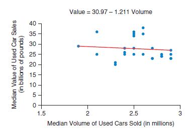
4.29╇ Used Car Market (Example 3)╇ Assume that the scatterplot shows the median volume and median value of used cars over the years in the UK used car market.a. As the data are graphed, which is the independent and which is the dependent variable?b. Why do you suppose median value and
4.28╇ See-Saw╇ The table gives data on the heights (above ground)of the left and right seats of a see-saw (in feet). Assume the trend is linear, calculate the correlation, and explain what it shows.Left Right 4 0 3 1 2 2 1 3 0 4
4.27╇ Video Games and BMI╇ The table gives some hypothetical data for number of hours of video games played in a day and BMI(body mass index) for some young teenagers. Assume that the trend is linear, calculate the correlation, and explain what the sign shows.(Although these are
4.26╇ Cousins╇ Five people were asked how many female first cousins they had and how many male first cousins. The data are shown in the table. Assume the trend is linear, find the correlation, and comment on what it means.Female Male 2 4 1 0 3 2 5 8 2 2
4.25╇ Rate My Hotels╇ Arnold, a destination traveler, went to the website TopTenReviews.com and looked up the reservation process rating and booking help rating of six hotels in a city. The ratings are 1 (worst reservation process) to 10 (best reservation process) and 1
4.24╇ Price and Engine Capacity of Cars ╇ The correlation between the car price (in dollars) and the cubic capacity of the engine (in liters) for some cars is 0.89. If you found the correlation between the car price (by adding flat $1000 toward taxes and duties) and the cubic capacity
4.23╇Work Hours and TV Hours╇ In Exercise 4.9 there was a graph of the relationship between hours of TV and hours of work.Work hours was the predictor and TV hours was the response. If you reversed the variables so that TV hours was the predictor and work hours the response, what
4.22 Distance and Time A car is being driven at an average speed range of 50–70 kmph. The table shows distances between selected cities and the time taken by the car to cover these kilometers.a. Calculate the correlation of the numbers shown in the part a table by using a computer or statistical
4.21 Trash (Example 2) The table shows the number of people living in a house and the weight of trash (in pounds) at the curb just before trash pickup.People Trash (pounds)2 18 3 33 6 93 1 23 7 83a. Find the correlation between these numbers by using a computer or a statistical calculator.b.
4.20 Matching Match each of the following correlations with the corresponding graph.-0.51 _________ 0.98 _________ 0.18 _________ (A) 0.29 0.28- Batting Average 0.27- 0.26- 0.25 0.24 0.23 (B) 0.29 Batting Average 0.28 0.27 0.26 0.25 T 1250 1300 1350 1400 1450 1500 1550 1600 Hits 0.24- 0.23 900 1000
4.19 Matching Match each of the following correlations with the corresponding graph.0.87 _________-0.47 _________ 0.67 _________ (A) 74+ 72- Height (inches) 70 68 66 64 62 60 (B) 260- 240 220 Strike Outs 200 180 160 140 56 7 8 9 10 11 12 Shoe Size 120 100 2.2 2.4 2.6 2.8 3.0 3.2 3.4 3.6 ERA
4.18 Matching Pick the letter of the graph that goes with each numerical value listed below for the correlation. Correlations:-0.903 _________ 0.374 _________ 0.777 _________ (A) co 6 5- Acreage 4 3 2 1 0 1 2 3 4 Full Bath 5 6 7
4.17 Matching Pick the letter of the graph that goes with each numerical value listed below for the correlation. Correlations:0.767 _________ 0.299 _________-0.980 _________ (A) Total Value (thousands of dollars) 500 400 300 200 100 T 500 1000 1500 2000 2500 3000 3500 Acreage 6 4 2 Area (square
4.16 Handspans Refer to the figure.a. Would it make sense to find the correlation with this data set? Why or why not?b. Would the correlation be positive, negative, or near 0? Handspan of Nondominant Hand (cm) 25.0 22.5- 20.0 17.5 15.0 15.0 17.5 20.0 22.5 Handspan of Dominant Hand (cm) T 25.0
4.14 Salary of CEOs and Charities’ Income The figure shows a scatterplot of the salaries of CEOs (in pounds) and income of the charities headed by them. Would it make sense to find the correlation for this data set? Explain. According to this graph, what is the mean range of the income of
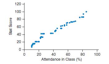
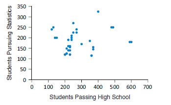
4.13 Statistics Score and B.Stata. The first scatterplot shows scores in statistics and attendance of students majoring in statistics in a college. Would it make sense to find the correlation using this data set? Why or why not?b. The second scatterplot shows the number of students passing high
4.12 Height and Weight for Women The figure shows a scatterplot of the heights and weights of some women taking statistics.Describe what you see. Is the trend positive, negative, or near zero?Explain. Weight (pounds) 260 240 220 200 180 160 140 120 100 . 60 61 62 63 64 65 66 67 68 69 Height (inches)
4.10 Work and Sleep The scatterplot shows the number of hours of work per week and the number of hours of sleep per night for some college students. Does the graph show a strong increasing trend, a strong decreasing trend, or very little trend? Explain.4.11 Age and Sleep The scatterplot shows the
4.9 Work and TV The scatterplot shows the number of work hours and the number of TV hours per week for some college students who work. There is a very slight trend. Is the trend positive or negative? What does the direction of the trend mean in this context?Identify any unusual points. 30 25 20- 15
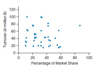
4.8 Market Share and Turnover The scatterplot shows data about the products of 40 corporate houses—the percentage of the market share for three or more products and the median annual turnover (in million $). Describe and interpret the trend. (The outlier is a pharmaceutical company). Tumover (in
Showing 400 - 500
of 6020
1
2
3
4
5
6
7
8
9
10
11
12
13
14
15
Last
Step by Step Answers