New Semester
Started
Get
50% OFF
Study Help!
--h --m --s
Claim Now
Question Answers
Textbooks
Find textbooks, questions and answers
Oops, something went wrong!
Change your search query and then try again
S
Books
FREE
Study Help
Expert Questions
Accounting
General Management
Mathematics
Finance
Organizational Behaviour
Law
Physics
Operating System
Management Leadership
Sociology
Programming
Marketing
Database
Computer Network
Economics
Textbooks Solutions
Accounting
Managerial Accounting
Management Leadership
Cost Accounting
Statistics
Business Law
Corporate Finance
Finance
Economics
Auditing
Tutors
Online Tutors
Find a Tutor
Hire a Tutor
Become a Tutor
AI Tutor
AI Study Planner
NEW
Sell Books
Search
Search
Sign In
Register
study help
business
statistics alive
Introduction To Probability And Statistics 15th Edition William Mendenhall Iii , Robert Beaver , Barbara Beaver - Solutions
1. Under what conditions can the Poisson random variable be used to approximate a probability associated with the binomial random variable?
A manufacturer of power lawn mowers buys 1-horsepower, two-cycle engines in lots of 1000 from a supplier. She then equips each of the mowers produced by her plant with one of the engines. History shows that the probability of any one engine from that supplier being defective is .001. In a shipment
Suppose a life insurance company insures the lives of 5000 men aged 42. If actuarial studies show the probability that any 42-year-old man will die in a given year to be .001, find the exact probability that the company will have to pay x54 claims during a given year.
Refer to Example 5.13, where we calculated probabilities for a Poisson distribution with m 52 and m 54. Use the cumulative Poisson table to find the probabilities of these events:1. No accidents during a 1-week period.2. At most three accidents during a 2-week period.
The average number of traffic accidents on a certain section of highway is two per week.Assume that the number of accidents follows a Poisson distribution with m 52.1. Find the probability of no accidents on this section of highway during a 1-week period.2. Find the probability of at most three
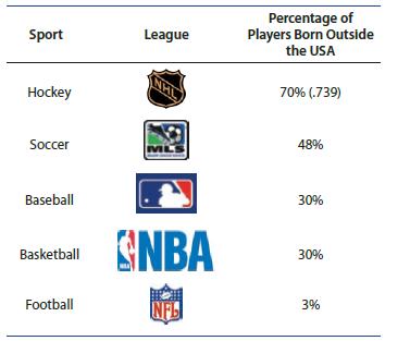
52. O Canada! The National Hockey League (NHL)has about 70% of its players born outside the United States, and of those born outside the United States, approximately 60% were born in Canada.5 Suppose that n512 NHL players are selected at random. Let x be the number of players in the sample born
51. Car Colors Car color preferences change over the years and according to the particular model that the customer selects. In a recent year, suppose that 10% of all luxury cars sold were black. If 25 cars of that year and type are randomly selected, find the following probabilities:a. At least
39. Tossing a Coin A balanced coin is tossed three times. Let x equal the number of heads observed.a. Use the formula for the binomial probability distribution to calculate the probabilities associated with x50, 1, 2, and 3.b. Construct the probability distribution.c. Find the mean and standard
38. SAT Scores In 2017, the average of the revised SAT score (Evidence Based Reading and Writing, and Math)was 1060 out of 1600.3 Suppose that 45% of all high school graduates took this test and that 100 high school graduates are randomly selected from throughout the United States. Which of the
37. Telemarketers A market research firm hires operators to conduct telephone surveys. The computer randomly dials a telephone number, and the operator asks the respondent whether or not he has time to answer some questions. Let x be the number of telephone calls made until the first respondent is
25. If x has a binomial distribution with p5.5, will the shape of the probability distribution be symmetric, skewed to the left, or skewed to the right?
Evaluate the probabilities when n = 8 and p = .2 24. P(x2)
Evaluate the probabilities when n = 8 and p = .2 23. P(x1)
Evaluate the probabilities when n = 8 and p = .2 22. C(.2)(.8)
Evaluate the probabilities when n = 8 and p = .2 21. C*(2)'(.8)
Evaluate the probabilities when n = 8 and p = .2 20. C(2)(.8)*
Evaluate the binomial probabilities 19. C'(.2)'(.8)
Evaluate the binomial probabilities 18. C}(.5)(.5)7
Evaluate the binomial probabilities 17. C(.05)(.95)
26. Use the formula for the binomial probability distribution to calculate the values of p(x) and construct the probability histogram for x when n56 and p5.2.[hint: Calculate P(x5k) for seven different values of k.]
27. Refer to Exercise 26.a. Construct the probability histogram for a binomial random variable x with n56 and p5.8. [hint: Use the results of Exercise 26; do not recalculate all the probabilities.]b. Do you see a relationship between the binomial distributions when n56 for p5.2 and p5.8?What is it?
36. Chicago Weather A meteorologist in Chicago recorded x, the number of days of rain during a 30-day period. explain why x is or is not a binomial random variable. (Hint: compare the characteristics of this experiment with those of a binomial experiment given in this section.) If the experiment is
35. Urn Problem II Two balls are randomly selected with replacement from a jar that contains three red and two white balls. The number x of red balls is recorded. explain why x is or is not a binomial random variable. (Hint: compare the characteristics of this experiment with those of a binomial
34. An Urn Problem Two balls are randomly selected without replacement from a jar that contains three red and two white balls. The number x of red balls is recorded. explain why x is or is not a binomial random variable. (Hint: compare the characteristics of this experiment with those of a binomial
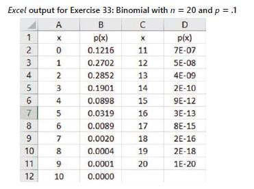
33. Let x be a binomial random variable with n520 and p5.1.a. Calculate P(x#4) using the binomial formula.b. Calculate P(x#4) using Table 1 in Appendix I.c. Use the following Excel output to calculate P(x#4).Compare the results of partsa, b, and c.d. Calculate the mean and standard deviation of the
32. In Exercise 31, the mean and standard deviation for a binomial random variable were calculated for a fixed sample size, n5100, and for different values of p.Graph the values of the standard deviation for the five values of p given in Exercise 31. For what value of p does the standard deviation
31. Find the mean and standard deviation for a binomial distribution with n=100 and these values of p: a. p=.01 d. p=.7 b. p=.9 e. p=.5 c. p=.3.
3. What is the z-score for the x552 observed cases of cancer? How do you interpret this zscore in light of the concern about an elevated rate of hematopoietic cancers in this area? How safe is it to live near a nuclear reactor? Men who lived in a coastal strip that extends 32 kilometers north from
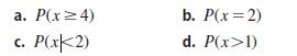
29. Use Table 1 in Appendix I to evaluate the following probabilities for n=6 and p=.8Verify these answers using the values of p(x) calculated in Exercise 27. a. P(x4) c. P(x2) b. P(x=2) d. P(x>1)
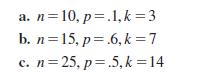
28. Use Table 1 in Appendix I to find the sum of the binomial probabilities from x50 to x5k for these cases: a. n=10, p=.1,k=3 b. n=15, p=.6, k = 7 c. n=25, p=.5, k = 14
Evaluate the binomial probabilities 16. C(.3) (.7)
Are professors at private colleges paid more than professors at public colleges? The data in Table 3.1 were collected from a sample of 400 college professors whose rank, type of college, and salary were recorded.1 The number in each cell is the average salary (in thousands of dollars) for all
Along with the salaries for the 400 college professors in Example 3.1, the researcher recorded two qualitative variables for each professor: rank and type of college. Table 3.2 shows the number of professors in each of the 23356 categories. Use comparative charts to describe the data. Do the
Use side-by-side bar charts to describe the data 1. Twenty measurements on two categories—(A or B)and (X or Y):(A, X), (B, Y), (A, X), (A, Y), (B, X)(B, Y), (A, X), (B, Y), (A, X), (A, Y)(B, X), (B, X), (B, Y), (A, X), (B, X)(B, Y), (B, Y), (A, Y), (B, Y), (B, Y)
Use side-by-side bar charts to describe the data 2. n=242 measurements on two categories—(A, B, or C) and (1, 2, or 3) A B 1 30 2 10 3 5 6220 52 35 10
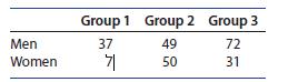
Use side-by-side pie charts to describe the data 3. Gender Differences Male and female respondents to a questionnaire about gender differences are categorized into three groups. Group 1 Group 2 Group 3 49 Men 37 72 Women 7 50 31
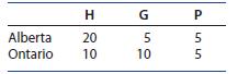
Use side-by-side pie charts to describe the data 4. Which Province? Clothing items are categorized according to the province in which they were produced and whether they were for home (H), garden (G), or personal (P). H G P 5 55 10 10 Alberta 20 Ontario
Use stacked bar charts to describe the data sets in Exercises 3 and 4 (reproduced as Exercises 5). Do the side-by-side pie charts or the stacked bar charts provide a better picture of the data? 5. Group 1 Group 2 Group 3 Men 37 49 72 Women 7 50 31
Use stacked bar charts to describe the data sets in Exercises 3 and 4 (reproduced as Exercises 6). Do the side-by-side pie charts or the stacked bar charts provide a better picture of the data? 6. HG P Alberta 20 5 5 Ontario 10 10 5
Use the data in Exercise 3(reproduced as follows) to create the conditional data distributions . Is there a difference in the distribution of responses for men and women?7. The conditional distribution in each of the groups given that the person was male. Men Group 1 Group 2 Group 3 37 49 72 Women
Use the data in Exercise 3(reproduced as follows) to create the conditional data distributions . Is there a difference in the distribution of responses for men and women?8. The conditional distribution in each of the groups given that the person was female. Men Group 1 Group 2 Group 3 37 49 72
9. Consumer Spending The following table shows the average amounts spent per week by men and women in each of four spending categoriesa. What possible graphs could you use to compare the spending patterns of women and men?b. Choose two different graphs and use them to display the data.c. What can
10. Cell Phones How young is too young to have a cell phone? A group of eighth-grade boys and girls were surveyed and asked if they had a cell phone, with the following results.a. Draw a stacked bar chart to describe the data.b. Draw a side-by-side bar chart to describe the data.c. What can you say
11. M&M’S The color distributions for two snack-size bags of M&M’S® candies, one plain and one peanut, are shown in the table. Choose an appropriate graph and compare the distributions Brown Yellow Red Orange Green Blue Plain 15 14 12 4 5 6 Peanut 6 2 2 3 3 5
12. Free Time? Parents and children have different opinions on their amount of free time. Researchers surveyed 198 parents and 200 children and recorded their responses to the question, “How much free time does your child have?” or “How much free time do you have?” The responses are shown
13. Consumer Price Index The price of living in the United States has increased dramatically in the past decade, as shown by the consumer price indexes (CPIs) for housing and transportation in the table that followsa. Use side-by-side comparative bar charts to describe the CPIs over time.b. Draw
14. How Big Is the Household? A local chamber of commerce surveyed 126 households within its city and recorded the type of residence and the number of family members in each of the households.a. Use a side-by-side bar chart to compare the number of family members living in each of the three types
15. Facebook Stats The social networking site Facebook has grown quickly since it began in 2004. The global growth (average daily users in millions) of the site from 2009 to 2017 is shown herea. Use a side-by-side bar chart to compare the growth in the U.S. and Canada versus Asia.b. Use four line
The number of household members, x, and the amount spent on groceries per week, y, are measured for six households in a local area.5 Draw a scatterplot of these six data points. x 2 3 3 4 1 5 y $384 $421 $465 $546 $207 $621
A distributor of table wines studied the relationship between price and demand using a type of wine that ordinarily sells for $12.00 per bottle. He sold this wine in 10 different marketing areas over a 12-month period, using five different price levels—from $12 to $16. The data are given in Table
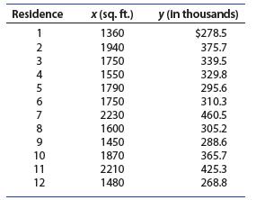
The data in Table 3.5 are the size of the living area (in square feet), x, and the selling price, y, of 12 residential properties. The scatterplot in Figure 3.6 shows a linear pattern in the data. Table 3.5 Living Area and Selling Price of 12 Properties Residence x (sq. ft.) y (in thousands) 1 1360
Find the correlation coefficient for the number of square feet of living area and the selling price of a home for the data in Example 3.5.
Find the best-fitting line relating y5 starting hourly wage to x5 number of years of work experience for the following data. Plot the line and the data points on the same graph. x 2 3 4 5 6 7 y $8.00 9.50 10.00 14.00 15.00 17.50
Graph the straight lines Then find the change in y for a one-unit change in x, find the point at which the line crosses the y-axis, and calculate the value of y when x=2.5. 1. y=2.0+0.5x
Graph the straight lines Then find the change in y for a one-unit change in x, find the point at which the line crosses the y-axis, and calculate the value of y when x=2.5. 2. y=40+36.2x
Graph the straight lines Then find the change in y for a one-unit change in x, find the point at which the line crosses the y-axis, and calculate the value of y when x=2.5. 3. y=5-6x
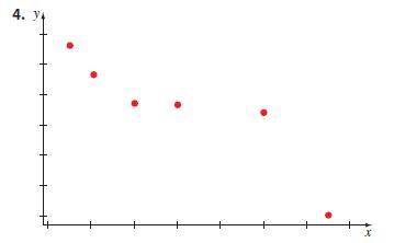
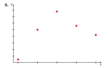
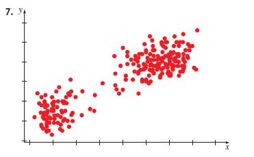
For the scatterplot.describe the pattern that you see. How strong is the pattern?Do you see any outliers or clusters? 4. Y x
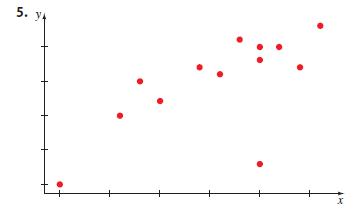
For the scatterplot.describe the pattern that you see. How strong is the pattern?Do you see any outliers or clusters? 5. 14 x
For the scatterplot.describe the pattern that you see. How strong is the pattern?Do you see any outliers or clusters? 6. Y x
For the scatterplot.describe the pattern that you see. How strong is the pattern?Do you see any outliers or clusters? 7. Y x
Use the sets of bivariate data . Calculate the covariance sxy, the correlation coefficient r, and the equation of the regression line. Plot the points and the line on a scatterplot.8. (3, 6) (5, 8) (2, 6) (1, 4) (4, 7) (4, 6)
Use the sets of bivariate data . Calculate the covariance sxy, the correlation coefficient r, and the equation of the regression line. Plot the points and the line on a scatterplot.9. (1, 6) (3, 2) (2, 4)
Use the sets of bivariate data . Calculate the covariance sxy, the correlation coefficient r, and the equation of the regression line. Plot the points and the line on a scatterplot. 10. x 1 2 3 4 5 6 y 5.6 4.6 4.5 3.7 3.2 2.7
Use the data entry method in your scientific calculator to enter the measurements. Recall the proper memories to find the correlation coefficient, r, the y-intercept,a, and the slope,b, of the line. Verify that your calculations in Exercise 8 are correct 11. (3, 6) (5, 8) (2, 6) (1, 4) (4, 7) (4, 6)
Use the data entry method in your scientific calculator to enter the measurements. Recall the proper memories to find the correlation coefficient, r, the y-intercept,a, and the slope,b, of the line. Verify that your calculations in Exercise 9 are correct 12. (1, 6) (3, 2) (2, 4)
Use the data entry method in your scientific calculator to enter the measurements. Recall the proper memories to find the correlation coefficient, r, the y-intercept,a, and the slope,b, of the line. Verify that your calculations in Exercise 10 are correct 13. x 1 2 3 4 5 6 y 5.6 4.6 4.5 3.7 3.2 2.7
Identify which of the two variables is the independent variable x and which is the dependent variable y.14. Number of hours spent studying and grade on a history test.
Identify which of the two variables is the independent variable x and which is the dependent variable y.15. Number of calories burned per day and the number of minutes running on a treadmill.
Identify which of the two variables is the independent variable x and which is the dependent variable y.16. Speed of a wind turbine and the amount of electricity generated by the turbine.
Identify which of the two variables is the independent variable x and which is the dependent variable y.17. Number of ice cream cones sold by Baskin Robbins and the temperature on a given day.
Identify which of the two variables is the independent variable x and which is the dependent variable y.18. Weight of newborn puppies and litter size.
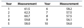
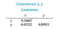
19. Measuring Over Time A quantitative variable is measured once a year for a 10-year period:a. Draw a scatterplot to describe the variable as it changes over time.b. Describe the measurements using the graph constructed in part a.c. Use this MINITAB output to calculate the correlation coefficient,
Determine which variable is the independent variable and which is the dependent variable. Calculate the correlation coefficient r, and the equation of the regression line. Plot the points and the line on a scatterplot. Does the line provide a good description of the data?20. Grocery Costs The
Determine which variable is the independent variable and which is the dependent variable. Calculate the correlation coefficient r, and the equation of the regression line. Plot the points and the line on a scatterplot. Does the line provide a good description of the data?21. Body Mass Index A study
Determine which variable is the independent variable and which is the dependent variable. Calculate the correlation coefficient r, and the equation of the regression line. Plot the points and the line on a scatterplot. Does the line provide a good description of the data?22. Recidivism Recidivism
23. Real Estate Prices The data showing the square feet of living space and the selling price of 12 residential properties from Example 3.5 are reproduced here.a. Find the best-fitting line for these data, and then plot the line and the data points on the same graph.b. How well does the fitted line
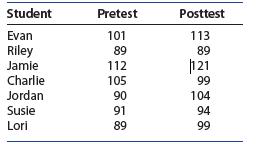
24. Special Needs Students Seven special needs students were studied to determine whether a social skills program caused improvement in pre/post measures and behavior ratings.8 For one such test, these are the pretest and posttest scores for the seven students:a. Draw a scatterplot relating the
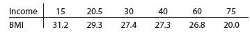
25. Chirping Crickets Male crickets chirp by rubbing their front wings together. They chirp faster with increasing temperature and slower with decreasing temperatures. The following table shows the number of chirps per second for a cricket, recorded at 10 different temperatures.a. Which of the two
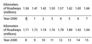
26. Lots of Highways The number of kilometers of U.S. urban roadways (millions of kilometers)for the years 2000–2015 is reported here.9 The years are simplified as years 0 through 15.a. Draw a scatterplot of the number of kilometers of roadways in the United States over time. Describe the pattern
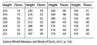
27. Tall Buildings How closely is the height (in meters) of a tall building and the number of floors related? The heights of 28 buildings in downtown Los Angeles and the number of floors for each building followsa. Which of the two variables (height and floors) is the independent variable, and
28. Old Faithful The waiting time between eruptions of the Old Faithful geyser in Yellowstone National Park depends upon the length in time of the last eruption. A representative sample of 10 data pairs for the eruption duration in minutes(x) and the waiting time in minutes till the next
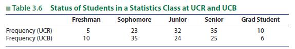
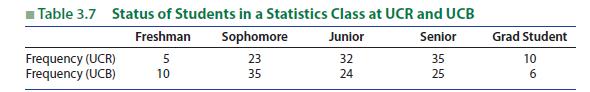
(Comparative Line and Bar Charts) Suppose that the 105 students in Example 1.12 were from the University of California, Riverside, and that another 100 students from an introductory statistics class at UC Berkeley were also interviewed. Table 3.6 shows the status distribution for both sets of
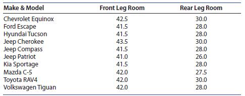
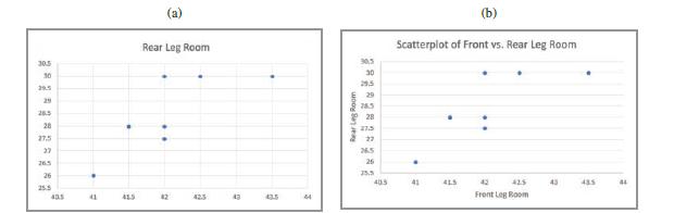
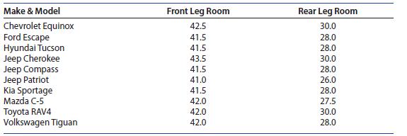
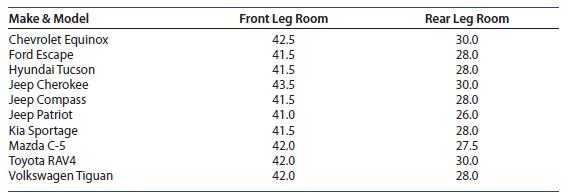
(Scatterplots, Correlation, and the Regression Line) The data from Example 2.17 give the front and rear leg rooms (in inches) for 10 different compact sports utility vehicles1. If you did not save the Excel spreadsheet from Chapter 2, enter the data into the first three columns of another Excel
(Comparative Line and Bar Charts) Suppose that the 105 students in Example 1.12 were from the University of California, Riverside, and that another 100 students from an introductory statistics class at UC Berkeley were also interviewed. Table 3.7 shows the status distribution for both sets of
(Scatterplots, Correlation, and the Regression Line) The data from Example 2.17 give the front and rear leg rooms (in inches) for 10 different compact sports utility vehicles:1. If you did not save the MINITAB worksheet from Chapter 2, enter the data into the first three columns of another MINITAB
(Scatterplots, Correlation, and the Regression Line) The data from Example 2.17 give the front and rear leg rooms (in inches) for 10 different compact sports utility vehicles1. Enter the data from columns 2 and 3 into L1 and L2. The scatterplot is created using 2nd ➤ stat plot, choosing Plot1 and
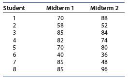
1. Midterm Scores When a student performs poorly on a midterm exam, the student sometimes is convinced they will do much better on the second midterm. The following data show the midterm scores (out of 100 points) for eight students in an introductory statistics class.a. Construct a scatterplot for
2. Midterm Scores, continued Refer to Exercise 1.a. Calculate r, the correlation coefficient between the two midterm scores. Describe the relationship between scores on the first and second midterms.b. Calculate the regression line for predicting a student’s score on the second midterm based on
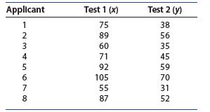
3. Test Interviews Of two personnel evaluation techniques, the first requires a 2-hour test-interview while the second can be completed in less than an hour. The scores for the eight individuals who took both tests are given in the next table.a. Construct a scatterplot for the data.b. Describe the
4. Test Interviews, continued Refer to Exercise 3.a. Find the correlation coefficient, r, to describe the relationship between the two tests.b. Would you be willing to use the second and quicker test rather than the longer test-interview to evaluate personnel? Explain.
5. Professor Asimov Professor Isaac Asimov wrote nearly 500 books during a 40-year career prior to his death. In fact, as his career progressed, he became even more productive in terms of the number of books written within a given period of time.13 These data are the times(in months) required to
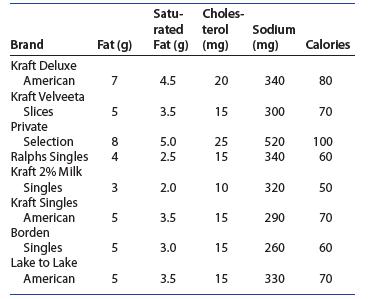
6. Cheese, Please! Do you just love cheese, or are you trying to avoid large amounts of fat, sodium, and cholesterol? The following information was taken from eight different brands of American cheese slices:a. Which pairs of variables do you expect to be strongly related?b. Draw a scatterplot for
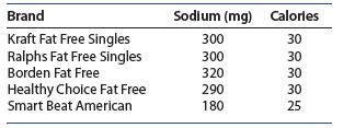
7. Cheese, again! The table shows the numbers of calories and the amounts of sodium (in milligrams)per slice for five different brands of fat-free American cheese.a. Draw a scatterplot to describe the relationship between the amount of sodium and the number of calories. Do you see any outliers? Do
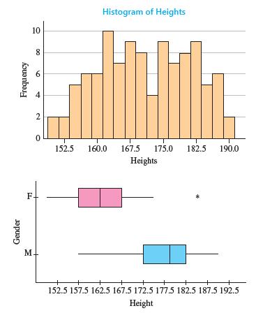
8. Heights and Gender Refer to Exercise 32 in Section 1.4. When the heights of these 105 students were recorded, their gender was also recorded.a. What variables have been measured in this experiment?Are they qualitative or quantitative?b. Look at the histogram and the comparative box plots shown
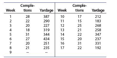
9. Philip Rivers The number of passes completed and the total number of passing yards were recorded for the Los Angeles Chargers quarterback, Philip Rivers, for each of the 16 regular season games that he played in the fall of 2017.a. Draw a scatterplot to describe the relationship between number
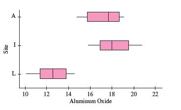
10. Pottery, continued In Exercise 12 (Chapter 1 Review), we analyzed the percentage of aluminum oxide in 26 samples of pottery.15 Since one of the sites only provided two measurements, that site is eliminated, and comparative box plots of aluminum oxide at the other three sites are shown.a. What
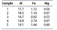
11. Pottery, continued Here is the percentage of aluminum oxide, the percentage of iron oxide, and the percentage of magnesium oxide in five samples collected at one of the four sites.a. Find the correlation coefficients describing the relationships between aluminum and iron oxide content, between
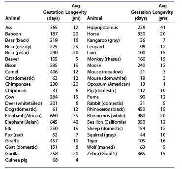
12. Gestation Times and Longevity The following table shows the gestation time in days and the average longevity in years for a variety of mammals in captivity; the potential life span of animals is rarely attained for animals in the wilda. Draw a scatterplot for the data.b. Describe the form,
13. Armspan and Height Leonardo da Vinci(1452–1519) drew a sketch of a man, indicating that a person’s armspan (measuring across the back with arms outstretched to make a “T”) is roughly equal to the person’s height. To test this claim, we measured eight people with the following
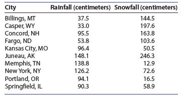
14. Rain and Snow The following table shows the average annual rainfall (centimeters) and the average annual snowfall (centimeters) for 10 cities in the United Statesa. Construct a scatterplot for the data.b. Calculate the correlation coefficient r. Describe the form, direction, and strength of the
Showing 3600 - 3700
of 6613
First
30
31
32
33
34
35
36
37
38
39
40
41
42
43
44
Last
Step by Step Answers