New Semester
Started
Get
50% OFF
Study Help!
--h --m --s
Claim Now
Question Answers
Textbooks
Find textbooks, questions and answers
Oops, something went wrong!
Change your search query and then try again
S
Books
FREE
Study Help
Expert Questions
Accounting
General Management
Mathematics
Finance
Organizational Behaviour
Law
Physics
Operating System
Management Leadership
Sociology
Programming
Marketing
Database
Computer Network
Economics
Textbooks Solutions
Accounting
Managerial Accounting
Management Leadership
Cost Accounting
Statistics
Business Law
Corporate Finance
Finance
Economics
Auditing
Tutors
Online Tutors
Find a Tutor
Hire a Tutor
Become a Tutor
AI Tutor
AI Study Planner
NEW
Sell Books
Search
Search
Sign In
Register
study help
business
data analytics accounting
ISE Data Analytics For Accounting 3rd Edition Ryan A. Teeter, Vernon Richardson, Katie L. Terrell - Solutions
(LO 5-2) Is it possible for a firm to have general journals from a product like JD Edwards actually reconcile to the general ledger in SAP to generate financial reports or drill down to see underlying transactions? Why or why not?
(LO 5-1) Why has most innovation in Data Analytics originated more in an internal audit than an external audit? Or if not, why not?
(LO 5-2) Who is most likely to have a working knowledge of the various enterprise systems that are in use in the company?a. Chief executive officerb. External auditorc. Internal auditord. IT staff
(LO 5-4) When there is no alarm in a continuous audit, but there is an abnormal event, we would call that a:a. false negative.b. true negative.c. true positive.d. false positive.
(LO 5-4) When there is an alarm in a continuous audit, but it is associated with a normal event, we would call that a:a. false negative.b. true negative.c. true positive.d. false positive.
(LO 5-3) All of the following may serve as standards for the audit methodology except:a. PCAOB’s auditing standards.b. COSO’s ERM framework.c. ISACA’s COBIT framework.d. FASB’s accounting standards.
(LO 5-3) Which of the following defines the time period, the level of materiality, and the expected time for an audit?a. Audit scopeb. Potential riskc. Methodologyd. Procedures and specific tasks
(LO 5-2) Which audit data standards ledger identifies data needed for purchase orders, goods received, invoices, payments, and adjustments to accounts?a. Order to Cash Subledgerb. Procure to Pay Subledgerc. Inventory Subledgerd. Base Subledger
(LO 5-2) Which audit data standards ledger defines product master data, location data, inventory on hand data, and inventory movement?a. Order to Cash Subledgerb. Procure to Pay Subledgerc. Inventory Subledgerd. Base Subledger
(LO 5-1) Under the guidance of the chief audit executive (CAE) or another manager, internal auditors build teams to develop and implement analytical techniques to aid all of the following audits except:a. process efficiency and effectiveness.b. governance, risk, and compliance, including internal
PwC uses three systems to automate its audit process. Aura is used to direct the audit by identifying which evidence to collect and analyze, Halo performs Data Analytics on the collected evidence, and Connect provides the workflow process that allows managers and partners to review and sign off on
Continuous audit uses alarms to identify exceptions that might indicate an audit issue and require additional investigation. If there are too many alarms and exceptions based on the parameters of the continuous audit system, will continuous auditing actually help or hurt the overall audit
How does the use of audit data standards facilitate data transfer between auditors and companies? How does it save time for both parties?
Make the case for why an internal audit is increasingly important in the modern audit. Why is it also important for external auditors and the scope of their work?
What types of sensors do businesses use to track activity?
Understand cloud-based collaboration platforms.
Evaluate continuous monitoring techniques and alarms.
Describe the appropriate tasks and approaches to automating procedures.
Understand different approaches to organizing enterprise data and common data models.
Understand how automation has created a data-rich environment where technology helps accountants, auditors, and managers improve the decisions being made.
In this lab we used relatively simple bar charts to perform the analysis. What other visualizations would be interesting to use to explore these data?
Some of the department centuries and decades are not readily easy to understand if we’re not Dillard’s employees. Which attributes would you like to learn more about?
This lab is a starting point for exploring revenue across stores and departments at Dillard’s. What next steps would you take to further explore these data?
Which Department is the best selling in the Big Ticket(Century) > Case Goods (Decade)?
Which Department Century is the worst performing?
Which Department Decade is the best selling in the Shoes Century?
What type of analysis did you perform in Part 1 of this lab (descriptive, diagnostic, predictive, or prescriptive)?
Which Texas city has the most stores?
Which Texas city is the store that has the highest sum of transactions located in?
You would like to compare the average online transaction amount for customers who reside in states that do not have Dillard’s stores with the online transaction amount for customers who reside in states that do have Dillard’s stores. How would you prepare your data to make that comparison?
What insights should Dillard’s draw from the online transactions that occur in states that already have Dillard’s stores in them? What additional exploratory analysis would you perform on these transactions?
Is the average online transaction amount for customers from Texas greater than or less than the average transaction amount for stores located in Texas?
What is the sum of online transactions in Alaska (AK)?
What is the average online transaction amount for customers from Maine?
Texas has the highest sum of transaction amounts, but only the fourth-highest average. What insight can you draw from that difference?
When working with geographic data, it is possible to view the output by a map or by a traditional visualization, such as the bar charts that you created in this lab. What type of insights can you draw more quickly with the map visualization than the bar chart?What type of insights can you draw more
What type of analytics (descriptive, diagnostic, predictive, prescriptive) is represented in these visualizations?
What is the average transaction amount for in-person transactions in Arkansas (AR)?
What is the average transaction amount for Montana(MT)?
Which state has the highest sum of transaction amount?
Which state has the lowest sum of transaction amount?
What other patterns or values stand out in this dashboard?
What are some additional ways you could slice loans that would be useful to lenders as they evaluate collectability of loans?
What might explain the pattern of loans in the second half of the year?
Do borrowers with a high debt-to-equity ratio tend to have larger loans or smaller loans?
Which period has the most nonvolatile volume of loans, January to June or July to December?
Do most of the borrowers own homes, have a mortgage, or rent?
What percentage of loans have a 36-month term?
What other summary values would you find useful in summarizing this loan data on a dashboard?
Why do we show the median values in this dashboard instead of average values?
What type of analytics (descriptive, diagnostic, predictive, or prescriptive) do these data cards represent?
What is the median debt-to-income ratio?
What is the median interest rate?
What is the median loan amount?
What is the total loan amount?
What other ways might you slice sales revenue to help management explore or predict performance?
What other visualizations might you use to explore sales revenue?
If you’re trying to find the top 10 customers, why would dividing the tree map by state make these harder to find?
What type of analytics (descriptive, diagnostic, predictive, prescriptive) is represented in the Sales Revenue Forecast visualization?
What type of analytics (descriptive, diagnostic, predictive, prescriptive) is represented in the Sales Revenue by Customer visualization?
What is the trend in the forecast for sales overall relative to March?
Use the filters to adjust the sales revenue forecast for each product description. Which product has the most uncertain forecast, that is, the widest range of possible values?
How many customers reside in Texas?
Who is the largest customer in Iowa (IA)?
Which additional visualizations might be useful for showing declarative data in this instance?
What are some additional ways you could slice sales volume that would be useful to management as they evaluate performance?
What do you notice about sales revenue and sales volume based on your dashboard?
Click the year 2020 in the Sales Volume By Month table. By how much did Sláinte miss or exceed its sales goal of 10,000 units for the year so far?
Which products sold over 300 units in February 2020?
By how much did Sláinte miss or exceed its overall sales goal of 10,000 units? Hint: Hover over Sales Volume By Target to see specific values.
What is the total sales volume for January 2020?
What other ways might you slice sales revenue to help management understand performance?
What other visualizations might you use to describe sales revenue?
How do size and color make certain data points stand out relative to other data points?
How much total revenue did that state generate overall?
Which state had the highest total revenue overall?
How much total revenue did the top-selling product generate overall?
What is the top-selling product by total revenue overall?
(LO 4-4) Analysis: In your opinion, is the primary reason that analysts use inappropriate scales for their charts due to an error related to naiveté (or ineffective training), or are the inappropriate scales used so the analyst can sway the audience one way or the other?
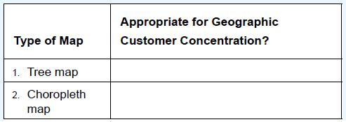
(LO 4-3, LO 4-4) Datavizcatalogue.com lists seven types of maps in its listing of charts. Which one would you use to assess geographic customer concentration by number? Analysis: How could you show if some customers buy more than other customers on such a map? Would you use the same chart or a
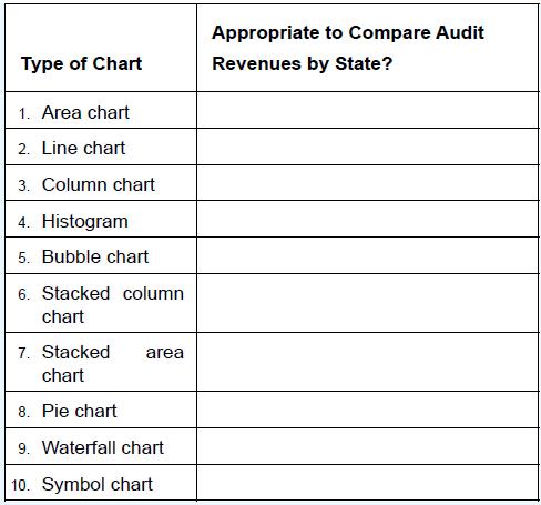
(LO 4-3, LO 4-4) The Big Four accounting firms (Deloitte, EY, KPMG, and PwC)dominate the audit and tax market in the United States. What chart would you use to show which accounting firm dominates in each state in terms of audit revenues? Type of Chart 1. Area chart 2. Line chart 3. Column chart 4.
(LO 4-3) According to Exhibit 4-12 and related chapter discussion, which is the best chart for static composition of a data item of the Accounts Receivable balance at the end of the year? Which is best for showing a change in composition of Accounts Receivable over two or more periods?What is the
(LO 4-3) According to Exhibit 4-12 and related chapter discussion, which is the best chart for comparisons of earnings per share over many periods? How about for only a few periods?What is the best chart category? Conceptual or data-driven?What is the best chart subcategory?What is the best chart
(LO 4-1) Analysis: Evaluate the use of color in the graphic associated with the opening vignette regarding drug overdose deaths across America. Would you consider its use effective or ineffective? Why? How is this more or less effective than communicating the same data in a bar chart?
(LO 4-1) Analysis: Why was the heat map associated with the opening vignette regarding the 1854 cholera epidemic effective? Now that we have more sophisticated tools and methods for visualizing data, what else could have been used to communicate this, and would it have been more or less effective
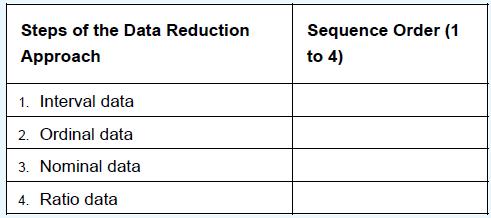
(LO 4-2, LO 4-3) Identify the order sequence from least sophisticated (1) to most sophisticated (4) data type. Steps of the Data Reduction Approach 1. Interval data 2. Ordinal data 3. Nominal data 4. Ratio data Sequence Order (1 to 4)
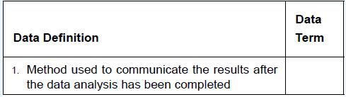
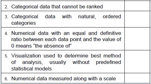
(LO 4-2) Match the definition to one of the following data terms:Declarative visualization Exploratory visualization Interval data Nominal data Ordinal data Ratio data Data Definition 1. Method used to communicate the results after the data analysis has been completed Data Term
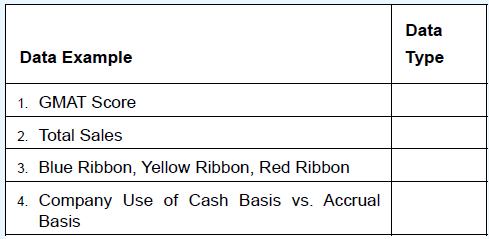
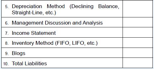
(LO 4-2) Match the data examples to one of the following data types:Interval data Nominal data Ordinal data Ratio data Structured data Unstructured data Data Example 1. GMAT Score 2. Total Sales 3. Blue Ribbon, Yellow Ribbon, Red Ribbon 4. Company Use of Cash Basis vs. Accrual Basis Data Type
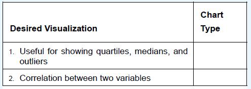
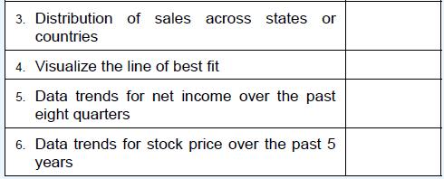
(LO 4-3) Match the desired visualization for quantitative data to the following chart types:Line charts Bar charts Box and whisker plots Scatter plots Filled geographic maps Desired Visualization 1. Useful for showing quartiles, medians, and Chart Type outliers 2. Correlation between two variables
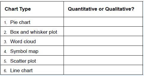
(LO 4-3) Match the chart type to whether it is used primarily to communicate qualitative or quantitative results: Chart Type 1. Pie chart 2. Box and whisker plot 3. Word cloud 4. Symbol map 5. Scatter plot 6. Line chart Quantitative or Qualitative?
(LO 4-3) According to the text and your own experience, why is Tableau ideal for exploratory data analysis?
(LO 4-3) The text mentions, “If your data analysis project is more declarative than exploratory, it is more likely that you will perform your data visualization to communicate results in Excel.” In your opinion, why is this true?
(LO 4-3) What would be the best chart to use to illustrate earnings per share for one company over the past 5 years?
(LO 4-3) Based on the data from datavizcatalogue.com, how does a box and whisker plot show if the data are symmetrical?
(LO 4-3) Based on the data from datavizcatalogue.com, what are some major flaws of using word clouds to communicate the frequency of words in a document?
(LO 4-3) Based on the data from datavizcatalogue.com, a line graph is best at showing trends, relationships, compositions, or distributions?
(LO 4-3) According to Exhibit 4-12, which is the best chart for showing a distribution of a single variable, like height? How about hair color? Major in college?
(LO 4-2) Explain Exhibit 4-4 and why these four dimensions are helpful in describing information to be communicated. Exhibit 4-4 lists conceptual and data driven as being on two ends of the continuum. Does that make sense, or can you think of a better way to organize and differentiate the different
(LO 4-3) What is the most appropriate chart when showing a relationship between two variables (according to Exhibit 4-12)?a. Scatter chartb. Bar chartc. Pie graphd. Histogram
(LO 4-3) Exhibit 4-12 gives chart suggestions for what data you’d like to portray.Those options include all of the following except:a. relationship between variables.b. geographic data.c. outlier detection.d. normal distribution curves.
Showing 600 - 700
of 1576
1
2
3
4
5
6
7
8
9
10
11
12
13
14
15
Last
Step by Step Answers