New Semester
Started
Get
50% OFF
Study Help!
--h --m --s
Claim Now
Question Answers
Textbooks
Find textbooks, questions and answers
Oops, something went wrong!
Change your search query and then try again
S
Books
FREE
Study Help
Expert Questions
Accounting
General Management
Mathematics
Finance
Organizational Behaviour
Law
Physics
Operating System
Management Leadership
Sociology
Programming
Marketing
Database
Computer Network
Economics
Textbooks Solutions
Accounting
Managerial Accounting
Management Leadership
Cost Accounting
Statistics
Business Law
Corporate Finance
Finance
Economics
Auditing
Tutors
Online Tutors
Find a Tutor
Hire a Tutor
Become a Tutor
AI Tutor
AI Study Planner
NEW
Sell Books
Search
Search
Sign In
Register
study help
mathematics
statistics
Statistical Reasoning For Everyday Life 4th Edition Jeff Bennett, Bill Briggs, Mario F. Triola - Solutions
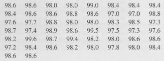
The following data show the body temperatures (°F) of randomly selected subjects. Construct a frequency table with seven classes: 96.9-97.2, 97.3-97.6, 97.7-98.0, and so on.
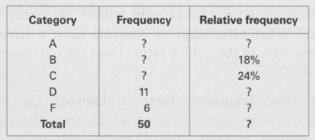
The following table shows grades for a term paper in an English class. The table is incomplete. Use the information given to fill in the missing entries and complete the table.
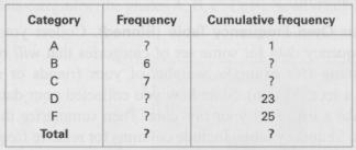
The following table shows grades for performances in a drama class. The table is incomplete. Use the information given to fill in the missing entries and complete the table.
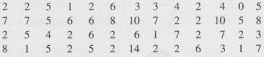
One of the authors drilled a hole in a die, filled it with a lead weight, and then proceeded to roll it. The results are given in the following frequency table.a. According to the data, how many times was the die rolled?b. How many times was the outcome greater than 2?c. What percentage of outcomes
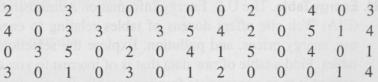
Consider the following frequency table for the number of children in American families.a. According to the data, how many families are there in America?b. How many families have two or fewer children?c. What percentage of American families have no children?d. What percentage of American families
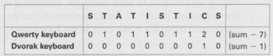
The traditional keyboard configuration is called a Qwerty keyboard because of the positioning of the letters QWERTY on the top row of letters. Developed in 1872, the Qwerty configuration supposedly forced people to type slower so that the early typewriters would not jam. Developed in 1936, the
A frequency table of grades has five classes (A, B, C, D, F) with frequencies of 4, 12, 16, 6, and 2. What are the relative frequencies of the five classes?
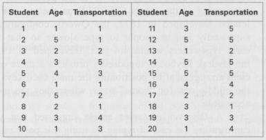
The students in a statistics class conduct a transportation survey of students in their high school. Among other data, they record the age and mode of transportation between home and school for each student. The following table gives some of the data that were collected. For age: 1 = 14years, 2 =
A frequency table of grades has five classes with frequencies of 4, 12, 16, 6, and 2. What are the corresponding cumulative frequencies of the five classes?
For a given data set of IQ scores, if you increase the width of the bins, the number of bins decreases. Decide whether the statement make sense or not? Explain clearly.
Professor Diaz records the following final grades in one of her courses:AAABBBBBBBBBBCCCCCCCCCCCDDFFFFConstruct a frequency table for these grades. Include columns for relative frequency and cumulative frequency.
The political party affiliations of 1000 survey subjects State the type of graphic that you believe would be most appropriate for displaying the data, if they were available. Explain your choice.
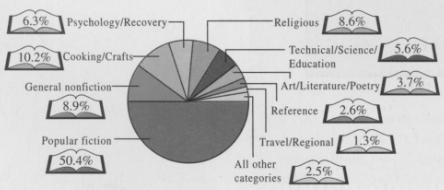
The pie chart in Figure 3.11 shows the results of a survey about what people are reading.a. Summarize these data in a table of relative frequencies.b. Construct a Pareto chart for these data.c. Which do you think is a better representation of the data: the pie chart or the Pareto chart? Why?Figure
The histogram in Figure 3.12 depicts cotinine levels (in milligrams per milliliter) of a sample of subjects who smoke cigarettes. Cotinine is a metabolite of nicotine, which means that cotinine is produced by the body when nicotine is absorbed. The data are from the Third National Health and
Exercise 11 in Section 3.1 required the construction of a frequency table from the weights (in pounds) of 36 cans of regular Coke. Use that frequency table to construct the corresponding histogram.In exercise
Exercise 12 in Section 3.1 required the construction of a frequency table for the weights (in pounds) of 36 cans of Diet Coke. Use that frequency table to construct the corresponding histogram.In exercise
Exercise 13 in Section 3.1 required the construction of a frequency table for the ages of recent Academy Award-winning male actors at the time when they won their award. Use that frequency table to construct the corresponding histogram.In exercise
Exercise 14 in Section 3.1 required the construction of a frequency table for a list of body temperatures (°F) of randomly selected subjects. Use that frequency table to construct the corresponding histogram.In exercise
A survey was conducted to determine how employees found their jobs. The table below lists the successful methods identified by 400 randomly selected employees. The data are based on results from the National Center for Career Strategies. Construct a Pareto chart that corresponds to the given data.
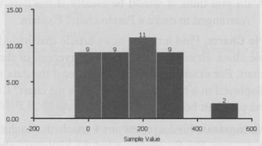
How is a histogram or line chart more helpful than a list of sample values for understanding a data distribution?
Refer to the data given in Exercise 19, and construct a pie chart. Compare the pie chart to the Pareto chart. Can you determine which graph is more effective in showing the relative importance of job sources?Job sources of survey respondents
Chief financial officers of U.S. companies were surveyed about areas in which job applicants make mistakes. Here are the areas and the frequency of responses: interview (452); resume (297); cover letter (141); reference checks (143); interview follow-up (113); screening call (85). These results are
Construct a Pareto chart of the data given in Exercise 21. Compare the Pareto chart to the pie chart. Which graph is more effective in showing the relative importance of the mistakes made by job applicants? In Exercise 21 Interview (452); resume (297); cover letter (141); reference checks (143);
Refer to the QWERTY data in Exercise 19 in Section 3.1 and construct a dotplot. Job sources of survey respondents Frequency Help-wanted ads……………………………….56 Executive search firms…………………………44 Networking…………………………………...280 Mass
Refer to the Dvorak data in Exercise 19 in Section 3.1 and construct a dotplot. Compare the result to the dotplot in Exercise 23. Based on the results, does either keyboard configuration appear to be better? Explain. In exercise 19 Job sources of survey respondents Frequency Help-wanted
The following table shows the numbers of cell phone subscriptions (in thousands) in the United States for various years. Construct a time-series graph of the data. "Linear" growth would result in a graph that is approximately a straight line. Does the time-series graph appear to show linear growth?
The following values are numbers of motor vehicle deaths in the United States for years beginning with 1980. The data are arranged in order by row. Construct a time-series graph and then determine whether there appears to be a trend. If so, provide a possible explanation.
Construct a stemplot of these test scores: 67, 72, 85, 75, 89, 89, 88, 90, 99, 100. How does the stemplot show the distribution of these data?
Listed below are the lengths (in minutes) of animated children€™s movies. Construct a stemplot. Does the stemplot show the distribution of the data? If so, how?
Assume that a data set is used to construct a histogram and a stemplot. Using only the histogram, is it possible to re-create the original list of data values? Using only the stemplot, is it possible to re-create the original list of data values? What is an advantage of a stemplot over a histogram?
I made a histogram to depict frequency counts of answers to the question "What political party do you belong to?" Decide whether the statement make sense or not? Explain clearly.
Incomes of college graduates who took a statistics course State the type of graphic that you believe would be most appropriate for displaying the data, if they were available. Explain your choice.
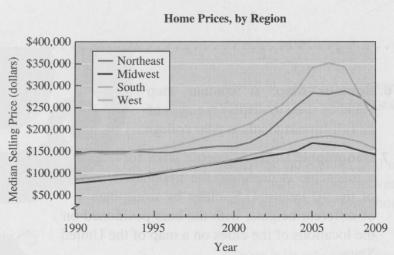
The graph in Figure 3.22 shows home prices in different regions of the United States. Note that the data have not been adjusted for the effects of inflation.a. In words, describe the general trends that apply to the home price data for all regions.b. In words, describe any differences that you
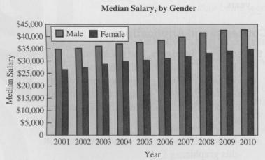
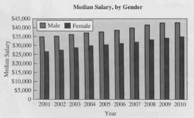
Consider the display in Figure 3.23 of median salaries of males and females in recent years.Figure 3.23a. What story does the graph convey?b. Redraw the graph as a multiple (two) line chart. Briefly discuss the advantages and disadvantages of the two different representations of this particular
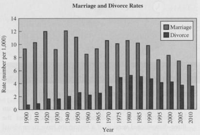
The graph in Figure 3.24 depicts the U.S. marriage and divorce rates for selected years since 1900. The marriage rates are depicted by the blue bars and the divorce rates are depicted by the red bars. Both rates are given in units of marriages/divorces per 1,000 people in the population (Department
The stack plot in Figure 3.25 shows Congressional Budget Office data for actual (through 2011) and projected spending on entitlement programs through 2085 as percentages of the gross domestic product (GDP). Interpret the graph and summarize its message.Figure 3.25
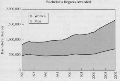
The stacked line chart in Figure 3.26 shows the numbers of bachelor's degrees awarded to men and women since 1970.a. Estimate the numbers of bachelor's degrees awarded to men and to women (separately) in 1970 and in 2010.b. About when were the number of bachelor's degrees equal for males and
Figure 3.27 shows how the mortality rate from melanoma (a form of skin cancer) varies on a county-by-county basis across the United States. The legend shows that the darker the shading in a county, the higher the mortality rate. Discuss a few of the trends revealed in the figure. If you were
One way of measuring segregation is the likelihood that a black student will have classmates who are white. Figure 3.28 shows the probability that a black student would have white classmates, by county, during a recent academic year. Do there appear to be any significant regional differences? Can
The following table lists the numbers of persons killed in fatal car crashes for three different categories of blood alcohol content (BAC) of drivers. The data are from the U.S. Census Bureau.
The following table gives the number of daily newspapers and their total circulation (in millions) for selected years since 1920 (Editor & Publisher).
The following table summarizes deaths due to firearms in different nations in a recent year (Coalition to Stop Gun Violence).
The following table lists labor force participation rates (as percentages) of mothers categorized according to the age of their youngest child (based on data from the Bureau of Labor Statistics).
What is a contour on a contour map? What does it mean when contours are close together? What does it mean when they are far apart?
A graphic artist for a magazine is depicting the populations of the 10 largest U.S. cities by using bi of different heights, with the bars positioned on the locations of the cities on a map of the United States. Decide whether the statement does make sense or not? Explain clearly.
The stack plot in Figure 3.21 shows the numbers of male and female higher education students for different years. Projections are from the U.S. National Center for Education Statistics.a. In words, discuss the trends revealed on this graphic.b. Redraw the graph as a multiple line chart. Briefly
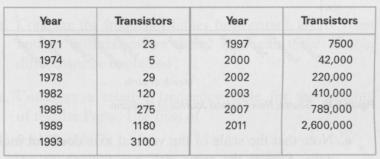
In 1965, Intel cofounder Gordon Moore initiated what has since become known as Moore's law: the number of transistors per square inch on integrated circuits will double approximately every 18 months. In the table below, the first row lists different years and the second row lists the number of
The graph in Figure 3.39 shows the percentage change in the CPI over recent years. In what year (of the years displayed) was the change in the CPI the greatest? What happened in 2009? How do actual prices in 2010 compare to those in 1990? Based on this graph, what can you conclude about changes in
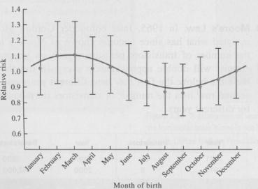
The graph in Figure 3.40 shows data regarding the relative risk of schizophrenia among people born in different months.Figure 3.40a. Note that the scale of the vertical axis does not include zero. Sketch the same risk curve using an axis that includes zero. Comment on the effect of this change.b.
The graph in Figure 3.41 shows the minimum wage in the United States, together with its purchasing power, which is adjusted for inflating with 1996 used as the reference year, The graph represents the years from 1955 to 2011. Summarize what the graph shows.Figure 3.41
When constructing a graph showing the population of the United States and the population of Mexico, an illustrator draws two different people with heights proportional to the populations. Identify a way in which the graph might be misleading? What is the general name for such graphs that use
To show how sugar production doubled from 1990 to now, an illustrator draws two sugar cubes. The first cube is drawn with a length of 1 cm on each side and the second cube is drawn with a length of 2 cm on each side. What are the volumes of the two sugar cubes? Is the illustration misleading? If
Figure 3.35 shows the highway fuel consumption (mi/gal) for the Chevrolet Aveo and the Honda Civic. How is the graph misleading? How could it be drawn so that it is not misleading?Figure 3.35
Figure 3.36 depicts 2010 populations for California, Texas, and New York (based on data from the 2010 Census). How is this graph misleading? How could it be drawn so that it is not misleading?Figure 3.36
Figure 3.37 depicts the amounts of daily oil consumption in the United States and Japan. Does the illustration accurately depict the data? Why or why not?Figure 3.37
Refer to Figure 3.37 used in Exercise 7 and construct a bar chart to depict the same data in a way that is fair and objective.Figure 3.37
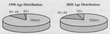
The pie charts in Figure 3.38 give the percentage of Americans in three age categories in 1990 and 2050 (projected).a. Consider the 1990 age distribution. The actual percentages for the three categories for 1990 were 87.5% (others), 11.3% (60-84), and 1.2% (85+). Does the pie chart show these
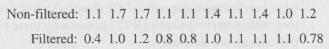
Listed below are the nicotine amounts (in mg per cigarette) for samples of filtered and non-filtered cigarettes. Do filters appear to be effective in reducing the amount of nicotine?a. Find the mean and median for each of the two data sets.b. Find the range and standard deviation for each of the
a. What is the standard deviation for a sample of 50 values, all of which are the same?b. Which of the following two car batteries would you prefer to buy, and why?• One taken from a population with a mean life of 48 months and a standard deviation of 2 months• One taken from a population with
Do the terms "average" and "mean" have the same meaning? Explain.
The average salary of all active professional basketball players. State whether the mean or median would give a better description of the "average." Explain your reasoning.
The average resting pulse rate of 500 randomly selected female statistics students State whether the mean or median would give a better description of the “average”. Explain your reasoning.
Pages from Merriam-Webster's Collegiate Dictionary, l1th edition, were randomly selected. Here are the numbers of words defined on those pages:Find the mean, median and mode of the listed numbers.
Listed below are the durations (in hours) of a sample of all flights of NASA's Space Transport System (space shuttle):Find the mean, median and mode of the listed numbers.
Actual times (in seconds) recorded when statistics students participated in an experiment to test their ability to determine when one minute (60 seconds) had passed:Find the mean, median and mode of the listed numbers.
Body temperatures (in degrees Fahrenheit) of randomly selected normal and healthy adults:Find the mean, median and mode of the listed numbers.
Blood alcohol concentrations of drivers involved in fatal crashes and then given jail sentences (based on data from the U.S. Department of Justice):Find the mean, median and mode of the listed numbers.
Time intervals (in minutes) between eruptions of Old Faithful geyser in Yellowstone National Park:Find the mean, median and mode of the listed numbers.
Weights (in grams) of randomly selected M&M plain candies:Find the mean, median and mode of the listed numbers.
Weights (in grams) of quarters in circulation:Find the mean, median and mode of the listed numbers.
The following table gives the total area in square miles (land and water) of the seven states with namesState
Cans of regular Coca-Cola vary slightly in weight. Here are the measured weights of seven cans, in pounds:a. Find the mean and median of these weights.b. Which, if any, of these weights would you consider to be an outlier? Explain.c. What are the mean and median weights if the outlier is excluded?
Suppose you have scores of 80, 84, 87, and 89 on quizzes in a mathematics class.a. What is the mean of these scores?b. What score would you need on the next quiz to have an overall mean of 88?c. If the maximum score on a quiz is 100, is it possible to have a mean of 90 after the fifth quiz? Explain.
Suppose you have scores of 60, 70, 65, 85, and 85 on exams in a sociology class.a. What is the mean of these scores?b. What score would you need on the next exam to have an overall mean of 75?c. If the maximum score on an exam is 100, what is the maximum mean score that you could possibly have
Suppose that school district officials claim that the average reading score for fourth-graders in the district is 73 (out of a possible 100). As a principal, you know that your fourth-graders had the following scores: 55, 60, 68, 70, 87, 88,95. Would you be justified in claiming that your students
Suppose the National Basketball Association (NBA) reports that the average height of basketball players is 6'8". As a coach, you know that the players on your starting lineup have heights of 6'5", 6'6", 6'6", 7'0", and 7'2". Would you be justified in claiming that your starting lineup has above
A grocer has three baskets of peaches. One holds 50 peaches and weighs 18 pounds, one holds 55 peaches and weighs 22 pounds, and the third holds 60 peaches and weighs 24 pounds. What is the mean weight of all of the peaches combined? Explain.
Each of the 300 students at a high school takes the same four courses. Three of the courses are each taught in 15 classes of 20 students each. The fourth course is taught in 3 classes of 100 students each. Find the mean class size experienced by each student. Find the mean class size in the 48
For the same statistics class described in Exercise 2, is the executive secretary's salary an outlier? Why or why not? In general, is an outlier defined in an exact way so that it can be clearly and objectively identified?
In addition to the batting average, another measure of hitting performance in baseball is called the slug¬ging average. In finding a slugging average, a single is worth 1 point, a double is worth 2 points, a triple is worth 3 points, and a home run is worth 4 points. A player's slugging average is
A small company has four stockholders. One stockholder has 400 shares, a second stockholder has 300 shares, a third stockholder has 200 shares, and the fourth stockholder has 100 shares. In a vote on a new advertising campaign, the first stockholder votes yes, and the other three stockholders vote
One common system for computing a grade point average (GPA) assigns 4 points to an A, 3 points to a B, 2 points to a C, 1 point to a D, and 0 points to an F. What is the GPA of a student who gets an A in a 4-credit course, a B in each of two 3-credit courses, and a C in a 1-credit course?
An experiment was conducted to determine whether a deficiency of carbon dioxide in soil affects the phenotypes of peas. Listed below are the phenotype codes, where 1 = smooth yellow, 2 = smooth green, 3 = wrinkled yellow, and 4 = wrinkled green. Can the measures of center be obtained for these
A data set of incomes has modes of $50,000 and $80,000. Decide whether the statement makes sense (or is clearly true) or does not make sense (or is clearly false). Explain clearly.
A researcher studying an income distribution obtains the same value of $75,000 for the mean, median, and mode. Decide whether the statement makes sense (or is clearly true) or does not make sense (or is clearly false). Explain clearly.
The average height of all active professional basketball players. State whether the mean or median would give a better description of the "average." Explain your reasoning.
The histogram in Figure 4.12 shows the weights (in grams) of 72 pennies. Over the histogram, draw a smooth curve that captures its general features. Then classify the distribution according to its number of modes and its symmetry or skewness. What feature of the graph reflects the fact that 35 of
The daily rainfall amounts (in inches) for Boston in a recent year consist of 365 values with these properties:• The mean daily rainfall amount is 0.083 inch.• The median of the daily rainfall amounts is 0 inches.• The minimum daily rainfall amount is 0 inches and the maximum is 1.48
Consider the IQ scores of professors who teach statistics courses compared with the IQ scores of adults randomly selected from the general population. Which of these two sets of IQ scores has less variation? What effect does the lower variation have on a graph of the distribution of those IQ scores?
How is the range computed for a set of sample data? Is the range a measure of variation? What is a major disadvantage of the range?
Statistics are sometimes used to compare or identify authors of different works. The lengths of the first 20 words in the foreword by Tennessee Williams in Cat on a Hot Tin Roof are listed along with the lengths of the first 20 words in The Cat in the Hat by Dr. Seuss. Does there appear to be a
The trend of thinner Miss America winners has generated charges that the contest encourages unhealthy diet habits among young women. Listed below are body mass indexes (BMI) for Miss America winners from two different time periods. Does there appear to be a difference in variation?BMI (from the
In an analysis of the accuracy of weather forecasts, the actual high temperatures are compared with the high temperatures predicted one day earlier and the high temperatures predicted five days earlier. Listed below are the errors between the predicted temperatures and the actual high temperatures
Researchers at Pennsylvania State University conducted experiments with poplar trees. Listed below are weights (in kilograms) of poplar trees given no treatment and poplar trees treated with fertilizer and irrigation. Does there appear to be a difference between the two standard deviations?Find the
A statistics professor with too much time on his hands weighed each M&M candy in a bag of 465 plain M&M candies. a. One of the M&Ms weighed 0.776 gram and it was heavier than 25 of the other M&Ms. What is the percentile of this particular value? b. One of the M&Ms weighed 0.876 gram and it was
A data set consists of the 85 ages of women at the time that they won an Oscar in the category of best actress. a. One of the actresses was 40 years of age, and she was older than 63 of the other actresses at the time that they won Oscars. What is the percentile of the age of 40? b. One of the
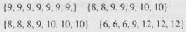
The following four sets of 7 numbers all have a mean of 9.a. Make a histogram for each set.b. Give the five-number summary and draw a boxplot for each set.c. Compute the standard deviation for each set.d. Based on your results, briefly explain how the standard deviation provides a useful
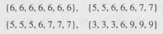
The following four sets of 7 numbers all have a mean of 6.a. Make a histogram for each set.b. Give the five-number summary and draw a boxplot for each set.c. Compute the standard deviation for each set.d. Based on your results, briefly explain how the standard deviation provides a useful
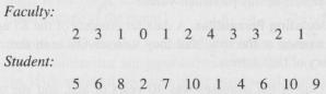
The following data sets give the ages in years of a sample of cars in a faculty parking lot and a student parking lot at the College of Portland.a. Find the mean, median, and range for each of the two data sets.b. Give the five-number summary and draw a boxplot for each of the two data sets.c. Find
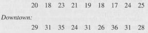
The following data sets give the driving speeds in miles per hour of the first nine cars to pass through a school zone and the first nine cars to pass through a downtown intersection.a. Find the mean, median, and range for each of the two data sets.b. Give the five-number summary and draw a boxplot
Showing 52500 - 52600
of 88243
First
519
520
521
522
523
524
525
526
527
528
529
530
531
532
533
Last
Step by Step Answers
.png)
.png)
.png)
.png)
.png)
.png)
.png)
.png)
.png)
.png)
.png)
.png)
.png)
.png)
.png)
.png)
.png)
.png)
.png)
.png)
.png)
.png)
.png)
.png)
.png)
.png)
.png)
.png)
.png)
.png)
.png)
.png)