New Semester
Started
Get
50% OFF
Study Help!
--h --m --s
Claim Now
Question Answers
Textbooks
Find textbooks, questions and answers
Oops, something went wrong!
Change your search query and then try again
S
Books
FREE
Study Help
Expert Questions
Accounting
General Management
Mathematics
Finance
Organizational Behaviour
Law
Physics
Operating System
Management Leadership
Sociology
Programming
Marketing
Database
Computer Network
Economics
Textbooks Solutions
Accounting
Managerial Accounting
Management Leadership
Cost Accounting
Statistics
Business Law
Corporate Finance
Finance
Economics
Auditing
Tutors
Online Tutors
Find a Tutor
Hire a Tutor
Become a Tutor
AI Tutor
AI Study Planner
NEW
Sell Books
Search
Search
Sign In
Register
study help
business
statistics alive
Introduction To Probability And Statistics 15th Edition William Mendenhall Iii , Robert Beaver , Barbara Beaver - Solutions
Evaluate the combinations 9. C
Evaluate the permutations 8. P.20
Evaluate the permutations 7. P6 6
Evaluate the permutations 10 6. Plo 9
Evaluate the permutations 5. P 3
40. Flextime A survey to determine the availability of flextime schedules in the California workplace provided the following information for 220 firms located in two California cities.A company is selected at random from this pool of 220 companies.a. What is the probability that the company is
37. Fruit Flies In a genetics experiment, the researcher mated two Drosophila fruit flies and observed the traits of 300 offspring. The results are shown in the table.One of these offspring is randomly selected and observed for the two genetic traits.a. What is the probability that the fly has
30. Need Eyeglasses? A large number of adults are classified according to whether they were judged to need eyeglasses for reading and whether they actually used eyeglasses when reading. The proportions falling into the four categories are shown in the table. A single adult is selected from this
29. Preschool or Not? A teacher randomly selects 1 of his 25 kindergarten students and records the student’s gender, as well as whether or not that student had gone to preschool.a. Construct a tree diagram for this experiment. How many simple events are there?b. The table on the next page shows
27. Free Throws A particular basketball player hits 70% of her free throws. When she tosses a pair of free throws, the four possible simple events and three of their probabilities are as given in the table:a. Find the probability that the player will hit on the first throw and miss on the second.b.
A sample space consists of five simple events with P(E1) = P(E2)=.15, P(E3)= .4, and P(E4)=2P(E5). 13. Find the probability of event B = {E, E,}.
A sample space consists of five simple events with P(E1) = P(E2)=.15, P(E3)= .4, and P(E4)=2P(E5). 12. Find the probability of event A = {E,, E, E}.
A sample space contains seven simple events: E1 , E2 , . . . ,E7 . Suppose that E1 , E2 , . . . ,E6 all have the same probability, but E7 is twice as likely as the others.Find the probabilities of the events 9. C = {E, E}
A sample space contains seven simple events: E1 , E2 , . . . ,E7 . Suppose that E1 , E2 , . . . ,E6 all have the same probability, but E7 is twice as likely as the others.Find the probabilities of the events 8. B = {E,, E.,, E., E7}
A sample space contains seven simple events: E1 , E2 , . . . ,E7 . Suppose that E1 , E2 , . . . ,E6 all have the same probability, but E7 is twice as likely as the others.Find the probabilities of the events 7. A = {E, E., E.}
Experiment III A sample space consists of S={E1, E2, E3,E4 }. List the simple events in "both A and B," "A or B or both," and "not B" for the events given 15. A={E} and B={E,E,,E,}
Experiment III A sample space consists of S={E1, E2, E3,E4 }. List the simple events in "both A and B," "A or B or both," and "not B" for the events given 14. A={E,E} and B={E,E,,E}
Experiment III A sample space consists of S={E1, E2, E3,E4 }. List the simple events in "both A and B," "A or B or both," and "not B" for the events given 13. A={E, E} and B={E,E,}
5. How does your blood pressure compare with that of others of your same gender? Check your systolic blood pressure against the appropriate histogram in part 3 or 4 to determine whether your blood pressure is “normal” or whether it is unusually high or low. Blood pressure is the pressure that
4. Consider the 965 men and 945 women as the entire population of interest. Choose a sample of n550 men and n550 women, recording their systolic blood pressures and their ages. Draw two relative frequency histograms to graphically display the systolic blood pressures for your two samples. Do the
3. Construct a relative frequency histogram of the systolic blood pressure data for the 965 men and another for the 945 women. Compare the two histograms. Blood pressure is the pressure that the blood exerts against the walls of the arteries. When physicians or nurses measure your blood pressure,
2. What types of graphs can be used to describe this data set? What types of questions could be answered using different types of graphs? Blood pressure is the pressure that the blood exerts against the walls of the arteries. When physicians or nurses measure your blood pressure, they take two
1. What are the variables that have been measured in this survey? Are the variables quantitative or qualitative? Discrete or continuous? Are the data univariate, bivariate, or multivariate? Blood pressure is the pressure that the blood exerts against the walls of the arteries. When physicians or
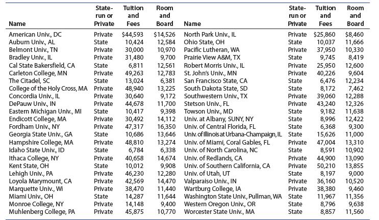
20. How Expensive Is Your College? The data that follows is a sample of 4-year colleges and universities in the United States, along with their costs for tuition and fees and for room and board in 2016.5 How does your college compare?Use any of the graphs presented in this chapter to describe the
19. Old Faithful The following data are the waiting times between eruptions of the Old Faithful geyser in Yellowstone National Park.25 Use a graph to describe the waiting times. If there are any unusual features in your graph, see if you can think of any practical explanation for them. 56 89 51 79
18. Laptops and Learning An informal experiment was conducted at a New Jersey high school to investigate the use of laptop computers as a learning tool for studying algebra.24 A freshman class of 20 students was given laptops to use at school and at home, while another freshman class of 27 students
17. Kentucky Derby The following data set shows the winning times (in seconds) for the Kentucky Derby races from 1950 to 2017.23a. Do you think there will be a trend in the winning times over the years? Draw a line chart to verify your answer.b. Use a graph to describe the distribution of winning
16. Presidential Vetoes Here is a list of the 44 presidents of the United States along with the number of regular vetoes used by eachUse an appropriate graph to describe the number of vetoes cast by the 44 presidents. Write a summary paragraph describing this set of data. Washington J. Adams
15. What’s Normal? The 37.0-degree standard for human body temperature was derived by a German doctor in 1868. To check this claim, Allen Shoemaker22 recorded the body temperatures of 130 healthy people. The relative frequency histogram of these data follows.a. Describe the shape of the
14. Hydroelectric Plants The following data represent the installed capacities in megawatts(millions of watts) for the world’s 15 largest hydroelectric plants.a. Construct a stem and leaf display for the data.b. How would you describe the shape of this distribution? 22,500 10,000 6,300 14,000
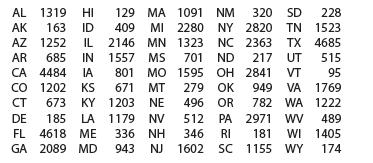
13. Gasoline Tax The following are the 2017 state gasoline tax in cents per gallon for the 50 U.S. states and the District of Columbiaa. Draw a stem and leaf display for the data.b. How would you describe the shape of this distribution?c. Are there states with unusually high or low gasoline taxes?
12. An Archeological Find An article in Archaeometry described 26 samples of Romano-British pottery, found at four different kiln sites in the United Kingdom.20 The percentage of aluminum oxide in each of the 26 samples is shown in the following tablea. Use a relative frequency histogram to
11. Wind Power Wind power is the use of air flow through wind turbines to power generators for electric power. The map that follows shows the net generation from wind (in megawatt hours) by state at the end of 2017a. For the states that have installed wind generating capacity, use a relative
10. Pulse Rates A group of 50 biomedical students recorded their pulse rates by counting the number of beats for 30 seconds and multiplying by 2.a. Why are all of the measurements even numbers?b. Draw a stem and leaf plot to describe the data, splitting each stem into two lines.c. Construct a
9. Election Results, continued Refer to Exercises 7 and 8.The accompanying stem and leaf plots were generated using MINITAB for the variables named “Popular Vote”and “Percent Votea. Describe the shapes of the two distributions. Are there any outliers?b. Do the stem and leaf plots look like
8. Election Results, continued Refer to Exercise 7.Listed here is the percentage of the popular vote received by President Trump in each of the 50 statesa. By just looking at the table, what shape do you think the distribution for the percentage of the popular vote by state will have?b. Draw a
7. Election Results The 2016 election was a race in which Donald Trump defeated Hillary Clinton and other candidates, winning 304 electoral votes, or 57% of the 538 available. However, Trump only won 46.1% of the popular vote, while Clinton won 48.2%.The popular vote (in thousands) for Donald Trump
6. Gulf Oil Spill Cleanup On April 20, 2010, the United States experienced a major environmental disaster when a Deepwater Horizon drilling rig exploded in the Gulf of Mexico. The number of personnel and equipment used in the Gulf oil spill cleanup, beginning May 2, 2010 (Day 13) through June 9,
5. Major World Lakes A lake is a body of water surrounded by land. Hence, some bodies of water named “seas,” like the Caspian Sea, are actually salt lakes. In the table that follows, the length in kilometers is listed for the major natural lakes of the world, excluding the Caspian Sea, which
4. Continuous or Discrete, again Identify each variable as continuous or discrete:a. Number of properties for sale by a real estate agencyb. Depth of a snowfallc. Length of time for a driver to respond when about to have a collisiond. Number of aircraft arriving at the Atlanta airport in a given
3. Continuous or Discrete? Identify each variable as continuous or discrete:a. Length of time between arrivals at a medical clinicb. Time required to finish an examinationc. Weight of two dozen shrimpd. A person’s body temperaturee. Number of people waiting for treatment at a hospital emergency
2. Symmetric or Skewed? Do you expect the distributions of the following variables to be symmetric or skewed? Explain.a. Price of a 250-gram can of peasb. Height in centimeters of freshman women at your universityc. Number of broken taco shells in a package of 100 shellsd. Number of ticks found on
1. Quantitative or Qualitative? Identify each variable as quantitative or qualitative:a. Ethnic origin of a candidate for public officeb. Score (0–100) on a placement examinationc. Fast-food restaurant preferred by a student(McDonald’s, Burger King, or Carl’s Jr.)d. Mercury concentration in a
(Dotplots, Stem and Leaf Plots, Histograms) The top 50 over-the-counter (OTC) stocks in a recent year were found using an equal weighting of 1-year total return and average daily dollar volume growth. These 50 weightings, or averages, are listed in Table 1.19.16 Create a new worksheet (File ➤ New
(Line Charts) The Dow Jones Industrial Average was monitored at the close of trading for 10 days in a recent year with the results shown in Table 1.18.1. Although we could simply enter this data into third and fourth columns of the current worksheet, let’s create a new worksheet using File ➤
33. Starbucks Students at the University of California, Riverside (UCR), along with many other Californians love their Starbucks! The distances in kilometers from campus for the 39 Starbucks stores within 16 kilometers of UCR are shown here15:a. Construct a relative frequency histogram to describe
32. Student Heights The self-reported heights of 105 students in a biostatistics class are described in the relative frequency histogram shown here.a. Describe the shape of the distribution.b. Do you see any unusual feature in this histogram?c. Can you think of an explanation for the two peaks in
31. Windy Cities Are some cities more windy than others? Does Chicago deserve to be nicknamed“The Windy City”? These data are the average wind speeds (in kilometers per hour) for 54 selected cities in the United States5a. Construct a relative frequency histogram for the data. (hint: Choose the
30. Ages of Pennies, continued The data here represent the ages of a different set of 50 pennies, again calculated using AGE 5 =CURRENT YEAR-YEAR ON PENNY.a. Draw a relative frequency histogram to display these penny ages. Is the shape similar to the shape of the relative frequency histogram in
29. Ages of Pennies We collected 50 pennies and recorded their ages, by calculating AGE 5 =CURRENT YEAR-YEAR ON PENNY.a. Before drawing any graphs, what do you think the distribution of penny ages will look like? Will it be moundshaped, symmetric, skewed right, or skewed left?b. Draw a relative
28. Batting Champions The officials of major league baseball have crowned a batting champion in the National League each year since 1876. A sample of winning batting averages is listed in the table14:a. Use a relative frequency histogram to describe the batting averages for these 20 champions.b. If
27. How Long Is the Line? To decide on the number of service counters needed for stores to be built in the future, a supermarket chain gathered information on the length of time (in minutes)required to service customers, using a sample of 60 customers’ service times, shown here:a. Construct a
26. Preschool The ages (in months) at which 50 children were first enrolled in a preschool are listed as followsa. Construct a relative frequency histogram for these data. Start the lower boundary of the first class at 30 and use a class width of 5 months.b. What proportion of the children were 35
25. A Recurring Illness The length of time (in months) between the onset of a particular illness and its recurrence was recorded for n50 patients:a. Construct a relative frequency histogram for the data.b. Would you describe the shape as roughly symmetric, skewed right, or skewed left?c. Find
24. Survival Times Altman and Bland report the survival times for patients with active hepatitis, half treated with prednisone and half receiving no treatment.13 The data that follow are adapted from their data for those treated with prednisone. The survival times are recorded to the nearest
The test scores on a 100-point test were recorded for 20 students. Construct a relative frequency distribution for the data, using 6 classes of width 8, and starting at 52.23. Compare the shape of the histogram to the stem and leaf plot from Exercise 16, Section 1.3. Are the shapes roughly the
The test scores on a 100-point test were recorded for 20 students. Construct a relative frequency distribution for the data, using 6 classes of width 8, and starting at 52.22. Is the shape of the distribution unusual? Can you think of any reason that the scores would have such a shape? 61 93 91 86
The test scores on a 100-point test were recorded for 20 students. Construct a relative frequency distribution for the data, using 6 classes of width 8, and starting at 52.21. Describe the shape and location of the scores. 61 93 91 86 55 63 94 89 67 62 72 87 889 86 82 76 68 65 75 14 57 84
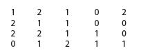
20. Describe the shape of the distribution. Do you see any outliers?Construct a relative frequency histogram for these 20 measurements on a discrete variable that can take only the values 0, 1, and 2. 2007 100 1 1 1 -2 2727 -220
19. If a measurement is selected at random from the 20 measurements shown, what is the probability that it is a 2?Construct a relative frequency histogram for these 20 measurements on a discrete variable that can take only the values 0, 1, and 2. 2007 100 1 1 1 -2 2727 -220
18. What proportion of the measurements are less than 2?Construct a relative frequency histogram for these 20 measurements on a discrete variable that can take only the values 0, 1, and 2. 2007 100 1 1 1 -2 2727 -220
17. What proportion of the measurements are greater than 1?Construct a relative frequency histogram for these 20 measurements on a discrete variable that can take only the values 0, 1, and 2. 2007 100 1 1 1 -2 2727 -220
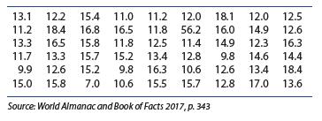
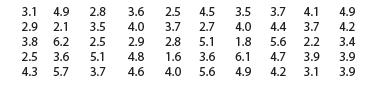
Relative Frequency Histogram I Construct a relative frequency histogram for these 50 measurements using classes starting at 1.6 with a class width of .5.16. What fraction of the measurements are from 2.6 up to but not including 4.6? 3.1 4.9 2.8 3.6 2.5 4.5 3.5 3.7 4.1 4.9 2.9 2.1 3.5 4.0 3.7 2.7
Relative Frequency Histogram I Construct a relative frequency histogram for these 50 measurements using classes starting at 1.6 with a class width of .5.15. What is the probability that a measurement drawn at random from this set will be greater than or equal to 3.6? 3.1 4.9 2.8 3.6 2.5 4.5 3.5 3.7
Relative Frequency Histogram I Construct a relative frequency histogram for these 50 measurements using classes starting at 1.6 with a class width of .5.14. What fraction of the measurements are less than 5.1? 3.1 4.9 2.8 3.6 2.5 4.5 3.5 3.7 4.1 4.9 2.9 2.1 3.5 4.0 3.7 2.7 4.0 4.4 3.7 4.2 3.8 6.2
Relative Frequency Histogram I Construct a relative frequency histogram for these 50 measurements using classes starting at 1.6 with a class width of .5.13. How would you describe the shape of the distribution? 3.1 4.9 2.8 3.6 2.5 4.5 3.5 3.7 4.1 4.9 2.9 2.1 3.5 4.0 3.7 2.7 4.0 4.4 3.7 4.2 3.8 6.2
use the information given to find a convenient class width. Then list the class boundaries that can be used to create a relative frequency histogram. 12. 8 classes for n = 75 measurements; minimum value = 0; maximum value = 192
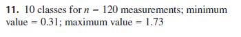
use the information given to find a convenient class width. Then list the class boundaries that can be used to create a relative frequency histogram. 11. 10 classes for n = 120 measurements; minimum value = 0.31; maximum value = 1.73
use the information given to find a convenient class width. Then list the class boundaries that can be used to create a relative frequency histogram. 10. 6 classes for n = 20 measurements; minimum value =25.5; maximum value = 76.8
use the information given to find a convenient class width. Then list the class boundaries that can be used to create a relative frequency histogram. 9. 7 classes for n = 50 measurements; minimum value 10; maximum value = 110 =
Use the relative frequency histogram that follows to calculate the proportion of measurements falling into the intervals given. Remember that the classes include the left boundary point, but not the right.8. At least 31.5 but less than 33.5 Relative Frequency 10 0.1 0.2 20 0.4 0.3 0 30.5 31.0 31.5
Use the relative frequency histogram that follows to calculate the proportion of measurements falling into the intervals given. Remember that the classes include the left boundary point, but not the right.7. at least 34 Relative Frequency 10 0.1 0.2 20 0.4 0.3 0 30.5 31.0 31.5 32.0 32.5 33.0 33.5
Use the relative frequency histogram that follows to calculate the proportion of measurements falling into the intervals given. Remember that the classes include the left boundary point, but not the right.6. Greater than or equal to 33.5 Relative Frequency 10 0.1 0.2 20 0.4 0.3 0 30.5 31.0 31.5
Use the relative frequency histogram that follows to calculate the proportion of measurements falling into the intervals given. Remember that the classes include the left boundary point, but not the right.5. less than 31 Relative Frequency 10 0.1 0.2 20 0.4 0.3 0 30.5 31.0 31.5 32.0 32.5 33.0 33.5
Use the relative frequency histogram that follows to calculate the proportion of measurements falling into the intervals given. Remember that the classes include the left boundary point, but not the right.4. 32 to Relative Frequency 10 0.1 0.2 20 0.4 0.3 0 30.5 31.0 31.5 32.0 32.5 33.0 33.5 34.0
Use the relative frequency histogram that follows to calculate the proportion of measurements falling into the intervals given. Remember that the classes include the left boundary point, but not the right.3. 33 or more Relative Frequency 10 0.1 0.2 20 0.4 0.3 0 30.5 31.0 31.5 32.0 32.5 33.0 33.5
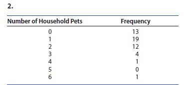
Construct a relative frequency histogram using the statistical table. How would you describe the shape of the distribution? 2. Number of Household Pets 0 1 Frequency 13 23456 19 12 4 1 5 0 1
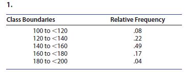
Construct a relative frequency histogram using the statistical table. How would you describe the shape of the distribution? 1. Class Boundaries 100 to
Twenty-five Starbucks® customers are polled in a marketing survey and asked, “How often do you visit Starbucks in a typical week?” Table 1.12 lists the responses for these 25 customers.Use a relative frequency histogram to describe the data. Table 1.12 Number of Visits in a Typical Week for 25
25. American Presidents The following table lists the ages at the time of death for the 38 deceased American presidents from George Washington to Ronald Reagan5:a. Before you graph the data, think about the distribution of the ages at death for the presidents.What shape do you think it will have?b.
24. Top 20 Movies The table that follows shows the weekend gross ticket sales for the top 20 movies for the weekend of August 25–28, 20171a. Draw a stem and leaf plot for the data. Describe the shape of the distribution and look for outliers.b. Draw a dotplot for the data. Which of the two graphs
23. Hazardous Waste How safe is your neighborhood? Are there any hazardous waste sites nearby? The table and the stem and leaf plot show the number of hazardous waste sites in each of the 50 states and the District of Columbia in 2016.5a. Describe the shape of the distribution. Identify the
16. Test Scores The test scores on a 100-point test were recorded for 20 students.61 93 91 86 55 63 86 82 76 57 94 89 67 62 72 87 68 65 75 84a. Use a stem and leaf plot to describe the data.b. Describe the shape and location of the scores.c. Is the shape of the distribution unusual? Can you think
15. Cheeseburgers Create a dotplot for the number of cheeseburgers eaten in a given week by 10 college students.4 5 4 2 1 3 3 4 2 7a. How would you describe the shape of the distribution?b. What proportion of the students ate more than 4 cheeseburgers that week?
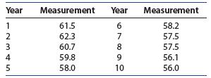
14. Measuring over Time A quantitative variable is measured once a year for a 10-year period. What does the line chart tell you about the data?Construct a line chart to describe the data Year Measurement Year Measurement 1 61.5 6 58.2 2 62.3 7 57.5 3 60.7 8 57.5 4 59.8 9 56.1 5 58.0 10 56.0
13. Navigating a Maze A psychologist measured the length of time it took for a rat to get through a maze on each of 5 days. Do you think that any learning is taking place?Construct a line chart to describe the data 1 2 3 4 5 43 46 32 25 Day Time (seconds) 45
12. Compare the dotplot and the stem and leaf plot. Do they convey roughly the same information?A discrete variable can take on only the values 0, 1, or 2. Use the set of 20 measurements on this variable to answer the question 1 1 1 12 2121 - 220 2007 1
11. Describe the shape of the distribution. Do you see any outliers?A discrete variable can take on only the values 0, 1, or 2. Use the set of 20 measurements on this variable to answer the question 1 1 1 12 2121 - 220 2007 1
10. How could you define the stem and leaf for this data set? Draw the stem and leaf plot.A discrete variable can take on only the values 0, 1, or 2. Use the set of 20 measurements on this variable to answer the question 1 1 1 12 2121 - 220 2007 1
9. Draw a dotplot to describe the data.A discrete variable can take on only the values 0, 1, or 2. Use the set of 20 measurements on this variable to answer the question 1 1 1 12 2121 - 220 2007 1
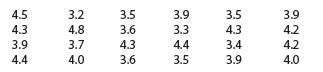
8. Does the stem and leaf plot in Exercise 7 improve the presentation of the data? 4.5 4.3 Auth 3.2 3.5 3.9 3.5 4.8 3.6 3.3 4.3 4.2 3.9 3.7 4.3 4.4 3.4 4.4 4.0 3.6 3.5 3.9 tttw 3.9 4.2 4.0
7. Draw a stem and leaf plot, using each number in theones place twice to form the stems. 4.5 4.3 Auth 3.2 3.5 3.9 3.5 4.8 3.6 3.3 4.3 4.2 3.9 3.7 4.3 4.4 3.4 4.4 4.0 3.6 3.5 3.9 tttw 3.9 4.2 4.0
6. Draw a stem and leaf plot, using the number in the ones place as the stem. 4.5 4.3 Auth 3.2 3.5 3.9 3.5 4.8 3.6 3.3 4.3 4.2 3.9 3.7 4.3 4.4 3.4 4.4 4.0 3.6 3.5 3.9 tttw 3.9 4.2 4.0
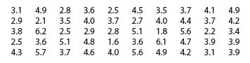
5. Find the eighth and ninth largest observations. Construct a stem and leaf plot for these 50 measurements and answer the question 3.1 4.9 2.8 3.6 2.5 4.5 3.5 3.7 4.1 4.9 2.9 2.1 3.5 4.0 3.7 2.7 4.0 4.4 3.7 4.2 3.8 6.2 2.5 2.9 2.8 5.1 1.8 5.6 2.2 3.4 2.5 3.6 5.1 4.8 1.6 3.6 6.1 4.7 3.9 3.9 4.3 5.7
4. Use the stem and leaf plot to find the smallest observation. Construct a stem and leaf plot for these 50 measurements and answer the question 3.1 4.9 2.8 3.6 2.5 4.5 3.5 3.7 4.1 4.9 2.9 2.1 3.5 4.0 3.7 2.7 4.0 4.4 3.7 4.2 3.8 6.2 2.5 2.9 2.8 5.1 1.8 5.6 2.2 3.4 2.5 3.6 5.1 4.8 1.6 3.6 6.1 4.7
3. Describe the shape of the distribution. Do you see any outliers? Construct a stem and leaf plot for these 50 measurements and answer the question 3.1 4.9 2.8 3.6 2.5 4.5 3.5 3.7 4.1 4.9 2.9 2.1 3.5 4.0 3.7 2.7 4.0 4.4 3.7 4.2 3.8 6.2 2.5 2.9 2.8 5.1 1.8 5.6 2.2 3.4 2.5 3.6 5.1 4.8 1.6 3.6 6.1
Construct a dotplot for the data given . Describe the shape of the distribution and look for any outliers.2. 53, 61, 58, 56, 58, 60, 54, 54, 62, 58, 60, 58, 56, 56, 58
Construct a dotplot for the data given . Describe the shape of the distribution and look for any outliers.1. 2.0, 1.0, 1.1, 0.9, 1.0, 1.2, 1.3, 1.1, 0.9, 1.0, 0.9, 1.4, 0.9, 1.0, 1.0
An administrative assistant for the athletics department at a local university is monitoring the GPAs for eight members of the women’s volleyball team. He enters the GPAs into the database but accidentally misplaces the decimal point in the last entry.Use a dotplot to describe the data and
Look at the four dotplots shown in Figure 1.12. Describe the locations and shapes of these distributions. 2 4 -+ 9 9 6 7 8 9
Showing 300 - 400
of 6613
1
2
3
4
5
6
7
8
9
10
11
12
13
14
15
Last
Step by Step Answers