New Semester
Started
Get
50% OFF
Study Help!
--h --m --s
Claim Now
Question Answers
Textbooks
Find textbooks, questions and answers
Oops, something went wrong!
Change your search query and then try again
S
Books
FREE
Study Help
Expert Questions
Accounting
General Management
Mathematics
Finance
Organizational Behaviour
Law
Physics
Operating System
Management Leadership
Sociology
Programming
Marketing
Database
Computer Network
Economics
Textbooks Solutions
Accounting
Managerial Accounting
Management Leadership
Cost Accounting
Statistics
Business Law
Corporate Finance
Finance
Economics
Auditing
Tutors
Online Tutors
Find a Tutor
Hire a Tutor
Become a Tutor
AI Tutor
AI Study Planner
NEW
Sell Books
Search
Search
Sign In
Register
study help
business
nonparametric statistical inference
Statistical Reasoning For Everyday Life 4th Edition Jeffrey Bennett - Solutions
Pareto Chart. Construct a Pareto chart from the data given in Exercise 4.Compare the Pareto chart to the pie chart.Which graph is more effective in showing the numbers of frustrating sounds? Explain.
Pie Chart of Awful sounds. In a survey, 1,004 adults were asked to identify the most frustrating sound that they hear in a day. Two hundred seventy-nine chose jackhammers, 388 chose car alarms, 128 chose barking dogs, and 209 chose crying babies (based on data from Kelton Research). Construct a pie
not-so-outstanding news Graph. Find a graph from a recent news report that, in your opinion, fails in its attempt to display data visually in a meaningful way.Discuss what the graph was trying to show, explain why it failed, and explain how it could have been done better.
outstanding news Graph. Find a graph from a recent news report that, in your opinion, is truly outstanding in displaying data visually. Discuss what the graph shows, and explain why you think it is so outstanding.
Pictograph in the news. Find an example of a pictograph in a recent news report. Discuss what the pictograph attempts to show, and discuss whether the artistic embellishments help or hinder this purpose.
Economic Graph in the news. Find an example in a recent news report of a graph that shows economic data over time.Are the data adjusted for inflation? Discuss the meaning of the graph and any ways in which it might be deceptive.
scale Problems in the news. Find an example in a recent news report of a graph in which the vertical scale does not start at zero. Suggest why the graph was drawn that way and also discuss any ways in which the graph might be misleading as a result.
Distortions in the news. Find an example in a recent news report of a graph that involves some type of perceptual distortion. Explain the effects of the distortion, and describe how the graph could have been drawn more honestly.
image search. Choose some topic that interests you for which you think that good statistical graphs should be available. Do an image search for the topic in Google, Bing, or other search engine. Does the search give you what you were looking for? Briefly discuss the value of the search results in
usA snapshot. USA Today offers a daily pictograph for its “Snapshot.” Find a snapshot from a recent issue of USA Today. Briefly discuss its purpose and effectiveness.
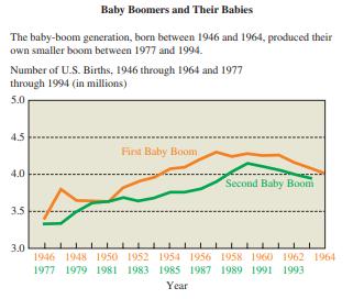
Double Horizontal scale. The graph in Figure 42 shows simultaneously the number of births in this country during two time periods: 1946–1964 and 1977–1994. When did the first baby boom peak? When did the second baby boom peak? Why do you think the designer of this display chose to superimpose
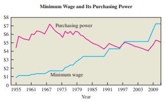
Constant Dollars. The graph in Figure 41 shows the minimum wage in the United States, together with its purchasing power, which is adjusted for inflation with 1996 used as the reference year. The graph represents the years from 1955 to 2011. Summarize what the graph shows. $7 $6 2 5 3 2 3 $1
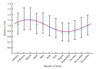
seasonal Effects on schizophrenia? The graph in Figure 40 shows data regarding the relative risk of schizophrenia among people born in different months.a. Note that the scale of the vertical axis does not include zero. Sketch the same risk curve using an axis that includes zero. Comment on the
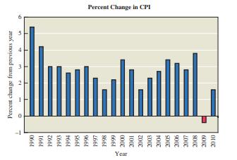
Percentage Change in the CPi. The graph in Figure 39 shows the percentage change in the CPI over recent years.In what year (of the years displayed) was the change in the CPI the greatest? What happened in 2009? How do actual prices in 2010 compare to those in 1990? Based on this graph, what can you
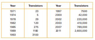
Moore’s law. In 1965, Intel cofounder Gordon Moore initiated what has since become known as Moore’s law:the number of transistors per square inch on integrated circuits will double approximately every 18 months. In the table below, the first row lists different years and the second row lists
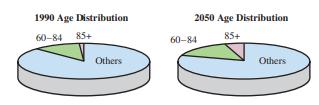
Three-Dimensional Pies. The pie charts in Figure 38 give the percentage of Americans in three age categories in 1990 and 2050 (projected).a. Consider the 1990 age distribution. The actual percentages for the three categories for 1990 were 87.5%(others), 11.3% (60–84), and 1.2% (85+). Does the pie
Pictograph. Refer to Figure 37 used in Exercise 7 and construct a bar chart to depict the same data in a way that is fair and objective.
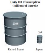
Pictograph. Figure 37 depicts the amounts of daily oil consumption in the United States and Japan. Does the illustration accurately depict the data? Why or why not? Daily Oil Consumption (millions of barrels) 20.0 5.4 United States Japan
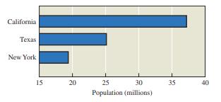
Comparing state Populations. Figure 36 depicts 2010 populations for California, Texas, and New York (based on data from the 2010 Census). How is this graph misleading?How could it be drawn so that it is not misleading? California Texas New York 15 20 25 30 35 40 Population (millions)
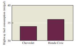
Car Mileage. Figure 35 shows the highway fuel consumption (mi/gal) for the Chevrolet Aveo and the Honda Civic.How is the graph misleading? How could it be drawn so that it is not misleading? Highway fuel consumption (mi/gal) 00 35 30 Chevrolet Honda Civic
sugar Cubes. To show how sugar production doubled from 1990 to now, an illustrator draws two sugar cubes. The first cube is drawn with a length of 1 cm on each side and the second cube is drawn with a length of 2 cm on each side. What are the volumes of the two sugar cubes? Is the illustration
Vertical scale. A line chart has a vertical scale with values of 0, 1, 10, 100, 1000 and 10,000. What is the name of such a scale? What is an advantage of such a scale?
Graph of Populations. When constructing a graph showing the population of the United States and the population of Mexico, an illustrator draws two different people with heights proportional to the populations. Identify a way in which the graph might be misleading? What is the general name for such
Exaggerating a Difference. Under standard test conditions, the braking distance for a Honda Civic is 136 feet and the braking distance for a VW Jetta is 137 feet. Is that difference meaningful? How could a graph be constructed so that the difference is greatly exaggerated?
Fancy news Graphics. Find an example in the news of a graphic that combines two or more of the basic graphic types. Briefly explain what the graphic is showing, and discuss the effectiveness of the graphic.
Three-Dimensional Displays. Find an example of a three-dimensional display in a recent news report.Are three dimensions needed, or are they included for cosmetic reasons? Comment on the effectiveness of the display. Could another display have been used to depict the same data?
Geographical Data. Find an example of a graph of geographical data in a recent news report. Comment on the effectiveness of the display. Could another display have been used to depict the same data?
stack Plots. Find an example of a stack plot in a recent news report. Comment on the effectiveness of the display. Could another display have been used to depict the same data?
Multiple bar Graphs. Find an example of a multiple bar graph or multiple line chart in a recent news report. Comment on the effectiveness of the display.Could another display have been used to depict the same data?
The Federal budget. Go to the Web site for the U.S. Office of Management and Budget (OMB) and look for some of its charts related to the federal budget. Pick two charts of particular interest to you and discuss the data they show.
Weather Maps. Many Web sites offer contour maps with current weather data. Find at least two contour weather maps and discuss what they show.
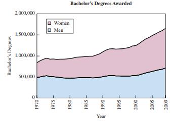
College Degrees. The stacked line chart in Figure 26 shows the numbers of bachelor’s degrees awarded to men and women since 1970.a. Estimate the numbers of bachelor’s degrees awarded to men and to women (separately) in 1970 and in 2010.b. About when were the number of bachelor’s degrees equal
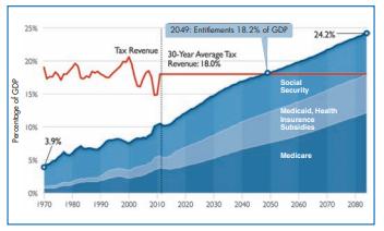
Entitlement spending. The stack plot in Figure 25 shows Congressional Budget Office data for actual (through 2011)and projected spending on entitlement programs through 2085 as percentages of the gross domestic product (GDP).Interpret the graph and summarize its message. Percentage of GDP 25% 2049:
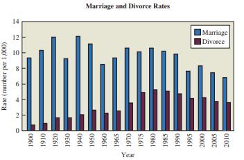
Marriage and Divorce Rates. The graph in Figure 24 depicts the U.S. marriage and divorce rates for selected years since 1900. The marriage rates are depicted by the blue bars and the divorce rates are depicted by the red bars. Both rates are given in units of marriages/divorces per 1,000 people in
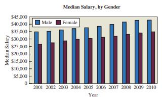
Gender and salary. Consider the display in Figure 23 of median salaries of males and females in recent years.a. What story does the graph convey?b. Redraw the graph as a multiple (two) line chart. Briefly discuss the advantages and disadvantages of the two different representations of this
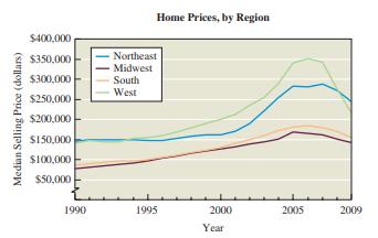
Home Prices by Region. The graph in Figure 22 shows home prices in different regions of the United States. Note that the data have not been adjusted for the effects of inflation.a. In words, describe the general trends that apply to the home price data for all regions.b. In words, describe any
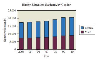
Genders of students. The stack plot in Figure 21 shows the numbers of male and female higher education students for different years. Projections are from the U.S. National Center for Education Statistics.a. In words, discuss the trends revealed on this graphic.b. Redraw the graph as a multiple line
stack Plot. A multiple bar graph could be used to show the numbers of males, females, and total students at your college for each of the past 10 years.decide whether the statement makes sense (or is clearly true) or does not make sense (or is clearly false). Explain clearly. Not all of these
Geographic Data. A graphic artist for a magazine is depicting the populations of the 10 largest U.S. cities by using bars of different heights, with the bars positioned on the locations of the cities on a map of the United States.decide whether the statement makes sense (or is clearly true) or does
Contour Map. A contour map could be used to display the ages of all full-time students at your college.decide whether the statement makes sense (or is clearly true) or does not make sense (or is clearly false). Explain clearly. Not all of these statements have definitive answers, so your
Three-Dimensional Graph. A quality control engineer claims that because cars are three-dimensional objects, she needs a three-dimensional graph to display the production cost of a Corvette for each of the past 10 years.decide whether the statement makes sense (or is clearly true) or does not make
Contour Map. What is a contour on a contour map? What does it mean when contours are close together? What does it mean when they are far apart?
Geographical Data. What are geographical data? Identify at least two ways to display geographical data.
Multiple bar Graph. What is a multiple bar graph, and how is it helpful?
Three-Dimensional Histograms. Can every histogram be converted to a three-dimensional graphic? Does the three-dimensional version of a histogram have more visual appeal? Does the three-dimensional version of a histogram provide any information not provided by the original histogram?
line Charts. Find a recent news article that includes a line chart. Briefly explain what the line chart shows, and discuss whether it helps make the point of the news article. Are the labels clear? Is the line chart a time-series diagram? Explain.
Histograms. Find a recent news article that includes a histogram. Briefly explain what the histogram shows, and discuss whether it helps make the point of the news article. Are the labels clear? Is the histogram a time-series diagram? Explain.
Pie Charts. Find a recent news article that includes a pie chart. Briefly discuss the effectiveness of the pie chart. For example, would it be better if the data were displayed in a bar graph rather than a pie chart? Could the pie chart be improved in other ways?
bar Graphs. Find a recent news article that includes a bar graph with qualitative data categories.a. Briefly explain what the bar graph shows, and discuss whether it helps make the point of the news article. Are the labels clear?b. Briefly discuss whether the bar graph could be recast as a
navel Data. Create an appropriate display of the navel data collected in Exercise 23 of Section 1.Discuss any special properties of this distribution.
statistical Abstract. Go to the Web site for the Statistical Abstract of the United States. Explore the selection of “frequently requested tables.” Choose one table of interest to you and make a graph from its data. You may choose any of the graph types discussed in this section. Explain how
Energy Table. Explore the energy tables at the U.S. Energy Information Administration (EIA) Web site. Choose a table that you find interesting and make a graph of its data. You may choose any of the graph types discussed in this section. Explain how you made your graph, and briefly discuss what can
Co2 Emissions. Look for updated data on international carbon dioxide emissions. Create a graph of the latest data and discuss any important features or trends that you notice.
stemplot. Listed below are the lengths (in minutes) of animated children’s movies. Construct a stemplot. Does the stemplot show the distribution of the data? If so, how?83 88 120 64 69 71 76 74 75 76 75 75 79 80 78 78 83 77 71 83 80 73 72 82 74 84 90 89 81 81 90 79 92 82 89 82 74 86 76 81 75 75
stemplot. Construct a stemplot of these test scores: 67, 72, 85, 75, 89, 89, 88, 90, 99, 100.How does the stemplot show the distribution of these data?
Time series for Motor Vehicle Deaths. The following values are numbers of motor vehicle deaths in the United States for years beginning with 1980. The data are arranged in order by row. Construct a time-series graph and then determine whether there appears to be a trend. If so, provide a possible
Time-series Graph for Cell Phone subscriptions. The following table shows the numbers of cell phone subscriptions (in thousands) in the United States for various years. Construct a time-series graph of the data. “Linear”growth would result in a graph that is approximately a straight line. Does
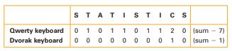
Based on the results, does either keyboard configuration appear to be better? Explain.
Dotplot. Refer to the Dvorak data in Exercise 19 in Section 1 and construct a dotplot. Compare the result to the dotplot in Exercise
Dotplot. Refer to the QWERTY data in Exercise 19 in Section 1 and construct a dotplot.
Compare the Pareto chart to the pie chart. Which graph is more effective in showing the relative importance of the mistakes made by job applicants?
job Application Mistakes Construct a Pareto chart of the data given in Exercise
job Application Mistakes Chief financial officers of U.S.companies were surveyed about areas in which job applicants make mistakes. Here are the areas and the frequency of responses: interview (452); resume (297); cover letter(141); reference checks (143); interview follow-up (113);screening call
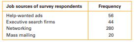
job sources. Refer to the data given in Exercise 19, and construct a pie chart. Compare the pie chart to the Pareto chart. Can you determine which graph is more effective in showing the relative importance of job sources?
job Hunting. A survey was conducted to determine how employees found their jobs. The table below lists the successful methods identified by 400 randomly selected employees.The data are based on results from the National Center for Career Strategies. Construct a Pareto chart that corresponds to the
body Temperatures. Exercise 14 in Section 1 required the construction of a frequency table for a list of body temperatures (°F) of randomly selected subjects. Use that frequency table to construct the corresponding histogram.
oscar-Winning Actors. Exercise 13 in Section 1 required the construction of a frequency table for the ages of recent Academy Award–winning male actors at the time when they won their award. Use that frequency table to construct the corresponding histogram.
Weights of Diet Coke. Exercise 12 in Section 1 required the construction of a frequency table for the weights (in pounds) of 36 cans of Diet Coke. Use that frequency table to construct the corresponding histogram.
Weights of Coke. Exercise 11 in Section 1 required the construction of a frequency table from the weights (in pounds) of 36 cans of regular Coke. Use that frequency table to construct the corresponding histogram.
Histogram. The histogram in Figure 12 depicts cotinine levels (in milligrams per milliliter) of a sample of subjects who smoke cigarettes. Cotinine is a metabolite of nicotine, which means that cotinine is produced by the body when nicotine is absorbed. The data are from the Third National Health
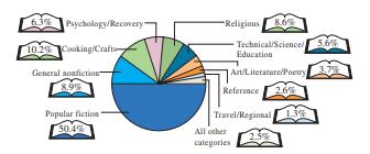
What People Are Reading. The pie chart in Figure 11 shows the results of a survey about what people are reading.a. Summarize these data in a table of relative frequencies.b. Construct a Pareto chart for these data.c. Which do you think is a better representation of the data: the pie chart or the
Ages of Crash Victims. Ages of people who died in car crashes last year describe data sets but do not give actual data. For each data set, state the type of graphic that you believe would be most appropriate for displaying the data, if they were available. Explain your choice.
Movie Theaters. Number of movie theatres for each year since 1960 describe data sets but do not give actual data. For each data set, state the type of graphic that you believe would be most appropriate for displaying the data, if they were available. Explain your choice.
Political Party. The political party affiliations of 1000 survey subjects describe data sets but do not give actual data. For each data set, state the type of graphic that you believe would be most appropriate for displaying the data, if they were available. Explain your choice.
incomes. Incomes of college graduates who took a statistics course describe data sets but do not give actual data. For each data set, state the type of graphic that you believe would be most appropriate for displaying the data, if they were available. Explain your choice.
Peak Values. I made both a histogram and a line chart for a data set of the crime rate (number of crimes committed) each year from 1960 to 2010. The histogram showed that the crime rate peaked in 1982, while the line chart showed that it peaked in 1983.decide whether the statement makes sense (or
Pareto Chart. A quality control engineer wants to draw attention to the most serious causes of defects, so sheuses a Pareto chart to illustrate the frequencies of the different causes of defects.decide whether the statement makes sense (or is clearly true) or does not make sense (or is clearly
Pie Chart. I used a pie chart to illustrate a data set showing how the cost of college has changed over time.decide whether the statement makes sense (or is clearly true) or does not make sense (or is clearly false). Explain clearly. Not all of these statements have definitive answers, so your
Histogram. I made a histogram to depict frequency counts of answers to the question “What political party do you belong to?”decide whether the statement makes sense (or is clearly true) or does not make sense (or is clearly false). Explain clearly. Not all of these statements have definitive
Histogram and stemplot. Assume that a data set is used to construct a histogram and a stemplot. Using only the histogram, is it possible to re-create the original list of data values? Using only the stemplot, is it possible to re-create the original list of data values? What is an advantage of a
Pareto Chart and Pie Chart. What is an important advantage of a Pareto chart over a pie chart?
Visualizing Data. How is a histogram or line chart more helpful than a list of sample values for understanding a data distribution?
Distribution. What do we mean by the distribution of data?
Temperature Data. Look for a weather report that lists yesterday’s high temperatures in many American cities. Choosing appropriate bins, make a frequency table for the high temperature data. Include columns for relative frequency and cumulative frequency.Briefly describe how and why you chose
Cumulative Frequencies. Find a recent news article that gives at least some data in the form of cumulative frequencies. Briefly describe the data, and discuss why cumulative frequencies were useful in this case.
Relative Frequencies. Find a recent news article that gives at least some data in the form of relative frequencies. Briefly describe the data, and discuss why relative frequencies were useful in this case.
Frequency Tables. Find a recent news article that includes some type of frequency table. Briefly describe the table and how it is useful to the news report. Do you think the table was constructed in the best possible way for the article? If so, why? If not, what would you have done differently?
your own Frequency Table (binned). Collect your own frequency data for some set of categories that will require binning (for example, weights of your friends or scores on a recent exam). State how you collected your data, and make a list of all your raw data. Then summarize the data in a frequency
your own Frequency Table (unbinned). Collect your own frequency data for some set of categories that will not require binning. (For example, you might collect data by asking friends to do a taste test on some brand of cookie.) State how you collected your data, and make a list of all your raw data.
navel Data. The navel ratio is defined to be a person’s height divided by the height (from the floor) of his or her navel. An old theory says that, on average, the navel ratio of humans is the golden ratio: (1+ 15)/2. Measure the navel ratio of each person in your class. What percentage of
Endangered species. The Web site for the World Conservation Monitoring Centre in Great Britain provides data on extinct, endangered, and threatened animal species.Explore these data and summarize some of your more interesting findings with frequency tables.
Energy Table. The U.S. Energy Information Administration(EIA) Web site offers dozens of tables relating to energy use, energy prices, and pollution. Explore the selection of tables. Find a table of raw data that is of interest to you and convert it to an appropriate frequency table. Briefly discuss
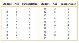
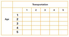
Double binning. The students in a statistics class conduct a transportation survey of students in their high school.Among other data, they record the age and mode of transportation between home and school for each student.The following table gives some of the data that were collected. For age: 1 =
Computer Keyboards. The traditional keyboard configuration is called a Qwerty keyboard because of the positioning of the letters QWERTY on the top row of letters. Developed in 1872, the Qwerty configuration supposedly forced people to type slower so that the early typewriters would not jam.
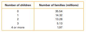
interpreting Family Data. Consider the following frequency table for the number of children in American families.a. According to the data, how many families are there in America?b. How many families have two or fewer children?c. What percentage of American families have no children?d. What
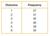
loaded Die. One of the authors drilled a hole in a die, filled it with a lead weight, and then proceeded to roll it.The results are given in the following frequency table.a. According to the data, how many times was the die rolled?b. How many times was the outcome greater than 2?c. What percentage
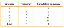
Missing information. The following table shows grades for performances in a drama class. The table is incomplete.Use the information given to fill in the missing entries and complete the table. ? ? Category Frequency Cumulative frequency ? ABCDE 6 619 F ? Total ? 23 25 ?
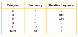
Missing information. The following table shows grades for a term paper in an English class. The table is incomplete. Use the information given to fill in the missing entries and complete the table. Category Frequency Relative frequency ABCDF 22 ? ? 18% ? 24% 11 ? 6 ? Total 50 ?
body Temperatures. The following data show the body temperatures (ºF) of randomly selected subjects. Construct a frequency table with seven classes: 96.9–97.2, 97.3–97.6, 97.7–98.0, and so on.98.6 98.6 98.0 98.0 99.0 98.4 98.4 98.4 98.4 98.6 98.6 98.8 98.6 97.0 97.0 98.8 97.6 97.7 98.8 98.0
oscar-Winning Actors. The following data show the ages of all Academy Award–winning male actors at the time when they won their award, through 2012. Make a frequency table for the data, using bins of 20–29, 30–39, and so on. Discuss your findings.44 41 62 52 41 34 34 52 41 37 38 34 32 40 43
Showing 2200 - 2300
of 5397
First
16
17
18
19
20
21
22
23
24
25
26
27
28
29
30
Last
Step by Step Answers