New Semester
Started
Get
50% OFF
Study Help!
--h --m --s
Claim Now
Question Answers
Textbooks
Find textbooks, questions and answers
Oops, something went wrong!
Change your search query and then try again
S
Books
FREE
Study Help
Expert Questions
Accounting
General Management
Mathematics
Finance
Organizational Behaviour
Law
Physics
Operating System
Management Leadership
Sociology
Programming
Marketing
Database
Computer Network
Economics
Textbooks Solutions
Accounting
Managerial Accounting
Management Leadership
Cost Accounting
Statistics
Business Law
Corporate Finance
Finance
Economics
Auditing
Tutors
Online Tutors
Find a Tutor
Hire a Tutor
Become a Tutor
AI Tutor
AI Study Planner
NEW
Sell Books
Search
Search
Sign In
Register
study help
statistics
elementary statistics in social research
Elementary Statistics Picturing The World 7th Global Edition Betsy Farber, Ron Larson - Solutions
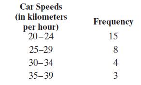
The optimum speeds (in kilometers per hour) for 30 hatchbacksApproximate the mean of the frequency distribution. Car Speeds (in kilometers per hour) Frequency 20-24 15 25-29 8. 30-34 4 35-39 3
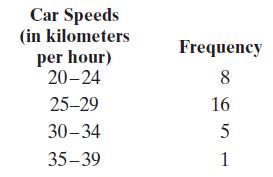
The optimum speeds (in kilometers per hour) for 30 hatchbacksApproximate the mean of the frequency distribution. Car Speeds (in kilometers per hour) 20-24 Frequency 8 25-29 16 30-34 5 35-39 1
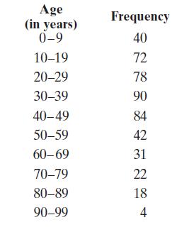
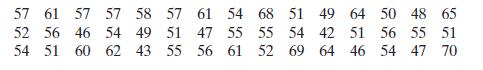
The ages (in years) of the residents of a small town in 2012Approximate the mean of the frequency distribution. Age (in years) Frequency 0-9 40 10-19 72 20-29 78 30-39 90 40-49 84 50-59 42 60-69 31 70-79 22 80-89 18 90-99 4
Number of classes: 5 Data set: The weights (to the nearest kilograms) of 30 femalesConstruct a frequency distribution and a frequency histogram for the data set using the indicated number of classes. Describe the shape of the histogram as symmetric, uniform, negatively skewed, positively skewed,
During a quality assurance check, the actual weights (in kilograms) of eight sacks of cement were recorded as 20.5, 19.4, 19.6, 18.0, 21.0, 20.2, 20.4, and 20.9.(a) Find the mean and the median of the contents.(b) The fifth value was incorrectly measured and is actually 20.0. Find the mean and the
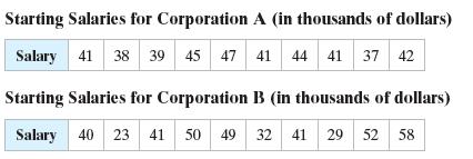
Two corporations each hired 10 graduates. The starting salaries for each graduate are shown. Find the range of the starting salaries for Corporation A. Starting Salaries for Corporation A (in thousands of dollars) Salary 41 38 39 45 47 41 44 41 37 42 Starting Salaries for Corporation B (in
Find the population variance and standard deviation of the starting salaries for Corporation A listed in Example 1.Data from Example 1Two corporations each hired 10 graduates. The starting salaries for each graduate are shown. Find the range of the starting salaries for Corporation A. Starting
In a study of high school football players that suffered concussions, researchers placed the players in two groups. Players that recovered from their concussions in 14 days or less were placed in Group 1. Those that took more than 14 days were placed in Group 2. The recovery times (in days) for
Sample office rental rates (in dollars per square foot per year) for Los Angeles are shown in the table at the left. Use technology to find the mean rental rate and the sample standard deviation.
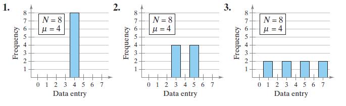
Without calculating, estimate the population standard deviation of each data set. 1. 2. 8 7 N=8 = 4 Frequency 2 1 0 1 2 3 4 5 6 7 Data entry Frequency 876SY N = 8 = 4 2 1 0 1 2 3 4 5 6 7 Data entry 3. Frequency 89654321 N=8 = 4 LLLI 0 1 2 3 4 5 6 7 Data entry
In a survey conducted by the National Center for Health Statistics, the sample mean height of women in the United States (ages 20–29) was 64.2 inches, with a sample standard deviation of 2.9 inches. Estimate the percent of women whose heights are between 58.4 inches and 64.2 inches.
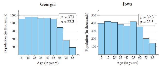
The age distributions for Georgia and Iowa are shown in the histograms. Apply Chebychev’s Theorem to the data for Georgia using k = 2. What can you conclude? Is an age of 100 unusual for a Georgia resident? Explain. Population (in thousands) 1500 1200 900 600- 300 -55 Georgia = 373 => 22.3 15
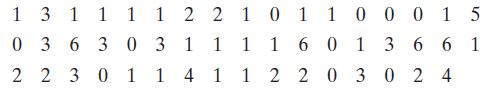
You collect a random sample of the number of children per household in a region. The results are listed below. Find the sample mean and the sample standard deviation of the data set. 1 3 1 1 1 1 2 2 101 1000 15 0363031 1 1 1 601366 2230114112203024
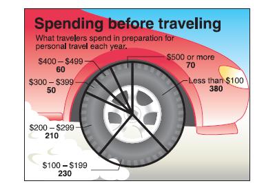
The figure below shows the results of a survey in which 1000 adults were asked how much they spend in preparation for personal travel each year. Make a frequency distribution for the data. Then use the table to estimate the sample mean and the sample standard deviation of the data set. Spending
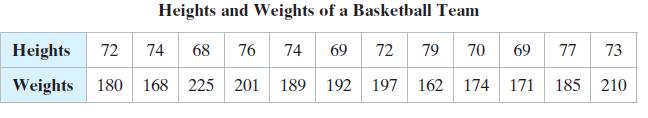
The table below shows the population heights (in inches) and weights (in pounds) of the members of a basketball team. Find the coefficient of variation for the heights and the weights. Then compare the results. Heights and Weights of a Basketball Team Heights 72 68 74 Weights 180 168 225 201 189
The altitudes (in kilometers) of atmosphere at which helium is found in majority in 10 different cities are listed.938.5 927.0 929.5 930.3 934.3 936.0 926.2 930.5 924.8 870.7(a) Find the range of the data set.(b) Change 870.7 to 807.7 and find the range of the new data set.
In Exercise 11, compare your answer to part (a) with your answer to part (b). How do outliers affect the range of a data set?Data from Exercises 11The altitudes (in kilometers) of atmosphere at which helium is found in majority in 10 different cities are listed.938.5 927.0 929.5 930.3 934.3 936.0
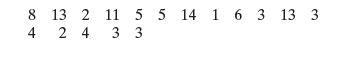
The numbers of deaths caused by fire per year from 1990 to 2005 in New South Wales Find the range, mean, variance, and standard deviation of the population data set. 8 13 2 11 4 2 2 4 4 3 5 5 14 1 6 3 13 3 3
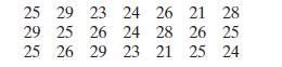
The durations (in days) of germination for a random sample of seeds.Find the range, mean, variance, and standard deviation of the sample data set. 25 29 23 24 26 21 28 29 25 26 24 28 26 25 25 26 29 23 21 25 24
You are applying for jobs at two companies. Company A offers starting salaries with μ = \($30,000\) and σ = \($4,000\). Company B offers starting salaries with μ = \($30,000\) and σ = \($2,000\). From which company are you more likely to get an offer of \($36,000\) or more? Explain your
Salary Offers You are applying for jobs at two companies. Company C offers starting salaries with μ = \($75,000\) and σ = \($2,500\). Company D offers starting salaries with μ = \($75,000\) and σ = \($5,000\). From which company are you more likely to get an offer of \($85,000\) or more?
Construct a data set that has the given statistics.N = 9 μ̅ = 8σ ≈ 6
Construct a data set that has the given statistics.n = 5 x̅ =12 s = 0
Construct a data set that has the given statistics.n = 5 x̅ = 8 s ≈ 4
You are conducting a survey on the number of people per house in your region. From a sample with n = 60, the mean number of people per house is 3 and the standard deviation is 1 person. Using Chebychev’s Theorem, determine at least how many of the households have 0 to 6 people. Chebychev's
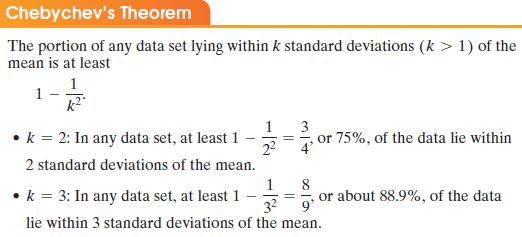
The mean height of students of a class is 125 centimeters, with a standard deviation of 4 centimeters. Apply Chebychev’s Theorem to the data using k = 2. Interpret the results. Chebychev's Theorem The portion of any data set lying within k standard deviations (k > 1) of the mean is at least 1 k
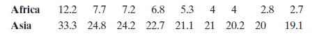
Sample wealth (in billions of dollars) for billionaires in Africa and Asia are listed.Find the coefficient of variation for each of the two data sets. Then compare the results. Africa 12.2 7.7 7.2 6.8 5.3 4 4 2.8 2.7 Asia 33.3 24.8 24.2 22.7 21.1 21 20.2 20 19.1
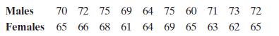
Sample weight averages (in kilograms) for 10 males and 10 females are listed.Find the coefficient of variation for each of the two data sets. Then compare the results. Males 70 72 75 69 64 75 60 71 73 72 Females 65 66 68 61 65 66 68 61 64 69 64 69 65 63 62 65
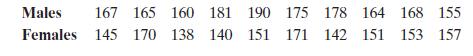
Sample height averages (in centimeters) for 10 males and 10 females are listed.Find the coefficient of variation for each of the two data sets. Then compare the results. Males 167 165 160 181 190 175 178 164 168 155 Females 145 170 138 140 151 171 142 151 153 157
Each year in the U.S., automobile commuters waste fuel due to traffic congestion. The amounts (in gallons per year) of fuel wasted by commuters in the 15 largest U.S. urban areas are listed. (Large urban areas have populations of at least 3 million.) Find the first, second, and third quartiles of
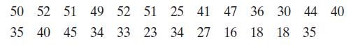
The tuition costs (in thousands of dollars) for 25 liberal arts colleges are listed.Use technology to find the first, second, and third quartiles. What do you observe? 555 50 52 51 49 52 51 25 41 47 36 30 44 40 35 40 45 34 33 23 34 27 16 18 18 35
Find the interquartile range of the data set in Example 1. Are there any outliers?Data from Example 1Each year in the U.S., automobile commuters waste fuel due to traffic congestion. The amounts (in gallons per year) of fuel wasted by commuters in the 15 largest U.S. urban areas are listed. (Large
Draw a box-and-whisker plot that represents the data set in Example 1. What do you observe?Data from Example 1Each year in the U.S., automobile commuters waste fuel due to traffic congestion. The amounts (in gallons per year) of fuel wasted by commuters in the 15 largest U.S. urban areas are
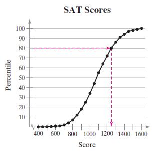
The ogive at the right represents the cumulative frequency distribution for SAT scores of college-bound students in a recent year. What score represents the 80th percentile? Percentile 100 90 80 70 60 50 40 30 20 10 88284 88 9 SAT Scores 400 600 800 1000 1200 1400 1600 Score
For the data set in Example 2, find the percentile that corresponds to $34,000.Data from Example 2The tuition costs (in thousands of dollars) for 25 liberal arts colleges are listed. Use technology to find the first, second, and third quartiles. What do you observe? 555 50 52 51 49 52 51 25 41 47
The mean speed of vehicles along a stretch of highway is 56 miles per hour with a standard deviation of 4 miles per hour. You measure the speeds of three cars traveling along this stretch of highway as 62 miles per hour, 47 miles per hour, and 56 miles per hour. Find the z-score that corresponds to
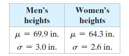
The table shows the mean heights and standard deviations for a population of men and a population of women. Compare the z-scores for a 6-foot-tall man and a 6-foot-tall woman. Assume the distributions of the heights are approximately bell-shaped. Men's heights = 69.9 in. M = 3.0 in. Women's
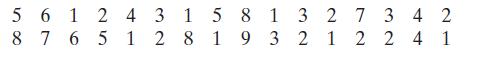
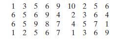
The numbers of extra classes taken per week by a sample of 32 studentsUse technology to draw a box-and-whisker plot that represents the data set. 561 2 4 8 7 6 5 1 3 1 5 8 28 1 9 1 3 27 34 2 3 2 1 2 2 4 1
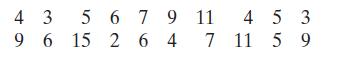
The numbers of leaves availed by a sample of 20 executives in a recent yearUse technology to draw a box-and-whisker plot that represents the data set. 4 3 5 6 7 9 11 453 96 15 264 7 11 59
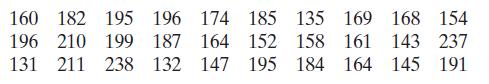
The numbers of working hours of a sample of 30 employees in a monthUse technology to draw a box-and-whisker plot that represents the data set. 160 182 195 196 174 196 210 199 187 164 131 211 238 132 147 185 135 169 168 154 158 161 143 237 152 195 184 164 145 191
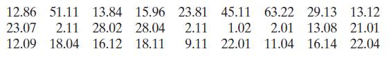
The annual profits (in thousands of dollars) of a sample of 27 companies listed on a stock exchangeUse technology to draw a box-and-whisker plot that represents the data set. 12.86 51.11 13.84 15.96 23.81 45.11 63.22 29.13 13.12 23.07 2.11 28.02 28.04 12.09 18.04 16.12 18.11 2.11 1.02 2.01 13.08
Refer to the data set in Exercise 23 and the box-and-whisker plot you drew that represents the data set.(a) About 25% of the students took no more than how many extra classes per week?(b) What percent of the students took less than three extra classes per week?(c) You randomly select one student
Refer to the data set in Exercise 26 and the box-andwhisker plot you drew that represents the data set.(a) About 50% of the companies made less than what amount of annual profits?(b) What percent of the companies made profits of more than \($12.09\) thousand?(c) What percent of the companies made
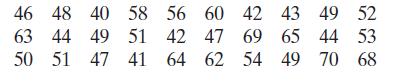
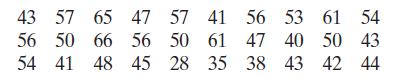
Find the percentile that corresponds to an age of 47 years old.Use the data set, which represents the ages of 30 executives. 43 57 65 47 57 41 56 53 61 54 56 50 66 56 50 61 47 40 50 43 54 41 48 45 28 35 38 43 42 44
Find the percentile that corresponds to an age of 57 years old.Use the data set, which represents the ages of 30 executives. 43 57 65 47 57 41 56 53 61 54 56 50 66 56 50 61 47 40 50 43 54 41 48 45 28 35 38 43 42 44
Use the data set, which represents the ages of 30 executives.Which ages are below the 75th percentile? 43 57 65 47 57 41 56 53 61 54 56 50 66 56 50 61 47 40 50 43 54 41 48 45 28 35 38 43 42 44
Use the data set, which represents the ages of 30 executives.Which ages are above the 25th percentile? 43 57 65 47 57 41 56 53 61 54 56 50 66 56 50 61 47 40 50 43 54 41 48 45 28 35 38 43 42 44
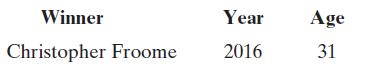
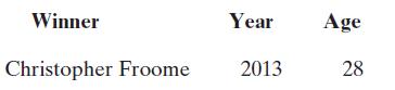
The distribution of the ages of the winners of the Tour de France from 1903 to 2016 is approximately bell-shaped. The mean age is 27.9 years, with a standard deviation of 3.3 years. Use the corresponding z-score to determine whether the age is unusual. Explain your reasoning. Winner Christopher
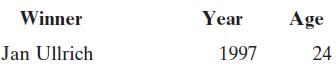
The distribution of the ages of the winners of the Tour de France from 1903 to 2016 is approximately bell-shaped. The mean age is 27.9 years, with a standard deviation of 3.3 years. Use the corresponding z-score to determine whether the age is unusual. Explain your reasoning. Winner Jan Ullrich
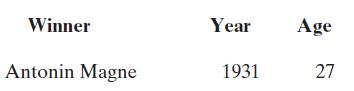
The distribution of the ages of the winners of the Tour de France from 1903 to 2016 is approximately bell-shaped. The mean age is 27.9 years, with a standard deviation of 3.3 years. Use the corresponding z-score to determine whether the age is unusual. Explain your reasoning. Winner Year Age
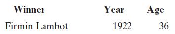
The distribution of the ages of the winners of the Tour de France from 1903 to 2016 is approximately bell-shaped. The mean age is 27.9 years, with a standard deviation of 3.3 years. Use the corresponding z-score to determine whether the age is unusual. Explain your reasoning. Winner Year Firmin
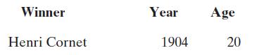
The distribution of the ages of the winners of the Tour de France from 1903 to 2016 is approximately bell-shaped. The mean age is 27.9 years, with a standard deviation of 3.3 years. Use the corresponding z-score to determine whether the age is unusual. Explain your reasoning. Winner Henri Cornet
The distribution of the ages of the winners of the Tour de France from 1903 to 2016 is approximately bell-shaped. The mean age is 27.9 years, with a standard deviation of 3.3 years. Use the corresponding z-score to determine whether the age is unusual. Explain your reasoning. Winner Year Age
The life spans of a species of lady bugs have a bell-shaped distribution, with a mean of 1000 days and a standard deviation of 100 days.(a) The life spans of three randomly selected lady bugs are 1250 days, 1175 days, and 950 days. Find the z-score that corresponds to each life span. Determine
A brand of bearings has a mean life span of 15,000 cycles, with a standard deviation of 1,250 cycles. Assume the life spans of the bearings have a bell-shaped distribution.(a) The life spans of three randomly selected bearings are 13,500 cycles, 17,000 cycles, and 18,500 cycles. Find the z-score
(a) identify any outliers(b) draw a modified box-and-whisker plot that represents the data set. Use asterisks (*) to identify outliers.16 9 11 12 8 10 12 13 11 10 24 9 2 15 7
(a) identify any outliers(b) draw a modified box-and-whisker plot that represents the data set. Use asterisks (*) to identify outliers.75 78 80 75 62 72 74 75 80 95 76 72
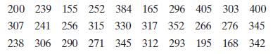
The data set lists the out-of-pocket prescription medicine expenses (in dollars) for 30 U.S. adults in a recent year. Construct a frequency distribution that has seven classes. 200 239 155 252 384 165 296 405 303 400 307 241 256 315 330 317 352 266 276 345 238 306 290 271 345 312 293 195 168 342
Using the frequency distribution constructed in Example 1, find the midpoint, relative frequency, and cumulative frequency of each class. Describe any patterns.Data from Example 1The data set lists the out-of-pocket prescription medicine expenses (in dollars) for 30 U.S. adults in a recent year.
Draw a frequency histogram for the frequency distribution in Example 2. Describe any patterns.Data from Example 2Using the frequency distribution constructed in Example 1, find the midpoint, relative frequency, and cumulative frequency of each class. Describe any patterns.Data from Example 1The
Draw a frequency polygon for the frequency distribution in Example 2. Describe any patterns.Data from Example 2Using the frequency distribution constructed in Example 1, find the midpoint, relative frequency, and cumulative frequency of each class. Describe any patterns.Data from Example 1The data
Draw a relative frequency histogram for the frequency distribution in Example 2.Data from Example 2Using the frequency distribution constructed in Example 1, find the midpoint, relative frequency, and cumulative frequency of each class. Describe any patterns.Data from Example 1The data set lists
Draw an ogive for the frequency distribution in Example 2.Data from Example 2Using the frequency distribution constructed in Example 1, find the midpoint, relative frequency, and cumulative frequency of each class. Describe any patterns.Data from Example 1The data set lists the out-of-pocket
Use technology to construct a histogram for the frequency distribution in Example 2.Data from Example 2Using the frequency distribution constructed in Example 1, find the midpoint, relative frequency, and cumulative frequency of each class. Describe any patterns.Data from Example 1The data set
Number of classes: 6 Data set: Amounts (in dollars) spent on conveyance for a quarter of a year.Construct a frequency distribution for the data set using the indicated number of classes. In the table, include the midpoints, relative frequencies, and cumulative frequencies. Which class has the
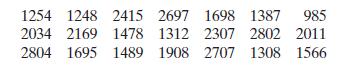
Number of classes: 6 Data set: January production (in units) for 21 manufacturing plants of a multinational company Construct a frequency distribution and a frequency histogram for the data set using the indicated number of classes. Describe any patterns. 1254 1248 2415 2697 1698 1387 985 2034
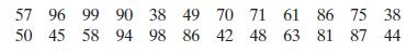
Number of classes: 5 Data set: Strengths (in parts per thousands) of 24 acids Construct a frequency distribution and a frequency histogram for the data set using the indicated number of classes. Describe any patterns. 57 96 99 90 38 49 50 45 58 94 98 86 70 71 61 86 75 38 42 48 63 81 87 44
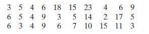
Number of classes: 8 Data set: Response times (in days) of 30 males to a test drive survey Construct a frequency distribution and a frequency histogram for the data set using the indicated number of classes. Describe any patterns. 3 5 4 6 6549 18 15 23 4 69 3 5 14 2 17 5 6 34 9 6 7 10 15 15 11 3
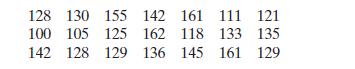
Number of classes: 8 Data set: Bowling speeds (in kilometers per hour) of 21 bowlers in a cricket series Construct a frequency distribution and a frequency histogram for the data set using the indicated number of classes. Describe any patterns. 128 130 155 142 161 111 121 100 105 125 162 118 133
Number of classes: 6 Data set: Ages of the U.S. presidents at Inauguration Construct a frequency distribution and a frequency polygon for the data set using the indicated number of classes. Describe any patterns. 535 344 555 6455 358 655 42 484 659
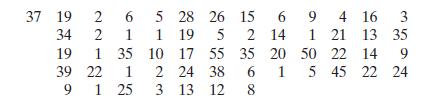
Number of classes: 5 Data set: Regnal years of the monarchs of Great Britain Construct a frequency distribution and a frequency polygon for the data set using the indicated number of classes. Describe any patterns. 37 19 2 6 5 28 26 15 6 9 4 16 3 34 2 1 119 5 2 14 1 21 13 35 19 1 35 10 17 55 35
Data set: Ratings from 1 (lowest) to 10 (highest) provided by 36 people after taste testing a new flavor of ice cream.Construct a frequency distribution and a relative frequency histogram for the data set using five classes. Which class has the greatest relative frequency and which has the least
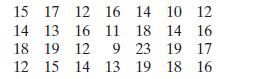
Data set: Years of service of 28 best drivers in a city in France Construct a frequency distribution and a relative frequency histogram for the data set using five classes. Which class has the greatest relative frequency and which has the least relative frequency? 15 17 12 16 14 10 12 14 13 16 11
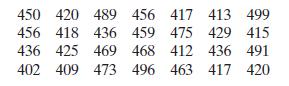
Data set: Weights (in kilograms) of 28 adult male polar bears Construct a frequency distribution and a relative frequency histogram for the data set using five classes. Which class has the greatest relative frequency and which has the least relative frequency? 450 420 489 456 417 413 499 456 418
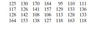
Data set: Systolic blood pressure levels (in millimeters of mercury) of 28 patients Construct a frequency distribution and a relative frequency histogram for the data set using five classes. Which class has the greatest relative frequency and which has the least relative frequency? 125 130 170 184
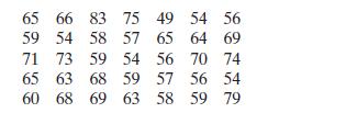
Data set: Retirement ages of 35 Statistics professors Construct a cumulative frequency distribution and an ogive for the data set using six classes. Then describe the location of the greatest increase in frequency. 65 66 83 75 49 54 56 59 54 58 57 65 64 69 71 73 59 54 56 70 74 65 63 68 59 57 56 54
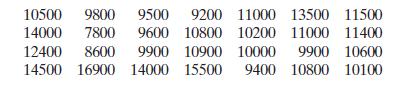
Data set: Daily calorie intakes (in kilojoules) of 28 people Construct a cumulative frequency distribution and an ogive for the data set using six classes. Then describe the location of the greatest increase in frequency. 10500 9800 9500 9200 11000 13500 11500 14000 7800 9600 10800 10200 11000
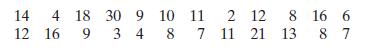
Data set: Number of accidents per day in a city Use the data set and the indicated number of classes to construct(a) an expanded frequency distribution,(b) a frequency histogram,(c) a frequency polygon,(d) a relative frequency histogram,(e) an ogive. 14 4 18 30 9 10 11 2 12 8 16 6 12 16 9 3 4 8 7
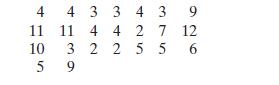
Number of classes: 6 Data set: Number of stars in the Chinese Hellenistic constellations Use the data set and the indicated number of classes to construct(a) an expanded frequency distribution,(b) a frequency histogram,(c) a frequency polygon,(d) a relative frequency histogram,(e) an ogive. 11 4
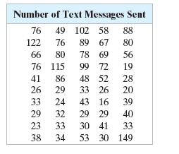
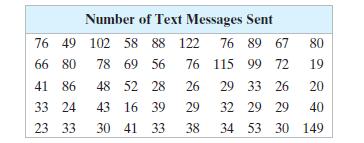
The data set at the left lists the numbers of text messages sent in one day by 50 cell phone users. Display the data in a stem-and-leaf plot. Describe any patterns. Number of Text Messages Sent 76 49 102 58 88 122 76 89 67 80 66 80 78 69 56 76 115 99 72 19 41 86 48 52 28 26 29 33 26 20 33 24 43 16
Organize the data set in Example 1 using a stem-and-leaf plot that has two rows for each stem. Describe any patterns.Data from Example 1The data set at the left lists the numbers of text messages sent in one day by 50 cell phone users. Display the data in a stem-and-leaf plot. Describe any
Use a dot plot to organize the data set in Example 1. Describe any patterns.Data from Example 1The data set at the left lists the numbers of text messages sent in one day by 50 cell phone users. Display the data in a stem-and-leaf plot. Describe any patterns. Number of Text Messages Sent 76 49 102
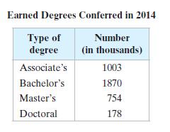
The numbers of earned degrees conferred (in thousands) in 2014 are shown in the table at the right. Use a pie chart to organize the data. Earned Degrees Conferred in 2014 Type of Number degree (in thousands) Associate's 1003 Bachelor's 1870 Master's 754 Doctoral 178
In 2014, these were the leading causes of death in the United States.Accidents: 136,053 Cancer: 591,699 Chronic lower respiratory disease: 147,101 Heart disease: 614,348 Stroke (cerebrovascular diseases): 133,103Use a Pareto chart to organize the data. What was the leading cause of death in the
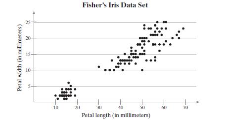
The British statistician Ronald Fisher introduced a famous data set called Fisher’s Iris data set. This data set describes various physical characteristics, such as petal length and petal width (in millimeters), for three species of iris. In the scatter plot shown, the petal lengths form the
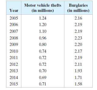
The table lists the number of motor vehicle thefts (in millions) and burglaries (in millions) in the United States for the years 2005 through 2015. Construct a time series chart for the number of motor vehicle thefts. Describe any trends. Year Motor vehicle thefts (in millions) Burglaries (in
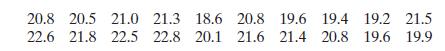
Use a stem-and-leaf plot to display the data, which represent the humidity (in percentages) in the atmosphere as measured in 20 different days in a city.Organize the data using the indicated type of graph. Describe any patterns. 20.8 20.5 21.0 21.3 18.6 20.8 19.6 19.4 19.2 21.5 22.6 21.8 22.5 22.8
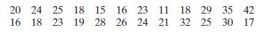
Use a stem-and-leaf plot to display the data, which represent the numbers of hours 24 students study per week.Organize the data using the indicated type of graph. Describe any patterns. 20 24 25 18 15 16 23 11 18 29 35 42 16 18 18 23 19 28 26 24 21 32 25 30 17
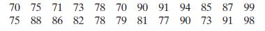
Use a stem-and-leaf plot to display the data, which represent the runs scored by a batsman in a World Cup series.Organize the data using the indicated type of graph. Describe any patterns. 70 75 71 73 78 70 90 91 94 85 87 99 75 88 86 82 78 79 81 77 90 73 91 98
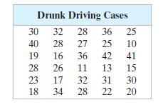
Use a stem-and-leaf plot to display the data shown in the table at the left, which represent the drunk driving cases registered at 30 strategic road intersections.Organize the data using the indicated type of graph. Describe any patterns. Drunk Driving Cases 30 32 28 36 25 40 28 27 25 10 19 16 36
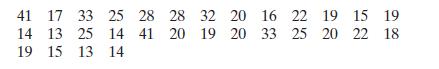
Use a stem-and-leaf plot that has two rows for each stem to display the data, which represent the incomes (in millions) of the top 30 highest-paid tech CEOs.Organize the data using the indicated type of graph. Describe any patterns. 41 17 33 25 28 28 32 20 16 22 19 15 19 14 13 25 14 19 15 13 14 41
The salaries (in thousand dollars) of a sample of 10 employeesOrganize the data using the indicated type of graph. Describe any patterns. 225 410 368 310 228 298 361 159 486 296
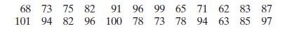
Use a dot plot to display the data, which represent the blood glucose levels (in milligrams per deciliter) of 24 patients at a pathology laboratory.Organize the data using the indicated type of graph. Describe any patterns. 68 73 75 82 101 94 82 96 91 100 96 99 65 71 62 83 87 78 73 78 94 63 85 97
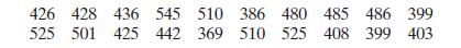
Use a dot plot to display the data, which represent the weights (in kilograms) of 20 polar bears.Organize the data using the indicated type of graph. Describe any patterns. 426 428 436 545 510 386 480 485 486 399 525 501 425 442 369 510 525 408 399 403
The five countries that have won the FIFA World cup more than once include Uruguay (2), Italy (4), Germany (4), Brazil (5), and Argentina (2). Use a Pareto chart to display the data.Organize the data using the indicated type of graph. Describe any patterns.
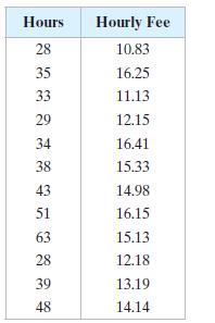
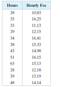
Use a scatter plot to display the data shown in the table at the left. The data represent the numbers of coaching hours and the hourly fees (in dollars) of 12 cricket coaches.Organize the data using the indicated type of graph. Describe any patterns. Hours Hourly Fee 28 10.83 35 16.25 33 11.13 29
Use a scatter plot to display the data shown in the table at the left. The data represent the numbers of coaching hours and the hourly fees (in dollars) of 12 cricket coaches.Organize the data using the indicated type of graph. Describe any patterns. Hours Hourly Fee 28 10.83 35 16.25 33 11.13 29
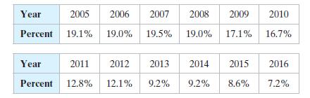
Tourism Use a time series chart to display the data shown in the table. The data represent the percentages of Egypt’s gross domestic product (GDP) that come from the travel and tourism sector.Organize the data using the indicated type of graph. Describe any patterns. Year 2007 2008 2009 2005 2006
The weights (in pounds) for a sample of adults before starting a weight-loss study are listed. What is the mean weight of the adults? 274 235 223 268 290 285 235
Find the median of the weights listed in Example 1.Data from Example 1The weights (in pounds) for a sample of adults before starting a weight-loss study are listed. What is the mean weight of the adults? 274 235 223 268 290 285 235
Showing 1300 - 1400
of 1977
First
6
7
8
9
10
11
12
13
14
15
16
17
18
19
20
Step by Step Answers