New Semester
Started
Get
50% OFF
Study Help!
--h --m --s
Claim Now
Question Answers
Textbooks
Find textbooks, questions and answers
Oops, something went wrong!
Change your search query and then try again
S
Books
FREE
Study Help
Expert Questions
Accounting
General Management
Mathematics
Finance
Organizational Behaviour
Law
Physics
Operating System
Management Leadership
Sociology
Programming
Marketing
Database
Computer Network
Economics
Textbooks Solutions
Accounting
Managerial Accounting
Management Leadership
Cost Accounting
Statistics
Business Law
Corporate Finance
Finance
Economics
Auditing
Tutors
Online Tutors
Find a Tutor
Hire a Tutor
Become a Tutor
AI Tutor
AI Study Planner
NEW
Sell Books
Search
Search
Sign In
Register
study help
mathematics
elementary statistics picturing
Elementary Statistics 11th Edition Mario F. Triola - Solutions
In Data Set 4, use tar in king-size cigarettes for the horizontal scale and use carbon monoxide (CO) in the same king-size cigarettes for the vertical scale. Determine whether there appears to be a relationship between cigarette tar and CO in king-size cigarettes. If so, describe the relationship.
When using histograms to compare two data sets, it is sometimes difficult to make comparisons by looking back and forth between the two histograms. A back-to-back relative frequency histogram uses a format that makes the comparison much easier. Instead of frequencies, we should use relative
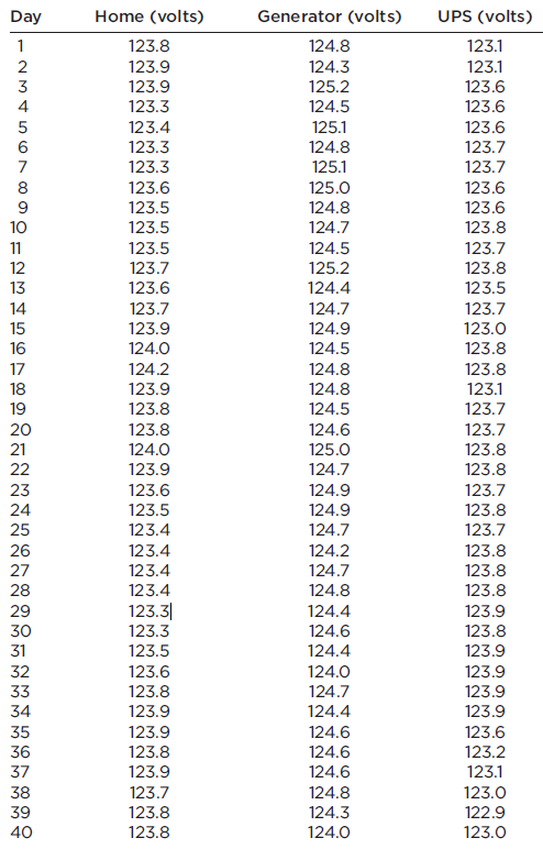
Refer to Data Set 13 in Appendix B and use the 40 home voltage measurements. Construct a frequency distribution with five classes. Begin with a lower class limit of 123.3 volts, and use a class width of 0.20 volt. Does the result appear to have a normal distribution? Why or why not? Day Home
Construct a pie chart depicting the distribution of train derailments from Exercise 30 in Section 2-2.
Use the frequency distribution from Exercise 28 in Section 2-2 to construct a histogram. Compare this histogram to the histogram from Exercise 19.
Construct a Pareto chart depicting the distribution of train derailments from Exercise 30 in Section 2-2.
Use the frequency distribution from Exercise 27 in Section 2-2 to construct a histogram.
Construct a Pareto chart depicting the distribution of blood groups from Exercise 29 in Section 2-2.
Use the relative frequency distributions from Exercise 26 in Section 2-2 to construct a histogram for the weights of regular Coke and another histogram for the weights of diet Coke. Compare the results and determine whether there appears to be a significant difference.
Listed below are amounts of strontium-90 (in millibecquerels) in a simple random sample of baby teeth obtained from Pennsylvania residents born after 1979 (based on data from “An Unexpected Rise in Strontium-90 in U.S. Deciduous Teeth in the 1990s,” by Mangano, et. al., Science of the Total
Construct a pie chart depicting the distribution of blood groups from Exercise 29 in Section 2-2.
Use the frequency distribution from Exercise 25 in Section 2-2 to construct a histogram. Does the result appear to be a normal distribution? Why or why not?
Construct a Pareto chart of the data given in Exercise 15. Compare the Pareto chart to the pie chart. Which graph is more effective in showing the relative importance of the mistakes made by job applicants?
Use the frequency distribution from Exercise 24 in Section 2-2 to construct a histogram. Do the weights of discarded paper appear to have a normal distribution?
In a study, researchers treated 570 people who smoke with either nicotine gum or a nicotine patch. Among those treated with nicotine gum, 191 continued to smoke and the other 59 stopped smoking. Among those treated with a nicotine patch, 263 continued to smoke and the other 57 stopped smoking
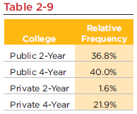
Construct a pie chart for the data in Table 2-9. Compare the pie chart to the Pareto chart in Exercise 13. Which graph is more effective in showing the information in Table 2-9? Table 2-9 Relative College Public 2-Year Public 4-Year Frequency 36.8% 40.0% Private 2-Year 1.6% Private 4-Year 21.9%
Use the frequency distribution from Exercise 23 in Section 2-2 to construct a histogram. What does the histogram suggest about the length of 3/4 in., as printed on the labels of the packages containing the screws?
Use the frequency distribution from Exercise 22 in Section 2-2 to construct a histogram. Using a very loose interpretation of the relevant criteria, does the result appear to be a normal distribution? Compare this histogram to the histogram from Exercise 13.
Construct the cumulative frequency distribution that corresponds to the frequency distribution in the exercise indicated.Tar (mg) inFilteredCigarettes
Table 2-9 (based on data from the U.S. National Center for Education Statistics) shows the distribution of undergraduate college student enrollments. Construct a Pareto chart for the data in Table 2-9. Table 2-9 Relative College Public 2-Year Public 4-Year Frequency 36.8% 40.0% Private 2-Year 1.6%
Construct the cumulative frequency distribution that corresponds to the frequency distribution in the exercise indicated.Tar (mg) inNonfilteredCigarettes
For a recent year, 38.5% of undergraduates were attending two-year colleges, and the other undergraduates were in four-year colleges (based on data from the U.S. National Center for Education Statistics).a. Construct a bar graph that is misleading by exaggerating the difference between the two
Use the weights of discarded plastic to construct a frequency polygon. For the horizontal axis, use the midpoints of these class intervals: 0.00–0.99, 1.00–1.99, 2.00–2.99, 3.00–3.99, 4.00–4.99, 5.00–5.99.
Use the frequency distribution from Exercise 20 in Section 2-2 to construct a histogram. Compare this histogram to the histogram from Exercise 11.
Construct one table (similar to Table 2-8 on page 51) that includes relative frequencies based on the frequency distributions from Exercises 7 and 8, then compare the weights of discarded metal and plastic. Do those weights appear to be about the same or are they substantially different? Table 2-8
Use the weights to construct an ogive. For the horizontal axis, use these class boundaries: –0.005, 0.995, 1.995, 2.995, 3.995, 4.995, 5.995. (Hint: See Exercise 8 in Section 2-2.) How many of the weights are below 4 lb?
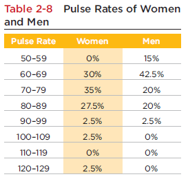
Construct one table (similar to Table 2-8 on page 51) that includes relative frequencies based on the frequency distributions from Exercises 5 and 6, then compare the amounts of tar in nonfiltered and filtered cigarettes. Do the cigarette filters appear to be effective? Table 2-8 Pulse Rates of
Construct a dotplot of the weights of discarded plastic. What does the dotplot suggest about the distribution of the weights?
Using a strict interpretation of the relevant criteria on page 50, does the frequency distribution given in Exercise 6 appear to have a normal distribution? Does the distribution appear to be normal if the criteria are interpreted very loosely?
Use the weights to construct a stemplot. What does the stemplot suggest about the distribution of the weights?
The cotinine levels summarized in the table that accompanies Exercise 6 are obtained from a simple random sample of smokers selected from the population of all smokers. If we add the original 40 cotinine levels, then divide the total by 40, we obtain 172.5, which is the average (mean). Is 172.5 a
Using a strict interpretation of the relevant criteria on page 50, does the frequency distribution given in Exercise 5 appear to have a normal distribution? Does the distribution appear to be normal if the criteria are interpreted very loosely?
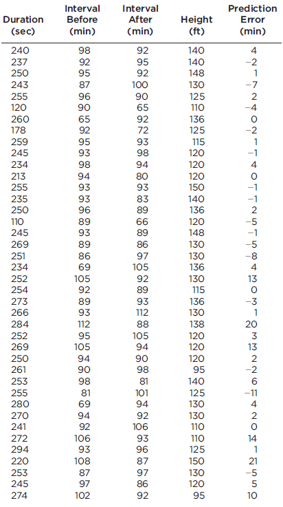
The accompanying table represents a frequency distribution of the duration times (in seconds) of 40 eruptions of the Old Faithful geyser, as listed in Data Set 15 in Appendix B. a. What is the class width? b. What are the upper and lower class limits of the first class? c. What are the upper and
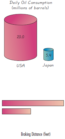
The accompanying graph uses cylinders to represent barrels of oil consumed by the United States and Japan. Does the graph distort the data or does it depict the data fairly? Why or why not? If the graph distorts the data, construct a graph that depicts the data fairly. Daily Oil Consumption
Construct an ogive of the amounts of Strontium-90. For the horizontal axis, use the class boundaries corresponding to the class limits given in Exercise 7. How many of the amounts are below 150 millibecquerels? Use the listed amounts of Strontium-90 (in millibecquerels) in a simple random sample
Identify the class width, class midpoints, and class boundaries for the given frequency distribution. The frequency distributions are based on data from Appendix B.Weights (lb)of DiscardedPlastic
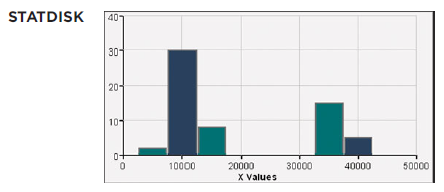
What is a reasonable explanation for the large gap in the histogram? The following STATDISKgenerated histogram, which represents the numbers of miles driven by automobiles in New York City. STATDISK 40 30 20- 10 0- 50000 10000 20000 30000 40000 X Values
Construct the histogram that represents the data summarized in the table that accompanies Exercise 6. What should be the shape of the histogram in order to conclude that the data have a normal distribution? If using a fairly strict interpretation of a normal distribution, does the histogram suggest
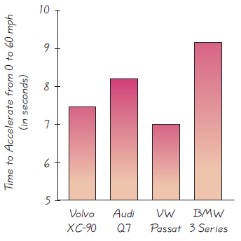
See the accompanying graph illustrating the acceleration times (in seconds) of four different cars. The actual acceleration times are as follows: Volvo XC-90: 7.6 s; Audi Q7: 8.2 s; Volkswagon Passat: 7.0 s; BMW 3 Series: 9.2 s. Does the graph correctly illustrate the acceleration times, or is it
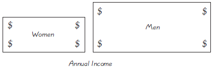
The accompanying graph depicts average full-time incomes of women and men aged 18 and over. For a recent year, those incomes were $37,197 for women and $53,059 for men (based on data from the U.S. Census Bureau). Does the graph make a fair comparison of the data? Why or why not? If the graph
Construct a frequency polygon of the amounts of Strontium-90. For the horizontal axis, use the midpoints of the class intervals in the frequency distribution in Exercise 18 from Section 2-2: 110?119, 120?129, 130?139, 140?149, 150?159, 160?169, 170?179, 180?189. Use the listed amounts of
Identify the class width, class midpoints, and class boundaries for the given frequency distribution. The frequency distributions are based on data from Appendix B.Weights (lb) ofDiscardedMetal
The accompanying frequency distribution summarizes the measured cotinine levels of a simple random sample of 40 smokers (from Data Set 5 in Appendix B).a. What is the class width?b. What are the upper and lower class boundaries of the first class?c. What is the relative frequency corresponding to
Listed below are the annual sunspot numbers for a recent sequence of years beginning with 1980. Construct a time-series graph. Is there a trend? If so, what is it? 154.6 140.5 115.9 66.6 45.9 17.9 13.4 29.2 100.2 157.6 142.6 145.7 94.3 54.6 29.9 17.5 8.6 21.5 64.3 93.3 119.6 123.3 123.3 65.9
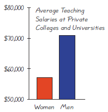
See the accompanying graph that compares teaching salaries of women and men at private colleges and universities (based on data from the U.S. Department of Education). What impression does the graph create? Does the graph depict the data fairly? If not, construct a graph that depicts the data
Construct a stemplot of the amounts of Strontium-90. What does the stemplot suggest about the distribution of those amounts? Use the listed amounts of Strontium-90 (in millibecquerels) in a simple random sample of baby teeth obtained from Pennsylvania residents born after 1979 (based on data from
What is the class width? What are the approximate lower and upper class limits of the first class? The following STATDISKgenerated histogram, which represents the numbers of miles driven by automobiles in New York City. STATDISK 40 30 20- 10 0- 10000 20000 30000 40000 50000 X Values
Identify the class width, class midpoints, and class boundaries for the given frequency distribution. The frequency distributions are based on data from Appendix B.Tar (mg) inFilteredCigarettes
a. What is a random sample?b. What is a simple random sample?c. Assume that the population of the United States is partitioned into 300,000 groups with exactly 1000 subjects in each group. If a computer is used to randomly select one of the groups, is the result a random sample? Simple random
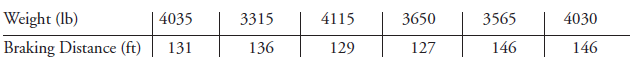
Listed below are the weights (in pounds) and braking distances (in feet) of the first six cars listed in Data Set 16 from Appendix B. Use the weights and braking distances shown below to construct a scatterplot. Based on the result, does there appear to be a relationship between the weight of a car
According to data from Gordon, Churchill, Clauser, et al., women have an average (mean) weight of 137 lb or 62 kg, and men have an average (mean) weight of 172 lb or 78 kg. These averages are shown in the accompanying graph. Does the graph depict the data fairly? Why or why not?
Construct a dotplot of the amounts of Strontium-90. What does the dotplot suggest about the distribution of those amounts? Use the listed amounts of Strontium-90 (in millibecquerels) in a simple random sample of baby teeth obtained from Pennsylvania residents born after 1979 (based on data from
How many automobiles are included in the histogram? How many of the automobiles traveled more than 20,000 miles? The following STATDISKgenerated histogram, which represents the numbers of miles driven by automobiles in New York City. STATDISK 40 30 20- 10 0- 50000 10000 20000 30000 40000 X Values
Suppose that the results in the table were obtained by mailing a survey to 10,000 executives and recording the 1733 responses that were returned. What is this type of sampling called? Is this type of sample likely to be representative of the population of all executives? Why or why not?Refer to the
Identify the class width, class midpoints, and class boundaries for the given frequency distribution. The frequency distributions are based on data from Appendix B.Tar (mg) inNonfilteredCigarettes
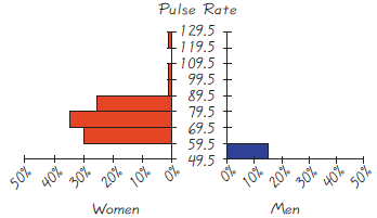
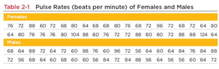
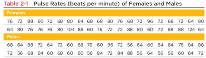
Construct a stemplot of the pulse rates of males listed in Table 2-1 on page 47 How does the result compare to the stemplot for the pulse rates of females shown in Section 2-4? Table 2-1 Pulse Rates (beats per minute) of Females and Males Females 76 72 88 60 72 68 80 64 68 68 80 76 68 72 96 72 68
When referring to a normal distribution, does the term “normal” have the same meaning as in ordinary language? What criterion can be used to determine whether the data depicted in a histogram have a distribution that is approximately a normal distribution? Is this criterion totally objective,
The accompanying frequency distribution summarizes the heights of a sample of people at Vassar Road Elementary School. What can you conclude about the people included in the sample?
Given that there are 1733 responses, find the actual number of responses in each category.Refer to the table in the margin, which summarizes results from a survey of 1733 randomly selected executives (based on data from Korn/Ferry International). Participants responded to this question: “If you
Construct a dotplot of the pulse rates of males listed in Table 2-1 on page 47 How does the result compare to the dotplot for the pulse rates of females shown in Section 2-4? Table 2-1 Pulse Rates (beats per minute) of Females and Males Females 76 72 88 60 72 68 80 64 68 68 80 76 68 72 96 72 68 72
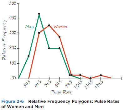
Figure 2-6 includes relative frequency polygons for the pulse rates of females and males. When comparing two such data sets, why is it generally better to use relative frequency polygons instead of frequency polygons? 50% - 40% Men 30% Women 20% 10% - 0%- 54.5 124.5 Relative Frequency Polygons:
Assume that, as a newspaper reporter, you must graph data showing that increased smoking causes an increased risk of lung cancer. Given that people might be helped and lives might be saved by creating a graph that exaggerates the risk of lung cancer, is it ethical to construct such a graph?
The population of ages at inauguration of all U. S. Presidents who had professions in the military is 62, 46, 68, 64, 57. Why does it not make sense to construct a histogram for this data set?
A Harris Interactive survey involved 1644 people between the ages of 8 years and 18 years. The accompanying table summarizes the results. Does this table describe a relative frequency distribution? Why or why not?
What is the level of measurement of the 1733 individual responses: nominal, ordinal, interval, or ratio? Why?Refer to the table in the margin, which summarizes results from a survey of 1733 randomly selected executives (based on data from Korn/Ferry International). Participants responded to this
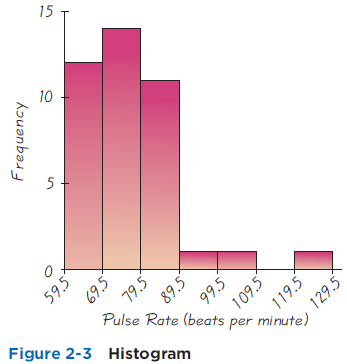
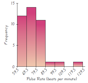
Construct the histogram that corresponds to the frequency distribution from Exercise 1. How does the result compare to the histogram for females (Figure 2-3)? 15 10 5 59.5 109.5 Pulse Rate (beats per minute) Figure 2-3 Histogram Frequency 69.5 79.5 89.5 99.5 119.5 129.5
If you want to graph changing tuition costs over the past 20 years, which graph would be better, a histogram or a time-series graph? Why?
America Online (AOL) occasionally conducts online polls in which Internet users can respond to a question. If a graph is constructed to illustrate results from such a poll, and the graph is designed objectively with sound graphing techniques, does the graph provide us with greater understanding of
Example 9 includes a scatterplot of temperature chirps data. In general, what type of data is required for the construction of a scatterplot, and what does the scatterplot reveal about the data?
After constructing a relative frequency distribution summarizing IQ scores of college students, what should be the sum of the relative frequencies?
Does the table describe a frequency distribution? Why or why not?Refer to the table in the margin, which summarizes results from a survey of 1733 randomly selected executives (based on data from Korn/Ferry International). Participants responded to this question: “If you could start your career
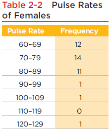
Table 2-2 is a frequency distribution summarizing the pulse rates of females (listed in Table 2-1), and Figure 2-3 is a histogram representing those same pulse rates. When investigating the distribution of that data set, which is more effective: the frequency distribution or the histogram?
The Washington Post illustrated diminishing purchasing power of the dollar in five different presidential administrations using five different $1 bills of different sizes. The Eisenhower era was represented by a $1 with purchasing power of $1, and the subsequent administrations were represented
Example 1 includes a frequency polygon depicting pulse rates of women, and Example 4 includes a dotplot of the same data set. What are some advantages of the dotplot over a frequency polygon?
Table 2-2 is a frequency distribution summarizing the pulse rates of females listed in Table 2-1, and Figure 2-3 is a histogram depicting that same data set. When trying to better understand the pulse rate data, what is the advantage of examining the histogram instead of the frequency
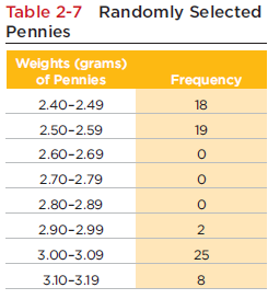
Table 2-7 on page 51 is a frequency distribution summarizing the weights of 72 different pennies. Is it possible to identify the original list of the 72 individual weights from Table 2-7? Why or why not? Table 2-7 Randomly Selected Pennies Weights (grams) of Pennies Frequency 2.40-2.49 18
In “Cardiovascular Effects of Intravenous Triiodothyronine in Patients Underdoing Coronary Artery Bypass Graft Surgery” (Journal of the American Medical Association, Vol. 275, No. 9), the authors explain that patients were assigned to one of three groups: (1) a group treated with
For the poll described in the Chapter Problem, assume that the respondents had been asked for their political party affiliation, and the responses were coded as 0 (for Democrat), 1 (for Republican), 2 (for Independent), or 3 (for any other response). If we calculate the average (mean) of the
Give an example (different from the one in the text) illustrating how confounding occurs.
You have been commissioned to conduct a job survey of graduates from your college. Describe procedures for obtaining a sample of each type: random, systematic, convenience, stratified, cluster.
America Online asked subscribers to respond to this question: “Which slogan do you hate the most?” Responders were given several slogans used to promote car sales, and Volkswagon’s slogan received 55% of the 33,160 responses. The Volkswagon slogan was “Relieves gas pains.”Identify the(a)
A study funded by the National Center for Complementary and Alternative Medicine found that echinacea was not an effective treatment for colds in children. The experiment involved echinacea treatments and placebos, and blinding was used. What is blinding, and why was it important in this experiment?
Some people responded to this request: “Dial 1-900-PRO-LIFE to participate in a telephone poll on abortion. ($1.95 per minute. Average call: 2 minutes. You must be 18 years old.)”Identify the(a) Sample(b) Population. Also, determine whether the sample is likely to be representative of the
University of Toronto researchers studied 699 traffic crashes involving drivers with cell phones (based on data from “Association Between Cellular-Telephone Calls and Motor Vehicle Collisions,” by Redelmeier and Tibshirani, New England Journal of Medicine, Vol. 336, No. 7). They found that cell
The Nielsen Media Research Company uses people meters to record the viewing habits of about 5000 households, and today those meters will be used to determine the proportion of households tuned to CBS Evening News.
A Gallup poll of 1012 randomly surveyed adults found that 9% of them said cloning of humans should be allowed.Identify the(a) Sample(b) Population. Also, determine whether the sample is likely to be representative of the population.
The newspaper USA Today published a health survey, and some readers completed the survey and returned it.Identify the(a) Sample(b) Population. Also, determine whether the sample is likely to be representative of the population.
Physicians at the Mount Sinai Medical Center plan to study emergency personnel who worked at the site of the terrorist attacks in New York City on September 11, 2001. They plan to study these workers from now until several years into the future.
Ranks of cars evaluated by Consumer’s UnionDetermine which of the four levels of measurement (nominal, ordinal, interval, ratio) is most appropriate.
The Associated Press provided an article with the headline, “ATV accidents killed 704 people in ’04.” The article noted that this is a new record high, and compares it to 617 ATV deaths the preceding year. Other data about the frequencies of injuries were included. What important value was
Refer to the city and highway fuel consumption amounts of different cars listed in Data Set 16 of Appendix B. Compare the city fuel consumption amounts and the highway fuel consumption amounts, then answer the following questions without doing any calculations.a. Does the conclusion that the
Physicians at the Mount Sinai Medical Center studied New York City residents with and without respiratory problems. They went back in time to determine how those residents were involved in the terrorist attacks in New York City on September 11, 2001.
In the New York Times Magazine, a report about the decline of Western investment in Kenya included this: “After years of daily flights, Lufthansa and Air France had halted passenger service. Foreign investment fell 500 percent during the 1990s.” What is wrong with this statement?
Years in which movies were released, as listed in Data Set 9 in Appendix BDetermine which of the four levels of measurement (nominal, ordinal, interval, ratio) is most appropriate.
A classroom consists of 36 students seated in six different rows, with six students in each row. The instructor rolls a die to determine a row, then rolls the die again to select a particular student in the row. This process is repeated until a sample of 6 students is obtained. Does this sampling
Measured amounts of greenhouse gases (in tons per year) emitted by cars listed in Data Set 16 in Appendix BDetermine which of the four levels of measurement (nominal, ordinal, interval, ratio) is most appropriate.
In a Gallup poll of 1038 randomly selected adults, 85% said that secondhand smoke is somewhat harmful or very harmful, but a representative of the tobacco industry claims that only 50% of adults believe that secondhand smoke is somewhat harmful or very harmful. Is there statistically significant
NBC News polled reactions to the last presidential election by surveying adults who were approached by a reporter at a location in New York City. Does this sampling plan result in a random sample? Simple random sample? Explain.
America Online posted this question on its Web site: “How much stock do you put in long-range weather forecasts?” Among its Web site users, 38,410 chose to respond.a. Among the responses received, 5% answered with “a lot.” What is the actual number of responses consisting of “a lot?”b.
Companies (Disney, MGM, Warner Brothers, Universal, 20th Century Fox) that produced the movies listed in Data Set 7 in Appendix BDetermine which of the four levels of measurement (nominal, ordinal, interval, ratio) is most appropriate.
Showing 1200 - 1300
of 2934
First
6
7
8
9
10
11
12
13
14
15
16
17
18
19
20
Last
Step by Step Answers