New Semester
Started
Get
50% OFF
Study Help!
--h --m --s
Claim Now
Question Answers
Textbooks
Find textbooks, questions and answers
Oops, something went wrong!
Change your search query and then try again
S
Books
FREE
Study Help
Expert Questions
Accounting
General Management
Mathematics
Finance
Organizational Behaviour
Law
Physics
Operating System
Management Leadership
Sociology
Programming
Marketing
Database
Computer Network
Economics
Textbooks Solutions
Accounting
Managerial Accounting
Management Leadership
Cost Accounting
Statistics
Business Law
Corporate Finance
Finance
Economics
Auditing
Tutors
Online Tutors
Find a Tutor
Hire a Tutor
Become a Tutor
AI Tutor
AI Study Planner
NEW
Sell Books
Search
Search
Sign In
Register
study help
mathematics
introductory statistics exploring the world through data
Introductory Statistics Exploring The World Through Data 3rd Edition Robert Gould, Rebecca Wong, Colleen N. Ryan - Solutions
The following figure shows a scatterplot of the educational level of twins. Describe the scatterplot. Explain the trend and mention any unusual points. 20 18 - 16 - 14 - 12 - 10 8 5 10 15 20 Education of One Twin (years) Education of Other Twin (years)
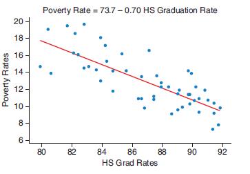
Poverty rates and high school graduation rates for the 50 states and the District of Columbia are graphed below.a. What does the trend tell us about the relationship between poverty and high school graduation rates?b. Interpret the slope of the regression equation.c. The value of the coefficient of
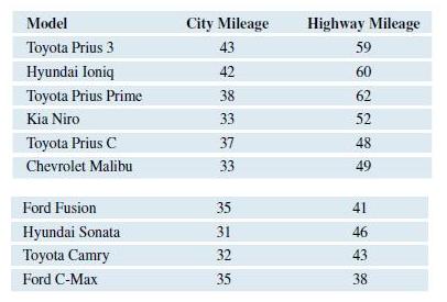
The following table gives the number of miles per gallon in the city and on the highway for some of the most fuel efficient cars according to Consumer Reports. Make a scatterplot of the data using city mileage as the predictor variable. 1Find the regression equation and use it to predict the
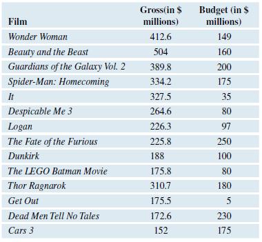
Move studios try to predict how much money their movies will make. One possible predictor is the amount of money spent on the production of the movie. The table shows the budget and amount of money made for a sample of movies made in 2017. The budget (amount spent making the movie) and gross
Data on the fat, carbohydrate, and calorie content for a sample of popular snack foods are found on this text’s website. Use the data to determine which is a better predictor of the number of calories in these snack foods: fat or carbohydrates?
The LSAT is a standardized test required for entrance to most law schools. The high LSAT score for admitted students and the percentage of students passing the bar exam immediately after law school graduation for a sample of law schools is found on this text’s website.a. Do law schools that have
The acceptance rate for a sample of law schools and the percentage of students employed at graduation are on this text’s website. A low acceptance rate means the law school is highly selective in admitting students.a. Do more selective law schools have better job-placement success? Make a graph
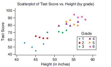
a. The following figure shows hypothetical data for a group of children. By looking at the figure, state whether the correlation between height and test score is positive, negative, or near zero.b. The shape and color of the each marker show what grade these children were in at the time they took
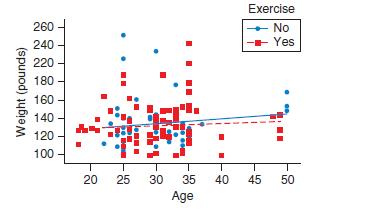
The following scatterplot shows the age and weight for some women. Some of them exercised regularly, and some did not. Explain what it means that the blue line (for those who did not exercise) is a bit steeper than the red line (for those who did exercise) Exercise 260 No 240 -- Yes 220 180 160 140
The following table shows the fat content (in grams) and calories for a sample of granola bars.Fat (in grams) Calories7.6 . . . . . . . . . . . . . . . . . . . . . . . 3703.3 .
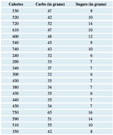
The data shows the number of calories, carbohydrates (in grams) and sugar (in grams) found in a selection of menu items at McDonald’s. Scatterplots suggest the relationship between calories and both carbs and sugars is linear. The data are also available on this text’s website.a. Calculate the
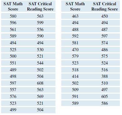
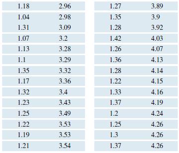
The following table shows the average SAT Math and Critical Reading scores for students in a sample of states. A scatterplot for these two variables suggests a linear trend.a. Find and report the value for the correlation coefficient and the regression equation for predicting the math score from
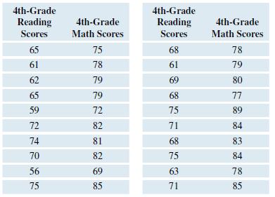
Data from the National Data shown in the table are the 4th-grade reading and math scores for a sample of states from the National Assessment of Educational Progress. The scores represent the percentage of 4thgraders in each state who scored at or above basic level in reading and math. A scatterplot
Data on the number of home runs, strikeouts, and batting averages for a sample of 50 Major League Baseball players were obtained. Regression analyses were conducted on the relationships between home runs and strikeouts and between home runs and batting averages. The StatCrunch results are shown
Data on the 3-point percentage, field-goal percentage, and free-throw percentage for a sample of 50 professional basketball players were obtained. Regression analyses were conducted on the relationships between 3-point percentage and field-goal percentage and between 3 point percentage and
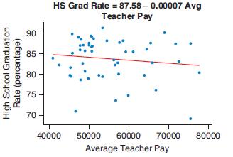
The scatterplot shows the average teacher pay and high school graduation percentage rate for each of the 50 states and the District of Columbia. The regression equation is also shown.a. Based on the scatterplot is the correlation between average teacher pay and high school graduation rate positive,
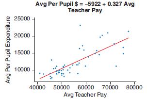
The scatterplot shows the average teacher pay and the per pupil expenditure for each of the 50 states and the District of Columbia. The regression equation is also shown.a. From the scatterplot is the correlation between average teacher pay and per pupil expenditure positive, negative, or near
The table shows the calories in a five-ounce serving and the % alcohol content for a sample of wines.Calories % alcohol122 . . . . . . . . . . . . . . 10.6119 . . . . . . . . . . . . . . 10.1121 . . . . . . . . . . . . . . 10.1123 . . . . . .
Answer the questions using complete sentences.a. An economist noted the correlation between consumer confidence and monthly personal savings was negative. As consumer confidence increases, would we expect monthly personal savings to increase, decrease, or remain constant?b. A study found a
Answer the questions using complete sentences.a. What is an influential point? How should influential points be treated when doing a regression analysis?b. What is the coefficient of determination and what does it measure?c. What is extrapolation? Should extrapolation ever be used?
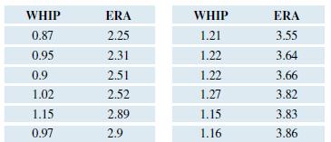
The table shows the Earned Run Average (ERA) and WHIP rating (walks plus hits per inning) for the top 40 Major League Baseball pitchers in the 2017 season. Top pitchers will tend to have low ERA and WHIP ratings.a. Make a scatterplot of the data and state the sign of the slope from the scatterplot.
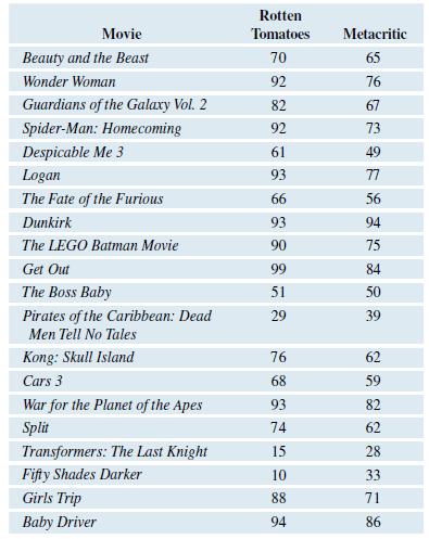
The following table give the Rotten Tomatoes and Metacritic scores for the several movies produced in 2017. Both of these ratings systems give movies a score using a scale from 0 to 100.a. Use technology to make a scatterplot using Rotten Tomatoes as the independent variable and Metacritic as the
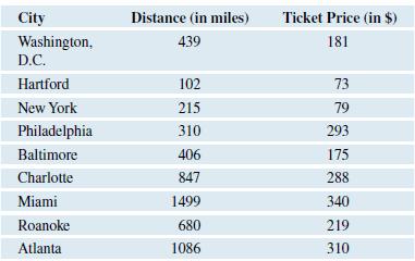
The following table gives the distance from Boston to each city and the cost of a train ticket from Boston to that city for a certain date.a. Use technology to produce a scatterplot. Based on your scatterplot do you think there is a strong linear relationship between these two variables? Explain.b.
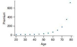
The graph shows the monthly premiums for a 10-year $250,000 male life insurance policy by age of purchase. For example, a 20-year-old male could purchase such a policy for about $10 per month, while a 50-year-old male would pay about $24 per month for the same policy.a. Explain what the graph tells
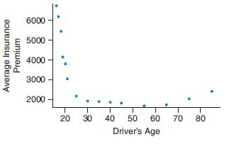
The following graph shows the average car insurance premium for a sample of ages.a. Explain what the graph tells us about insurance rates for drivers at different ages. Explain why insurance rates might follow this trend.b. Would it be appropriate to do a linear regression analysis on these data?
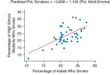
The following figure shows a scatterplot with a regression line. The data are for the 50 states. The predictor is the percentage of adults who smoke. The response is the percentage of high school students who smoke. (The point in the lower left is Utah.)a. Explain what the trend shows.b. Use the
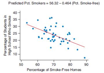
The following figure shows a scatterplot with the regression line. The data are for the 50 states. The predictor is the percentage of smokefree homes. The response is the percentage of high school students who smoke. The data came from the Centers for Disease Control and Prevention.a. Explain what
Indicate which variable you think should be the predictor (x) and which variable should be the response (y). Explain your choices.a. A researcher measures subjects’ stress levels and blood pressures.b. Workers who commute by car record the length of their commutes (in miles) and the amount spent
Indicate which variable you think should be the predictor (x) and which variable should be the response (y). Explain your choices.a. You have collected data on used cars for sale. The variables are price and odometer readings of the cars.b. Research is conducted on monthly household expenses.
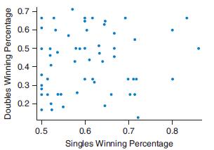
The following graph shows the winning percentages in singles matches and doubles matches for a sample of male professional tennis players.a. Based on this scatterplot, would you say there is a strong linear association between these two variables?b. Would the numerical value of the correlation
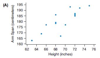
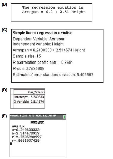
Measurements were made for a sample of adult men. A regression line was fit to predict the men’s arm span from their height. The output from several different statistical technologies is provided. The scatterplot confirms that the association between arm span and height is linear.a. Report the
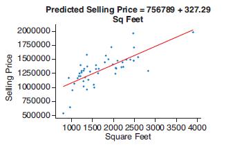
The scatterplot shows the size (in square feet) and selling prices for homes in a certain zip code in California.a. Use the graph to estimate the selling price of a home with 2000 square feet.b. Use the equation to predict the selling price for a home with 2000 square feet.c. What is the slope of
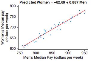
The scatterplot shows the median weekly earning (by quarter) for men and women in the United States for the years from 2005 through 2017. The correlation is 0.974.a. Use the scatterplot to estimate the median weekly income for women in a quarter in which the median pay for men is about $850.b. Use
United Press International published an article with the headline “Study Finds Correlation between Education, Life Expectancy.” Would you expect this correlation to be negative or positive? Explain your reasoning in the context of this headline.
USA Today College published an article with the headline “Positive Correlation Found between Gym Usage and GPA.” Explain what a positive correlation means in the context of this headline.
In Exercise 4.1 there is a graph of the relationship between SAT score and college GPA. SAT score was the predictor and college GPA was the response variable. If you reverse the variables so that college GPA was the predictor and SAT score was the response variable, what effect would this have on
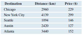
The distance (in kilometers) and price (in dollars) for one-way airline tickets from San Francisco to several cities are shown in the table.a. Find the correlation coefficient for this data using a computer or statistical calculator. Use distance as the x-variable and price as the y-variable.b.
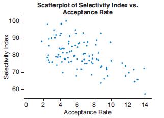
The scatterplot shows the acceptance rate and selectivity index for a sample of medical schools. The acceptance rate is the percentage of applicants who were accepted into the medical school. The selectivity index is a measure based on GPA, test scores, and acceptance rates. A higher index
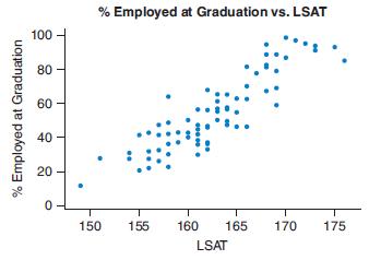
The scatterplot shows the LSAT (Law School Aptitude Test) scores for a sample of law schools and the percent of students who were employed immediately after law school graduation. Do you think the correlation coefficient among these variables is positive, negative, or near zero? Give a reason for
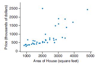
Describe the trend in the scatterplot of house price and area for some houses. State which point appears to be an outlier that does not fit the rest of the data. 2500 2000 1500 - 1000 - 500 - 1000 2000 3000 4000 5000 Area of House (square feet) Price (thousands of dollars)
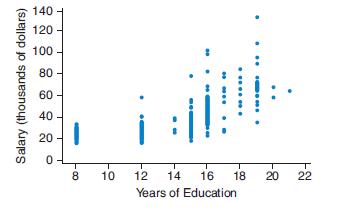
The scatterplot shows data on salary and years of education for a sample of workers. Comment on the trend of the scatterplot. Is the trend positive, negative, or near zero? 140 - 120 - 20 10 12 14 16 18 20 22 Years of Education 2. క్లి శి శ 9 Salary (thousands of dollars)
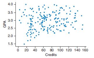
The scatterplot shows data on credits attained and GPA for a sample of college students. Comment on the trend of the scatterplot. Is the trend positive, negative, or near zero? 4.0 3.5 3.0 - 2.5 2.0 - 1.5 20 40 60 80 100 120 140 160 Credits GPA
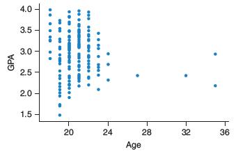
The scatterplot shows data on age and GPA for a sample of college students. Comment on the trend of the scatterplot. Is the trend positive, negative, or near zero? 4.0 3.5 3.0 2.5 2.0 - 1.5 20 24 28 32 36 Age .. . e ... e 0e .... e e .. GPA
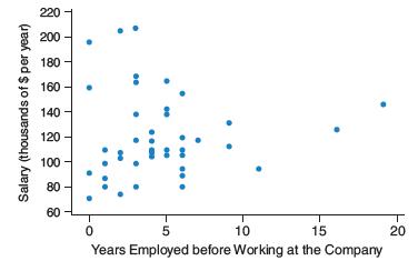
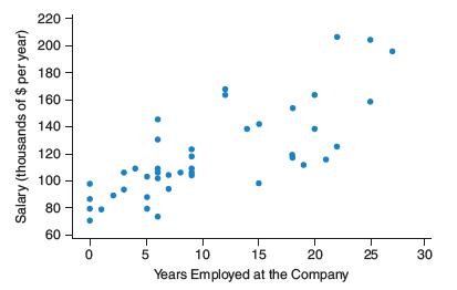
The first graph shows the years a person was employed before working at the company and the salary at the company. The second graph shows the years employed at the company and the salary. Which graph shows a stronger relationship and could do a better job predicting salary at the company? 220 200
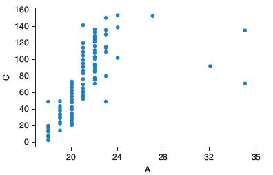
The scatterplot below shows data on age of a sample students and the number of college credits attained. Comment on the strength, direction, and shape of the trend. 160 140 - 120 - 100 - 80 - 60 - 40 - 20 20 24 28 32 35 A ..
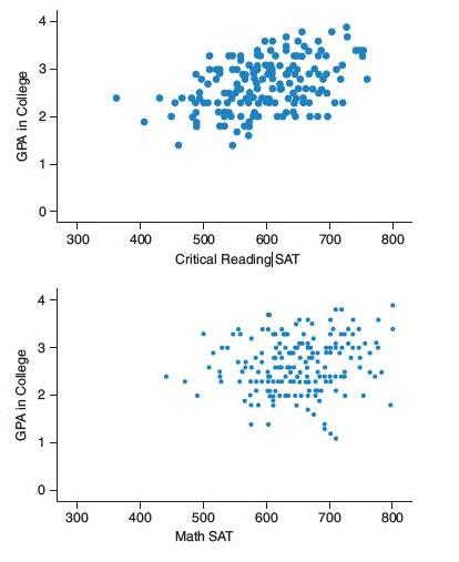
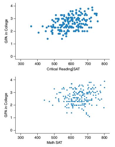
The scatterplots show SAT scores and GPA in college for a sample of students. The top graph uses the critical reading SAT score to predict GPA in college and the bottom graph shows math SAT to predict GPA. Which is the better predictor of GPA for these students, critical reading SAT or math SAT?
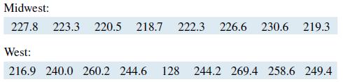
indicates cost of living for a typical consumer and is used by government economists as an economic indicator. The following data shows the CPI for large urban areas in midwestern and western states in the United States. Compare the CPI of the two regions. Start with a graph to determine
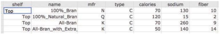
Data were collected on cereals stocked by a supermarket. A portion of the data table is shown below. Data includes shelf location (top, middle, bottom), name, manufacturer, type (hot or cold), and amount of calories, sodium and fiber per serving. Write one or two investigative questions that could
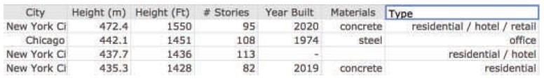
Data was collected on the tallest buildings in the United States. A portion of the data table is shown below. Write one or two investigative questions that could be answered using these data. City New York Ci Height (m) Height (Ft) # Stories Year Built Materials Type 472.4 1550 95 2020 concrete
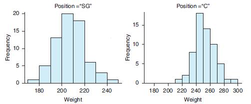
The graphs below show the weights of professional basketball players. One graph displays the weights of Centers (C) and the other graph displays the weights of Shooting Guards (SG). Write one or two investigative questions that could be answered by analyzing these graphs. Position ="SG" Position
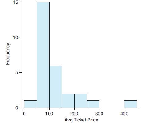
The following histogram shows the average ticket prices of 28 Broadway shows in the 2017 season. The median ticket price was $97.33. a. Describe the shape of the distribution. b. Would the mean of the data be greater than, less than, or about the same as the median of the data? Explain.c.
Mrs. Diaz has two children: a 3-yearold boy 43 inches tall and a 10-year-old girl 57 inches tall. Threeyear- old boys have a mean height of 38 inches and a standard deviation of 2 inches, and 10-year-old girls have a mean height of 54.5 inches and a standard deviation of 2.5 inches. Assume the
An exam score has a mean of 80 and a standard deviation of 4.a. Find and interpret in context an exam score that corresponds with a z-score of 2.b. What exam score corresponds with a z-score of -1.5?
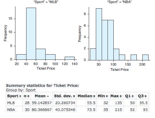
The following histograms show ticket prices for professional baseball (MLB) and professional basketball (NBA) tickets. a. Based on the shape of the distributions, which measure of center should be used to compare the prices: the mean or the median?b. Write a short report comparing the ticket
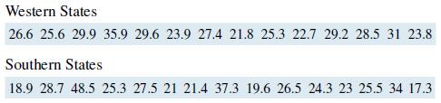
The tables below show the percentage of the population in western and southern states of the U.S. with a bachelor’s degree. Write a short report comparing the education attainment of these two regions. In your report, answer the question which region has the highest educational attainment (as
The mean of set A is smaller than that of set B, but the median of set B is smaller than that of set A. Report the mean and the median of both sets of data.
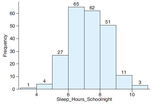
The histogram shows hours of sleep on a school night for a sample of 12th-grade students. a. Use the histogram and left-hand side of each bin to estimate the mean hours (to the nearest tenth) of sleep for 12th-graders on a school night.b. When comparing the mean and the median for this data
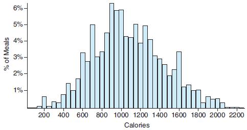
The New York Times collected data on the number of calories in meals at Chipotle restaurant. The distribution of calories was symmetric and unimodal and a graph of the distribution is shown below. a. Use the graph to estimate the mean number of calories in a Chipotle meal.b. One method for
A StatCrunch survey asked at what age should a person consider retirement. The data can be found at this text’s website. Who thinks people should retire at a younger age, males or females? Support your answer with appropriate graphs and summary statistics.
A StatCrunch survey asked people how many hours of video they watched daily. The data can be found at this text’s website. Who watches more hours of video, males or females? Support your answer with appropriate graphs and summary statistics.
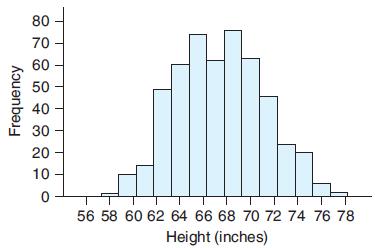
The following graph shows the heights for a large group of adults. Describe the distribution, and explain what might cause this shape. 80 70 60 50 40 30 20 10 56 58 60 62 64 66 68 70 72 74 76 78 Height (inches) Frequency
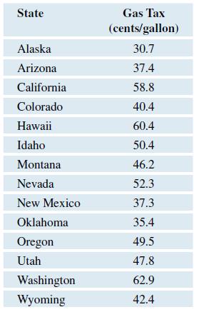
The following table shows the gas tax (in cents per gallon) in each of the western U.S. states. a. Find and interpret the median gas tax using a sentence in context. b. Find and interpret the interquartile range. c. What is the mean gas tax? d. Note that the mean and the median
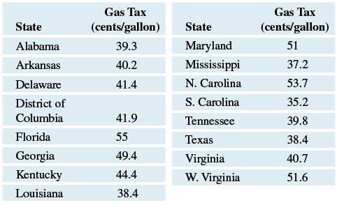
The following table shows the gas tax (in cents per gallon) in each of the southern U.S. states.a. Find and interpret the median gas tax using a sentence in context. b. Find and interpret the interquartile range. c. What is the mean gas tax? d. Note that the mean for this data set is
The five-number summary for a distribution of final exam scores is 60, 78, 80, 90, 100. Is it possible to draw a boxplot based on this information? Why or why not?
The five-number summary for a distribution of final exam scores is 40, 78, 80, 90, 100. Explain why it is not possible to draw a boxplot based on this information.
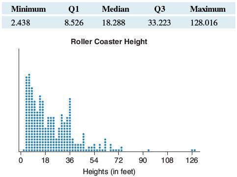
The dotplot shows the distribution of the heights (in feet) of a sample of roller coasters. The five-number summary of the data is given in the following table. Sketch a boxplot of the data. Explain how you determined the length of the whiskers. Minimum Q1 Median Q3 Maximum 2.438 8.526 18.288
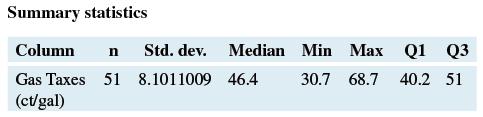
Data at this text’s website show the gas taxes for each of the 50 states and the District of Columbia. A summary of the data is shown in the following table. Should the maximum and minimum values of this data set be considered potential outliers? Why or why not? You can check your answer by using
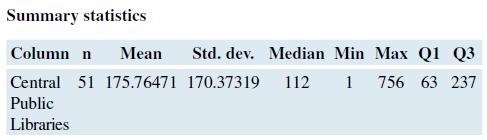
Data at this text’s website show the number of central public libraries in each of the 50 states and the District of Columbia. A summary of the data is shown in the following table. Should the maximum and minimum values of this data set be considered potential outliers? Why or why not? You can
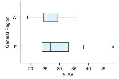
The following boxplot shows the percentage of the population that has earned a bachelor’s (BA) degree in the western (W) and eastern (E) United States. Estimate and interpret the median for each group. a. In which region does a greater percentage of the population have a BA degree?b. Which
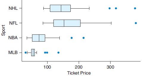
The following boxplot shows the average ticket price for professional hockey (NHL), football (NFL), basketball (NBA), and baseball (MLB) for the 2017 seasons. a. Which sport has the most expensive ticket prices? Which sport has the least expensive ticket prices?b. Compare the ticket prices for
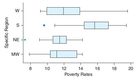
The following boxplot shows the poverty rates (the proportion of the population below the government’s official poverty level) for the 50 states and the District of Columbia. The regions are the West (W), South (S), NE (Northeast), and MW (Midwest). a. List the regions from highest to lowest
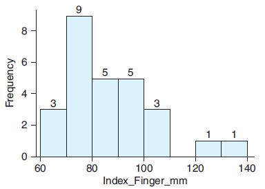
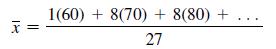
The histogram shows the lengths of index fingers (in millimeters) for a sample of eighth-graders.a. Use the histogram to approximate the mean ring finger length for the sample.b. Approximate the mean by completing the work that is started below. Note that the left-hand side of each bin is being
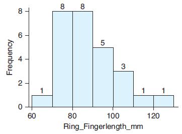
The histogram shows the lengths of ring fingers (in millimeters) for a sample of eighth-graders. a. Without doing any calculations, approximate the mean finger length for the sample.b. Approximate the mean by completing the work that is started below. Note the left-hand side of the bin is
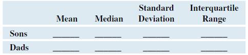
The data at this text’s website give the heights of 18 male college students and their fathers, in inches. a. Make histograms and describe the shapes of the two data sets from the histograms.b. Fill in the following table to compare descriptive statistics.c. Compare the heights of the sons
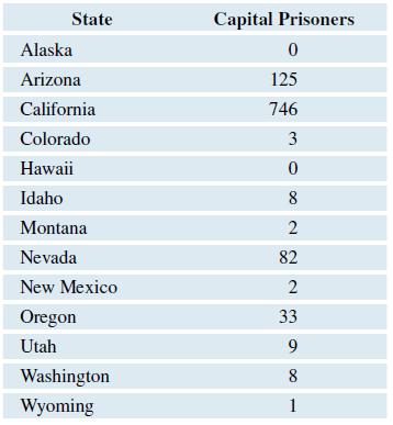
The following table shows the numbers of capital prisoners (prisoners on death row) in 2017 in the western U.S. states. a. Find the median number of prisoners and interpret (using a sentence in context).b. Find the interquartile range (showing Q1 and Q3 in the process) to measure the
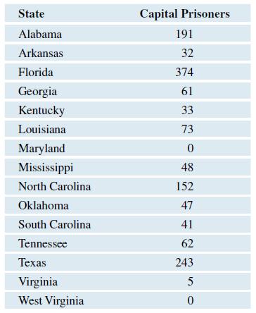
The following table shows the numbers of capital prisoners (prisoners on deathrow) in 2017 in the southern U.S. states.a. Find the median number of prisoners and interpret (using a sentence in context).b. Find the interquartile range (showing Q1 and Q3 in the process) to measure the variability in
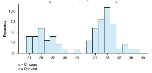
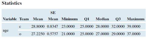
The following histograms show the ages of professional baseball players for two teams: the Chicago Cubs and the Oakland Athletics.a. Describe the shape of each histogram.b. Because of the shapes, which measures of center should be compared: the means or the medians?c. Because of the shapes, which
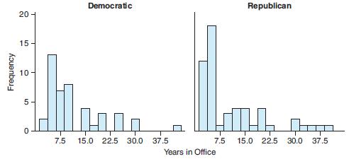
The following histograms show the number of years in office for Democratic and Republican U.S. senators. a. Describe the shape of each histogram.b. Because of the shapes, what measures of center should be compared: the means or the medians?c. Because of the shapes, what measures of spread
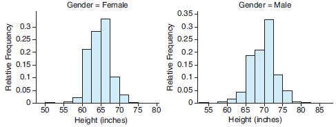
The National Longitudinal Survey records the heights of a representative sample of youths aged 14 to 20. The histograms show data for the heights of males and females. If you were comparing the heights of males and females, which measures of center and spread would you use? Why? Gender = Female
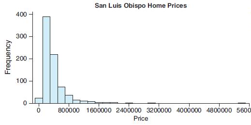
Home prices in San Luis Obispo County for a recent month are shown in the histogram. a. Describe the shape of the distribution.b. Because of the shape, what measures of center and spread should be used to describe the distribution? San Luis Obispo Home Prices 400 300 200 100 800000 1600000
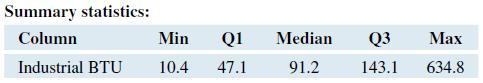
Data was collected on the industrial energy consumption per capita (in million BTUs) for all the states. A summary of the data is shown in the following table. a. What percentage of the states consumed fewer than 47.1 million BTUs per capita?b. What percentage of the states consumed fewer than
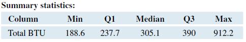
Data was collected on the total energy consumption per capita (in million BTUs) for all the states. A summary of the data is shown in the following table. a. What percentage of the states consumed more than 390 million BTUs per capita?b. What percentage of the states consumed more than 237.7
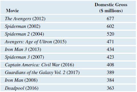
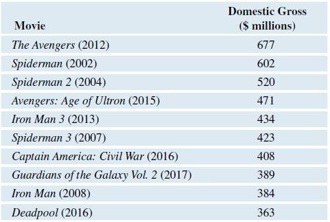
Use the data in Exercise 3.43, find and interpret the median domestic gross of the top seven Marvel movies.Data from Exercise 3.43,The top ten movies based on Marvel comic book characters for the U.S. box office as of fall 2017 are shown in the following table, with domestic gross rounded to the
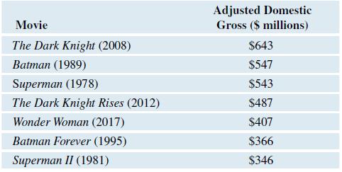
The top seven movies based on DC comic book characters for the U.S. box office as of fall 2017 are shown in the following table, rounded to the nearest hundred million. a. Find and interpret the median in context. b. Find and interpret the IQR in context. c. Find the range of the
The top ten movies based on Marvel comic book characters for the U.S. box office as of fall 2017 are shown in the following table, with domestic gross rounded to the nearest hundred million.a. Sort the domestic gross income from smallest to largest. Find the median by averaging the two middle
Assume that women’s heights have a distribution that is symmetric and unimodal, with a mean of 64 inches and a standard deviation of 2.5 inches. a. What women’s height corresponds with a z-score of -1.00? b. Professional basketball player Evelyn Akhator is 75 inches tall and plays in
Assume that men’s heights have a distribution that is symmetric and unimodal, with a mean of 69 inches and a standard deviation of 3 inches.a. What men’s height corresponds to a z-score of 2.00?b. What men’s height corresponds to a z-score of -1.50?
Babies born weighing 2500 grams (about 5.5 pounds) or less are called low-birthweight babies, and this condition sometimes indicates health problems for the infant. The mean birth weight for U.S.-born children is about 3462 grams (about 7.6 pounds). The mean birth weight for babies born one month
In 2017 a pollution index was calculated for a sample of cities in the western states using data on air and water pollution. Assume the distribution of pollution indices is unimodal and symmetric. The mean of the distribution was 43.0 points with a standard deviation of 11.3 points. a. What
In 2017 a pollution index was calculated for a sample of cities in the eastern states using data on air and water pollution. Assume the distribution of pollution indices is unimodal and symmetric. The mean of the distribution was 35.9 points with a standard deviation of 11.6 points.a. What
Data on residential energy consumption per capita (measured in million BTU) had a mean of 70.8 and a standard deviation of 7.3 for the states east of the Mississippi River. Assume that the distribution of residential energy use if approximately unimodal and symmetric.a. Between which two values
The histogram shows the number of runs scored by major league baseball teams for three seasons. The distribution is roughly unimodal and symmetric, with a mean of 687 and a standard deviation of 66 runs. An interval one standard deviation above and below the mean is marked on the histogram. a.
Is it possible for a standard deviation to be negative? Explain.
Is it possible for a standard deviation to be equal to zero? Explain.
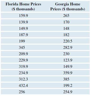
The prices (in $ thousand) of a sample of three-bedroom homes for sale in Florida and Georgia are shown in the table. (Source: Zillow.com) a. In which state are homes typically more expensive? Support your Answer using an appropriate statistic. b. Which state has more variation in home
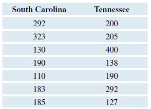
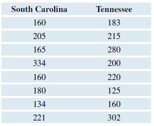
The prices (in $ thousand) of a sample of three-bedroom homes for sale in South Carolina and Tennessee are shown in the following table. Write a report that compares the prices of these homes. In your report, answer the questions of which state had the most expensive homes and which had the most
Four siblings are 2, 6, 9, and 10 years old.a. Calculate the mean of their current ages. Round to the nearest tenth.b. Without doing any calculation, predict the mean of their ages 10 years from now. Check your prediction by calculating their mean age in 10 years (when they are 12, 16, 19, and 20
From Amazon.com, the prices of 10 varieties of orange juice (59- to 64-ounce containers) sold were recorded: $3.88, $2.99, $3.99, $2.99, $3.69, $2.99, $4.49, $3.69, $3.89, $3.99.a. Find and interpret the mean price of orange juice sold on this site. Round to the nearest cent. b. Find the
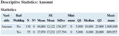
StatCrunch did a survey asking respondents how much they thought should be spent on a wedding and whether or not they had already had a wedding. The following table shows Minitab descriptive statistics for wedding costs. Compare the means and the standard deviations for those who had a wedding and
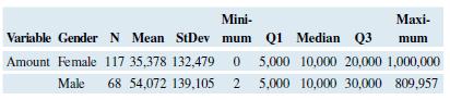
StatCrunch did a survey asking respondents their gender and how much they thought should be spent on a wedding. The following table shows Minitab descriptive statistics for wedding costs, split by gender.a. How many people were surveyed? b. Compare the results for men and women. Which group
Showing 500 - 600
of 710
1
2
3
4
5
6
7
8
Step by Step Answers